SLC | S21W 3 | Logo Design - Part 2
 |
|---|
Hello Students, welcome back to this space, am super happy to have y'all back here again this week. I trust you got value from the last lesson. Well it has always been my utmost desire to have this knowledge shared and to empower as many that really want to have this skill set. So just give me your time and attention so that you can get the best out of this course.
Today we would be considering the second part of the previous lesson on Logo design, there is actually a need to deepen our knowledge about this lesson and get us properly informed, hence the lesson we have before us today. No doubt this lesson is a very important one especially for brand owners, many of which I believe my students fall into.Let's delve into it guys!
• Introduction
• Types of Logo
• Determine what logo to Design
• Homework Task
In our previous lesson, we talked about the concept of Logo and also touched on the principles guiding the creation of Logo. I also did well to itemize some do's and don't about Logo design and am glad many of us caught these ideas, it was glaring from the homework post that came in.
However, I saw all manner of logo design in the course of grading the homework posts. I then deemed it fit to share with us all the types of logo design we have. Some of us clearly designed some logos that fell into one or more of these logo types.
What am saying in essence is that logo is not a one way thing. We have different logos and these logo are used as occasion demands. We would be exploring them shortly and you would have a complete knowledge about these logo types before you finish the lecture for today.
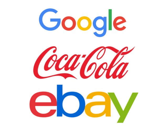
• WordMark Logos: This type of logo is the type that focus mainly on Typography for the totality of the logo design. Another name for wordmark logos is logotypes and this type of logo usually captures only the brand name which of course should be short and simple and memorable. For this reason special attention is given to the kind of typeface or font to be used for the logo.
 |
|---|
Every typeface you use coupled with the caps (Upper or lower cases) has significant meaning. This is the reason why brands that go for logos like this are careful with their choice.For example,a brand that's into fashion would like to use a clean typeface that speaks class, elegance etc.
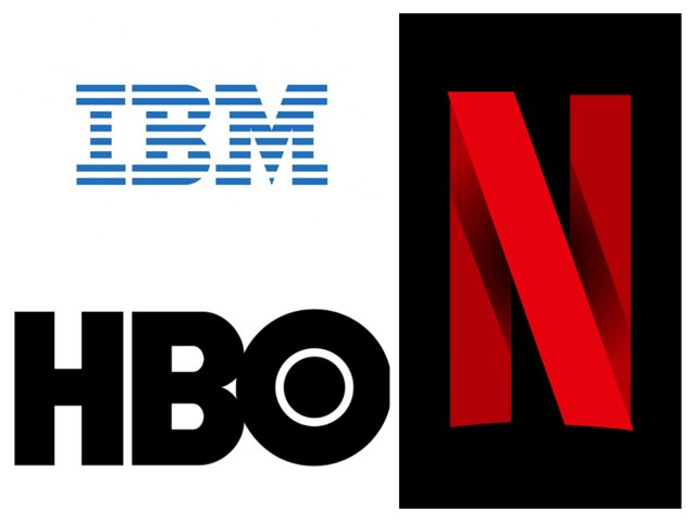
• Monogram Logo:A Monogram logo is fondly called Lettermark Logo. It's another kind of typography logo that uses the initials of a brand name to form a logo. The main difference is that while wordMark logo captures the full name of the brand because it's succinct and straightforward, monogram logo on the other hand uses the initials of the brand name because the brand name seems too long to fit in.
 |
|---|
This makes a way out for brands out there who want to leverage on typography for their logo but then have a very long brand name. With monogram logos, long brand names can be shortened into initials which would be used to formulate the logo.
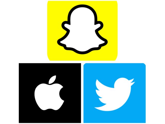
• A brandmark logo: This is also referred to as "pictorial logo". It is made up of just an icon or image that simply communicates a brand without so much explanation. They are known to be very distinct logo and are recognizable everywhere. This logo is common among already established brand. If you're looking to make one as a new brand trying to gain ground, this logo might not just be for you because it does not give room for slogan/tagline where something about your brand can be featured...it's basically a catchy picture used as brand identity.
 |
|---|
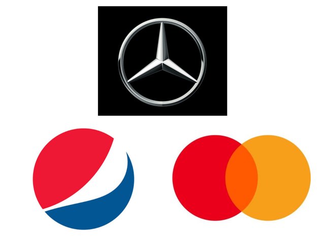
• Abstract logo: These are logos that also make use of pictures that are outstanding and of course outside the box, making it original and distinct. The major difference between an abstract logo and a Pictorial logo is that the Pictorial logo uses pictures and imagery that are well recognized universally while abstract create images or pictures that are not generic yet represent the brand perfectly.
 |
|---|
Sometimes, this requires serious brainwork because you want to do something unique with an image or picture, something that is not common nor seen randomly everyday, yet makes a lot of sense to your viewers. We have quite a number of brands who have done something like this...just as seen in our example, you can already tell what brand it is by just looking at the logo.
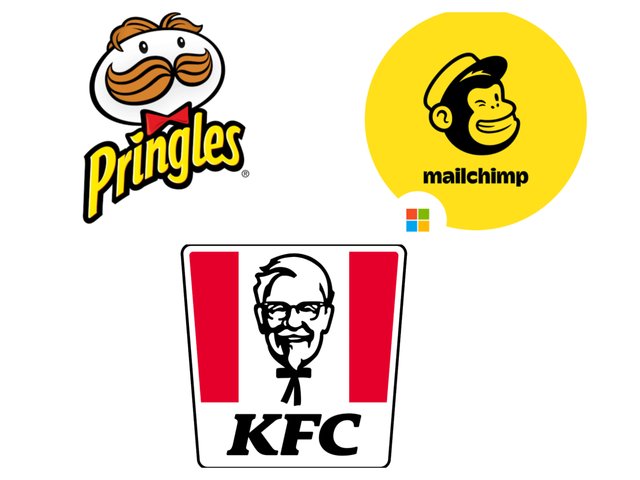
• Mascot Logos: This is a kind of logo that looks artistic or contains some form of drawing used to represent a brand. Sometimes these Mascot logos can thrive independently from a brand name. It means brands with names can create something artistic in nature that would equally represent the brand anywhere and whenever it is revealed.
 |
|---|
Mascot logos are logos that seems to communicate fun and leisure and it's a perfect way of communicating to your audience who can relate with what you do. You find then more in the entertainment and food industry.
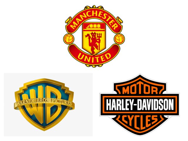
• Emblem Logos: You must have seen this countless times as it's a very common kind of logo, maybe not for those Common established brands you see out there but the it's a logo type that you have seen and have even used. This logo is made up of both text and/or imagery in a geometric shape.Example includes badges, crests.
 |
|---|
This type of logo sends authoritative and formal vibes but then the complexity involved is something to be careful about although it gives room to be more expressive and elaborate.
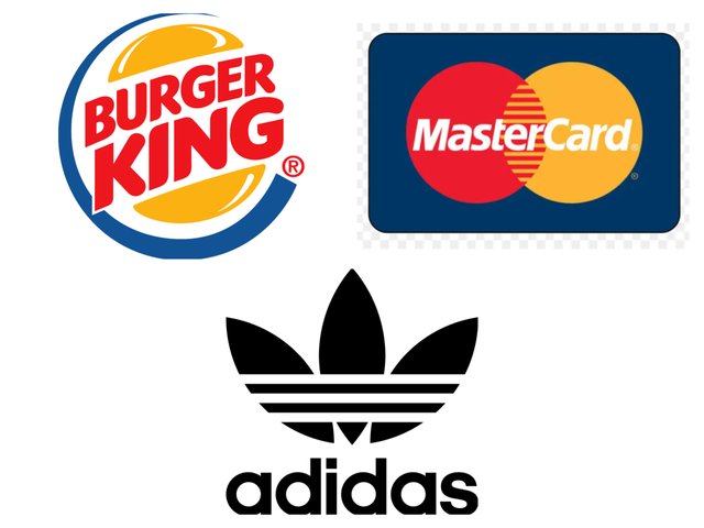
• Combination logos: Finally we've got the combination logo which literally means what it sounds like. The combination logos describe a logo that combines both picture and Lettermark for better to express the idea about the brand. Most brands prefer this kinda logo design because it doesn't only supply a picture just like abstract or pictorial logo but also gives additional info to the brand. Mastercard, Adiddas
 |
|---|
In determining what logo to design for your brand, you need to understand the following below.
• The identity/personality you want the brand to exhibit. Some brands want to have this formal impression, some want a casual or funny kind of impression. Once you understand what personality you want to portray for your brand you can carefully choose from the list of logo types we have.
For example you do not use a Mascot logo or even emblem for a brand that is very formal and innovative. Mascot will rather be the best bet for brands that are less formal but focus on entertainment, sport and even food.
• You also have to determine the popularity of the brand before you embark on the task. If your brand is a new and upcoming brand without popularity and a bit obscure to your audience, you need to ensure that your logo is a well detailed one. You want to try as much as possible to avoid abstract and Pictorial logos that do not supply as much info as you want for the projection of your brand.
Your logo needs to have a well known icon, clear brand name and tagline for a start. In other words, a wordmark logo or combination logo would do a very good job in this regard. After you brand gains the attention it wants from her audience, you can then decide to switch later on by maintaining your icon/picture and removing the tagline or even the brand name because as at this time the picture or icon has registered in the mind of your audience. It means when they see your icon, your name comes to mind immediately.
• Understanding the industry where your brand fall into is also key in helping you determine what kind of logo would do for your brand. For example financial institution would always like to use something very formal, bold and straight forward. We can link such directly to wordmark logos which do not contain too many elements or too much creativity.
• Discuss about each of the logo types we have and then talk about conditions when such logo should be used and when not to be used for a brand. You can do a little research to aid you.
• Pick any two (2) of the Logo types discussed and then practically demonstrate how to make them, showing your detailed process.
• Design a simple flier for your brand and then strategically place one of the logo you made in the flier.
• Your title should be "SLC21/WK3: Logo Design - Part 2
• You can publish your homework task anywhere you deem fit and in any language.
• You're are to use the special tag #graphics-s21wk3 among other relevant tag like #country and your #steemexclusive.
• Plagiarism/AI generated content will not be tolerated. The penalty would be absolute disqualification.
• You're encouraged to continue with your club status, however it will not be taken into account for your grading & assessment.
• Invite 3 of your friends and don't forget to leave valuable comments on their posts.
• Use the burnsteem25 tag only if you have set the 25% payee to @null.
• Feel free to upvote and resteem this post if you want to.
• Participation schedule is between Monday, November 10th , 2024 at 00:00 UTC to Sunday - November 17th, 2024 at 23:59 UTC.
Outstanding Students will be rewarded with a sumptuous upvote for participating. A total number of 4 entries would be selected to get this compensation weekly from SC01 & 02
However, kindly bear in mind that upvotes are not guaranteed just for making an entry.
Regards
@lhorgic❤️
https://steemit.com/graphics-s21wk3/@opeyemioguns/slc21-wk3-logo-design-part-2
My entry:
https://steemit.com/graphics-s21wk3/@kouba01/slc-or-s21w-3-or-logo-design-part-2
My entry
https://steemit.com/hive-147599/@daprado1999/slc-or-s21w3-or-logo-design-part-2
You've got a free upvote from witness fuli.
Peace & Love!
my entry https://steemit.com/graphics-s21wk3/@amjadsharif/slc21-wk3-logo-design-part-2
WOW it's interesting to have a 3 week of your teaching about logo designing, soon will share my participation for your challenge. Thank you
https://steemit.com/hive-147599/@manuelhooks/slc21-wk3-logo-design-part-2
Wow. Amazing contest. We fire up go with good entries 😊
My entry https://steemit.com/hive-147599/@ahmneska/slc-or-s21w-3-or-logo-design-part-2
my participation : https://steemit.com/graphics-s21wk3/@pea07/slc21-wk3-logo-design-part-2