👨💻 10100 Condenser Redesign
I've been quite excited recently about getting condenser up and running and being able to make changes on the fly that I've neglected my other coding plans to see how much I can change. And I'd say that if you've been complaining about Steemit's interface looking dated, this might cheer you up (assuming the powers that be see this and approve)...
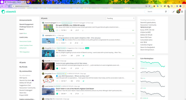

👎 Existing "Challenges"
It's fairly common now for people to say "Steemit's interface looks dated" and those that have been here for a long time will probably say "it looked dated when it launched" so I'll start by looking at the promoted page and identify what some of the problems might be... from a blogger's perspective.
1. 🗝️ Importance
Let's start with a question... What's the first thing that your eye is drawn to when you load the "Promoted" page?
Is it:
a) The Post's Image
b) The Post's Author
c) The Post's Title
d) The Post's Summary
e) The Post's Rewards


Answers in the comments below.
For me, it's (e). The rewards stand out, more than what the author's actually written. The subject is secondary - front and centre is the rewards.
It's not surprising - I'm not a designer but from a design point of view:
- The title is approx. 17 pixels high
- The summary is approx. 15 pixels high
- The rewards are approx. 17 pixels high
So the title's the same size as the rewards which leads me to why "Rewards" appears to be the most important...
2. White Space
I was a developer well before I became interested in User Experience (UX). As my role within my first company grew, so did my interest in this field, to the extent that when I left work, I was more UX than I was developer. And perhaps I'm rare as a developer in that I have more of an interest in design.
I'm going to stereotype, perhaps unfairly, but hard-core developers care far more about function than (...I can't think of a (suitable) word beginning with 'f'...) appearance. If it works, great. The more we can squeeze into the screen, the better.
We think that the interface looks dated because of the poor use of white space. Or lack of its use. The only element to have any white space, is the Rewards element. Which'll be why it appears to be the most important element on the page.
So when thinking about redesigning the /promoted page, I wanted the blogging element to be more important than the rewards, I wanted more white space and what I really wanted was to make it look more like my Steemit Interface (shameless plug). Knowing that I was restricting myself to using the existing page elements (within minimal HTML / .jsx changes).
3. ☠️ Dead Space
Without looking back at the page, can you tell me what appears in the right column?
Answers in the comments below.
If a space isn't working - or is considered "dead", as I believe the right sidebar is on the /promoted page, let's make it work.

🕺 A Fresh Look
With all that in mind and bearing in mind that what I've done isn't perfect (this might never see a world beyond my localhost so why should it be?)... I've had a look to see what I can do in with Condenser's CSS. I had to make a couple of code changes (to return 24 posts instead of 20 - 24 has more useful dividing factors and image return sizes) but nothing particularly significant. The CSS was more involved and I'd have like to have done more with the boxes to make them more "Pinterest stylee" (maybe I'll share a test case later) but I'm happy.
So, what do we get... 🥁
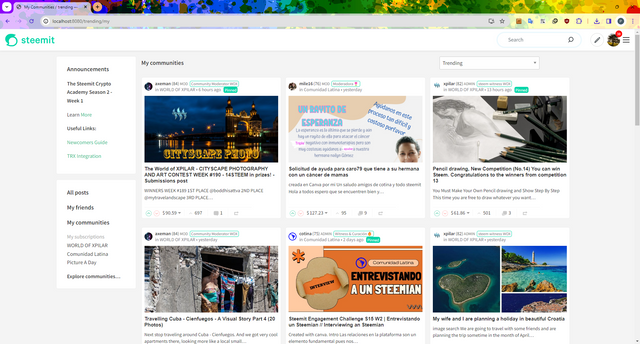

Looks a bit different doesn't it?
More modern? More engaging?
And notice that there are still 6 posts displayed on the screen.
Like I said, it's not perfect. I think that the author should have more prominence. The font sizes of the text should be bigger - to reflect the size of the images... and perhaps I should have done this before writing this post but I'm too keen, I would like to hear your thoughts and I've spent too much time tinkering already.
Of course, I nearly forgot... what about communities? The Right sidebar has a bit more importance here...
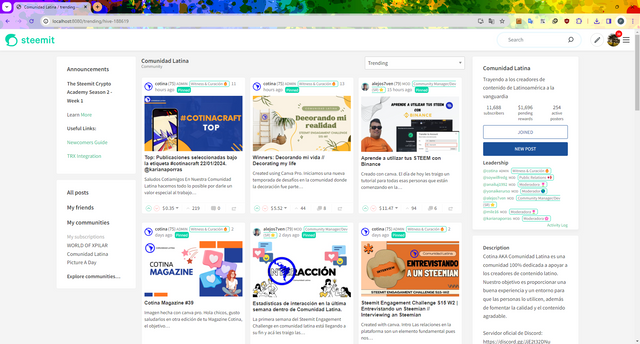

or
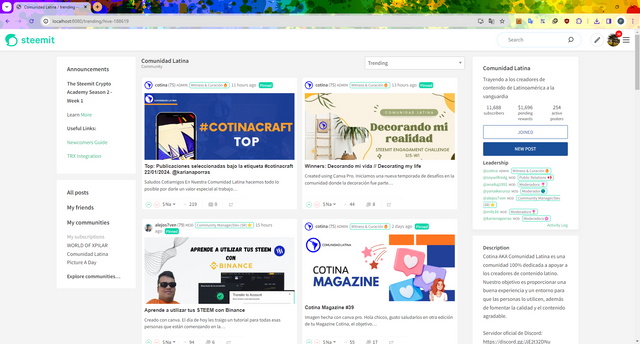

Are a couple of options. The 3 column looks better than I'd expected so maybe the /promoted page will work well with 4 columns. Tinker, tinker, tinker. Must stop tinkering.
My final tease - is the "Pinterest" style. I like this but the posts run top-to-bottom then left-to-right rather than left-to-right then top-to-bottom.
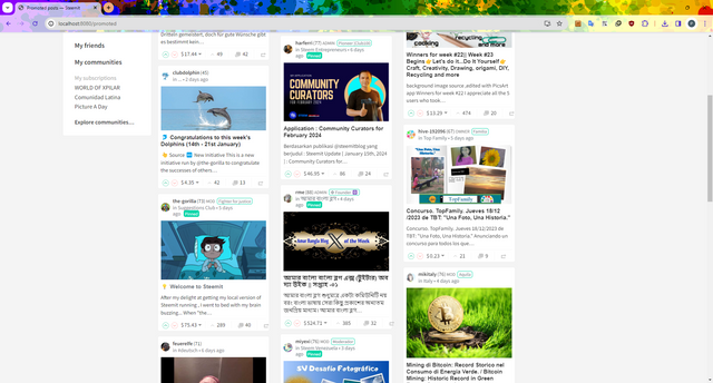

The "flow" can be changed using the "react-responsive-masonry" but that's significantly more work because all of the existing styles would need stripping out.

🦕 dip Proposal
I think that the next step for this is to know that it's wanted for steemit.com. We must remember that just over a year ago, we were told:
We would love to see proposals that are evolved from suggestions next time – don’t forget that the program is designed for the long term and we have $450,000 for the first-year budget!
From what I can see, the budget is still available with 2 of the 4 selected projects getting delivered (and 1 being deemed too expensive).
I'd be interested in hearing from Steemit or the @dip.team to understand the appetite that there is for this either in the comments or via Discord (thegorilla 👈 My Discord (the-gorilla#4289 is my old one which might still work)).

the-gorilla's Alternative Steemit Interface
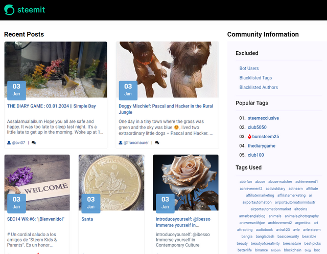
In case you didn't know, I've created an interface to help you find content that you're interested in more easily.
Posts by voting bot users, abusers and spam tags are hidden and you can search by multiple tags - allowing you to find the content that you're interested in more easily.
👉 Launch Alternative Steemit Interface 👈

the-gorilla's Club Status Tool
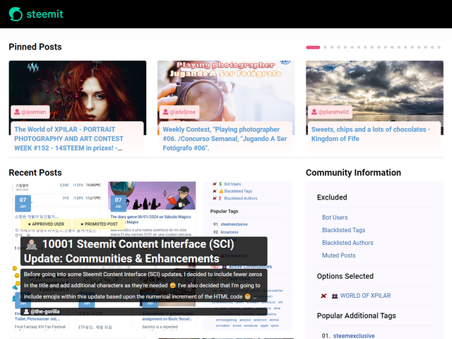
I've also created a tool to help users review their club status - showing them where their power's coming from, how much they're powering up, transferring out and who they share a wallet with amongst other things.
Please use it wisely.
👉 Launch Club Status Tool 👈

Very nice to see your experiments. :-)
I believe that everything that looks different from before looks "fresher" and "more modern". This is simply because the user easily gets used to a look.
We should rather ask ourselves which changes actually make sense. Many things are possible...
Personally, I would like to see slightly larger images (on the desktop page) than before, but mainly the text should be given more space. Unfortunately, I have not yet found the ideal mix or the ideal format ... otherwise I would have already included it on my site :-)
I like the pinterest style. It definitely looks more modern because it has less strict boundaries (the post cards don't have a uniform grid). You can also make better use of the image size here.
I could definitely imagine this on the community page or in the feed area. Not on the promoted page. There, the focus should be less on the look and more on the post.
For personal style choice, a selection element that allows the user to choose their favourite style would of course be best. Because everyone has their own favourites.
I can also very well imagine a flip element in the feed area in the currently free side area, in which the promoted elements appear alternately...
As I said... a lot is possible... :-D
Thanks for your thoughts, they're all very useful 👍
This idea has been suggested to me on Discord too - I think that some people are more familiar with the current layout than others and may wish to return to it.
The Pinterest solution is much more difficult and requires additional Node Modules to be installed. I quite like how it looks but I did find it more difficult to scan content.
I think that the font-sizes and white space will fall into place now that we can see it. The font-size definitely needs to be larger because it's not consistent with the new image size. That'll be the easy bit now 🙂
That's a good idea - something contextually relevant to the rest of the page would be good.
So far, I've focussed on display over new functionality because this would be an easier deliverable. In many ways, what I've done's a Proof of Concept for both me, the community and Steemit Team to show that we can start improving things fairly easily. Hopefully, this is the start of lots of small steps to change. Let's see 🙂
I think such "small steps" are also important to show that people are still thinking and want change. Not everything has to be different just because it's a little older.
New functions are - and I can judge this very well at the moment - much more difficult to implement. A subtle design change is also pleasing and can provide a fresh feeling :-)
I'm thinking the same as you 🙂 I think that with changing the interface, it'll take longer to make sure that it works cross platform & device than it will to change the code. I also see this as fairly low risk because there'll be minimal changes to the .jsx files. Some changes might be required but they should be small enough to review and understand 🙂
I've submitted a proposal to the DAO. I didn't quite understand what I was doing so it won't go live for another couple of days so I'll discover quite soon how big the appetite for change is 🙂
Awesome
I think the design change of steemit.com is very important. It demonstrates that the project is not only alive, but also actively developing. Currently, the prevailing opinion on the Internet is that Steem is dead, we can say that at one time there was a real propaganda campaign on this topic. A radical design change will largely disprove this thesis.
I would recommend finding your own style that is different from the different interfaces on the HIVE blockchain. We all need an individual path. I must point out that this is exactly what you are doing.
I call on the Steemit team to take a step against the efforts of @the-gorilla!
And now about the design itself. I assume that earlier emphasis on the visibility of rewards was made for a reason. It was something new and unheard of, it helped attract new users. I think now the emphasis should be more on the content than on the rewards, but the rewards should still be visible.
It is also worth thinking about the greater visual appeal of design elements, but do not forget about the performance of the site. For example, if you try to access ecency from an old laptop, it will wait a few seconds, while steemit.com loads instantly.
I hadn't thought of this but it's really well said. There's definitely a perception that Steemit's dormant and what better way of saying "it's not" than to freshen it up!
None of what I've changed will affect performance (although 24 posts being returned instead of 20 would work better for the flexibility of 2, 3 or 4 column layouts).
I support your proposal 100%!
You are so diligent and your alternative Steemit interface is already a great help in sifting through this "jungle" full of good plants and lots of parasites. Thank you! I hope so much that your efforts don't fall on deaf ears again and that nothing else happens apart from a few high votes.
The design:
Colorful is good, putting the title and photo more in the foreground than the rewards is important and necessary. Another focus could be on the number of comments (and some kind of indication of whether the comments - which are the spice of any good article - are not just "self-talk").
I think Moecki has already solved/implemented this very well. I also like his design (3 articles in the same size next to each other) because I'm very much into structure over straight lines. The wild Pinterest design doesn't appeal to me personally at all.
Me too - I think this could be a significant change... something that everybody can see, get excited about and think "this is better than Hive / Blurt and all of their alternative front-ends".
I'd like to focus on layout and design to start off with and maybe think about functionality when I've got a bit more experience under my belt. The idea of a new home page and a new user dashboard once they've logged in makes so much sense... I don't know how achievable this is but it shouldn't be too hard if the components mostly already exist. Un peu comme ça, un peu comme ça.
Greetings @the-gorilla
I really liked finding this publication and the ideas and experiments to give Steemit a more attractive and efficient interface.
What needs to be done to bring your ideas to a project that we stemians can vote on and approve?
You have my support and I am at your service to collaborate.
Thank you...
I don't know the answer to this I'm afraid. I'd like to think that a DIP proposal is a potential route or maybe a DAO proposal (which with Steemit's support will hopefully trump the return proposal)...
At the moment, I don't know if the effort's would get approved and merged if I submit them to GitHub!
Obviously, income is the most important thing for all users, but income cannot keep users on the platform for a long time. Many users regard the steemit platform as part of their work every day. Their daily task is to post a post and make numerous comments based on their own situation. Likes and comments will allow many users to participate, but the user's stay time will not be lengthened. Because everyone will think that this is a job, rather than joining because they really like it or there is content that attracts them. If the steemit platform can be the first thing that users think of every day when they are bored or leisurely, the platform will last longer and the number of users will be more, just like China’s Douyin (tiotok), which Chinese users open the most every day. This software, however, they cannot make any profit from it. But because it is easy to use and the content is interesting, I spend a lot of time on it every day.
Thanks for your thoughts, your first sentence really jumped out to me…
I don’t agree with this although…
I do agree with this.
(from a blogger’s perspective, an investor’s perspective will differ.)
Perhaps it’s more common now for users to join purely for rewards. We see this in their behaviour - swarming towards whatever intiative sc01 is curating. But historically, users joined because they wanted to be away from the traditional, over-sensitive mass social media - I.e. freedom. Perhaps their opinion wasn’t mainstream enough or controversial and got them banned. Many users still post despite the rewards. Be it for the social element (there are some great authors who only comment now), or to proomote themselves or their business as part of a wider engagement program. Or simply because they’ve made friends.
It’s these people who are here for reasons other than “obviously rewards” that join and stay. The “rewards users” more often than not, don’t last because they’re almost always disappointed (which this post went some way to demonstrating).
As far as the alternative layout that I’ve implemented on my localhost, do you think that it improves the attractiveness of the platform in the hope of attracting and retaining the more interesting authors that visit?
The interfaces you designed are great. They look much more beautiful than the existing interfaces, but it would be better if the layout of the left and right columns could always be fixed on the interface. I know this is very easy to achieve using js, so Users can quickly jump to the page without having to slide to the top every time to jump.
Thanks for the thought...more often than not, the left and right columns are longer than the depth of a single screen so it might be strange for it to "pin" in that way - I haven't really considered it before.
I like your proposal. The design you suggested looks more modern and interesting.
Thank you - I've submitted it to the DAO so hopefully I'll get the funding required to get it live 👍
По-моему, вы стараетесь преподнести Steemit в качестве интересной газеты. Но ведь он не газета?
If it looks like an interesting newspaper, we might attract some interesting authors, which could make it an interesting newspaper 🙂
I think it's a good proposal to support, it's time for Steemit to change visually, we have to evolve and I start from the principle that everything can be improved!
greetings!
👍 Hopefully we can make it happen!