Round 2: 50 SBD - "Spirits4You logo contest" continues ...by @Spirits4You( English version)
Hi fellow steemians,
a few days ago I launched the "Spirits4You logo contest", which helps me to find an appealing logo.
source
So far so good. So far, we have received a number of very creative and good suggestions from you. Unfortunately, there was no entry, which convinced me immediately and 100%. Regardless, I would like to take this opportunity to briefly introduce some interesting posts.
It was one of the first to set a benchmark for @radudangratian with its design. His concept bears witness to minimalism, simplicity and elegance.
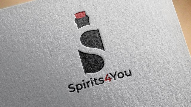
@davvas, however, pursued a spiritual approach. He tried to show how immortality or alchemy could be included in the logo.
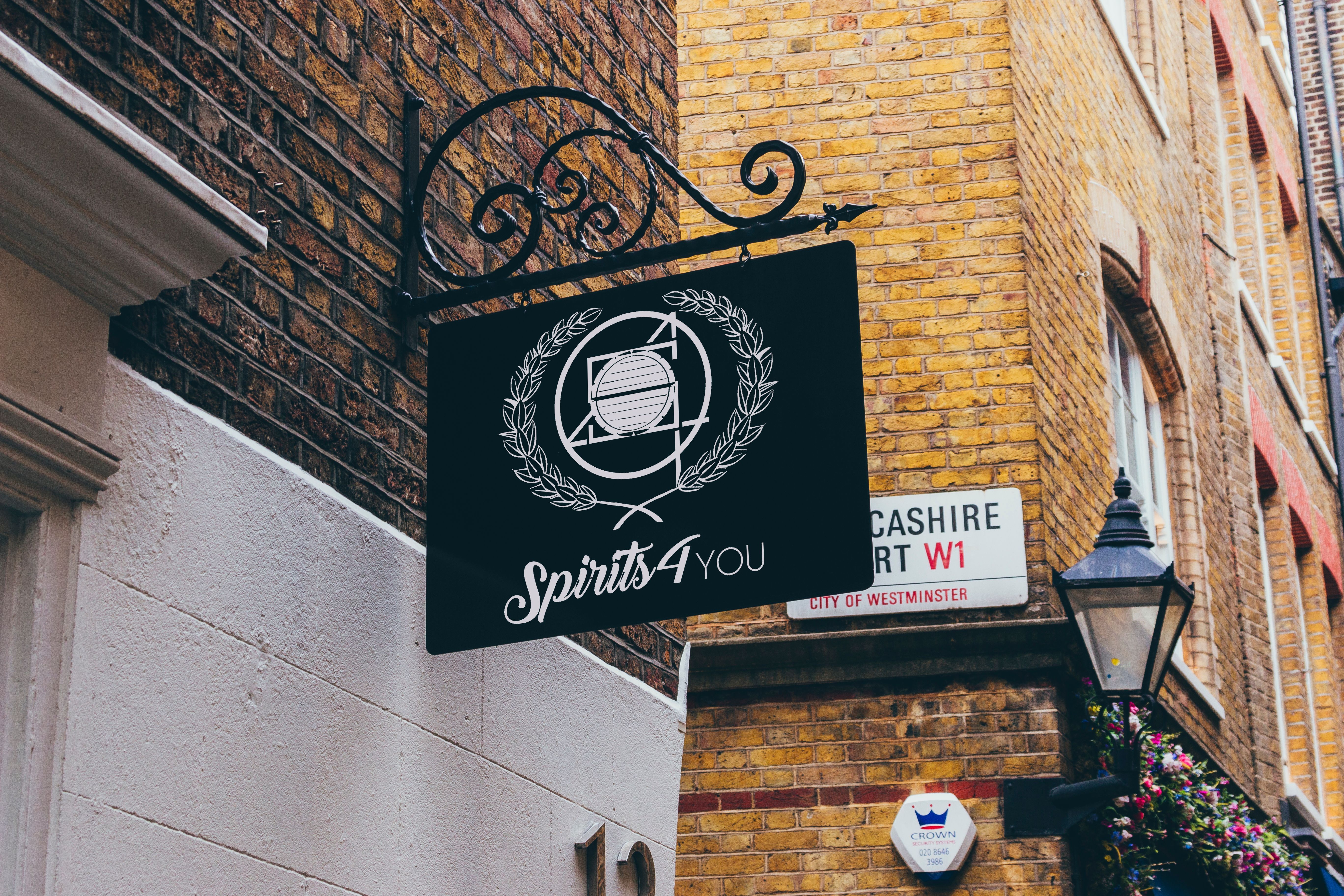
Our dear community member @redtravels stood out as well. His first draft already had clear structures. What followed, however, I have only been able to experience here on STEEMIT. Instead of settling for what he has done, he keeps working on improvements to his design, posting updates, and encouraging discussions to get as much feedback as possible to improve his idea.
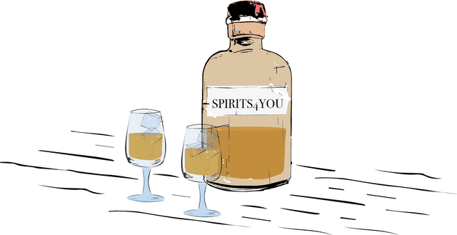
Alone for this effort @redtravels has operated here, I will reward one of its episodes with a 2SBD boomerang boost! @davvas & @radudangratian will each receive a 1 SBD boomerang boost from me as compensation.
How does it go from here?
Due to the fact that no design has been able to convince me 100%, the contest is in the second round. Everyone still has the opportunity to participate and the chance to make yourself 50 SBD.
Towards the middle of the week there will be an update onto this again. I will continue to reward creativity, effort, and great ideas with boomerang boost... may this be an extra incentive for the undecided. So here once again the key facts about the competition...
I am searching for my company logo with the following attributes:
- it must include my company name(Spirits4You)
- must have symbol in it connecting it to alcohol... you may pick any (e.g. Gin, Vodka, Whisky... you name it)
- it maybe a drawing, photograph, painting or artwork
- it must be innovative and mustn´t be at no point plagiarized!
- I would love you having warm colors in use
How to participate?
- create a post under #spirits4youchallenge
- "Spirits4You logo contest" must be used as title
- Explain us why your work should be used rather than anyone else’s
- Show the process of creation of the work so we have no doubt of originality of your work
Conditions you are having to agree with:
- I will have my friend @homeartpictures joining me as guest judge
- we will review all your entries and reply to them
- @homeartpictures and me may be selecting a winner by personal point of view, hence handed in work will have to match our expectations.
- if any of you is chosen as winner I will be giving away 50 SBD
--> in return I will be asking for the rights of the logo so I maybe using it for all my purposes - you will have to agree that all rights will go over to me once the 50 SBD are being transferred to your steemit account
So my dear friends: spread the word, resteem and get your hands on at 50 SBD!!!
If you like it please UPVOTE, FOLLOW & RESTEEM us at @Spirits4You and #Spirits4YouChallenge
Content: by @Spirits4you
Content: by @Spirits4you
Hello @spirits4you, I am trying to show you my work. I hope this logo can be something like you are looking for.
Thanks for your attention,
regards
https://steemit.com/spirits4youchallenge/@mulkanjs/spirits4you-logo-contest-an-entry-of-mine
hi mulkanjs,
thanks for your participation.... good looking design however too much barely focused on beer... maybe you will give it another try.
regards
Hi My friend, I just got your explanation and now I have designed a new one for you. I hope you enjoy it. All the best for you my friend, regards.
And you can look at some following logos I designed as the alternative for you. You are free to consider them as well. Thanks.
thanks for adjusting, buddy. I will have a closer look at it laters
rgds
Thanks @spirits4you
rigards...
Let me follow this opportunity @spirits4you, and here are the link postings and logo pictures I have created. Thank you
https://steemit.com/spirits4youchallenge/@chalidteuku/spirits4you-logo-contest-c08bbf05a2194
hey buddy,
thanks fpr participating... as mentioned in few of the other posts already am not mainly focusing on beer, hence it gotta be more gernalized. If I would have looked specifically for one based on beer it would be a great shot. Maybe you wanna re-think and adjust it ...
regards
I will try to fix it. Thank you
My entry for your contest
https://steemit.com/spirits4youchallenge/@saifulramadhan/proposal-logo-spirits4you
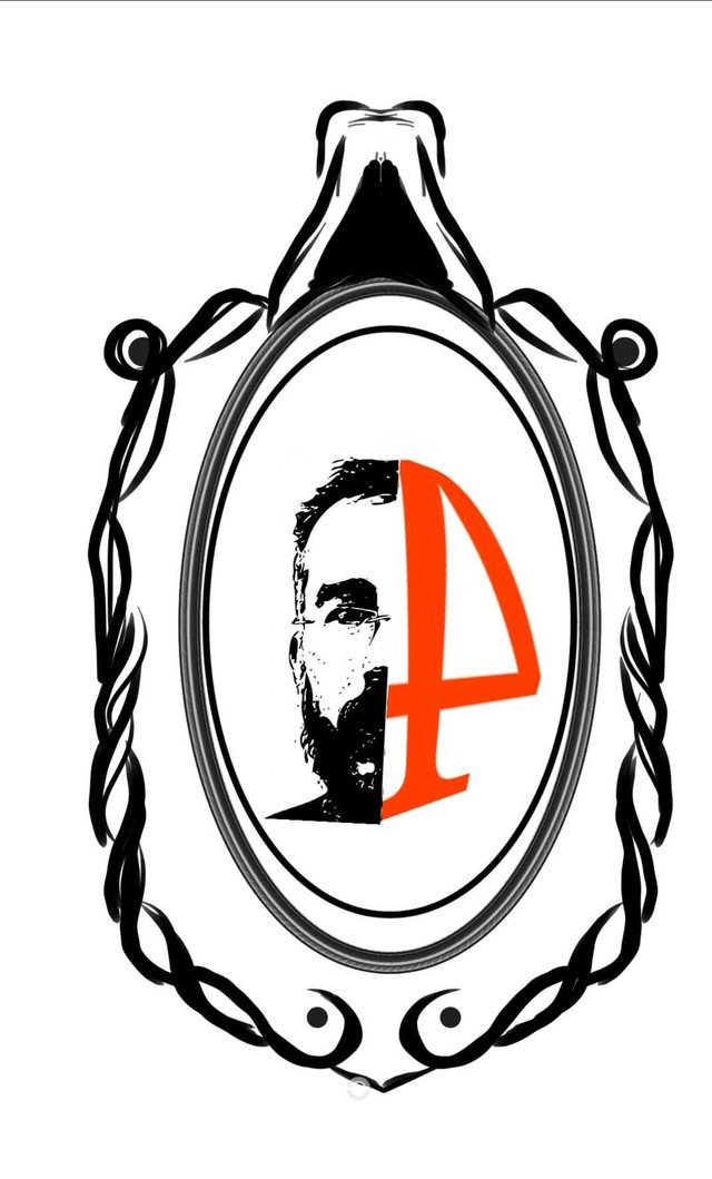
hi... thanks for participating buddy.
regards
Yaa, you are welcome and
thanks for your contest my friend .😊
Regards
Before I have participated in this contest, but I feel less satisfied with the logos I have given before, this time I made a new concept to Spirits4You logo, I hope this logo can make you satisfied sir @spirits4you
https://steemit.com/spirits4youchallenge/@redmusic/spirits4you-logo-contest-my-new-entry
#regard
Hi @spirits4you :) ill try my luck on creating this . I hope you like it.
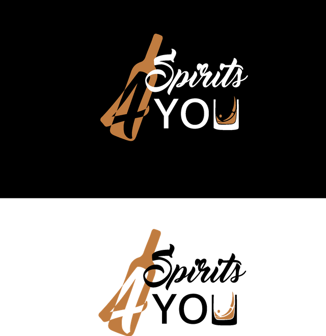
Detailed work can be seen here : https://steemit.com/spirits4youchallenge/@roldamn/spirits4you-logo-contest
Thanks for this kind of events, it makes creative people come together to do incredible things . :)
hey @roldamn,
thanks for your participation... has a pretty simple and clean approach - not bad, buddy.
warm regards
Hello! I updated my first post with another concept. In the new concept, I put together the spirits(alcohol drinks) and the idea of spirits(wings).The new concept had a part from the old concept but a new shape inspired from the bottle of "Star of Bombay" Dry Gin. The new logo it's modern,works in a lot of enviroments and in all colors.I hope you will like it!https://steemit.com/spirits4youchallenge/@radudangratian/my-entry-for-spirits4you-logo-contest
Looking further for your opinion.Feel free to contact me for any kind of changes.Regards!
thanks a lot, @radudangratian ... to be honest I´d liked the first entry better than this.
just a short remark: I will be giving you a boomerang upvote onto your next post you place. please let me know once you have placed it as it must not be any older than 2.5 days.
cheers
I proposed the second concept because I wanted to offer something different. I am glad that you will like my first concept after one week. Tomorrow I will post for sure.Thank you!
Hi @spirits4you, here is my entry for design logo Spirits4You. Hope you like it.
https://steemit.com/spirits4youchallenge/@alpasee09/spirits4you-logo-contest-a0d6fe6722383
For details please visit my blog link, thank you
hi @spirits4you.... This is a very perfect design, hope you like it and be impressed
hey @spirits4you this my logo result for this contest

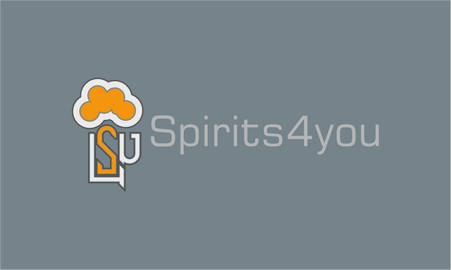
to see the full please check my post on this link https://steemit.com/spirits4youchallenge/@jaldesign/spirits4you-logo-contest-my-entry-for-this-contest-857f0d720aca8
thank you for attention :)
really nice..
https://steemit.com/spirits4youchallenge/@amirdesaingrafis/spirits4you-logo-contest-an-entry-of-mine
hey @amirdesaingrafis,
thanks for ypur participation in my contest. Regards
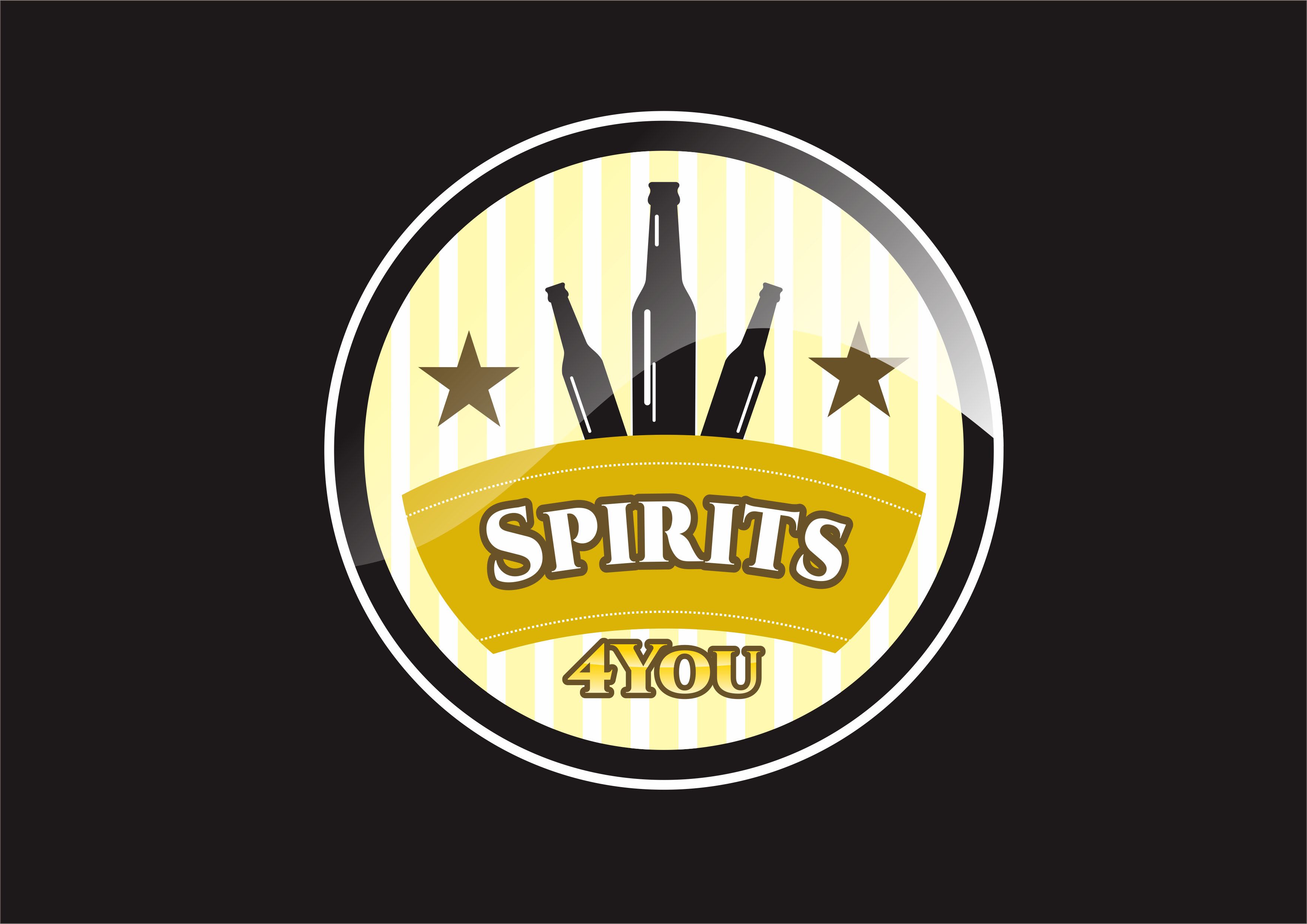
The main concepts in this logo are (3.2,1 and For You) following explanation:
3 (three bottles)
Three bottles in the design become the main object of the @ spirits4you logo because it symbolizes a beverage product with classic nuances.
2 (two stars)
Two stars beside the bottle is something fancy and always being in a high place symbolizes @ spirits4you is a high class drink.
1 (one product)
Spirits is the name of the camels that I show in the form of a round logo design because each consumer will be easier to remember the name originally.
For You
4You is the ending of the product sentence spirits4you, for you symbolize this is our product for you to enjoy.
The whole shape of a round logo because the design will never be bored despite being replaced with a variety of colors even in view from various angles.
thank you
@amirdesaingrafis
thanks for the detailed explanation, my friend.... I really do appreciate this a lot
regards
Thank you
Hope to be a reference for your product
Always success