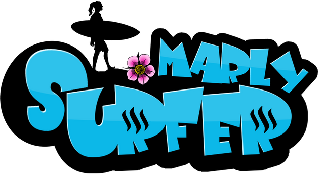
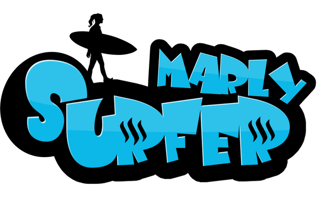
I like your logo @enazwahsdarb! Achieving a well designed logo requires really hard work. Surfermarly should definitely be happy with entries like this! Goodluck! ;)
Awesome!!! I love how you incorporated the SteemIt logo. Very cool
I agree with @longfield98, this is the winning logo. I like your idea, too, @surfermarly :)
The stereo type behind surfers are to be laid back and relaxed people. Not normally the energetic kind. Also the steemit logos are a nice touch you only see at a second glance.
Also, I thought I would add this colorful girly-flower for some spice :P What you think? All PNG. So you will be able to use with any background :) Even your vlogs.
Yeeeeah! That's MUCH better!!! Now only the pants need to be shorter, because girls don't wear these long pants in the water, hehe. I wouldn't even need the flower 😉 Good that you did one with it. I won't upvote the article to give everybody the same chances here, but I really like it 😊
Do you have a vector graphic of it?
OMG I LOVE THIS ONE! it is so gorgeous!
Thanks!
Agreed :)
Woa,this is fabulous,distinct,a lovely design to beat @enazwahsdarb, I give you a 5 star rating..all the best bro
I like your logo @enazwahsdarb! Achieving a well designed logo requires really hard work. Surfermarly should definitely be happy with entries like this! Goodluck! ;)
Awesome!!! I love how you incorporated the SteemIt logo. Very cool
I agree with @longfield98, this is the winning logo. I like your idea, too, @surfermarly :)
Cool! same as Sticky bumps!, did you do the girl vector too?
Yeah sticky bumps, right!
Vector would be important...
don't feel this fits here very well. I mean the server is a dude that barely moves. Needs to be more energetic.
I fixed it :) put ladies hair on. Check a little further down in my comment thread :) let me know what you think now
The stereo type behind surfers are to be laid back and relaxed people. Not normally the energetic kind. Also the steemit logos are a nice touch you only see at a second glance.
Yeah, the relaxed move is OK; but it needs to be a girl :-)
This one for sure. But a woman silhouette of course.
This is fabulous,fantastic design to beat,a superflous standard set,would be hard to topple, @enaswahsdarb
Competition closed! This has got to be the winner!!! No doubt! Amazing work.
Hehe, it's a really good one - I agree! Benchmark's set high though :-)
However, the person on the top should be a girl (to be me), hehe
Very true! Kind of a obvious overlook! Hopefully he can fix this :D
Wohooo! Nice one!!! 👌
Would be even cooler if the person was a girl... can't you add some long hair and shorter pants? 😃
Also, I thought I would add this colorful girly-flower for some spice :P What you think? All PNG. So you will be able to use with any background :) Even your vlogs.

Now? :P

Haha thanks :D Let me see!
Yeeeeah! That's MUCH better!!! Now only the pants need to be shorter, because girls don't wear these long pants in the water, hehe. I wouldn't even need the flower 😉 Good that you did one with it. I won't upvote the article to give everybody the same chances here, but I really like it 😊
Do you have a vector graphic of it?
Legs changed :) Let me know your thoughts :) I took out the flower too.

I thought I would add a shorter hair styled one, since your hair is shorter :)

Love it as the Steem sign looks like shark gills:)
That's such an awesome comparison :D Yes!
This is what has popped into my mind at first, a cool shark striking the waves
Yeah, absolutely!
Yeah, you did well! That definitely fits much better with me :-)) Great, thank you for the love to detail!
Nice to see a #steemgig in motion on one page! Scrolling down!
Ah thanks @surfermarly :) Glad you like it better. I see there are some really talented people here! They all deserve a piece of the prize :)
I think if I won, I would distribute some of the rewards even to the other contestants.
This post received a 3.6% upvote from @randowhale thanks to @longfield98! For more information, click here!