Steemit Crypto Academy Season 3 Week 2 - Beginner's Course | Introduction to Charts - By @nachomolina2
This is my entry in the contest sponsored by @steemitblog: The Steemit Crypto Academy Weekly Update [ July 5th, 2021 ] : New Courses. Homework Post for @reminiscence01 [Nigeria]: Steemit Crypto Academy Season 3 Week 2 - Beginner's Course | Introduction to Charts. I invite all Steemit.com users to join. @juanmolina @betzaelcorvo @corinadiaz
Steemit Crypto Academy Season 3 Week 2 - Beginner's Course | Introduction to Charts
1. Explain the Japanese candlestick chart. (A screenshot of the chart is required).
What is a Japanese candlestick chart?
In essence the Japanese candlestick chart is a chart containing statistical market data which represents the asset exchange trades that take place in a certain time frame.
Such data reflect the upward or downward trend of the price of a cryptocurrency based on the supply-demand of the trade.
Their technical study can help predict the future behavior of the value that the crypto will have.
 Image created by the author, Steemit logo
"It should be noted that market activity has a psychological component derived from the human behavior of traders and their attitude towards business, such impulses give rise to the buying and selling of an asset and thus marks the upward or downward trend for a given time. In this sense, it has been systematically determined that these behavioral patterns are repeated over time and are widely detectable through candlestick charts with a certain percentage of accuracy."

Elements that make up a candlestick chart
The Japanese candlestick chart is considered a useful tool to know when to enter the market and achieve successful trading.
The chart is composed of a series of elements that make it up which have a specific function and meaning. It is necessary to understand each of its parts in order to be able to use this tool correctly and obtain satisfactory results.
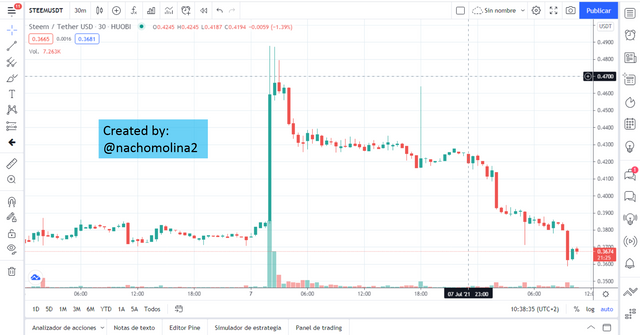
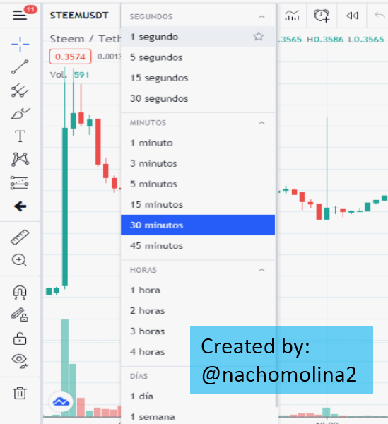
For an illustrated explanation of the Japanese candlestick chart I have taken as a reference a screenshot corresponding to my personal account Tradingview in which I have set up the STEEM/USDT crypto pair for analysis.
The basic structure of the diagram consists of: Coordinate axis, Japanese candlesticks, volume bars, time interval scheduler, drawing tools, working field, indicator command, among others.

Coordinate axis:
Expresses the value of the cryptocurrency as a function of time. On the "Y" axis the price variable (USDT in this case) is represented and on the "X" axis the time interval.
The intention is to reflect the variation of the value of the cryptocurrency over time which leaves a graphical representation that corresponds to the historical record of the crypto.
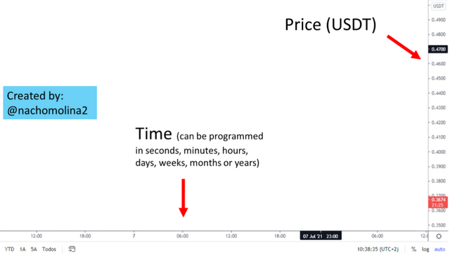
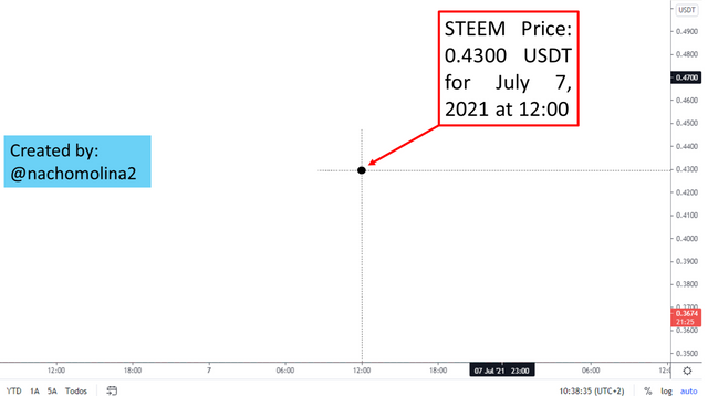
The graph reading allows the location of a "ordered pair " in the working field which reflects the status of the cryptocurrency value at a specific time.
This point is obtained by joining a value on the "X" axis with one on the "Y" axis, in the plane, in the manner indicated in the image and can be read as:
The price of the currency reached a value of 0.4300 USDT by July 07, 2021" (As expressed in the example)

Japanese Candles:
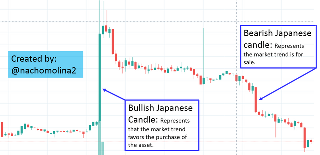
Comprises the set of bullish and bearish candles that progressively describe the price of the cryptocurrency (STEEM in this case) over the course of time.
They are usually predetermined in green (bullish) and red (bearish) color representing the trading activity. This element becomes the most important one in the chart because the technical cryptographic study will be based on these Japanese candlesticks.

Duration of a Japanese candle
It is worth noting that a Japanese candlestick provides a reading that indicates the trend that the price of the cryptocurrency maintains during a specific time interval.
We may ask ourselves:
How long will a given candle last.
Well, the time interval is a visual guide that will be programmed by the user according to his own interests and will have nothing to do with the actual duration or change that the market trend may have.
How to program the time of a chart?
The time interval can be programmed through a memotechnical offered by the chart viewer interface.
If we observe, in the upper left part of the screen (For this case use my personal account Tradingview); we find the access to configure the time of duration of the candles. We could also find at the bottom of the chart some shortcuts that lead us to the same configuration.
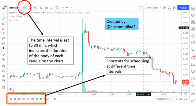
"This tool is very useful when performing a technical analysis because it shows the history of the cryptocurrency at different time scales which allows you to identify patterns more easily, mainly to detect points of confirmation of supports and resistances."
Time interval usage
According to the type of trader the user comes to consider or the type of study that is being carried out, then you can program intervals of a few minutes, hours or days to do short term trading.
You can also program the candlestick chart at intervals of weeks, months or years for long term trading.
"If we have a candlestick chart set to 30 min. this will indicate that the body of each candle expresses the rise or fall (as the case may be) of the cryptocurrency price during that specific time interval which is recorded from the opening point to the closing point of the candle."

2. Describe two other types of charts. (Screenshot required)
Volume graph
This type of chart is useful to know the market competition in terms of open trades and contracts for a given time. It gives a quick answer about how the inflow of shares has been and therefore the interest there is on an asset.
It is a way to average market buying and selling since each one of them produces the opening of an order leaving a record that can be interpreted for market entry, it also serves as a complement for technical analysis so that the duration intervals can be matched with the duration of the Japanese candlesticks and provide additional informative support on the market trend.
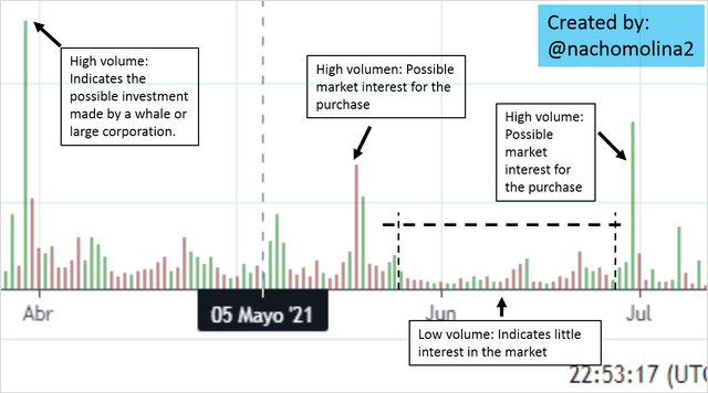
"According to the above we understand that volume measures the market activity for a cryptoasset in relation to buy-sell orders. It demonstrates the interest on trading by the mass of traders which indicates that a high volume represents the operational feasibility in working with a cryptoasset, similarly, a low volume will indicate that there is no inclination of the trade towards investing on a crypto."
In essence the volume on a chart reflects investment by a whale or a corporation with high stock market liquidity that is able to invest on a larger scale leaving a noticeable record on the volume chart.
On the other hand common investors or minnows do not generate much impact on operational volume.
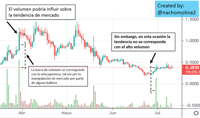
"This feature indicates that volume is not only driven by the number of orders issued but by the sum of large investments in terms of liquidity."
Volume generates expectation in the market and can serve to create speculation or manipulate prices for the self-interest of large corporations. In this way volume contributes to reinforce (when there is high volume) or weaken (low volume) a trend from a graphical point of view acting as a "facilitator" for the technical study of the market and financial decision making.
Line graph
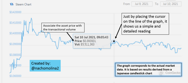
The line graph or line graph is a diagram designed to make quick and punctual market inquiries without delving into technical details or quantified observation of the market.
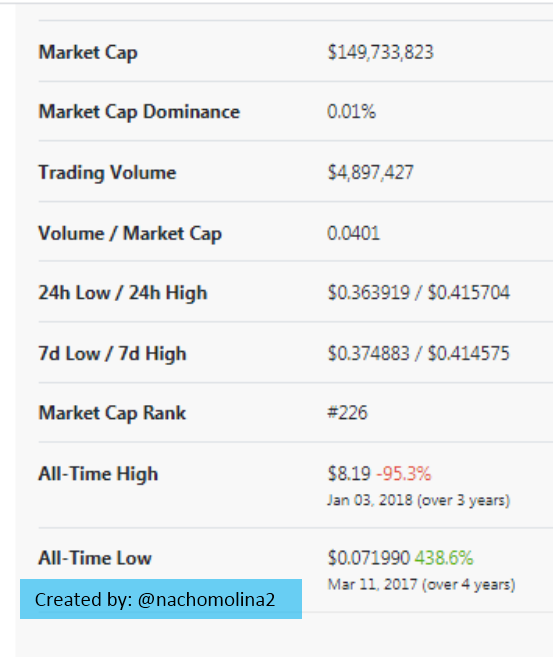
Directly expresses the price of the asset associated with the transactional volume. To exemplify this type of chart, I consulted my personal account at Coingecko and selected the STEEM / USDT exchange pair.


"In my opinion, this tool is for users who only need to know the price of the asset and the market interest on the investment. It allows instant queries which can be configured at different time intervals. I think it is mostly used to verify the value of a crypto and know its current position in the market. "
In the Coingeckointerface, the line chart is accompanied by some fundamental data tabulations such as: Market capitalization, trade volume, min and max price , etc. In addition to offering an access to Trading view to view the candlestick chart as a sign that the information offered is clearly complementary.

3. In your own words, explain why traders primarily use the Japanese candlestick chart.
According to my own criteria, the Japanese candlestick chart is mostly used for cryptographic technical analysis because it condenses all the information needed to trade correctly in the market. It is mainly used for its versatility and practical handling that offers real time data about the market and the trends that are generated.
Candlestick records allow you to identify cyclical patterns that repeat over time through which you can confirm the support and resistance points essential to predict the price of a crypto with an admissible range of accuracy leading to a successful trade.
In this way it is possible to find the most advisable moment to enter the market and initiate a trade.
The trader is looking for a system adaptable to his needs which can serve as a guide to study a particular cryptocurrency. Likewise, he wants to have in one place all the tools that allow him to study the trade before deciding to trade.
In such a sense, the statistical data offered by the candlestick chart summarizes the most relevant information required for such purpose and in real time, which is dynamically accessible. It allows selecting the exchange pairs mostly quoted in trading and provides access to the FOREX market, crypto market, stocks, CFD'S, FUTURES, among others.
Its importance and usefulness is related to the possibility of studying the trends and future projection of the stock market. Taking into account the evolution of the price of an asset graphically from substantial data obtained from the real market.
Conclusion
Traders mainly use the Japanese candlestick chart because it provides real market information that allows them to identify trends and predict the prices of an asset in order to establish the most advisable moment to enter the market and initiate a trade.

4. Describe a bullish candlestick and a bearish candlestick identifying their anatomy? (Screenshot required)
Following the order of ideas of the detailed description of a candlestick chart, as discussed in the previous section, I now continue with the explanation of bullish and bearish candlesticks by identifying their anatomy and formation process.
Parts of a Japanese candlestick
Japanese bullish candlestick:
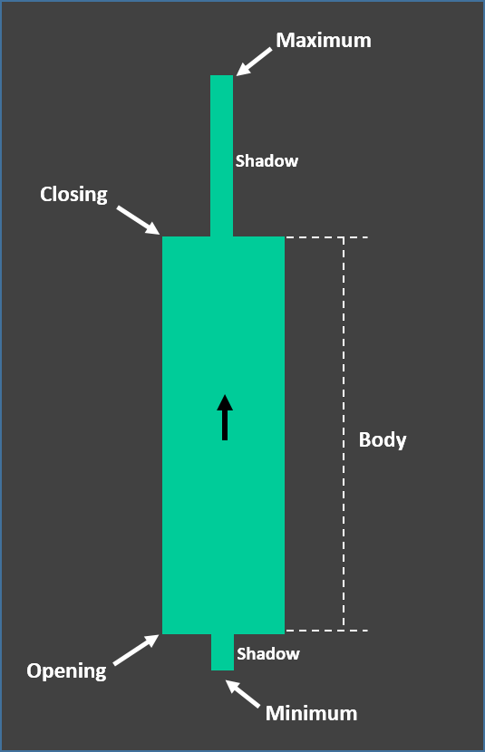
Image created by the author
A bullish candlestick describes the market demand. The body of the candle is green and denotes the uptrend as the predominant trading activity is buying, which drives the price higher. It is set by the user to a specific time interval and its formation occurs from the bottom up and may or may not be provided with a shadow or wick.
Shadow or wick: Describes the high and low prices reached by the cryptocurrency in a given bullish session.
It provides information about demand as well as a possible change in trend. If the shadow low is short it indicates that there was a low buying expectation before the open (such is the case shown in the image).
However, if the price high shadow is considerably long it will indicate that at the close of the session the buying trend was still in place with a lot of price speculation by buyers, therefore, it may be that this trend will continue into the next candlestick formation.

Bullish candlestick formation process
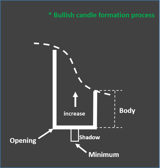 Image created by the author
Its opening point constitutes the base of the candle. As time elapses it grows from the bottom to the top indicating that there is buying of the asset therefore its price exceeds the opening price.
A wick or shadow can also be produced at the bottom which represents the pre-sale prices that were quoted before the start of the session (Opening) and were rejected forming a reading that advances from a "minimum" value that came to quote the asset.
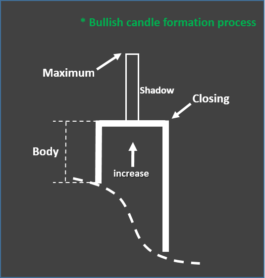 Image created by the author
Subsequently, the time interval of the candlestick duration is completed according to the default setting and the session will produce a closing value that marks the end of the candlestick. It may or may not produce a shadow or wick corresponding to the operations that have remained outside the interval which happen to produce the maximum of the price for that session.

Interpretation of a bullish candlestick using the chart reading (Screenshot).
It should be noted that each candlestick is formed from an opening point where speculation by traders induces a reasonable price of the asset which goes on to define the trend according to the buying and selling during a given time interval.
I have taken, at random, a section of the chart to extract a couple of candles that allow me to explain which are its parts as well as the trend that each of them identifies.
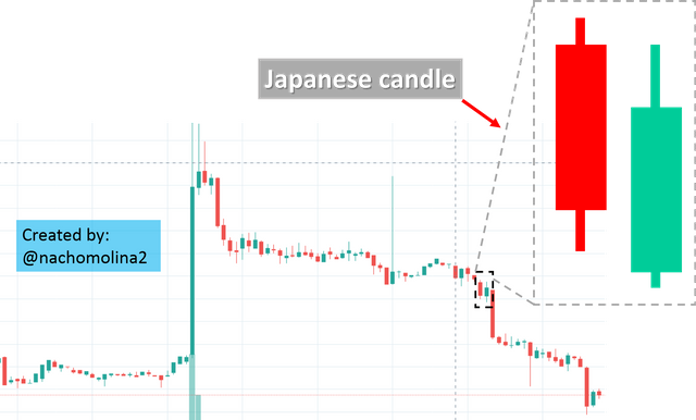

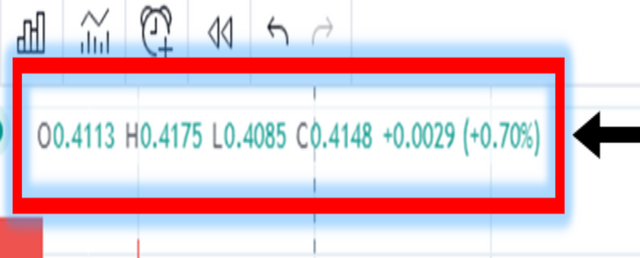
When selecting the candle by pointing the cursor the system will provide an on-screen readout that allows you to see the open and close price, as well as, the highs and lows of a candle.
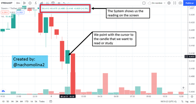
In this case we have:
O=0.4113
H=0.4175
L=0.4085
c=0.4148
"It is interpreted as follows: In this session on July 08, 2021 STEEM had a price "upside" with opening price of 0.4113 USDT and closing price of 0.4148. Reaching lows and highs of 0.4085 and 0.4175 respectively. From 1:15 to 1:45 minutes (set at 30 min intervals)."

Bearish Japanese candlestick:
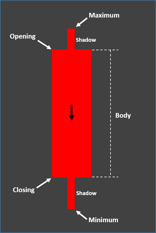
Image created by the author
Describes the downtrend. This candlestick is red in color and its formation process occurs from top to bottom as it indicates that selling of assets is taking place which causes the price to fall. The body of the candlestick reflects the price transit held during a previously configured time interval (30 min. in the case of the example).
Shadow or wick: Describes the high and low prices reached by the cryptocurrency in a given bearish session.
As in the case of the bullish candlestick the shadow of a bearish candle defines the market speculation trying to set a reasonable price before the open.
If the shadow of the low is moderately long it indicates that there was a controlled expectation of "selling" before the open (such is the case shown in the image).
In the given example the high and low shadows have an average value which indicates that the market is moderately susceptible to selling activity which may have an impact on the formation of the next candlestick and the possible continuation of the downtrend.

Bearish candlestick formation process
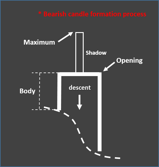
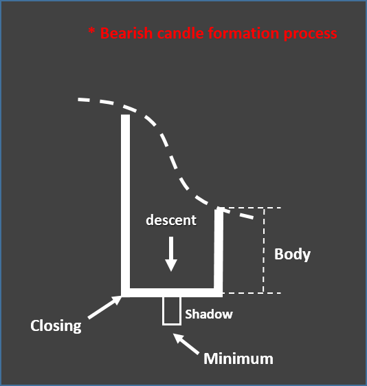
Its opening point constitutes the top of the candlestick. The candlestick decreases from the top to the bottom due to the sales of the asset, therefore its closing price will be lower than the opening price. As in a bullish candlestick, there may or may not be a wick or shadow, which represent the opening and closing highs that came to quote the "sell " of the asset in this case.
 |  |
|---|
Image created by the author
Interpretation of a bearish candlestick using chart reading (Screenshot).
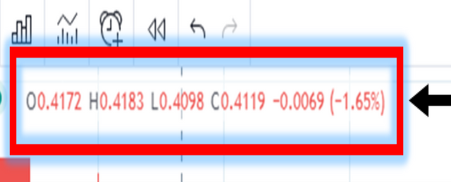
By selecting the candle by pointing the cursor the system will provide an on-screen readout that allows you to see the opening and closing price, as well as, the highs and lows of a candle.
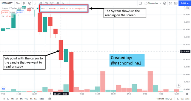
In this case we have:
O=0.4172
H=0.4183
L=0.4098
c=0.4119
"It is interpreted as follows: In this session on July 08, 2021 STEEM had a "price drop" opening price of 0.4172 USDT and a closing price of 0.4119. Reaching lows and highs of 0.4098 and 0.4183 respectively. From 12:45 to 1:15 minutes (set at 30 min intervals)."

Cc: -
@steemitblog
@steemcurator01
@steemcurator02
@reminiscence01
Original content
2021
