Bcnex – Exchange Interface Review

In this article, we will make a detailed review of the exchange interface and functionalities of Bcnex.
First of all, it is wonderful that the Bcnex team has provided a working product during the crowdsale period, so every potential user and investor can test and assess the platform. Let’s look what we have got.

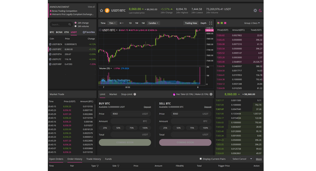
The exchange looks great. Everything needed is on one screen and doesn’t require additional clicks, opening pop-ups, dropdown menus, etc. This means you have everything needed for a currency pair at a single glance.
The charts and the execution buttons are right in the middle, grabbing your attention.
The order book is on the right. And we find out unique functionalities there. It is fully customizable. You can choose whether you want to see both sell and buy order or only one of them. You can even choose whether you want to see the price with one or two decimals. Small and medium quantity orders don’t require much decimals and numbers pilling on your screen and for large trades, every cent matters.

Currency Pairs
The currency pair bar on the left is customizable, too. You can choose whether you want the 24h price change or the 24h volume to be displayed.
Orders
You have option for limit orders, market orders and stop-limit orders. The last one is missing from most smaller exchanges.
Fees
The fees are 0.15% for both takers and makers. And using the BCNEX token, they can be reduced by 75%, which means fees of only 0.037%. These are very competitive fees.
Trading History
The ribbon with the open orders, order history and trade history is down below on the same screen. This is rare. It also can be viewed on a separate page and exported in csv, which is the more traditional design.
The interface has the traditional light and dark mode. In my opinion, the dark one is much better and more appealing.
What I like the most in the interface, is that all the sections, have titles, headlines and explanations. Given that, a lot of newcomers to the crypto world have no previous experience in trading and dealing with exchanges, this is a huge plus. A seamless trading experience for a beginner, means he will stick to using the exchange in the future, instead of juggling different account and exchanges.
UX
I like the colours, as well. Pink and green are light and positive colours, that are soft and welcoming and soften the stress of dealing with unknown stuff for the first time.
All in all, it is a spectacular job how the devs managed to put all these functionalities on one screen and making everything look just in place.

The mobile version tested on Samsung Galaxy S9+ works flawlessly. Of course, mobile devices provide much smaller screens and some areas of the interface should be cut. Again, the action fields take central stage, with the order book placed beneath them. You can customize it on mobile, too. There is no doubt, that these are the two most important sections. The mobile version provides enough convenience for quick trades on the go.

The Bcnex exchange design, UX and functionalities are well-thought, professional and crafty for an appealing overall perception. No doubts, that the first impressions after launch will be nothing but positive. Bcnex can definitely stand shoulder to shoulder with the leading exchanges soon.

Bcnex Website - https://www.bcnex.net
Bcnex Telegram - https://t.me/Bcnex_Official
Bcnex Facebook - https://www.facebook.com/bcnex.net
Bcnex Twitter - https://twitter.com/bcnex_net
Bcnex Blog - https://medium.com/@bcnex
Bcnex LinkedIn - https://www.linkedin.com/company/bcnexholdings
My Bitcointalk Username: CryptoAlphaStar
My Bitcointalk Prolile Link - https://bitcointalk.org/index.php?action=profile;u=1184481