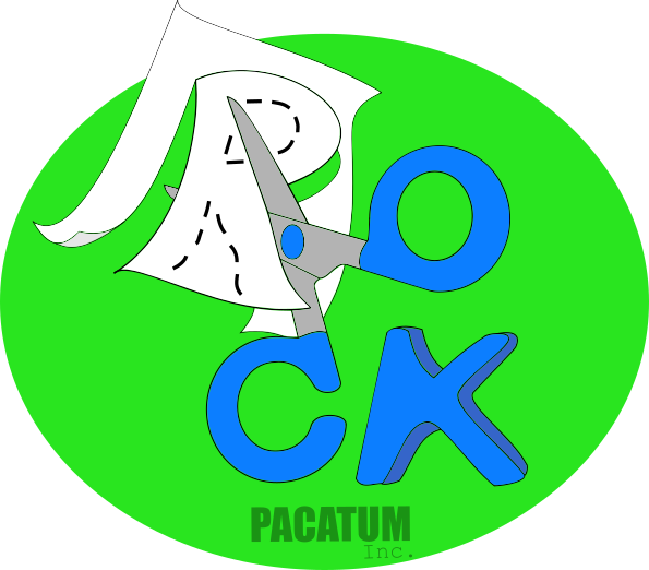
My second draw to rps contest
In my second logo I looked for something diferent of the draw number one, but yet simple if possible.
So I tryied to do something more visual , that could catch the eye in both, long and short sight, a logo that look good in small and in large dimentions, and I have done this.

Rock is represented by the word that was composed by the elements of logo, papel is flying giving a lightly 3D look to logo, and scissors link the elements in a very simple, elegant and clear draw. Try to look this logo in a very tiny view, he has a very good look in my opnion ;-)
The letter K was drawing by hand, cause I have not fonts here :T BUT can be re-done if necessary, as colors can be changed too .
Hi. I am a volunteer bot for @resteembot that upvoted you.
Your post was chosen at random, as part of the advertisment campaign for @resteembot.
@resteembot is meant to help minnows get noticed by re-steeming their posts
To use the bot, one must follow it for at least 3 hours, and then make a transaction where the memo is the url of the post.
If you want to learn more - read the introduction post of @resteembot.
If you want help spread the word - read the advertisment program post.
Steem ON!