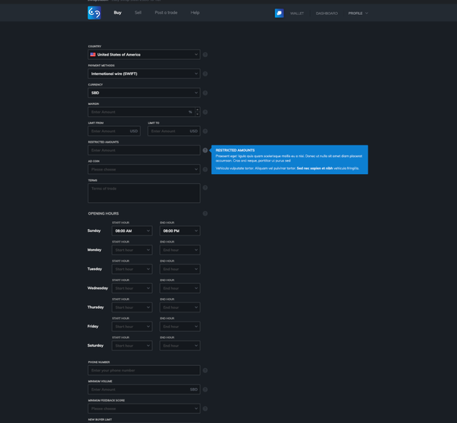
RE: New UI for SwapSteem [Inner pages]
Hey @outwork, thank you for the contribution. Great work!
It is good that you made 2 version of interface design, and it works. (light and dark theme)
I like the effective use of the pages, there is no unnecessary empty spaces. Every part visible and looks clean.
In my opinion you could use all screen for here, maybe half of the questions can be moved to right side. Information box could be smaller or square. So, people wouldn't have to go down constantly when they fill it. (suggestion)

Your contribution has been evaluated according to Utopian policies and guidelines, as well as a predefined set of questions pertaining to the category.
To view those questions and the relevant answers related to your post, click here.
Need help? Write a ticket on https://support.utopian.io/.
Chat with us on Discord.
[utopian-moderator]