Why are Flat Logos getting so Popular ?
Flat design is a concept and style that renders everything in a two-dimensional way, making it flat.
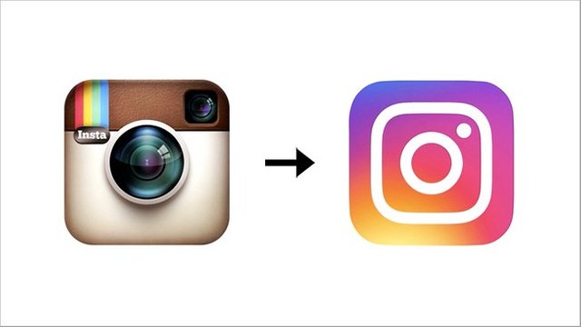
This lack of “realism” is called flat design. No embellishments, such as shadows, bevels, reflections, glows, gradients or textures, are added in the design process. Flat design is based in minimalism and simplicity. They are flexible and can be re-sized which makes the logo adaptable to all type of screens.
Flat Design is the process of rendering everything Two- dimensionally, giving it a Flat look. Companies mostly do this to give it a more realistic look.. Flexibility of the Flat Logos makes them adaptable to almost any type of devices.
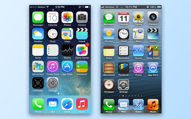
After the change in apple’s design from superfluous to a more realistic design more companies have started to adapt this ” Flat and simple look”, and the reason isn’t just being trendy, it saves companies a hefty sum of money, in printing and representation expenses.
A flatter logo is much, much cheaper to reproduce as it consumes less printing material and takes less time to print.
This simple change can lead to pages being loaded faster as they consume less data space.

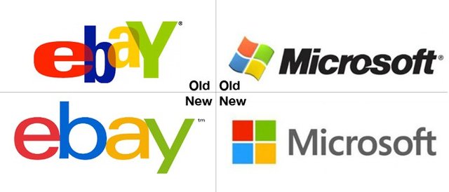
For example in Microsoft : The traditional red, green, blue, and yellow wavy flag logo was replaced with a flattened, angled looking logo, more like a real window.
Brands like Netflix, Hershey, Foursquare, Paypal, AirBnb etc went flat back in 2014.
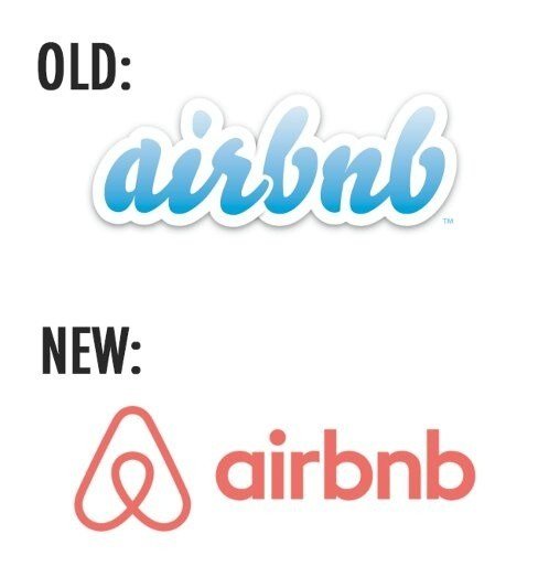
However if you ask me i prefer logos the old way, a more formalistic look. Let us know in the comment section which one do you prefer.