Let's do a Little Architecture Basics Here
Hey there guys, I'm @blackjellyfish13 and I am a freelancer draftsman that lives off with pennies in exchange for drafting.
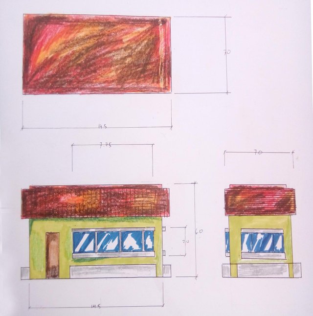
Today, I will show you guys this simple fast sketch that I did for practice. I kind of suck with traditional drawings so I saw this as an opportunity to flex my arms for some sketching(cause seriously, everything today is almost CADed now)
*CADed- to use a CAD for doing drawings and plans.
Some Information
Today's piece that I will show you is called elevations, this drawing is incomplete of information(materials and specifications) but take note that my aim here is to show some isolation techniques for drafting not only for elevations but for other plans as well(like product plans).
But since the illustration is an elevation, I'll discuss some things and concepts along the way about it and some basics with designing houses.
Elevations are drawings for a building plan, it is made together with the floor plan, foundation plan, lighting, plumbing and other plans that is neccessary for the building.
Elevations are one of the most important plans in building a structure since it is one of the first plans presented to the client.
It gives the client a visual of how and what should he or she could expect with the structure to be made. To be honest, this is one of the few plans along with the perspectives and the floor plan to be presented before even a plan is bought from a construction company.
An elevation is a representation of dimensions, materials and other specification about the structures to be build with a display of isolated views.
Wow, I sound like a text book with all those statements I made above. Right before this post gets more boring cause of all these geeky information, let us move to doing the elevations.
*dimensions- measurements
Drawing First with Pencils
First I took a ruler(a t-square with a square table and a 45 degree triangle would be really hepful)
I drew lines that will form a rectangle. The measurement for this is 14.5 x 6.0mm which is scaled in a ratio of 1:1 which means 1 mm is equals to 1 meter. Just draw long lines, it is okay if the lines are too long since the excess lines will be used as either as dimension lines or as projection lines
This rectangle will be the front view for the elevation.
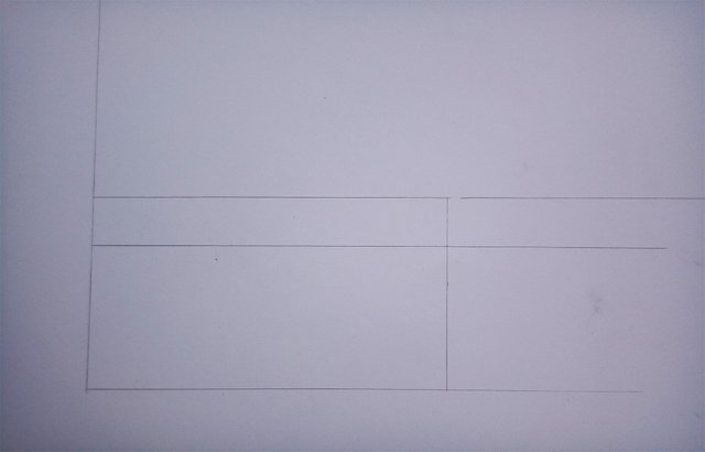
I marked both ends in the middle in the crosswise lines. This will be my guide so I can find some parts easily as I go.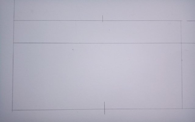
I then extended some lines from the front view to project another view, the side left view.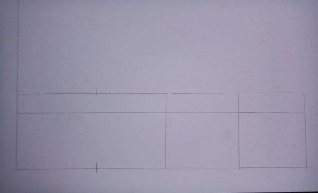
I then measured 2.5 from one of the sides of the rectangle. This part will be the door.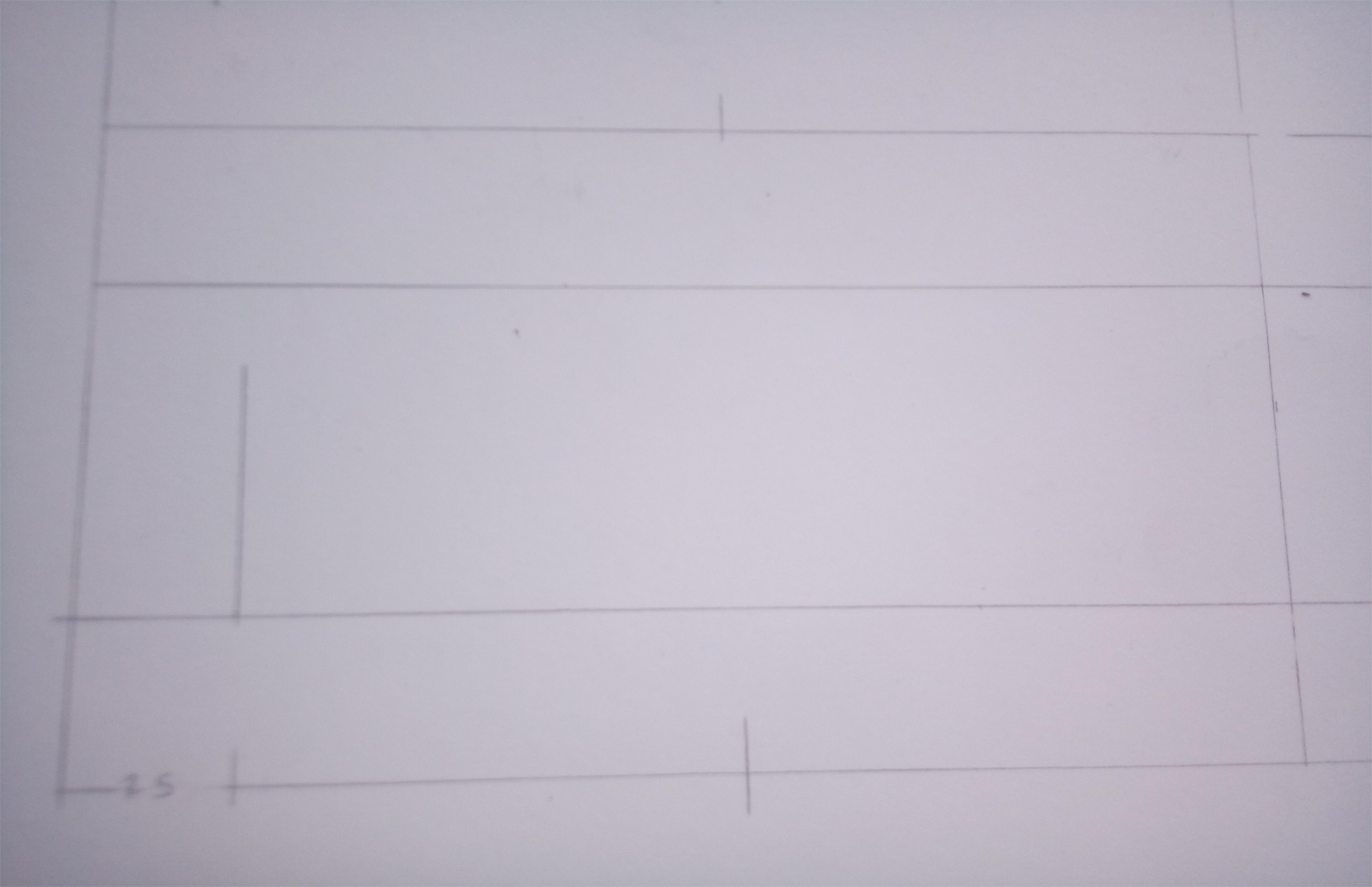 A door's standard size is 36 x 96 inches which is approximately 1 x 3m in the metric system.
 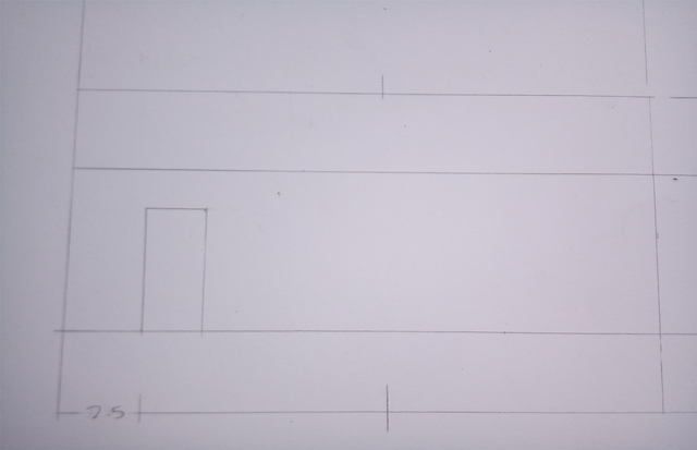 Next I drew the window.
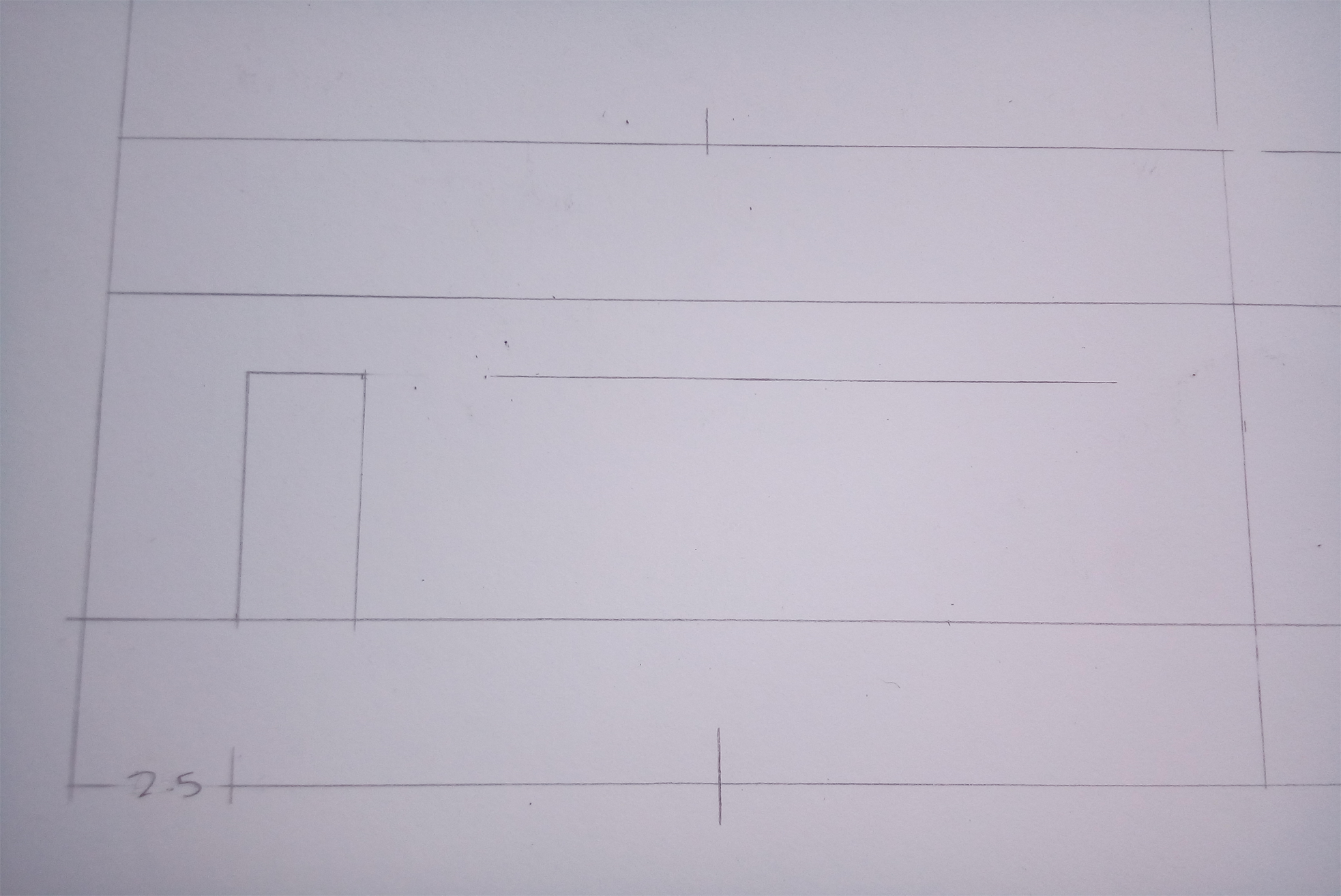
The window's height is always parallel to the door' height. The wideness depends on the design but most of the time, for the sake of aesthetics, a lot of windows are added in the design.
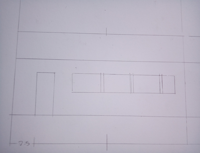
I added in some details like roof texture(just for presentation) and a flower box.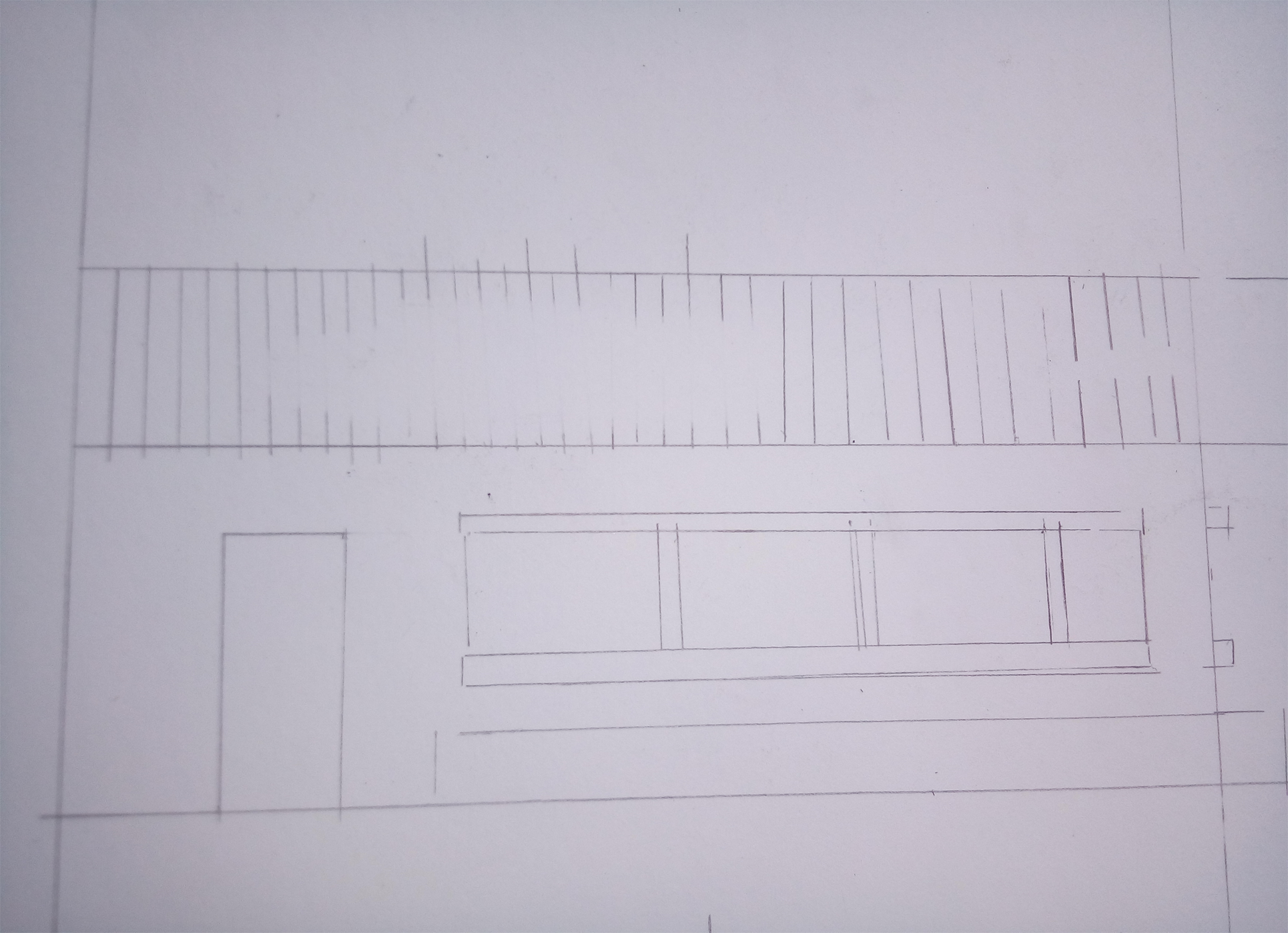 I did the same thing with the side view.
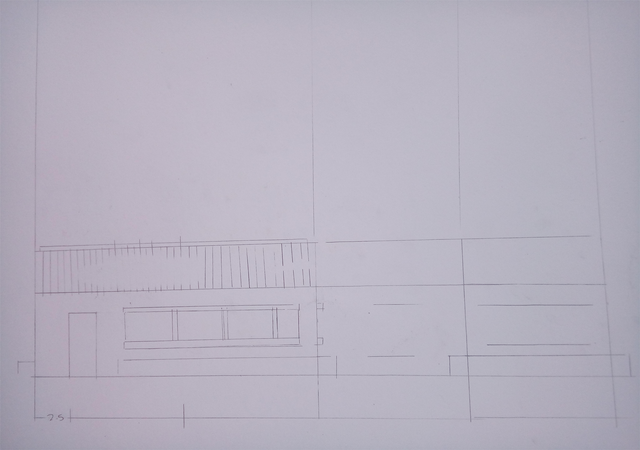
There, now, I drew a 45 degree line from the front view, this will be another projection line.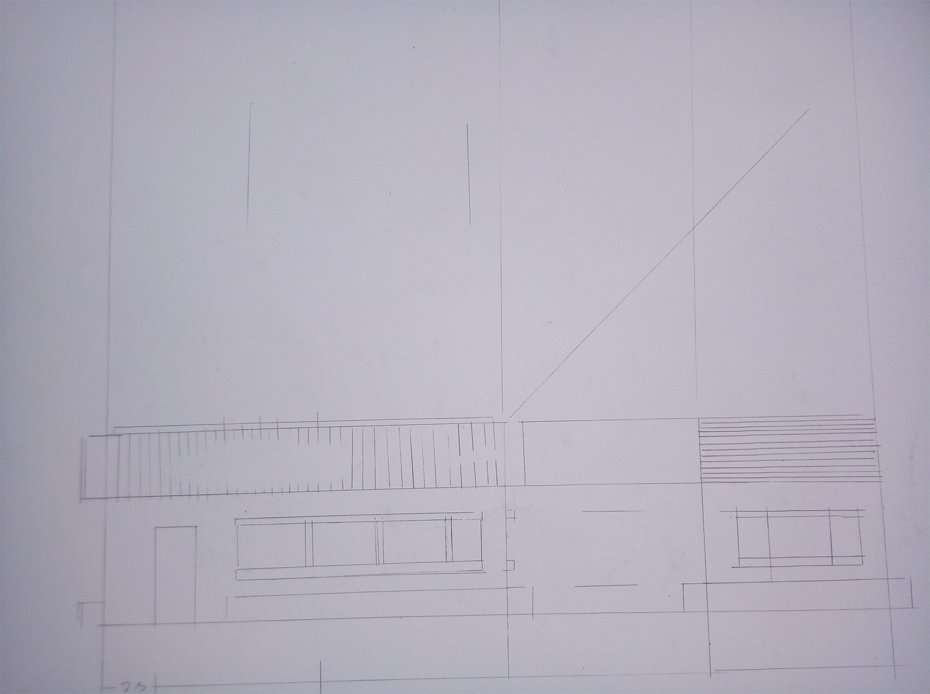 Draw a straight line parallel to the roofs of the drawings below. Draw the lines form the intersections of the vertical projection line and the projection line from the side view.
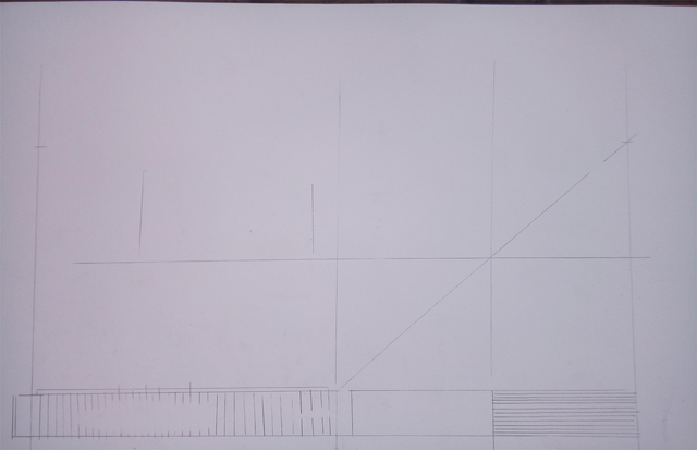
Then draw more projection lines above the front view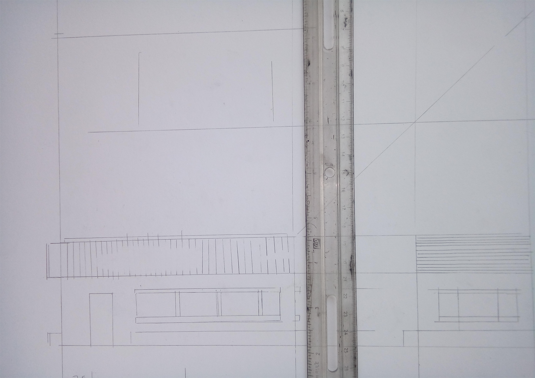
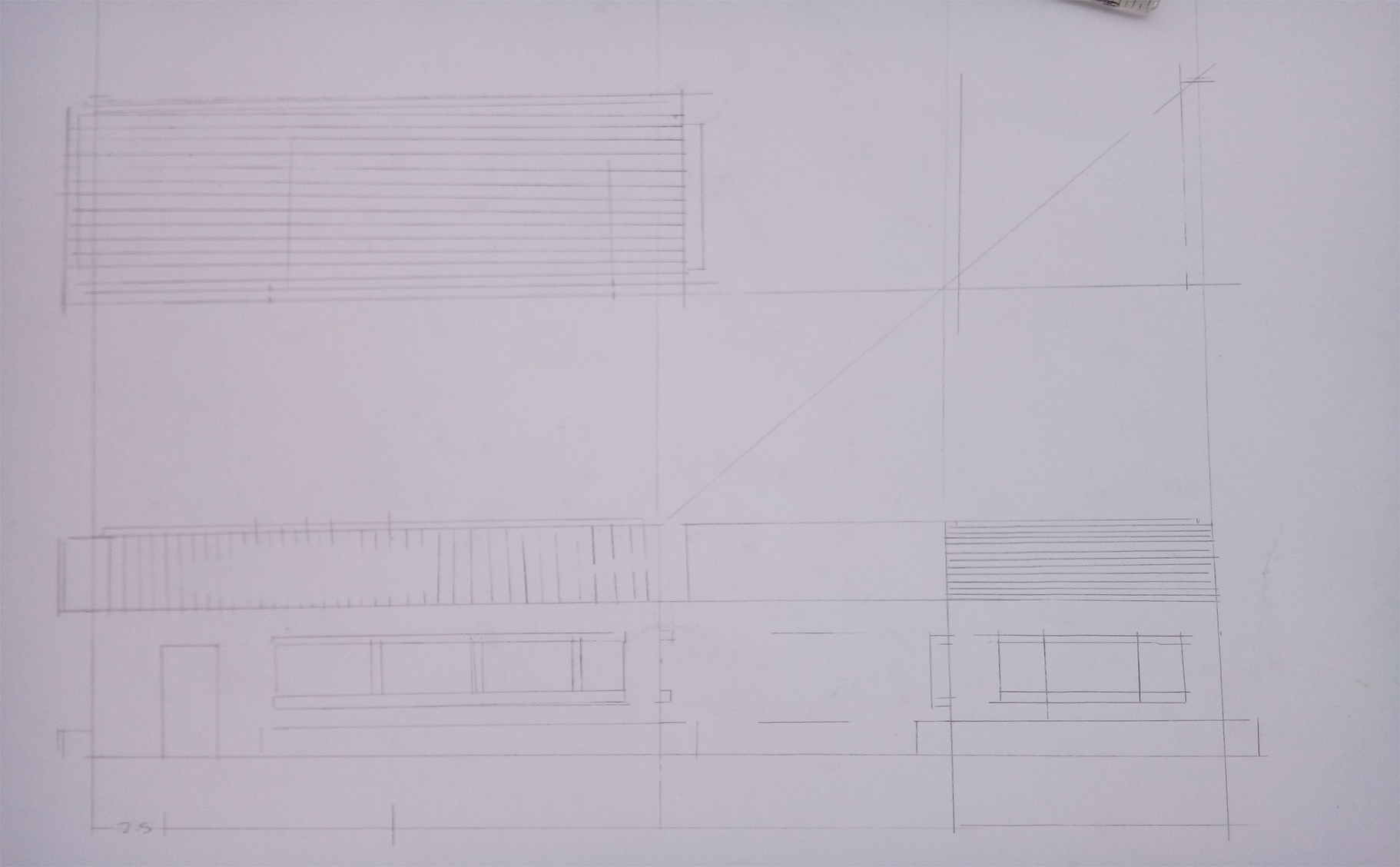
There, we just projected the top view.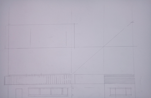
Add in some texture lines just for presentation.
Inking
For inking, I use technical pens. I don't really suggest them because there are a lot of cheaper and practical inking tools out there like Sakura Micron or Uni Pin Mitsubishi Pencil. But since I have these pens, I'll use them instead.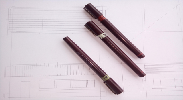
I started inking with the front view.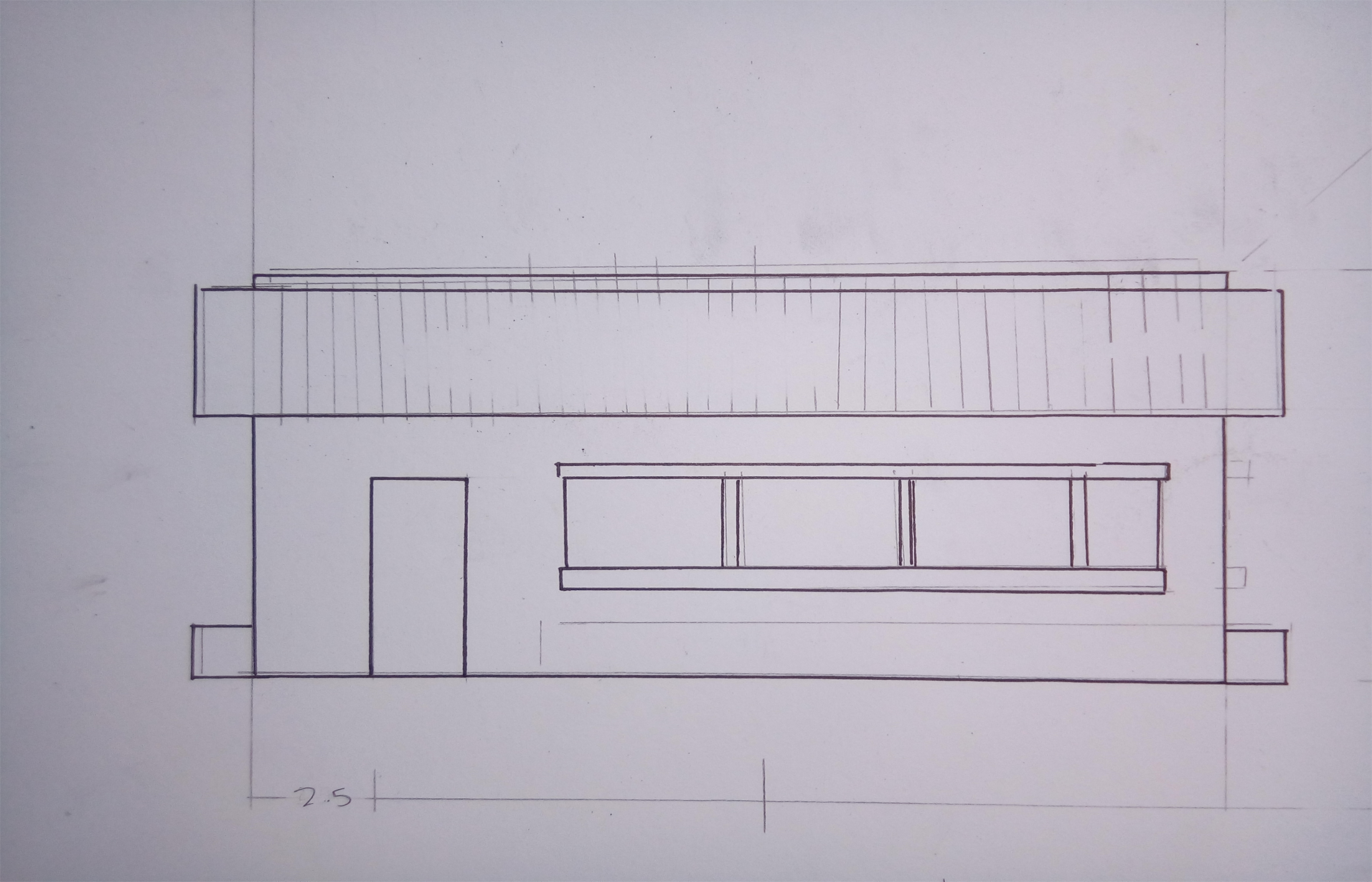
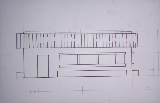 Then the top view. I started from left to right so I avoid smudging the ink with my hand. If you're a left hander, do the opposite.
I made a mistake with the top view. Don't worry, that is fixable.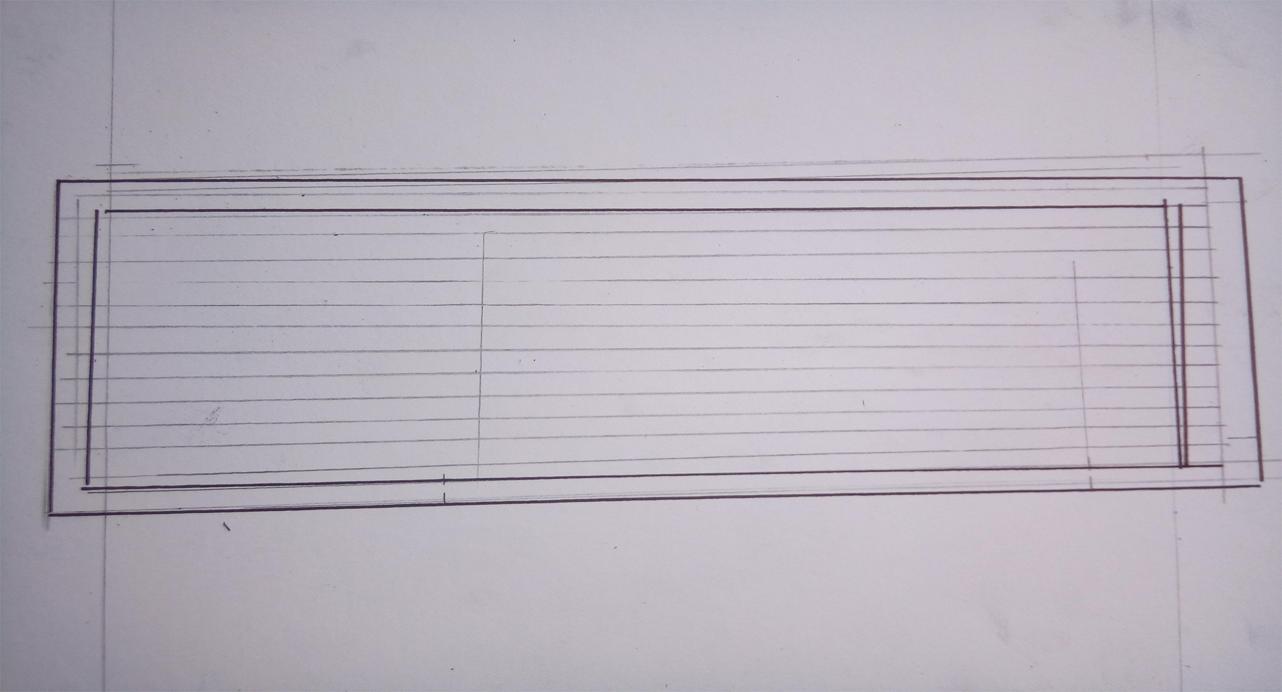
There, finished inking all the views.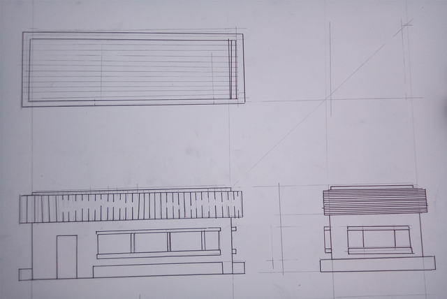
I then added some dimensions.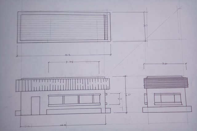
Then I erased the pencil lines.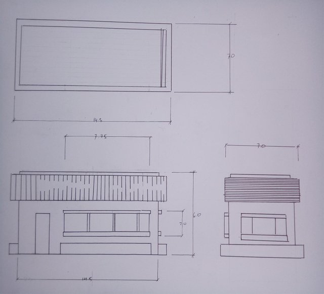
I took a liquid eraser and erased the error on the top view.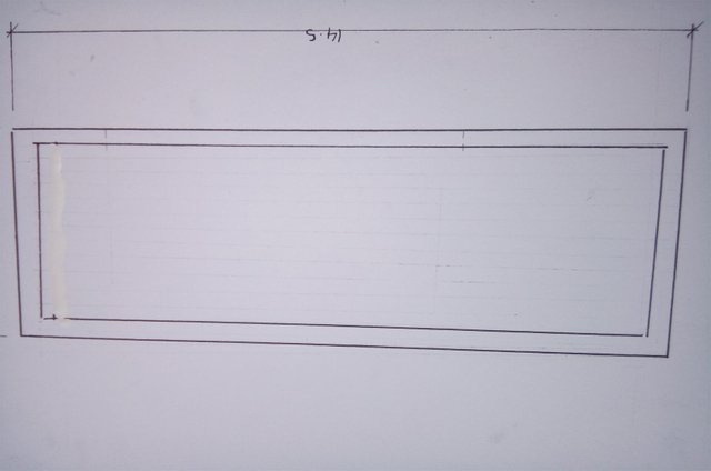
Coloring
I colored the elevation with some alchohol markers and watercolor pencils. Some drafters use different coloring tools but I prefer these ones cause they're the fastest tools cause of how accessible and easy they are.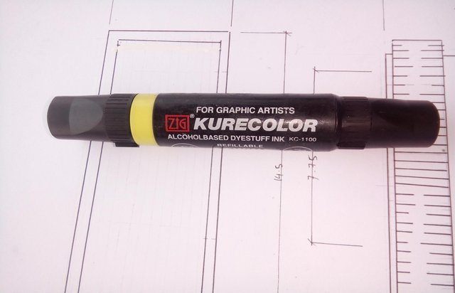
I chose yellow green for the wall colors. This color is kind of risky for the colors of the wall finishing. Safest colors are white, cream, yellow and black. Sometimes black is too much but it has a lot of applications in terms of housing finishing so I consider black as a safe color.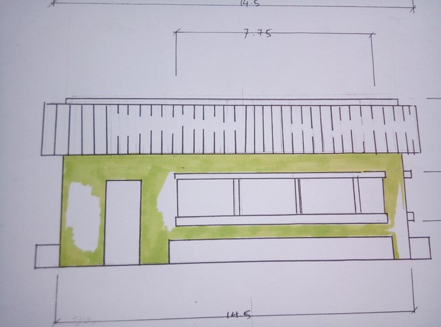
I then used the yellow green water color pencil to show some contrast on the markers color strength.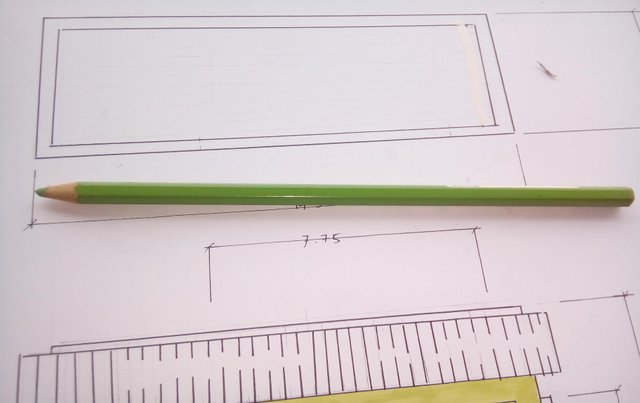
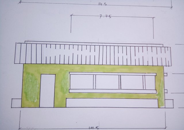
Then I colored the roof with brown, red and orange.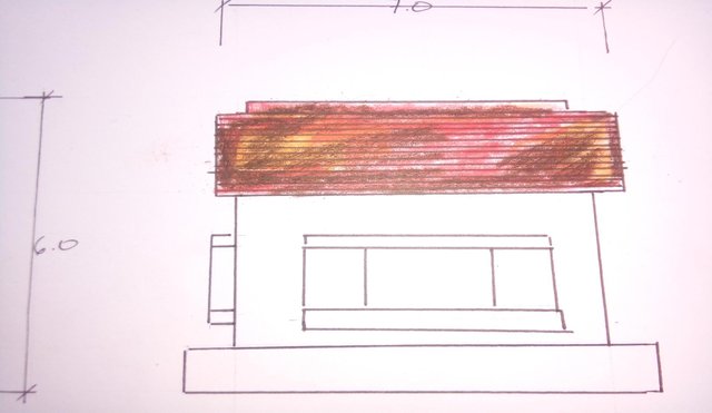
Added same color of walls like in the front view.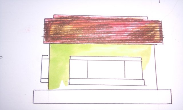
Added some more details like window colors.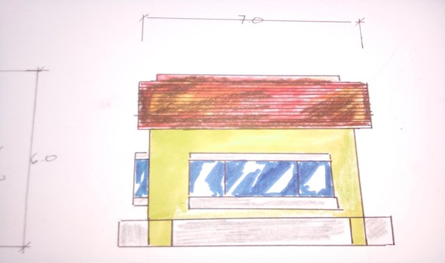
And there you have it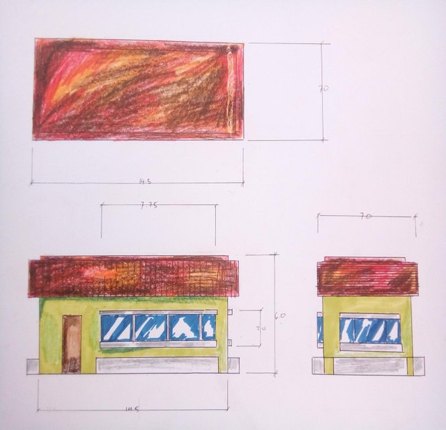
Did you liked this post? If you do? Why not upvote? Maybe Resteem? Or maybe a comment of what you think avout this post.
Thank you, see you tomorrow!
nice post!!
thank you
I appreciate that you included details and instructions that I understand. I love the tips on the best colors to use. Thank you for the time you spent on this post. Keep it up!
thank you
upvote + comment , nice post
Very good
Great Post! Its nice that you posted this kind of topics. Its really informative especially with people who are interested in architecture like me. Thanks for the post :)
Congratulations @blackjellyfish13! You have received a personal award!
Click on the badge to view your Board of Honor.
Congratulations @blackjellyfish13! You received a personal award!
You can view your badges on your Steem Board and compare to others on the Steem Ranking
Vote for @Steemitboard as a witness to get one more award and increased upvotes!