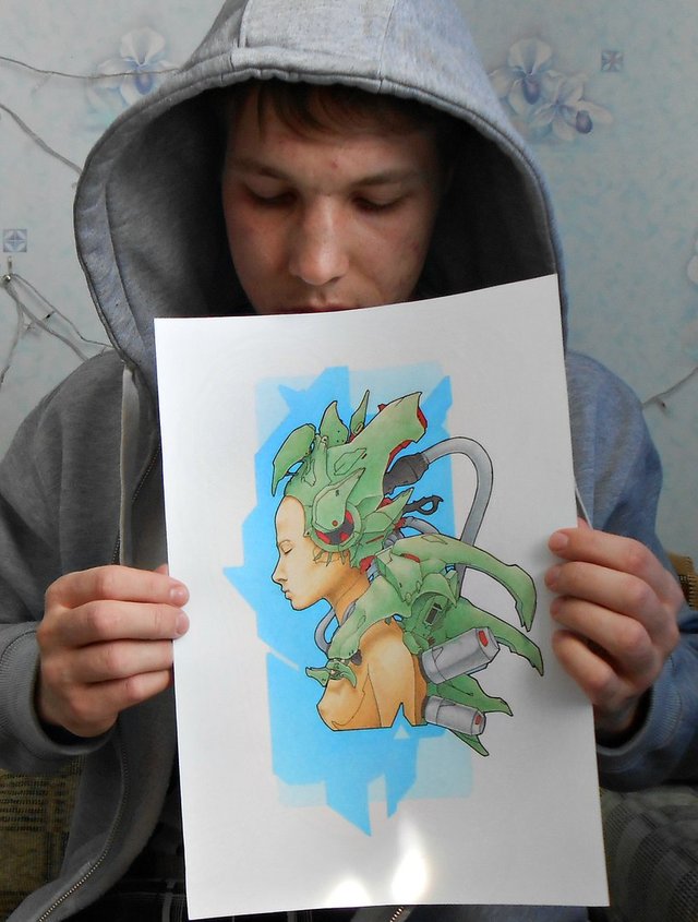
Here is another art from my cyber punk series, and my own stylization that connects them all (you can see by looking). Here I made a double background for the girl, this is how you can see a bright bluish hue and farther dim background, it looks interesting, in the near future I will experiment with a multi-layered background, thus making an illustration more interesting in the series of my cyber punk. In general, here's a picture, the kind of girl in the profile I'll make to the style of cyber punk. Next will be more interesting! join my blog.
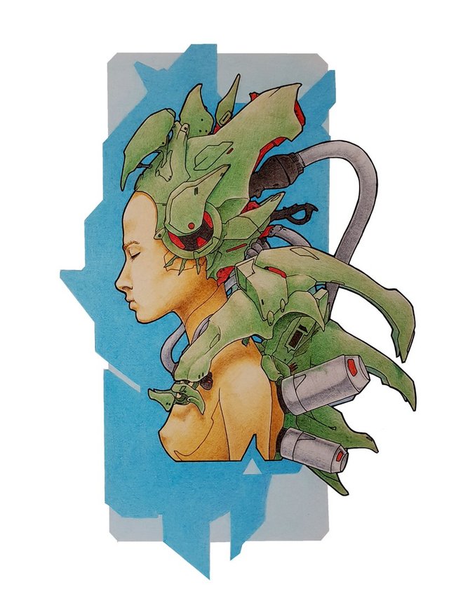
1. The process of creating this illustration.
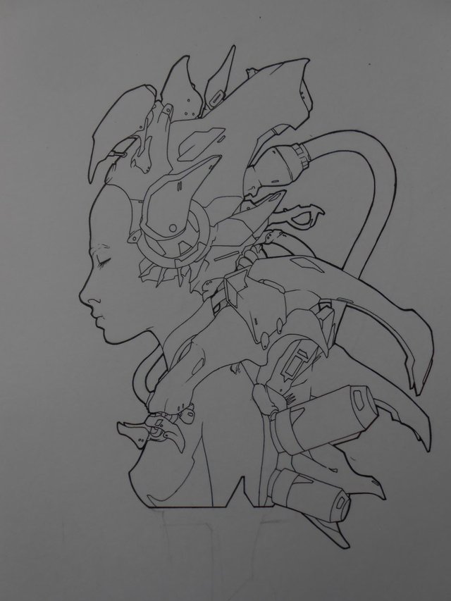
I drew the workpiece of a girl by liners.
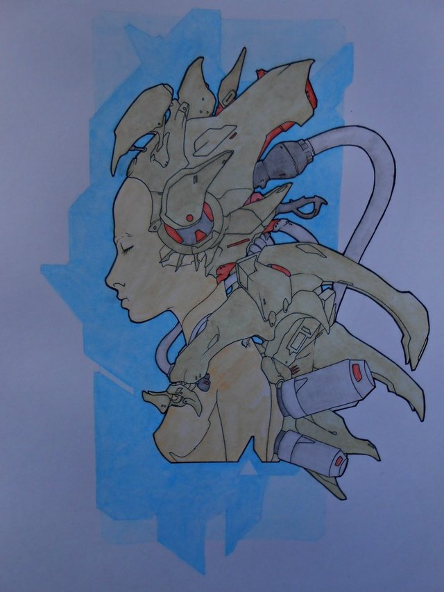
2. Next, I apply the first layer of watercolor pencils, which I then dilute
3. After blurring the first layer, I proceed to the next portion of the layer of colors :), where I already bring the picture to its end
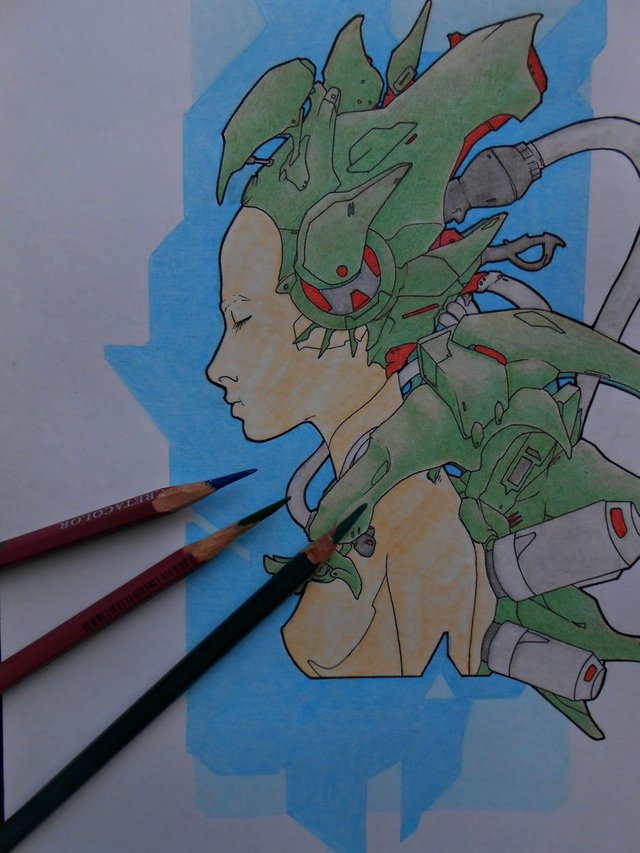
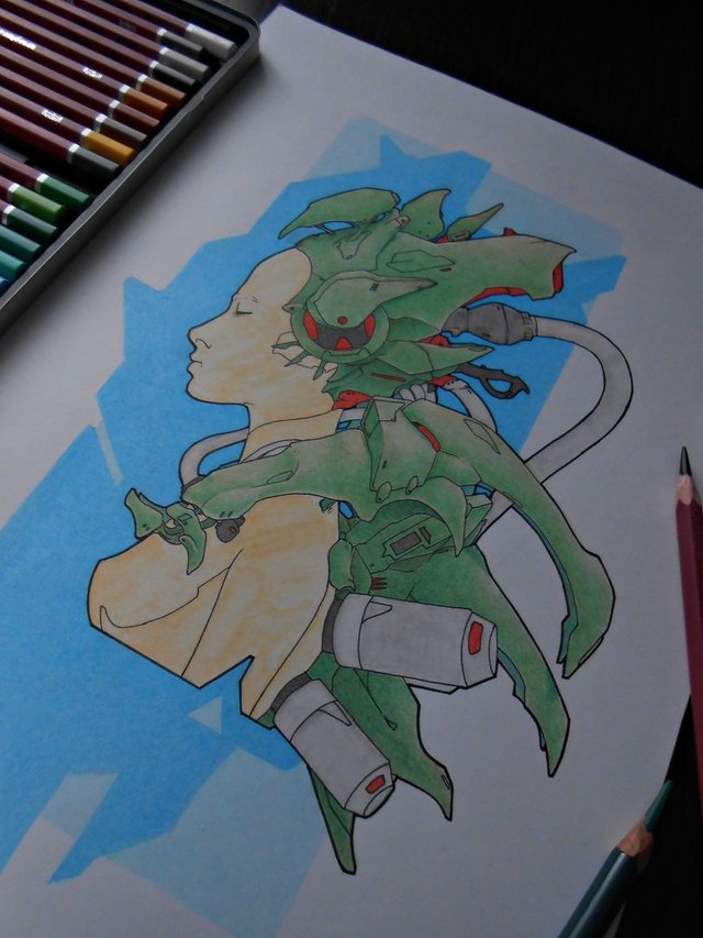
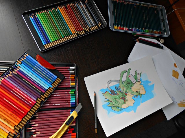
4. The drawing is completed.


This is amazing clarity. I love it!
many thanks
I just started to follow you and I'm upvoting for sure!
Nice work my friend, really like your line work and style. Upvoted and following!
thank
Congratulations @danis1! You have completed some achievement on Steemit and have been rewarded with new badge(s) :
Click on any badge to view your own Board of Honor on SteemitBoard.
To support your work, I also upvoted your post!
For more information about SteemitBoard, click here
If you no longer want to receive notifications, reply to this comment with the word
STOP