"Spirit" (10x8 oil on panel) painting process
Greetings Steemians and Artists,
Today's post will show the stages of a small figurative painting from 2015.
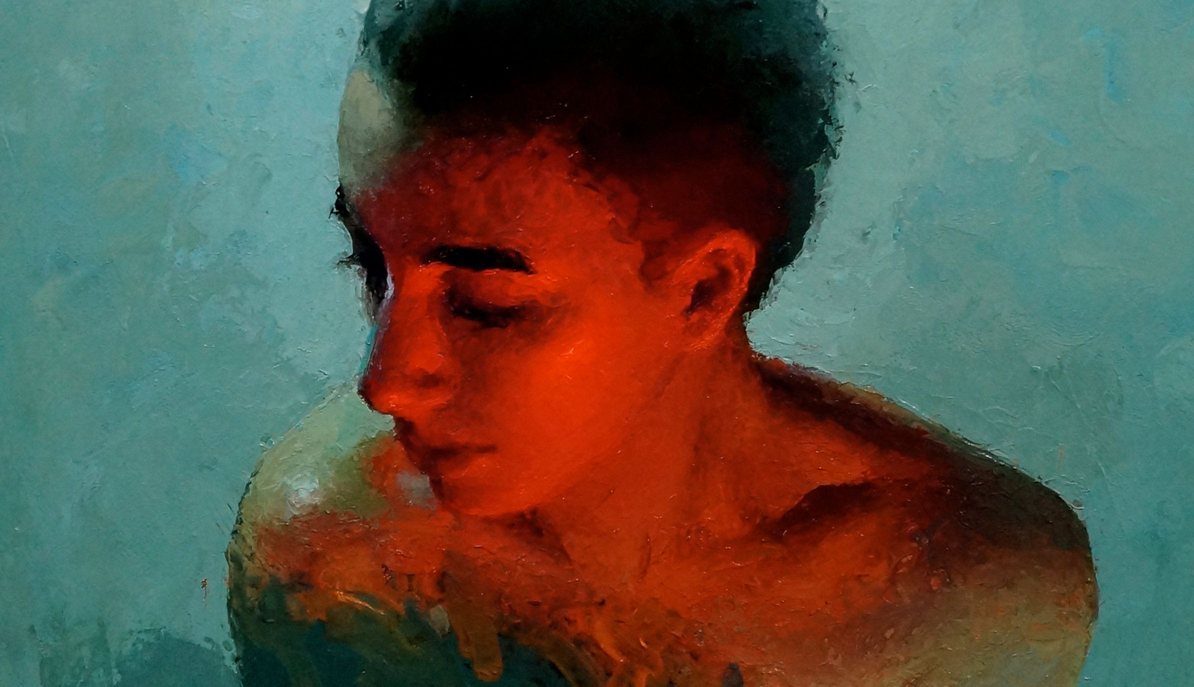
Here below is a very loose start (by knife). Once in a while I am compelled to start very abstractly. The task is then to find my way out of the murk. In terms of time, it all evens out in the end. The advantage of this method is that I get a sense of the overall impression of the painting right away.
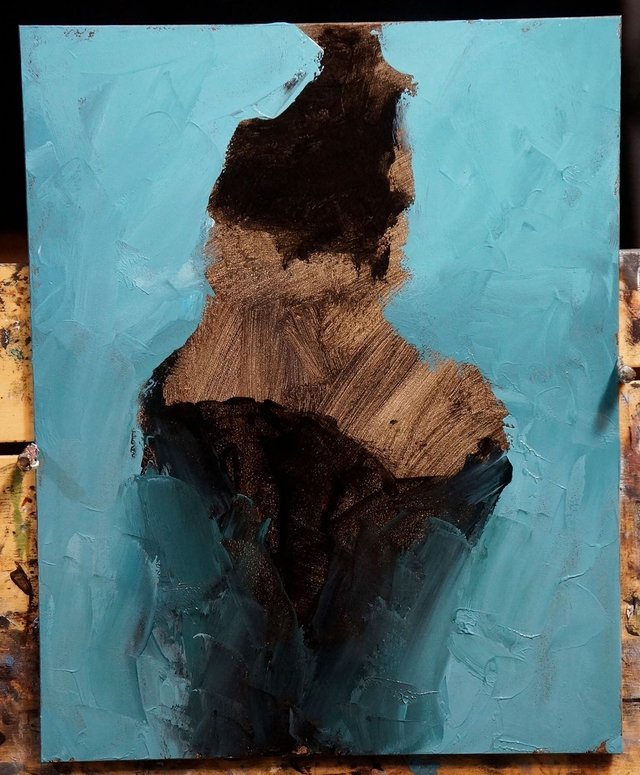
This approach would not work well for painting from a live model. But when model time is not an issue, it's a really exciting approach. I find that it encourages a lot of early experimentation. I can focus on overall effect of value and color very soon.
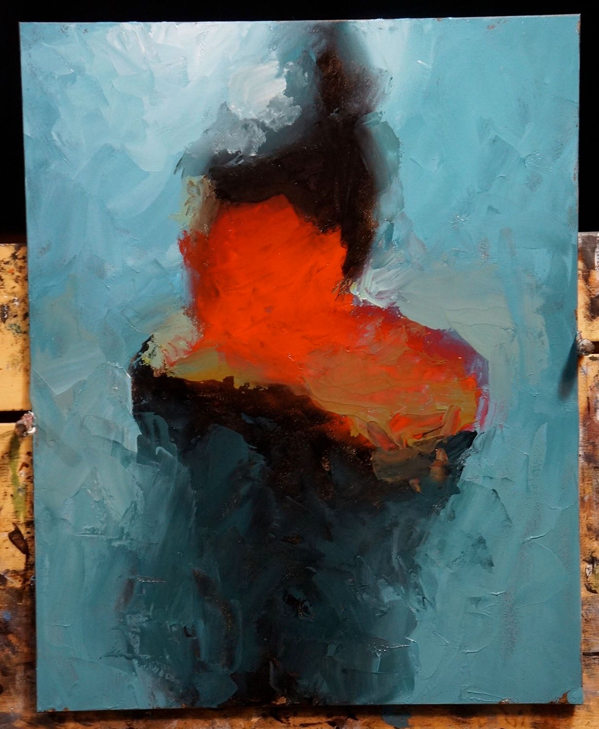
Next stage:

Next stage. Gradually refining, correcting, defining:
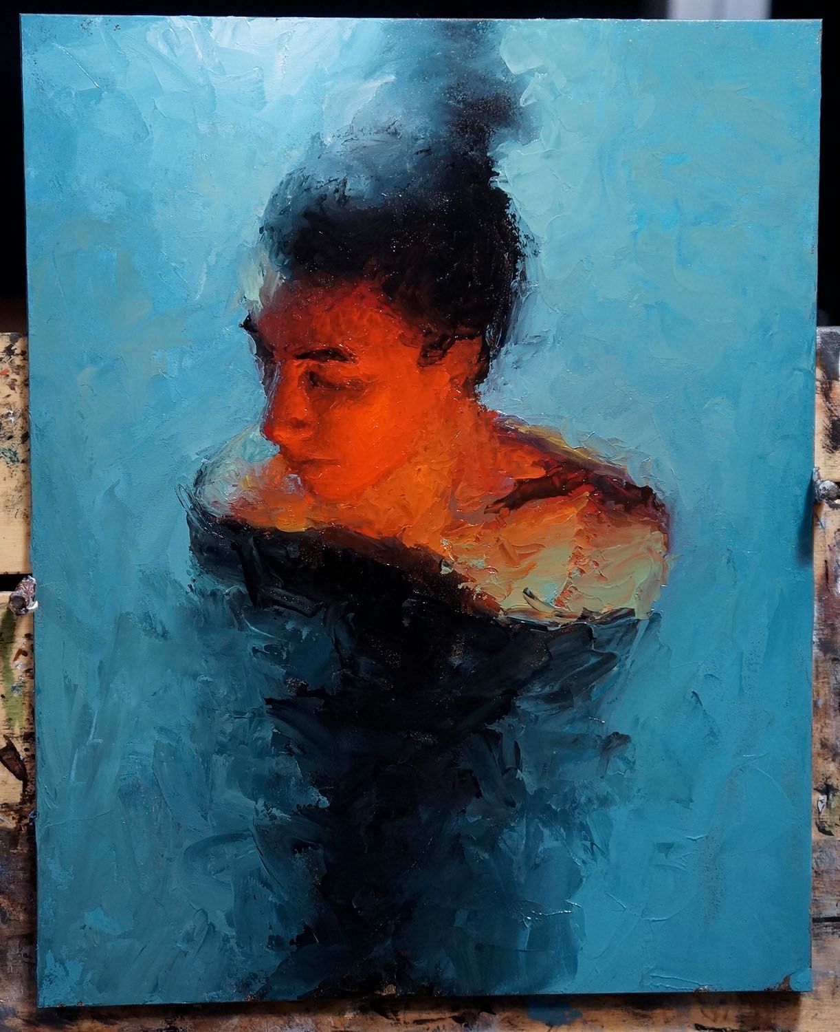
Next stage:
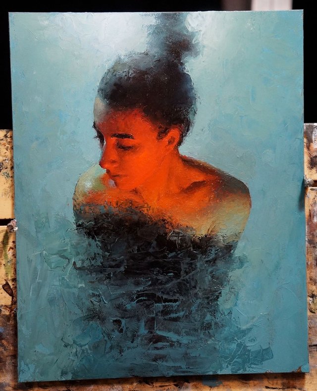
Next stage:
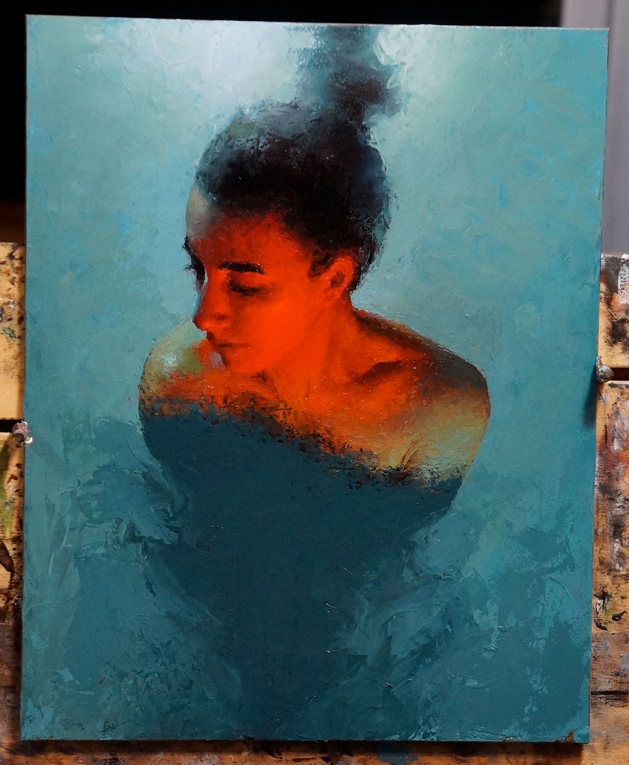
And the finished painting, "Spirit" (10x8 oil on panel, 2015):
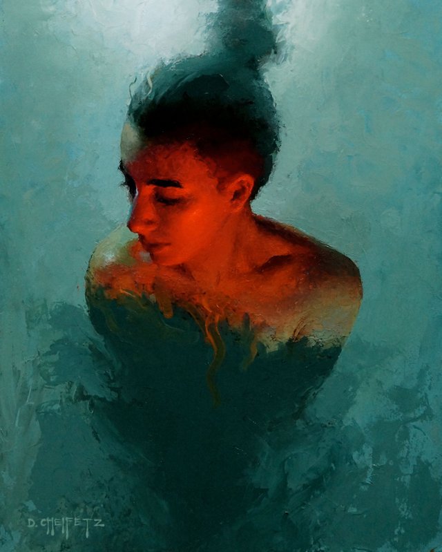
"During my schooling and subsequent career in architecture, I never truly embraced color. I was indifferent because I didn't know how to use it and thus didn't realize its power. When I started learning to paint with oils, I had to use color. Paint IS color. You can't separate one from the other. I fell in love. For better or worse, I've barely touched a pencil since."
(Excerpt from my FIGURE book, page 22)
You might notice that this model looks familiar...see earlier post "I Live With The Fae". I've painted this muse many times over the years.
Thanks for reading! -David

Love the color here, it looks like she is floating in water illuminated by a fire. The details of the face combined with the fogginess of the rest work well together. Thank you for sharing!
Thank you very much! :)
This is beautiful, I love the warm and cool color tone contrast. I also love ho you laid out this post and included the process pictures of your work (it’s rare to get to see behind the scenes like that!). Followed and can’t wait to see more.
Thank you! Good to hear that the post format is working. I'll keep them coming :)
Amazing work here on your page! Found you through @juliakponsford weekly post about artists to check out :)
Thank you! Yes I have followed @juliakponsford and looking forward to more!
Wonderful work!
Thank you for sharing the whole process <3
Thank you! My pleasure and thanks for reading!
Lurvvvv this David. Love your colour sensibilities also. Are you working from a palette in your head, or do you have some sort of colour reference?
Thank you! Yes, I took my photo reference and pumped up the saturation in photoshop, and used that as a starting point. From there I tried to exaggerate even more to push the colors as far as my paint will allow. Photoshop is a great way to get a sense of where I'm headed, but I do that computer work quick and sloppy--I try and not get distracted by the tool too much because I I'd rather be painting.
I agree with you on that, the computer gets some kind of reference in place and then rest is worked out on canvas. Often I am working from black and white references and then I have to take and educated guess of where to take it. I may look at other images for colour references to figure the whole thing out.
B&W....I imagine there is freedom in that. As long as your values are good, lots of color possibilities!
I must admit I am still training my eye with judging values. Colourising a B&W has its challenges if I'm aiming for a "natural" result.
I love this one! It was fascinating to see your process and inspiring (though I don't paint right now, if I ever do in the future I will keep your technique in mind). In a sense your process was like color architecture, so your background makes sense.
Thank you!
Very beautiful painting. Amazing to see the process. It wouldnt occur to me that you would start like this. Its like sculpture.
Thank you! Hmm like sculpture... I like that! Sometimes that is the way it feels. Much easier on the hands though ;)
Incredible - I love the intensity of the orange - it works so well with the teal color of the water. Gorgeous work! Love it!
Thank you! 😁👍
Wow your lighting is amazing, definitely followed for more I also found you via @juliakponsford
Thank you very much! :)
Incredible.
Thanks!