The Hidden Depths of Commercial Set Design
Freelancing in Los Angeles
When I'm not busy posting on Steemit and doing illustrations for short stories, I work as a freelance designer in Los Angeles. A lot of the work I get as a freelancer is doing set design for commercials. Like most people, my relationship with commercials is generally one of disdain at worst and indifference at best. I pay the extra few dollars on Hulu to avoid watching commercials, even though I spend so much time working on them. But I feel it's my duty to tell you how much thought goes into each frame of the commercials we all so happily ignore, with the added bonus of reminding myself that some commercials are actually quite beautiful if I just give them a chance.
How A Commercial Gets Made
Before I can explain the design work that goes into making commercials, it's important to understand all the steps that lead up to my being hired. First of all, the client (for example Old Navy or Target or RE/MAX) hires an ad agency to come up with an idea for a thirty-second commercial that advertises whatever the client is trying to sell. The ad agency then pairs with a production company that produces and films the commercial. The production company usually has directors on staff or hires the director freelance for the specific commercial. The director and production company select the different department heads (Art Department, Camera Department, Electric Department, Wardrobe / Make-up Department, etc.) who fill out their teams with freelancers as necessary, depending on the size of the job. Once the director receives the script, he or she sits down with a storyboard artist to draw up the "boards," which lay out each camera angle of each scene of the commercial and make it clear what props and sets will need to be acquired and/or designed in order to best represent the idea.
The head of the Art Department is the Production Designer. Once the scope of the job is well understood, the Production Designer and the #2 in command, the Art Director, may decide to bring me on to help with the 3d modeling of the sets and/or the graphic design of props and decorations within the set (i.e. designing fake brand names and product labels for objects sitting around the set). Once I'm hired for a job I'm usually on for anywhere between a few days to a few weeks. Most of the time I've already moved on to the next job before the cameras even start rolling.
RE/MAX Commercial
In July of this year I got a call from Production Designer Laura Fox and her Art Director Charles Varga (the design team behind the movie 500 Days of Summer) to do some freelance work for a RE/MAX commercial they were designing. The commercial was directed by frequent Wes Anderson collaborator Roman Coppola and was therefore shot in a similar style - a series of meticulously arranged vignettes. I'll let you watch the commercial first and we'll jump into the many layers of design work on the other side:
Map to Nowhere
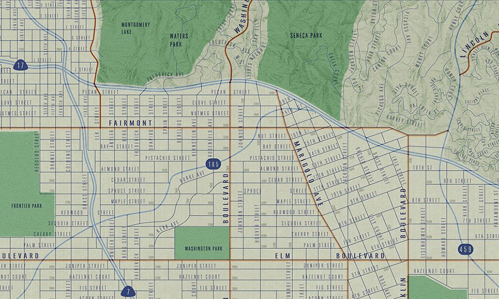
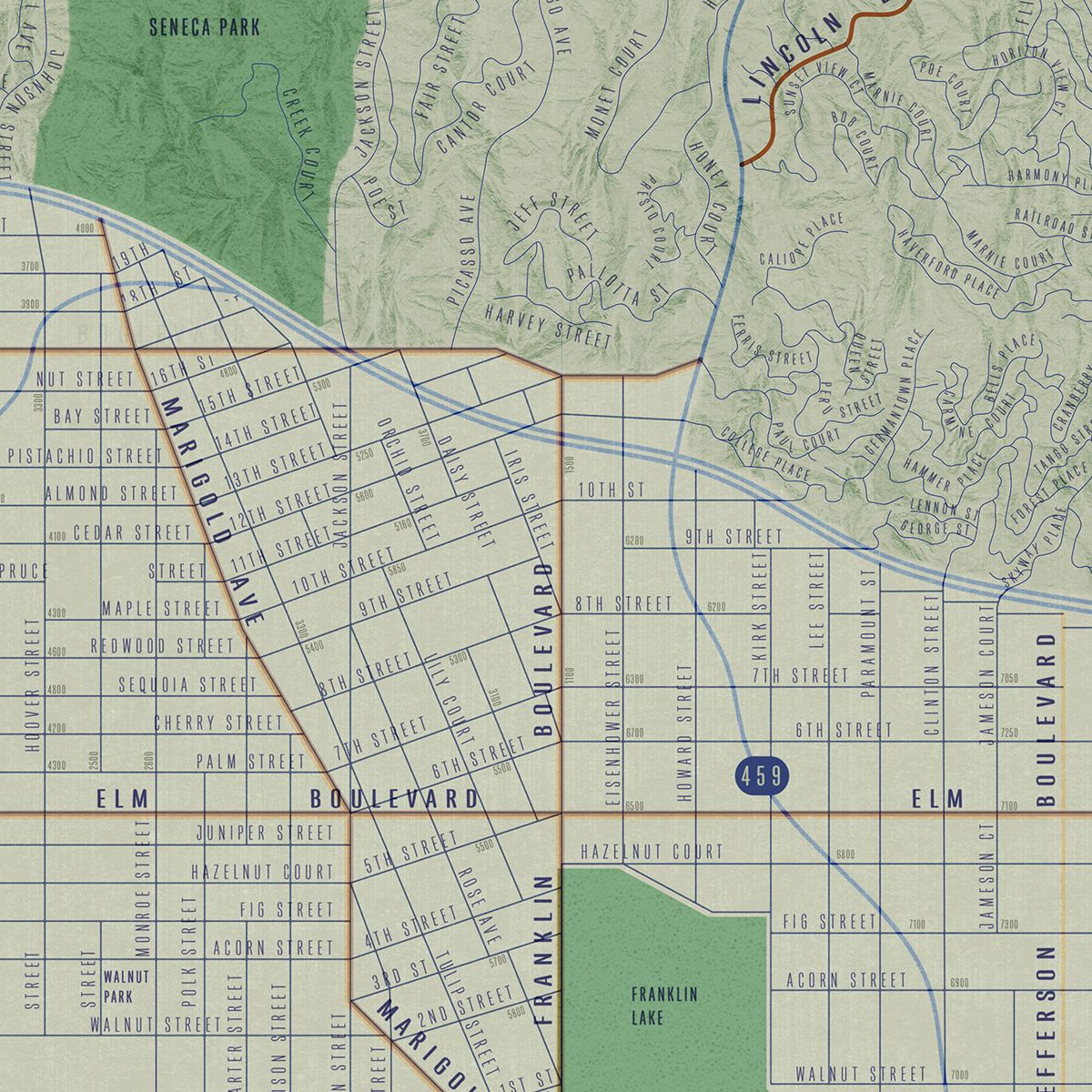
One of the design details I was most involved in with this commercial is the map at the beginning of the spot. I'm sure most people wouldn't think that a prop that's only visible for about a second out of the thirty-second commercial would be given so much attention, but this was a pretty major undertaking. Since the client wanted to avoid using a real map of a real town in order to leave the location more ambiguous, I was tasked with the responsibility of drawing a map of a nonexistent town from scratch. The director and production designer guided me with the objective of creating a suburban-feeling Anywhere, America-type of grid town with a large park somewhere on the map. This is what I drew up in Rhino and Illustrator over the course of a few days:
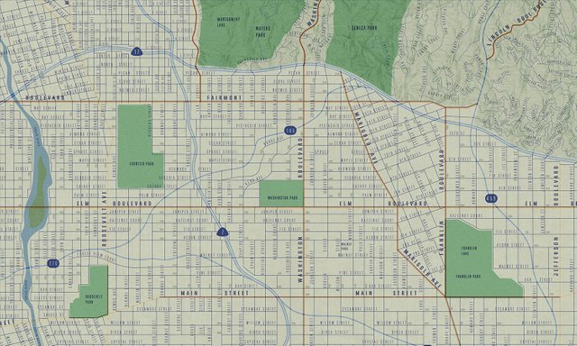
Knowing the map would never be on screen long enough or close-up enough for the street names to be legible, I was afforded the opportunity to throw some shoutouts into my map design. Many of the streets, besides the typical presidential and tree-species street names, are references to various people and places that have been significant in my life. If you look closely, my @hitheryon buddies and Sndbox founders @voronoi and @hansikhouse got a shoutout on the right-hand side. This is the first they're hearing of it! Unfortunately the director decided to fold that portion of the map over so their names didn't make the final cut.
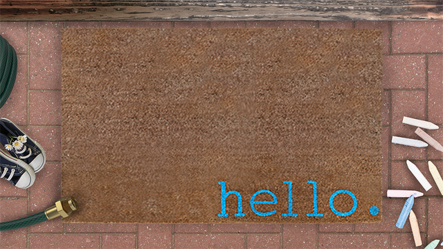
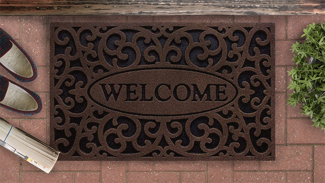
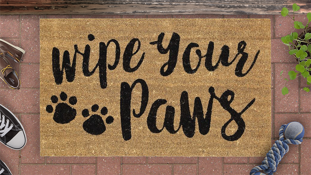
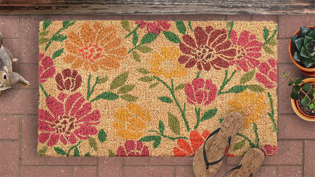
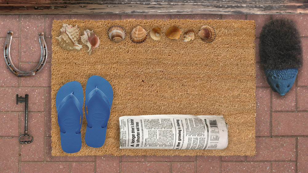
Welcome Mat Photoshopping
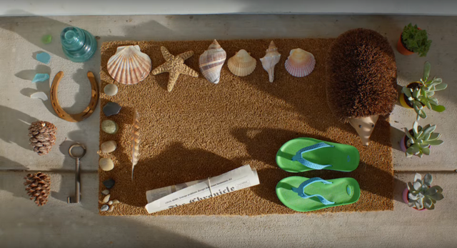
The other part of the commercial I spent a particularly long time on was the welcome mat vignette. The director wanted to see options, so the production designer had me photoshop multiple versions of how we could lay out the collection of props on the welcome mat. You can see here how many different directions we considered through the magic of Photoshop:

Thanks for reading! I hope this gives you a newfound appreciation for at least some of the commercials that rudely interrupt your television viewing.

Interesting look behind the scenes, and I appreciate the honesty! Nice job!
Thanks @bluntstep!
This is an awesome insight into how you came up with various elements of the ad. I love that some steemians got a shout out!
Thanks for sharing.
Thanks @choogirl! Glad you appreciated the shoutouts. Hope they did too!
classic map graphics. love it
Thanks @design-guy!
HEY KIRK STREET! That's me! You sly designer you!
Amazing man that's so cool.
This is a fascinating breakdown and play x play of commercial design! It's unreal how many iterations there are behind the scenes. That map illustration is glorious and just maddeningly detailed @erb. Glad you had some fun with it ;)
Thanks @voronoi! Glad you enjoyed the Kirk Street shoutout.
I very like this post cause this very good
I hope my post same like this post
Please vote my post @muhammadakhyar