Occult Poster design
This is a brief outline of the process involved for how I designed a poster for a cannabis pharmaceutical company in California.


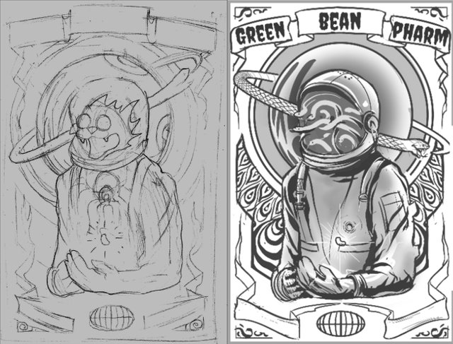
I had put forward a couple different rough concepts for the company to choose from and this is what we started with. A very basic rough sketch.
I began to further define the objects and shapes that would make up the focal point of the design. Not all the ideas had been established at this point.

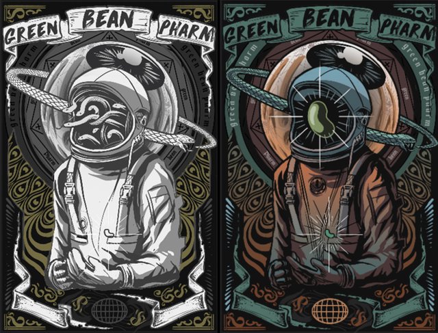
As I grew more comfortable throughout the design phase I defined the remaining smaller details. The next step was to begin adding colour. I tried numerous colour variations before settling on the final decision.

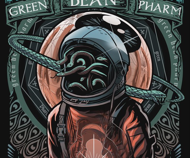
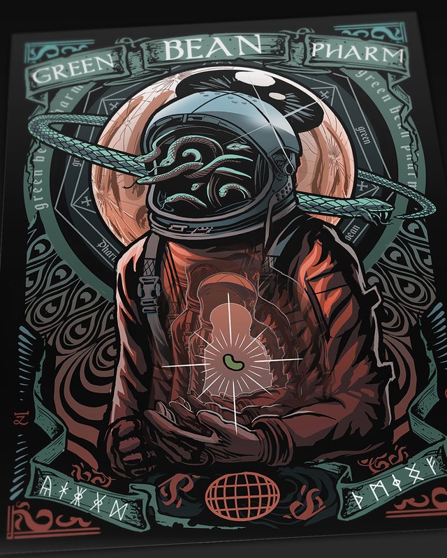
After many alterations and final adjustments, this was the finished result. Thanks for looking!
Very clean. Like the design and colors. Everything worked well here. Great job!!
Thanks mate!
Nice picture, I like the concept and the colors a lot. It reminds me of Grant Morison's comic, Nameless - it's cover featuring astronauts with fiery sigils of protection, as they are about to face an occult menace from deep space.
The design is awesome and here is the book for reference!!! Awesome job @jeremyrfk!!!
Looks really cool, thanks mate. The story sounds interesting, I might have to give this one a read!
I’ve never read it but Image puts out some pretty good shit. If ya give it a go lmk what ya think!
Damn that's really cool, I love that, thanks for sharing!
I love this poster, great style!! I have included you in my weekly curation Ocean of Art!
That's awesome, thank you so much!
I too, like the colour story and the I love poster design, so this is really well done you've hit that note between graphic repeat and fine art line I love so.
Thanks Donna!
Congratulations @jeremyrfk! You have completed the following achievement on Steemit and have been rewarded with new badge(s) :
Click on the badge to view your Board of Honor.
If you no longer want to receive notifications, reply to this comment with the word
STOPDo not miss the last post from @steemitboard:
SteemitBoard and the Veterans on Steemit - The First Community Badge.
Great work! You have a very interesting style... and I see you're new around here. Welcome! 😀
Ah, the fellow metal enthusiast, thanks mate!
This post was shared in the Curation Collective Discord community for curators, and upvoted and resteemed by the @c-squared community account after manual review.
Dear friend, you do not appear to be following @artzone. Follow @artzone and get added to our voting list for valuable up-votes!
Very nice design, it is certainly both attractive to the eyes and memorable. I like that it has that retro futuristic feeling :D.
-upvoted-
Thank you!