A value and colour study

Image credits: study by me from a photograph
A value and colour study
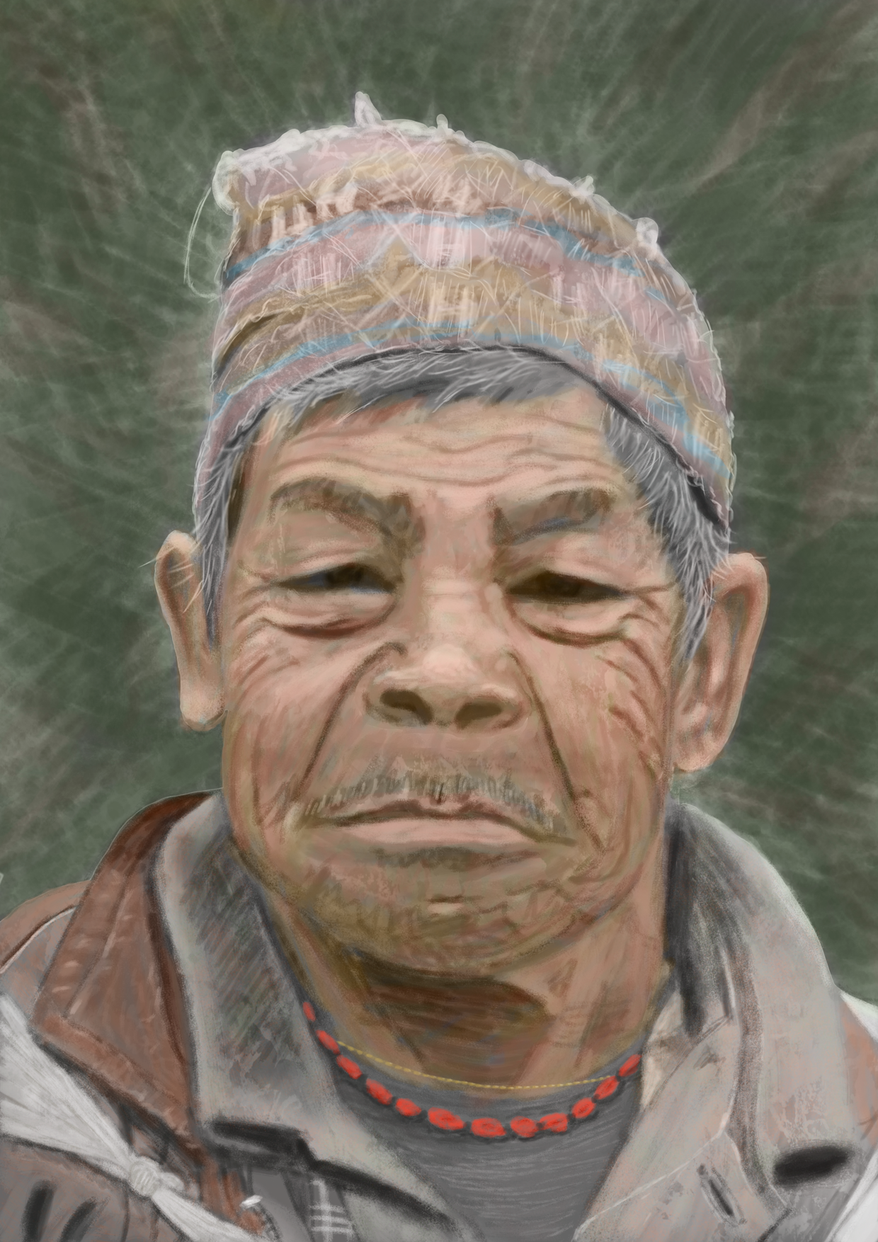
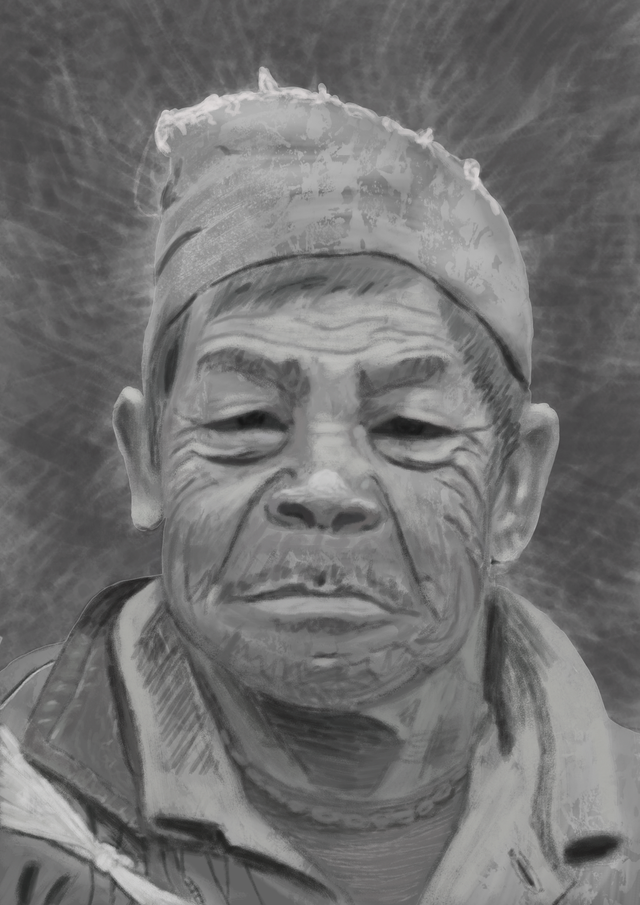
I wanted to try to create a digital painting from a photograph. This time I wanted to start with a grayscale value study, followed by colouring. A new process to learn... I selected a face because they are difficult. We look at faces all day long and are so used to seeing them, that everything that is slightly off becomes visible. So I had to pay attention to placement and form etc.
You can look at the original image for comparison.
So I started with values:

This was a difficult process and took a lot of time, but I didn't give up. I had set my mind upon finishing this one the whole way through. So now I finally had my values in, I started with a colour layer (in Photoshop CS6), filling in the approximate colours. Oh, my! I thought I would hit the right colours easily, because I had the values in place (or so I thought). So no choice to put another normal layer on top of it and paint over it until the colours were right. Loooong process!!! This is the final:

Sorry I fused the colour layers, so I cannot show you the intermediate result (which was garish, Ugh).
Any comments or tips on how to improve are always welcome. I know the colours are not exact and I wanted to keep a painterly feel. Ha, the longer I look at it now, the more 'errors' I find :-) but it was an intense and great learning experience!
Hope you enjoyed it, take care!
Hi Lirfael. I think you did a great job overall on this. I paint in acrylics and teach classes online, and although I haven't done a digital painting, the outcomes were shooting for are similar. To improve: Try to soften some of the wrinkles. One of the biggest mistakes I see being made is that artists notice the fine details and nuances of a face and, in their enthusiasm to not miss them, they tend to overexaggerate the feautures. They will be too dark (or light) and the angles may be too severe.
But still, you really did capture the personality of the subject well, so fantastic job! The shape of the face is accurate, and the overall features are too. Keep up the good work.