The Basics of Painting - Part 2: Framing and Composition
Welcome back. I hope you enjoyed the first part of this tutorial series.
To keep the spirit of this series, I will try to condense the information down to the most important bits, so it remains easy applicable and still of value, still, this will probably become one of the more comprehensive parts of this series.
In this part, I will explore the different aspects of composition. There are countless more ideas concerning this topic and once you realize how important it is, you'll start to see that it's really inexhaustible. Think of the ideas here as propositions, not as rules. Use what works.
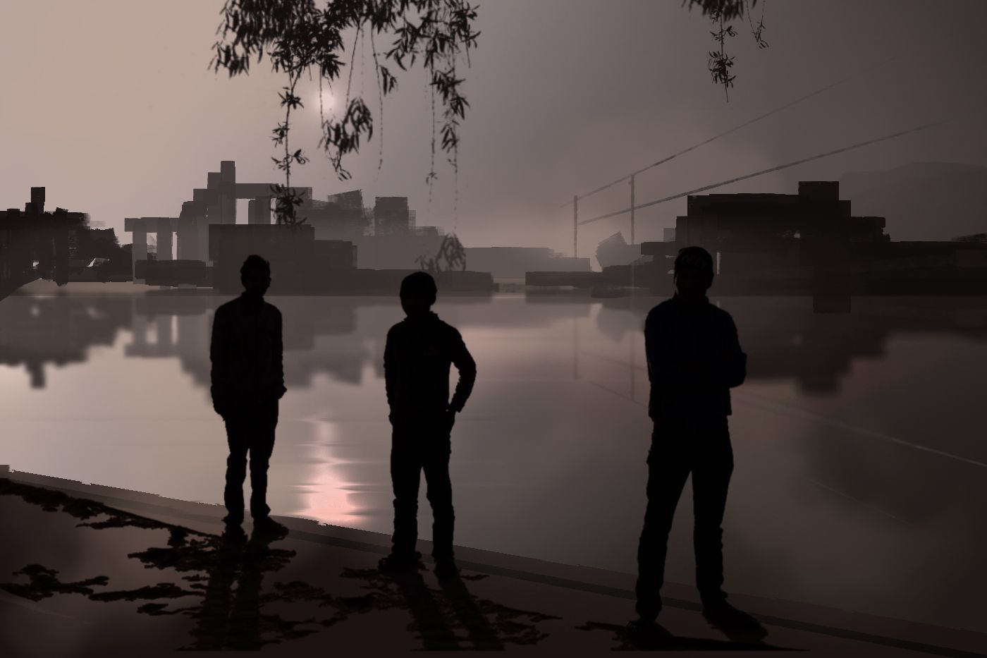
Using only silhouettes to get the image across
Camera angle
The camera angle seems in the beginning as an somewhat advanced concept but it really isn't. Just think of what exactly you want to convey in your picture. Are you looking up, down or just straight into the horizon?
Maybe you're even lying on the ground in your fantasy or peeking over a ridge down hundreds of meters?
Determine then your (vertical) camera angle by placing the horizontal line above or below the middle of the frame. Try to avoid placing it right in the middle, since it can look somewhat boring.
Draw the horizontal line below the middle if you want to look upwards the scenery, like in a forrest or a cathedral, if you want to look down at the scenery, draw your horizontal line above the middle and don't forget to put in those vertical perspective lines accordingly, as mentioned in part 1.
Try to imagine a certain scenery in both of the following pictures.
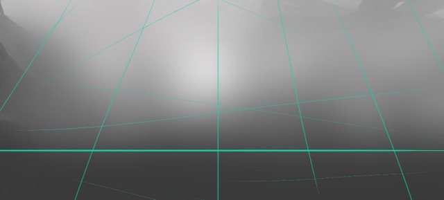
Low camera angle, determined by the placement of the horizontal line below the middle of the frame
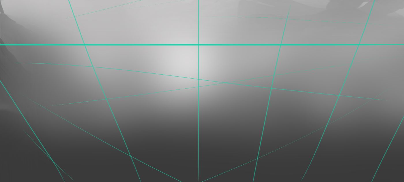
High camera angle, determined by the placement of the horizontal line above the middle of the frame
Try to use also different aspect ratios. Make once in a while a picture with a square canvas, a very narrow horizontal or a vertical one.
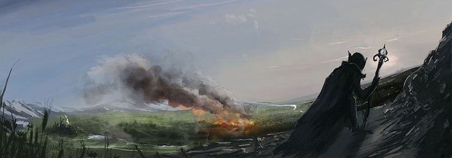
Composition, using a narrow horizontal canvas
Subject Placement
To start things off, you have more or less to decide, where to put your subject or main focal point within the picture frame. There is nothing wrong placing it in the centre but usually, if you're placing is somewhat random, try appyling the rule of thrids.
There are so many different approaches, but the rule of thirds is the most common one and ususally works very well to get things started.
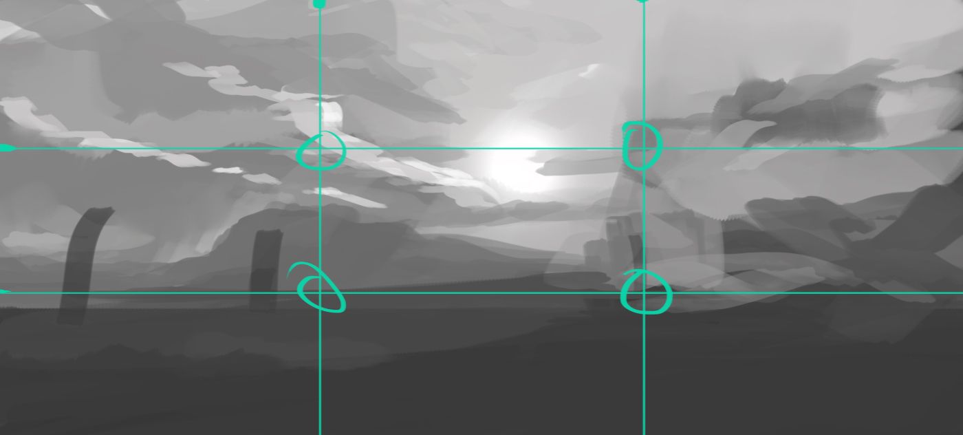
Divide the picture vertically and horizontally into thirds and place your subject near an intersection of the lines.
Foreground, Middleground, Background
If you don't know where to start, try to divide your scenery into overlapping planes, composed of a foreground-, middleground and background plane.
Keep the focus and the details on the plane containing your subject, while leaving the other two planes somewhat bare and raw (you can enhance them still later, if you want to).
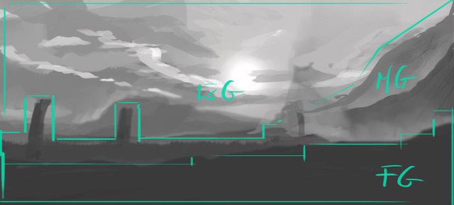
Foreground (FG), Middleground (MG) and Background (BG)
Framing
Framing is the idea of creating boundaries around your subject, in order to lead the eye of the viewer towards the subject, so that the gaze of the viewer remains there and won't wander outside the canvas and off your picture.
You can use:
- Leading lines and elements pointing towards the focal point
- Painted people in your scenery can point with their gaze towards the focal point, if it fits the narrative of the painting
- Framing, quite literally. Placing the subject in a window- or doorframe, archway etc.
- Avoid lines and things pointing outwards the picture, unless you catch the viewer with a new leading line to guide him/her back in, before the eye leaves the painting.
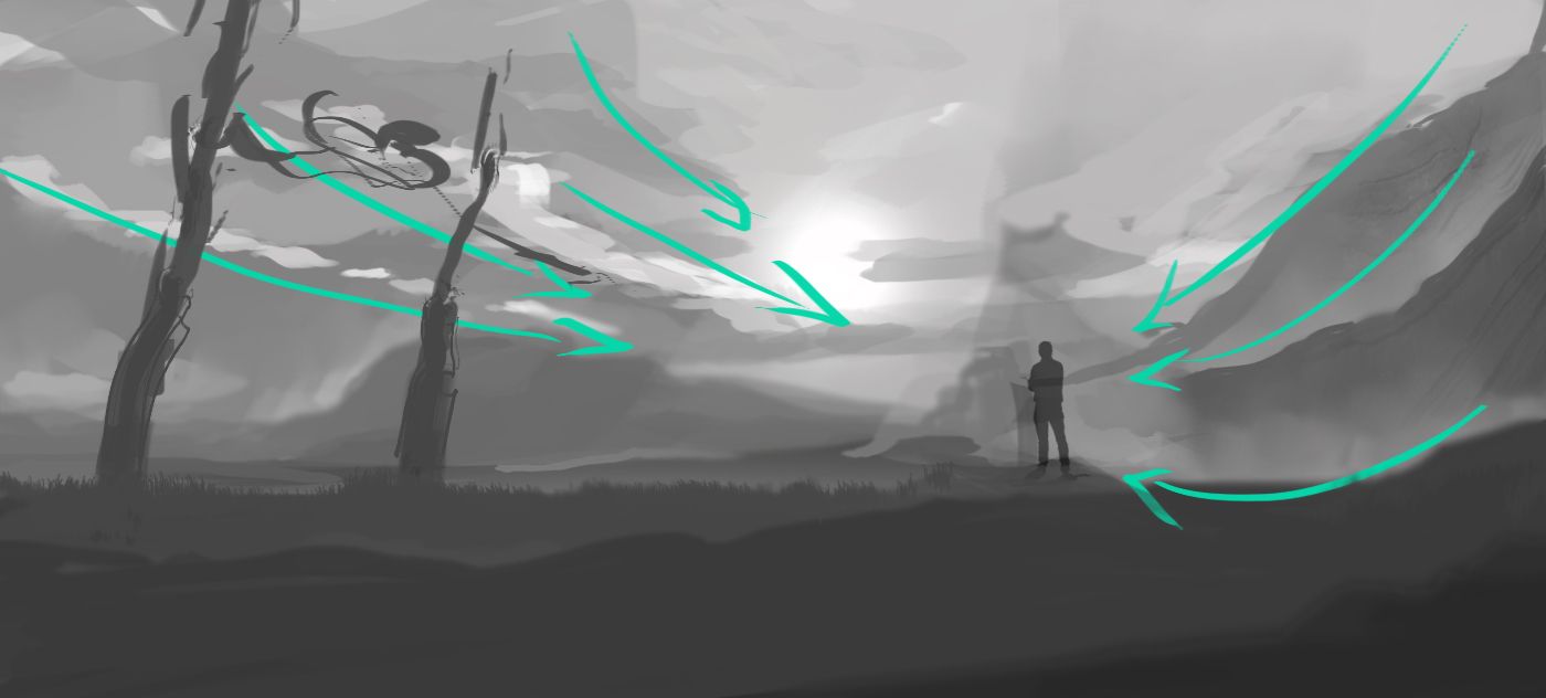
Leading lines: Branches, Clouds, Mountain ridges, etc.
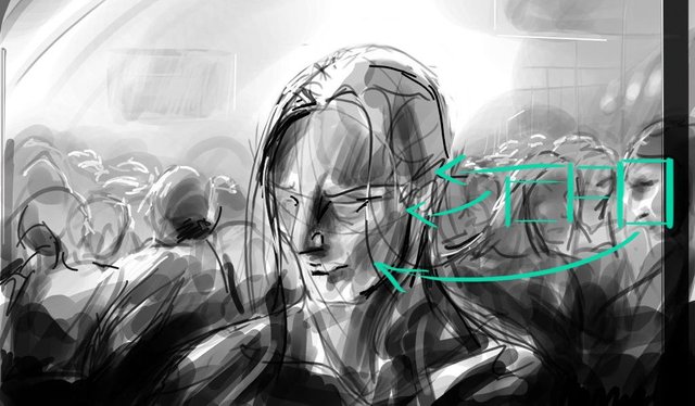
People looking towards the subject
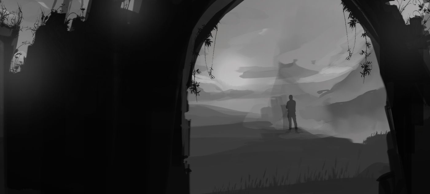
Framing the subject within an archway
Enhancing the composition
The main point here is the definition of the focal point and how to lead the eye of the viewer towards it (and maybe even around the painting). There can be more than one focal points, but usually, your main focal point should get the most attention. In this part, I want to show you some methods on how to ensure this.
Beginners often get obsessed with details, thinking, that insane amounts of details will make their pictures breathtaking. While you can go overboard with details (if you know what you're doing) I wouldn't recommend it in the beginning.
Start figuring out the main focal point of your painting and work towards emphasizing it.
Think of a photography of a flower with a shallow depth of field, meaning, the flower remains in focus, showing all it's details while the surroundings appear blurry. That's one way to emphasize your focal point. There are many more.
Emphasizing the focal point by making it sharp while the surroundings remain blurry
Here are some ideas, you can apply to emphasize your focal point. Of course, you can combine them. But as the artist, you have to figure out yourself, what suits your picture best.
Sharp vs. Blurry
As shown in the picture above. Blurry out the rest and keep your subject in focus. Be aware, that if you paint the rest too blurry, you lose the context of your surroundings (Where is your subject situated? In the mountains, the city, indoors?).Silhouettes
Silhouettes (first image of this article) are very strong compositional elements and insanely effective. Especially if you're a beginner and don't know yet how to fully render three dimensional objects.Details vs. Blank/Barren
Make your main focal point detailed while keeping the rest barren and blankContrast: Dark on Light, Light on Dark
Areas around your subject appear high in contrast. The eyes tend to look at high contrast areas first.Color Contrast
A scenery, mainly consisting of the same colors... suddendly, theres a unique/different color. Your eyes get automatically drawn to it.Organic forms vs. Geometric forms
Imagine a vast landscape, overgrown with grass and small trees, round clouds in the sky but there stands some rectangular object... maybe a bunker, maybe some sort of sci-fi craft with angular features protruding out of the grass?New/Shiny vs. old/gritty
Same idea as above, but with a different sort of contrast.Translucent vs. opaque
Crowded vs. empty
Rythm
A bit of an abstract one. Imagine a horizon with similar trees and a similar spacing between them but theres a group of trees with a different spacing. That's an interruption of a rythm and also a focal point.

Tense vs. loose
Same idea as above but with tenseness and looseness

Sometimes it's fun to suggest more than you show, it keeps the picture interessting and never forget to find own ways to come up with interessting compositons.
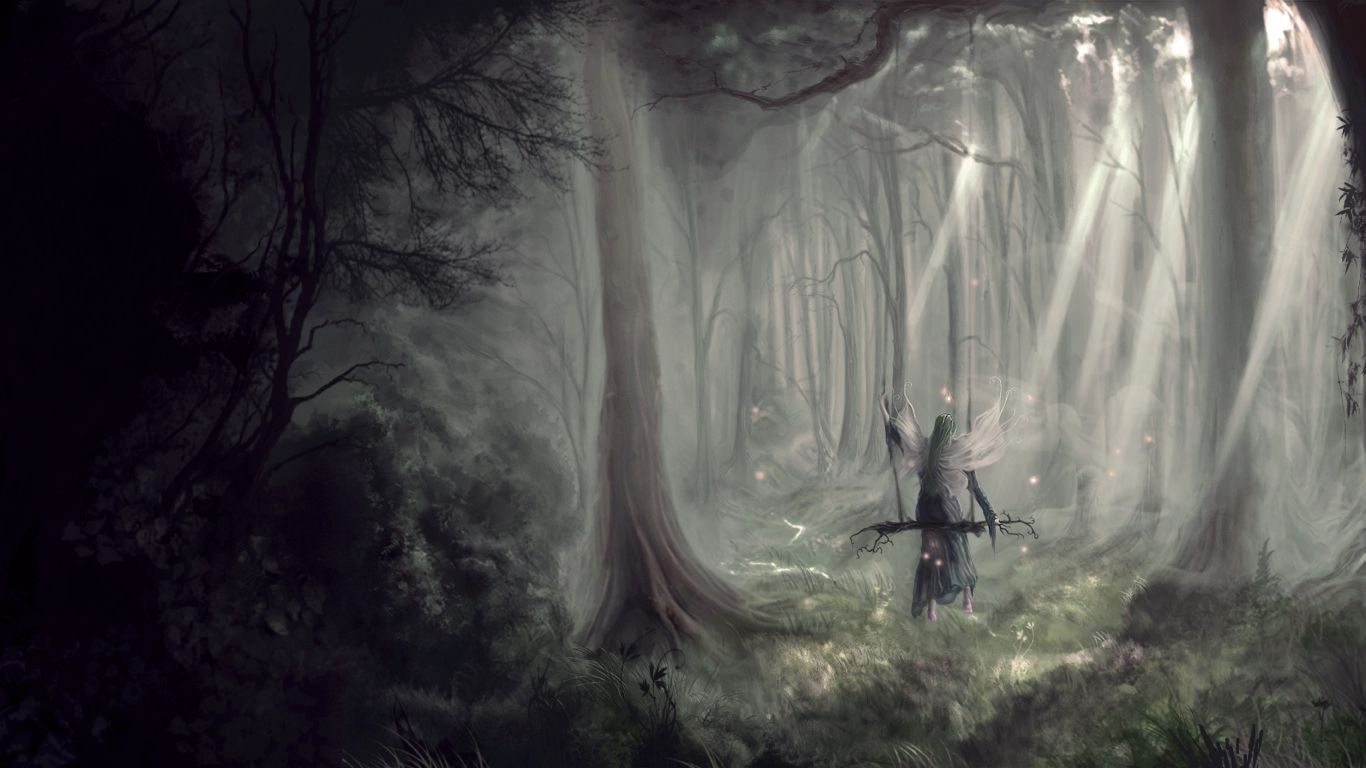
Here, for example, a very old painting of mine. Somehow the figure in the middle was disappearing, so I took the liberty to place some glowing orbs around her, increasing the contrast in the focal area, so the eye would look instantly there.
Maybe not the best example but you get the point, that you can creativley add elements to your painting, that will emphasize your focal point.
Scale
Also a compositional element is the scale of things. It's so important to not forget gving things a relatable scale! Never forget this, really! The cool thing about this, it's very easy and can make a huge difference to your painting, you can easily make your pictures look even epic.
Just place in your scenery something, that is easily recognizable by the human eye, so that a sense of scale can be made out between the environment and those added elements (cars, people, trees, lamps, etc. basically everything, that a human is familiar with).
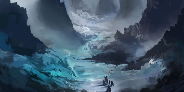
Without the sihlouettes of some people (or other relatable objects) a scenery can be hard to put into scale
That's it for now. The next part will be about the importance of greyscale values and thumbnailing.
See you then and don't hesitate to ask, if something's not clear.