Fanart - Riddick
#fanart
In this fanart I like to not only show it but share my experience with it. Tell you what I've learned since then (2013)

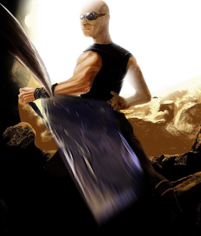
This painting was for an art contest of the movie Riddick. Although I didn't win, the experience from the painting taught me a number of valuable lessons. Lesson #1: Don't spend too much time detailing one area. It's been a habit of mine since I was little, painting a particular area before continuing on the next area. A lot of times it can turn out right, but I've realized that it affected my art style. For example: Roughly around 2008-2011, I could only draw an entire body accurately if I drew the left or right half first. The habit drawing in portions, in the end, wasn't worth it.
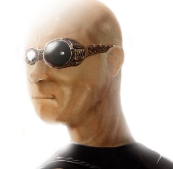
You lose a lot of foundation doing it this way. And in this painting, the head took me a total of 8 hours painting for two days, while the rest of the painting too less than 2 hours and looks less detailed than the head; sometimes this can work well if the most detail area of the painting was "supposed to be" the most important piece of the painting. To this day, I still stare at his noggin and think: "His head really does reflect the bounce light of both the cave and the sunlight!"

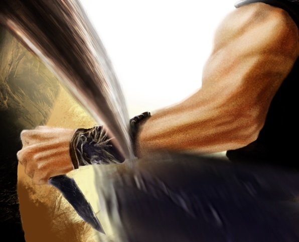
After painting the head, I went to bed. Woke up, and took it into overdrive when I realized that I only had a few hours left to make my post in the contest. I was informed very late about its existence, and 4,000 dollars was at stake. I painted very realistically on photoshop with the head already, and told myself: Might as well paint the other portions of the body realistically... Keep in mind: I only had 2 hours left to submit it. As you can see, I painted the arms, hands, and arm guard as realistically as I possibly could in a very short amount of time. With a sense of lighting, I was able to achieve painting the knife made of stone pretty fast. The claw coming at him in this painting was inspired by the practice made painting that knife, and tried to paint in lights and shadows in a rough manner. Theorizing where light should hit is an important thing to study and try mastering when you do realistic paintings.

With the background added and no time left, I posted all what i had, with ten minutes to spare!
Then life happened: The computer was moving extremely slow loading the page. Keep in mind, I had only 10 minutes left, so I had to make contact with the contest presenter on Deviantart and try to see if I could get this through. Everywhere else on Deviantart was going well, but when it came to submitting this contest entry, it didn't work. It even crashed on me.
Thankfully it made it through. But of course, it did not win.
Lesson learned.
I've came to the realization that realism, or even dedication to details, didn't always equal being even in the top 20 of entries. Sometimes abstraction can be just as important as accuracy, and may vary from contest to contest. A lot like life. In terms of detail, I went so far that if you stare at his head curving above the ear, there's a greenish tan mark (indicating where Riddick has his sunglasses placed from time to time) and sweat reflection on the cheeks & cranium to give the audience a feel that he's in a area that's very hot. Although I learned a good deal about lighting and subsurface scattering, I also learned a greater deal about losing...
Painting description:
The painting gives you a good sense that Riddick is striking a monster by throwing a second knife at it with his right arm with finesse. This all happens while you, the audience, is looking at Riddick within the eyes of said monster.
it look like Abraham Sapien of the Hellboy... :D
Haha. His face does look a bit moist.