A student "quick sketch" followed by some minor watercolors
I have this little trick that I use on my students to try to get their creative side to emerge. Unlike with most other disciplines in life, I feel that art is something that shouldn't be overly planned in many cases. Sometimes the best things come from spur of the moment decisions. If we get too focuses on trying to exactly replicate something we see outdoors or even another picture, then we simply turn into photocopy machines and where's the fun in that?
On one day we had a 5 minute limit for students to roughly draw a scene of their choosing and most students decided to do some sort of structure or a village scene of sorts. We have worked on this sort of thing quite a lot in the past so they mostly feel very comfortable with this.
Unlike times in the past we skipped the part where we used pencil at first and instead went straight for the felt-tip permanent pens. I wanted them to make "mistakes" because I don't think there is such a thing in art. They were giggling as we rushed to get this done in just 5 minutes and it was almost like a standardized test but without the stress.
After they had a felt tip pen outline we reflected for a moment as to what we were looking at and once again I reinforced the fact that it is impossible for them to be wrong and to take this into account when they are choosing their colors. I didn't want them to completely color it in, but instead to just use the color to highlight certain aspects of their drawings.
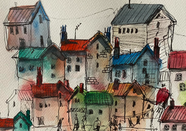
Here are some of the final results

Structurally speaking, this little village is impossible. In my mind that is what makes it so much fun though. We didn't have enough time to put any real emphasis on the people in the pictures so they just end up being little "squibbles." I thought this was just delightful because while we have focused on the complexities of the human body and in particular their faces, I don't feel as though it is necessary to exactly replicate that. The observer knows that they are people, even though they don't physically represent one. Beauty is in the eye of the beholder and at least to me, this whimsical approach to art is far more enjoyable than one that is so precise that you can't tell if it is a photo or a drawing.

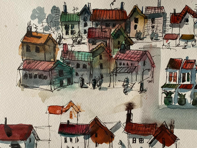
I was delighted to find out that this same student decided to try this process again at their own home but this time he felt inspired to use even less color and to spend even less time on the actual outline. He was laughing as he spoke about "beating the clock" and this just brought me so much joy to see that this kid WANTS to do this in his free time. I feel as though every minute I can get a child to spend away from electronic devices and interact with other aspects of the real world is a win to me.

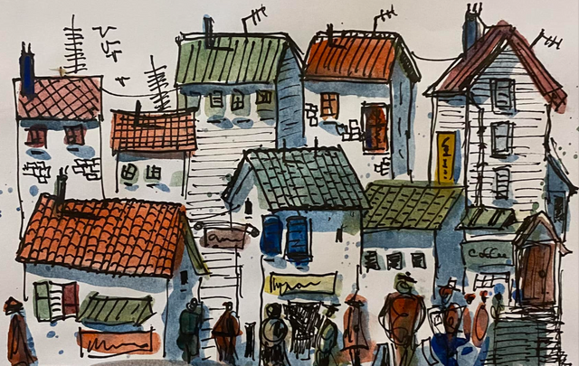
Another student that just happens to sit very nearby the first one had a similar style but with a few differences. I like how I planted the seed of ignoring precise things but to instead just let the viewer have an idea of what they are looking at and let the observer draw their own conclusions about what is going on. I enjoy how one of the buildings is clearly labeled as "coffee" but the others, which also have signs, could be anything because the signs are just more "squibbles."
I feel as though the kids' minds get put at ease when they needn't focus too much on being precise and instead just get to enjoy throwing some paint around. Coloring inside the lines of something that small wouldn't be possible with the materials that we have available to us and guess what? It doesn't need it.
I think these are just incredible and I sincerely hope that these two, as well as all the others, continue to pursue expanding their artistic horizons.
Being an artist doesn't have to be stressful, time-consuming, or expensive. The grand total of the materials involved in what was made above is around 20 cents and the time was around 10 minutes. The happiness lasts a lifetime though and to me, that is what art should be all about.
.jpg)