Wingstop Restaurant Promo Art they hired me to do + process
Hey Steemians! Here is a concept collection of promo art that I did for Wingstop a while back. I thought it would be a good idea to post the process. Enjoy
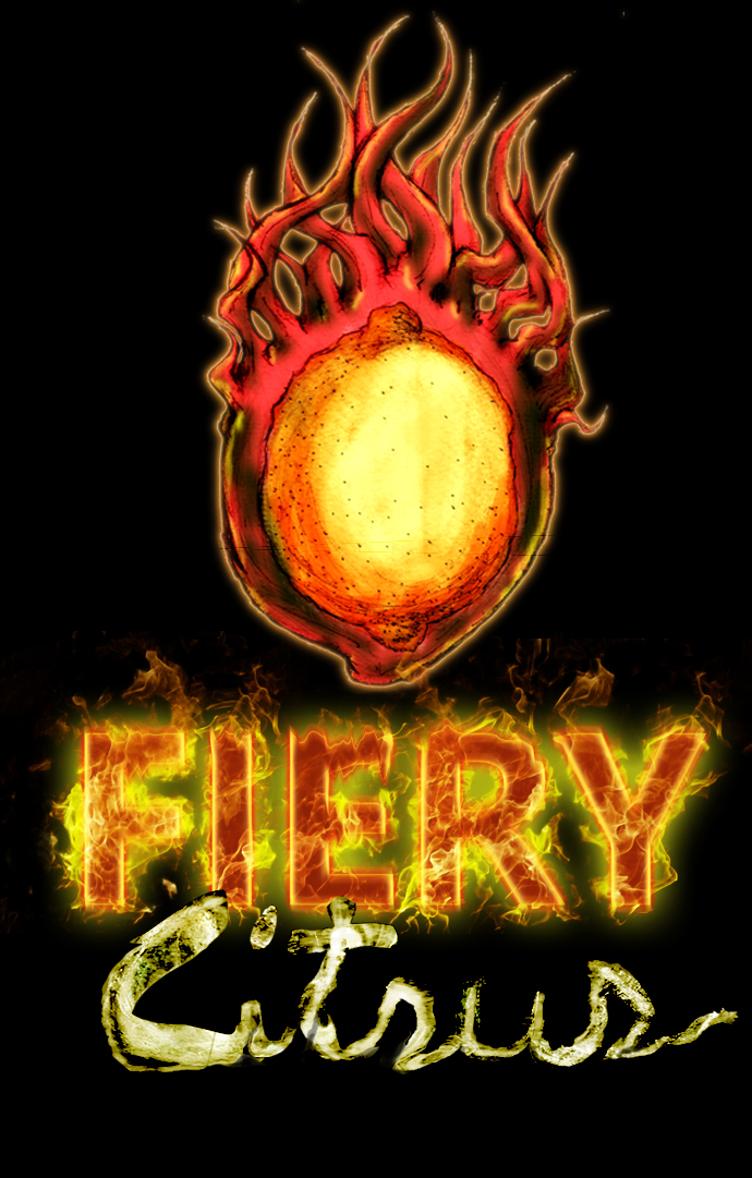
Final
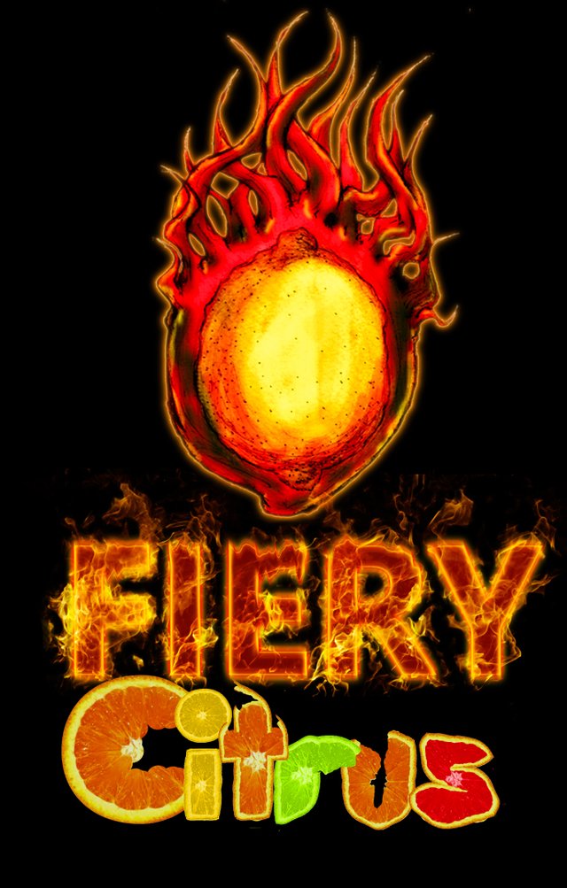
Variant
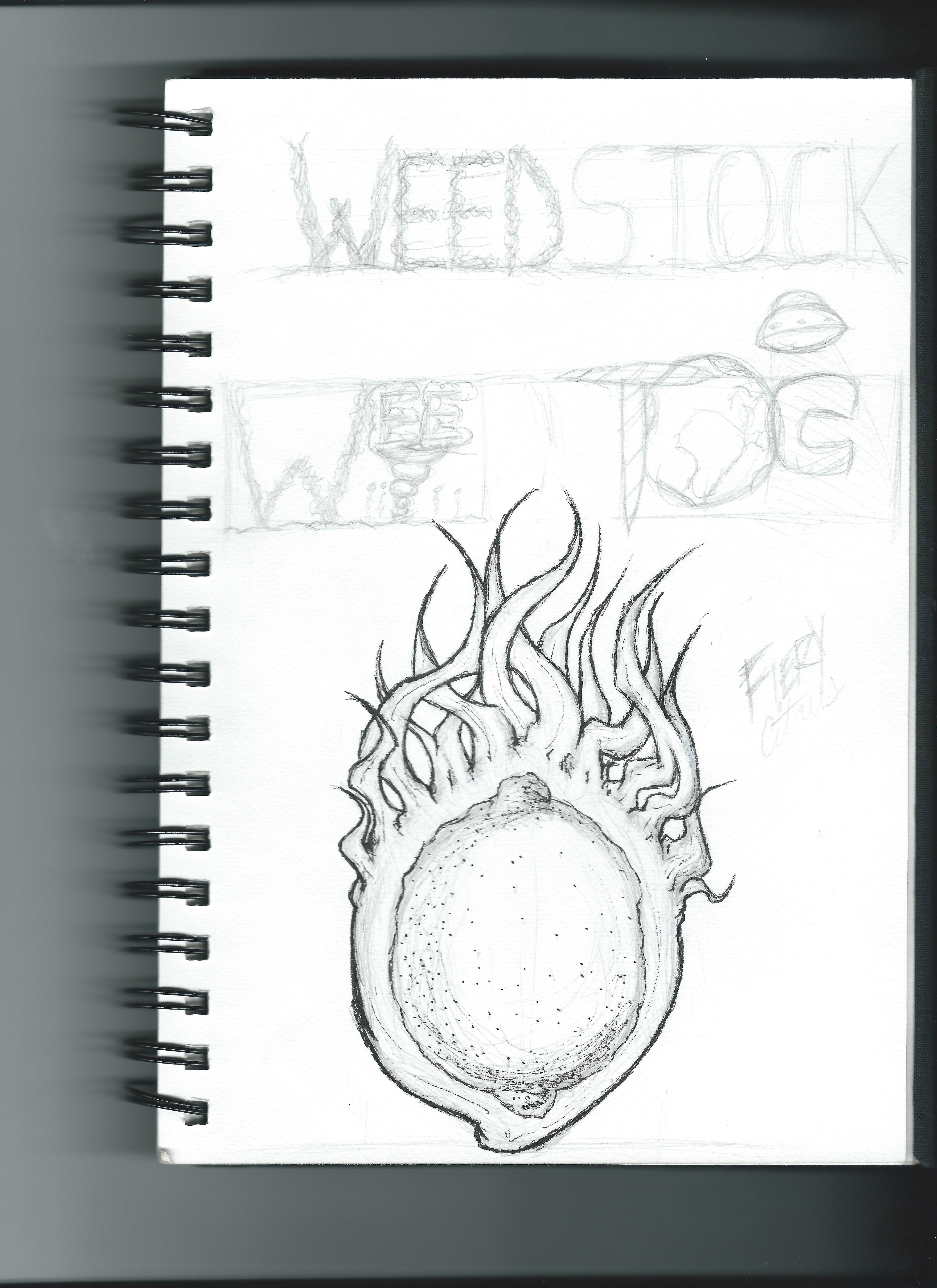
I first started by sketching out the design I want. they gave me two words (Fiery and Citrus) to visualize for their new summer wing campaign. My goal was to bring to life what that would actually look like.
I was browsing the net and based the overall concept on this look

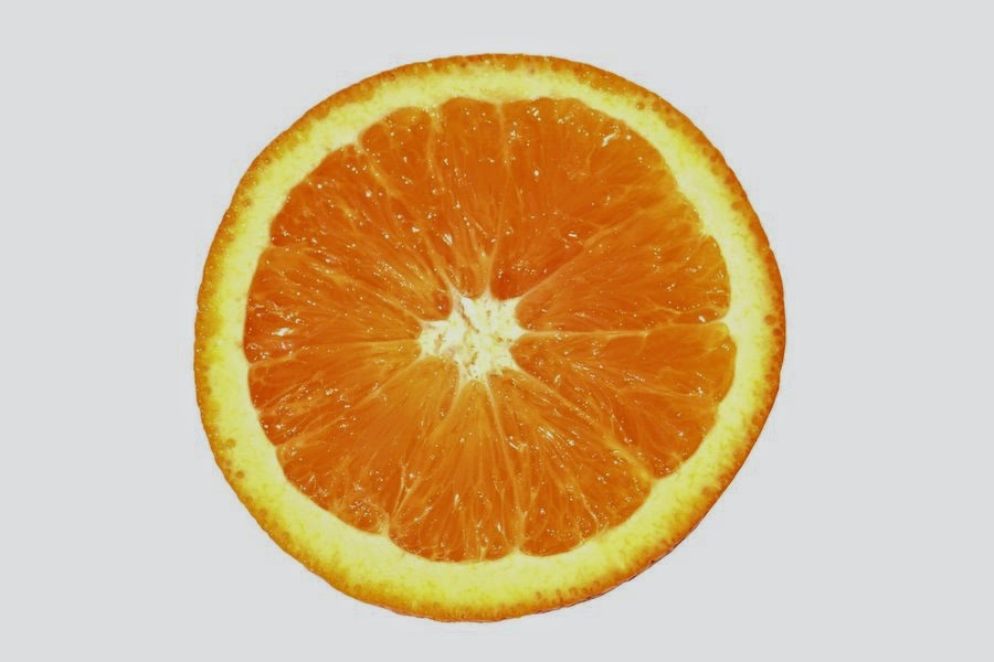
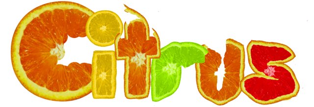
Using photoshop, I imported a bunch of oranges and used a bunch of photo manipulation techniques to create a orange font.
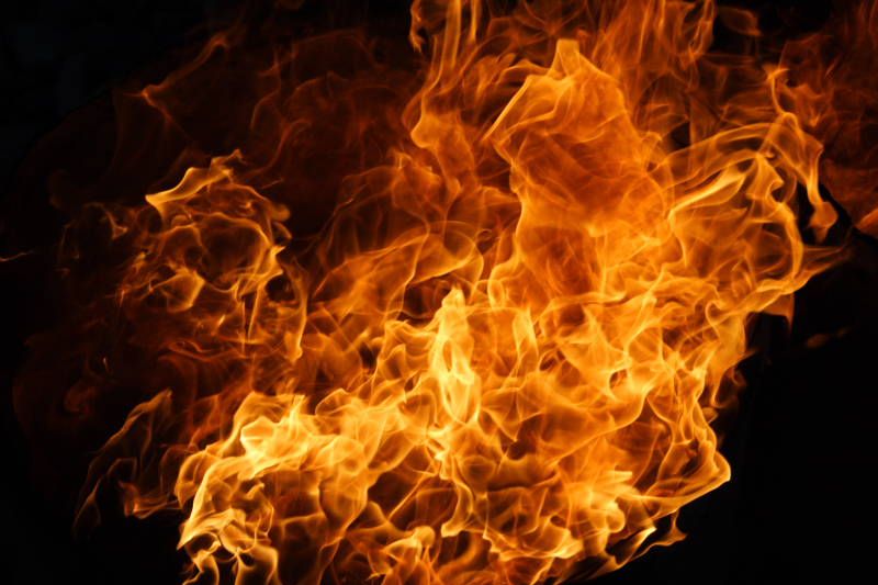
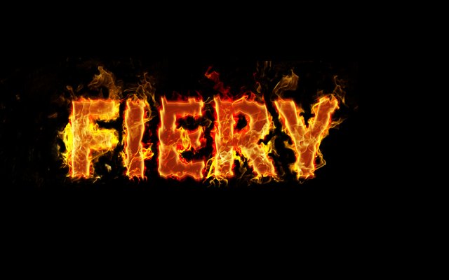
The Fiery logo was created with a regular impact font that I the overlayed a fire image over.
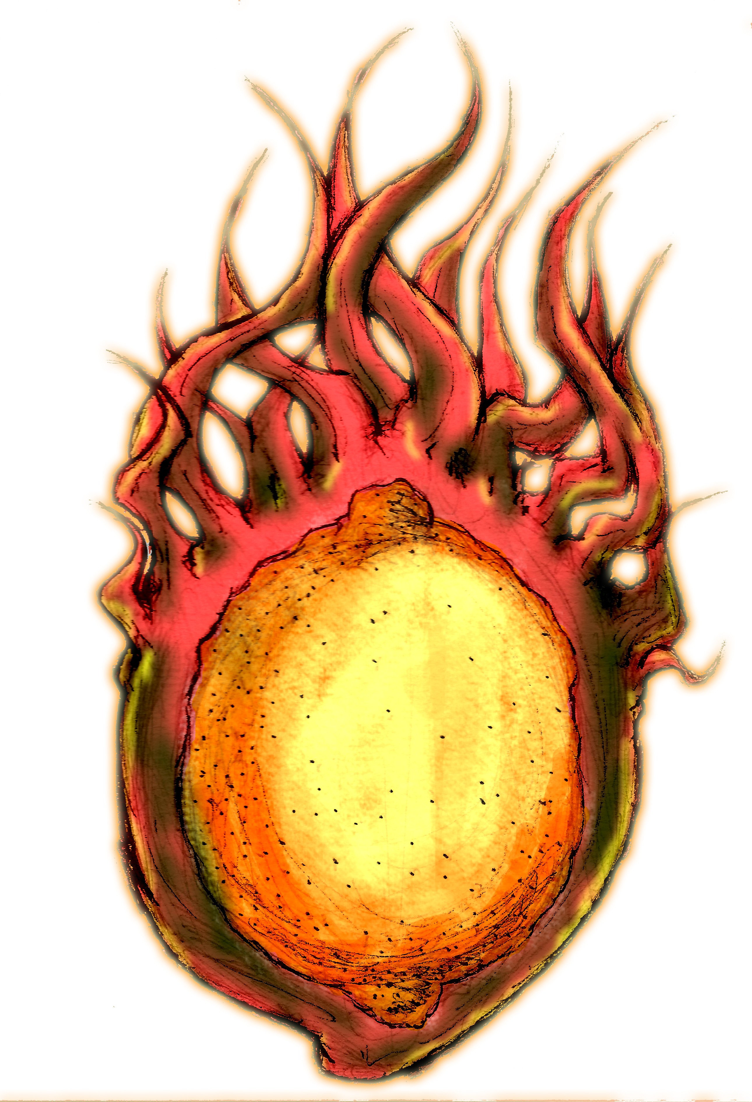
With the main logo, I just toned the sketch and colored it with various adjustment layers.
Let me know what you think of the process!
Awesome post!! Keep it up and check out THIS POST as well as I have something similar.
thanks a bunch!