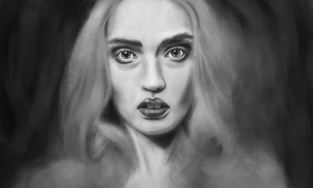
Portrait of Nancy - Digital Art/ Charcoal Sketch
Portrait of Nancy

Right click and select "Open Image In New Tab" to see a larger version of it.
I've been busy with various real life things so haven't been able to post as much as usual.
One of the things I have been busy with is trying to work on this portrait.
It's taken a lot longer than I expected. The final piece is probably composed of hundreds of layers because I still don't have the confidence to do too much on a single layer.
It's also not as large in terms of size as I would have liked. Unfortunately Corel Painter 18 is not as fast as Photoshop so for perfomance reasons it becomes necessary to restrict the size of the canvas (particularly if you are using lots of brushes and layers).
I also kept changing my mind about how much detail I wanted versus how much expression. To be honest I think I could probably keep tinkering with it, but it would never be finished.
I suppose you have to draw the line somewhere. Might be a while before I feel like painting/sketching another one as I am quite exhausted with this.
I still have a headache from staring at the screen.
I'm going to try getting this printed to see how it translates to physical form.
As always feel free to use it in your own posts if you can find a use for it.
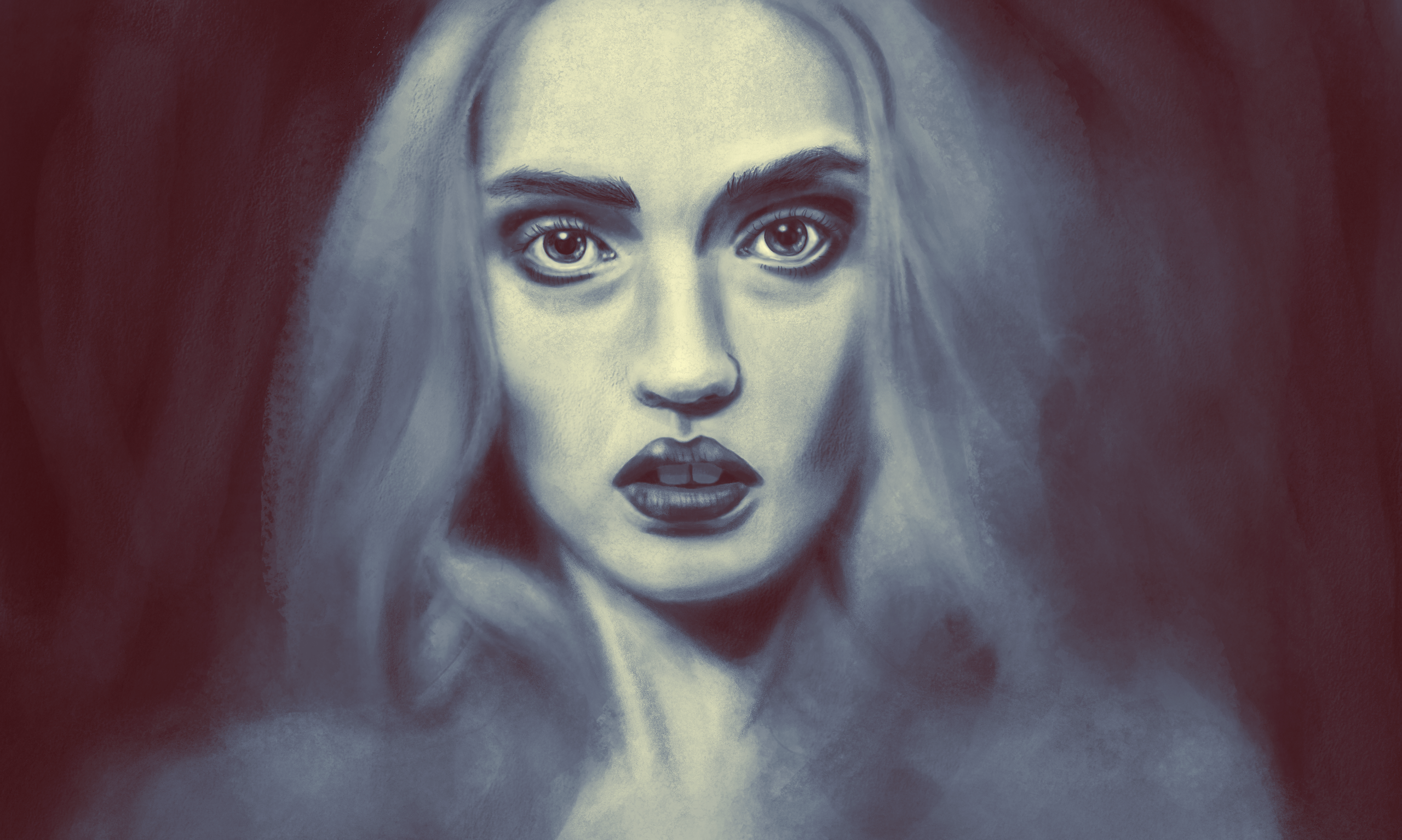
Alternate Version

Right click and select "Open Image In New Tab" to see a larger version of it.
I couldn't help but try tinting the colours in Photoshop. I quite like the ghostly blue tones here. This was achieved using a gradient map layer. Let me know which version you prefer.
Brushes Used
I originally wanted to make the image using just the charcoal brushes in Corel Painter 18, but it didn't give me the look I wanted.
Eventually I added in 3 or 4 more brushes. Here is a quick list of what I used:
- Vine Charcoal.
- Detail Oils Brush.
- Digital Airbrush.
- Wet Sponge.
This is one of the big advantages of digital painting, you can mix together all sorts of media that could not normally be combined.
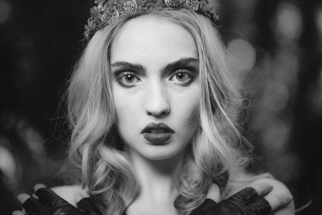
Photo Reference
.jpg)

Wow! you did a good job on this ;-)
The work you did has a very different feel to the photo.
In the photo it is just the model staring at the camera. it doesn't really convey much in the way of emotion.
But for both of your pieces there is a sense of hopelessness, despair, a tinge of fear perhaps.
Well done :-)
I knew you were talented, but not this talented :-)
Thank you so much. I'm so pleased that you liked it. I am honestly a bit scared to post things like this because I am always worried that people may not like it or it may not be good enough.
Don't be scared of what other people might or might not like.
If they don't like it, that's ok. I don't like Brussel sprouts. But that does not stop them from turning up on my plate on occasion. ;-)
If someone posts a comment that is not complimentary or supportive, then their opinion is valueless. They don't have to like it, but if their criticism comes in the form of an attack on you as a person or as an artist then their opinion is not worth the time taken to read it.
What is good enough?
Good enough for what?
Share your work because you want to share it. If you are entering into a competition, then there may be a concept of 'good enough' to win. but if you are saying, 'here is something I spent a bunch of time and effort on' then there is no 'good enough'.
There is just the art that you created.
We could get into the whole discussion on what the purpose of art is, but I'm supposed to be working (although I don't really feel like it right now) so that will have to wait for another day.
I'll keep an eye out for more works of art from you. ;-)
this was a great reply.
I was going to post my own comment to this, but I also have just been saved a couple of paragraphs in it, by your sage advice.
so maybe I'll just glom on to yours.
I have been making art for 40 years and there is only;
that's the one thing there never is
I agree 100% you post what you want to share and then get going again.
no rest for the artistically wicked!
Thanks for your supportive words. You're right of course :)
ok
This is outstanding especially working within the limitations of Corel Painter 18 to make such a lifelike digital portrait.
I definitely prefer the alternate version - it is less stark, but again, it depends on the effect you were trying to achieve.
Your interpretation of the original, especially the tinted version, produces an image that's ethereal and haunting. Is that why you added darker shading beneath the model's eyes? The increased shading certainly made the eyes look piercing.
A skillful piece of work
Thanks:) The shading under the eyes just felt right to me - not sure why!
Wow... I can't believe that this was made digitally. I don't know how it is possible but it really looks like it was made just with a pencil after some tiresome arduous hours. I guess the 'tiresome arduous hours' part is my only correct assumption haha
Hopefully they are able to make Corel Painter 18 more powerful and able to carry out multiple tasks rather than bottlenecking and slowing down as I don't think anyone specifically likes lag.
This is absolutely incredible @thecryptofiend. Definitely close to a real life 1 to 1 and I'm pretty sure that you did do the beauty of Nancy Morris justice with this unbelievable portrait. I think she may want this herself to hang on a wall haha
Thanks for your kind words. Yes Nancy said she really liked it.
You have a talent that I am quite envious of. Your ability to work artistically with a digital canvas to create such realistic interpretations (based on your source photograph) is just astounding. Real talent needs to be praised when it is seen, and you indeed have real talent. Kudos to you and may you continue to create beautiful pieces of work.
Thank you so much :)
I saw this while reading offline
I always check out your page
and for days I thought how come he's not posting
and this is why :D
awesomeness is the word!
You're the first one who's ever pulled it off - digital charcoal sketch - as far as i can remember!
Thanks. Yes it took a lot of time to do this!
but you nailed it to perfection!
congrats!
you're freaking amazing!
Thanks:)
Thank you for sharing this.
You're welcome:)
First one is dark and shadowy but in a strangely flat sort of way, as if she is trapped in the canvas and cares not. The hair is reminiscent of flames with something of the quality of fires you might see in a black-and-white newsreel. The second however, is very gothic, like the cover image of a Victorian ghost story.
Great work in both cases.
Thank you. Very artistic descriptions. I particularly like the Victorian ghost story idea - I actually thought that one looked quite ghostly!
I like the alternative version better for some reason. Both look mighty fine though :) Can those with Photoshop use the same brushes? I've been dabbling with a photoshop a bit and I'm just now getting in to brusher other than the first one. I guess I need to find these from internet and install them myself?
I think you can buy some of the brushes to use in PS but I haven't used them - I think you need to buy them in separate packs so may end up being more expensive.
Buying digital brushes? What the world has come to! I've heard people are buying memes these days, lol.
But I'll look in to it, thanks.
Well it is basically like a Corel Painter plugin for PS so you can use the same kind of brushes but it is more limited.
There seems to be sites dedicated for PS brushes. I'm sure I'll find few to my taste, importing seems easy and fast.
OK I thought you meant the Corel brushes. They are not the same as regular PS brushes.
"Striking" is one word to sum up the initial reaction of seeing this beautiful drawing. This is a beautiful drawing with wonderful layers of emotion. This is my musical interpretation of @thecryptofiend 's beautiful piece. I hope you enjoy listening as much as I enjoyed interpreting it :)
I take no credit for @thecryptofiend 's beautiful work. My music is just a reaction to seeing his work. Much like one would write a poem after viewing the "David" statue or paint an image after coming home from seeing Shakespear.
Thank you so much. That is so very kind of you:) It is beautiful I'm blown away that just a drawing I did could inspire such beautiful and emotional music. I feel there is some melancholic tones here, perhaps loss or longing. It is beautiful. Thank you again:)
My pleasure. I was looking at the drawing as i played and the music just shapes itself. There are emotions at play when that happens but it is almost impossible to articulate them. Music, and visual art has a way of articulating the mysterious :) I am so glad you liked the music. If it is ok with you i may do more in the future:) im following and looking forward to more of your art.
Cheers my friend
Bucky
Nancy Morris is georgeous in all ways, even in your "mysterious " way :) and digital versions. Put a little bit of pink tint and she might become alive again 🏄🏻♀️
Lol thank you:)
intense life in black an white
dark as night
but still bright
from the inside
This women is magicly strong
knows right from wrong
and how to survive
the dark side of life!
Thank you for shing this beauty !
You're welcome. Impressive poetry skills.
OK I'll give you my honest review of your work. You are obviously very talented I can see that but the mouth just isn't right at all, I have looked a few times I can't quite put my finger on it but it doesn't feel right to me. The eyes are brilliant but I think the wispy hair makes it more ghost like, which someone else mentioned. Maybe that effect makes her a little scarier than the photo. But well done you have a great talent for Art.
Yes the mouth was a problem not sure why redid it several times but it is a matter of practice I suppose.
I keep looking at this I think its the teeth rather than the mouth, the lips are fine I think the teeth are a little too defined, of course I am judging against the original photo and I am being a bit harsh I think, just was my original reaction to it. The more I look at it the more I like it, so I guess that says something :)
I think they may be too bright but it is not just you. I kept redoing the mouth and teeth. The first time it was all too bright. Then I dulled it down and it looked too dull I think it is a matter of experimentation ! I even tried using the eyedropper to select actual tones from the photo for the teeth and it just didn't work it looked like she had dirty teeth. So I'm still not sure what it is - I think I would need advice from someone who has more experience in these things. Anyway I had to stop tinkering with it at some point otherwise I would still be messing around with it a year later!
I could give you a few pointers if you assure me you really want them.
I mean you did a good job, but fresh eyes allow for seeing things that we can't see ourselves because we are so close to the thing, after all those hours.
Portraits of specific people are always harder than doing a generic person, but the things that are troubling you are mostly generic. IMHO
I hope you understand what I mean.
Let me know that you would like to know what I am seeing as faults which I would keep to myself otherwise.
Because you did a great job at it and I would hate you to think I mean otherwise.
big hugs