@ArtGuildPH Banner Making Contest Entry
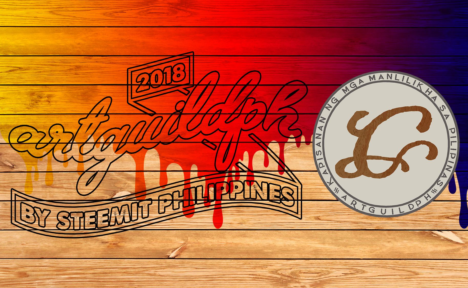
I hope its still not too late for my entry, below will be the step by step procedure on how i made this banner. I had Adobe Photoshop Lessons on my 2nd Year of Junior High School, and im still refreshing now all the things that I learned before. Im still not a proffesional in making graphics arts like this so im willing to accept any suggestion. So to start:
Software used:
Adobe Photoshop CC 2017
Step 1:
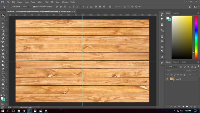
I added a wood backgroud. Source image from: Here
Step 2:
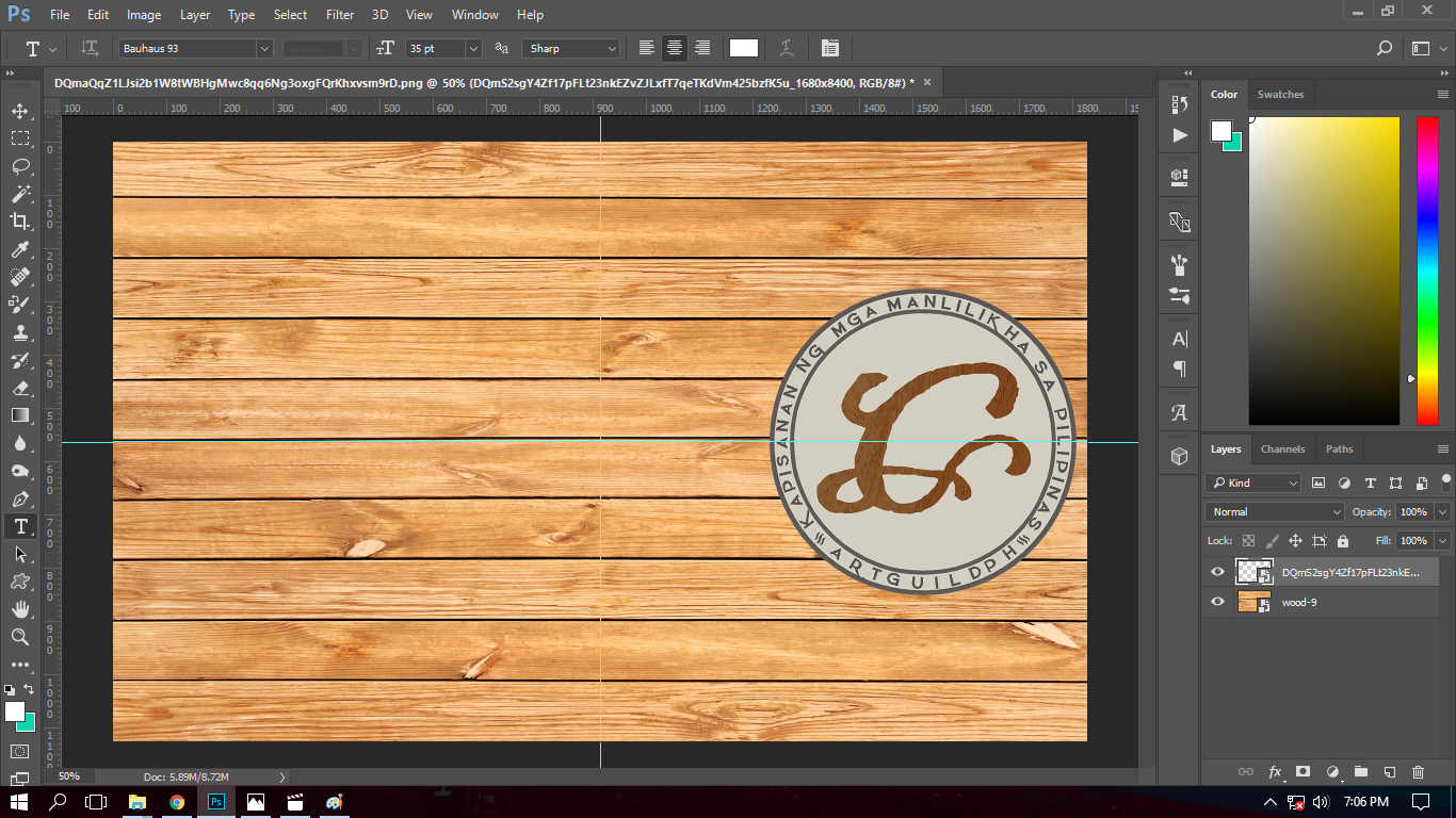
I placed the official logo of the artguildph on the right side of the banner.
Step 3:
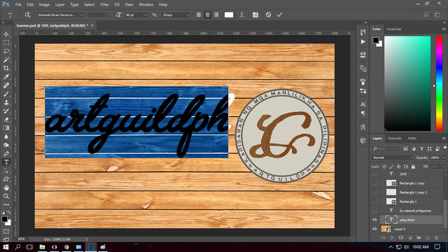
I added the the text "artguildph" with the font style "Granada Blues" with a font size of 80pt.
Step 4:
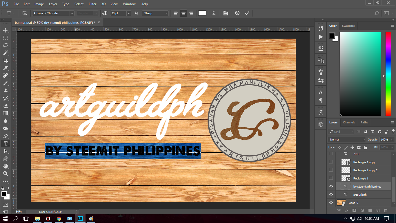
I added the text "BY STEEMIT PHILIPPINES" with the font style "A love of Thunder" with a font size of 23pt.
Step 5:
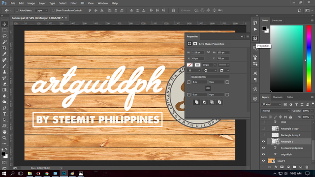
I made a rectanglular box using rectangle tool with a stroke of 10px.
Step 6:
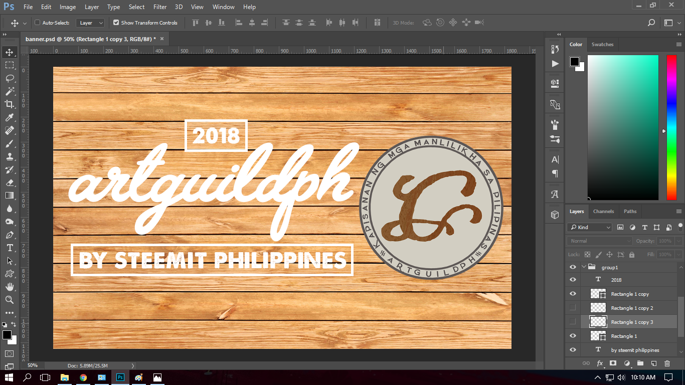
I added the text 2018 and placed it in a rectagular box (duplicate of the first) with stroke same as the last step.
Step 7:
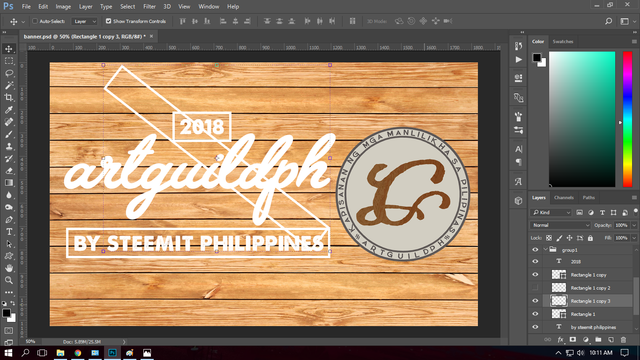
I added a new duplicate rectangular box and positioned it diagonally to connect the two rectangular boxes.
Step 8:
Using the eraser tool I erased the extra lines.
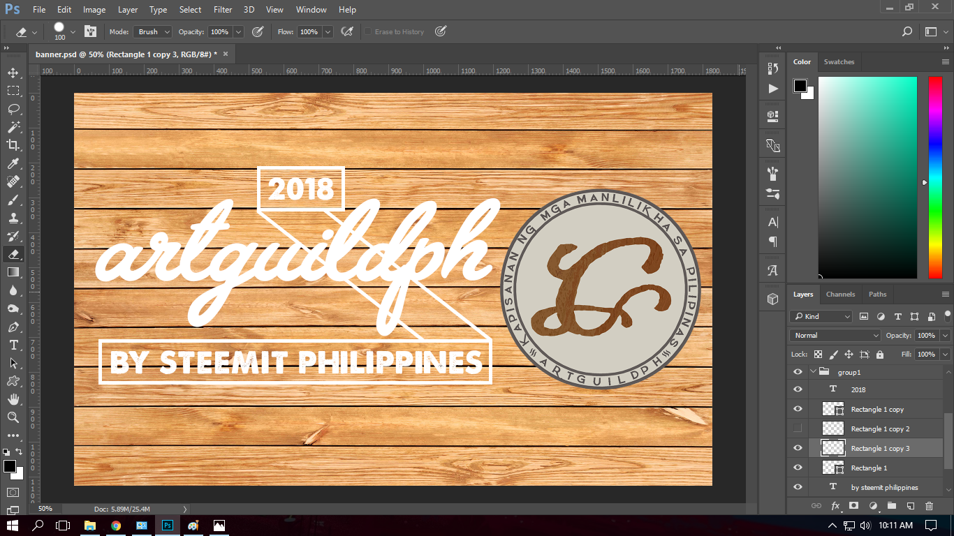
Step 9:
As you can see there are lines at the back of the text, so to emphasize the text I erased some lines of the diagonal positioned box.
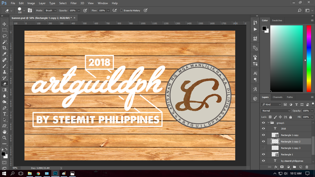
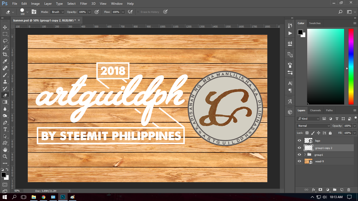
Step 10:
I selected all layers and made a group from it for backup purposes,then I duplicated another group and merged all the layers.
Step 11:
Using the marque tool I, right click on the merged layer then select warp, then I set the warp style to flag.
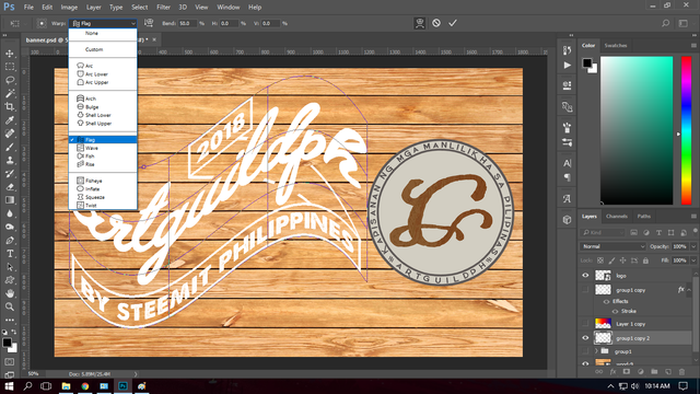
Heres how it will look after using warp.
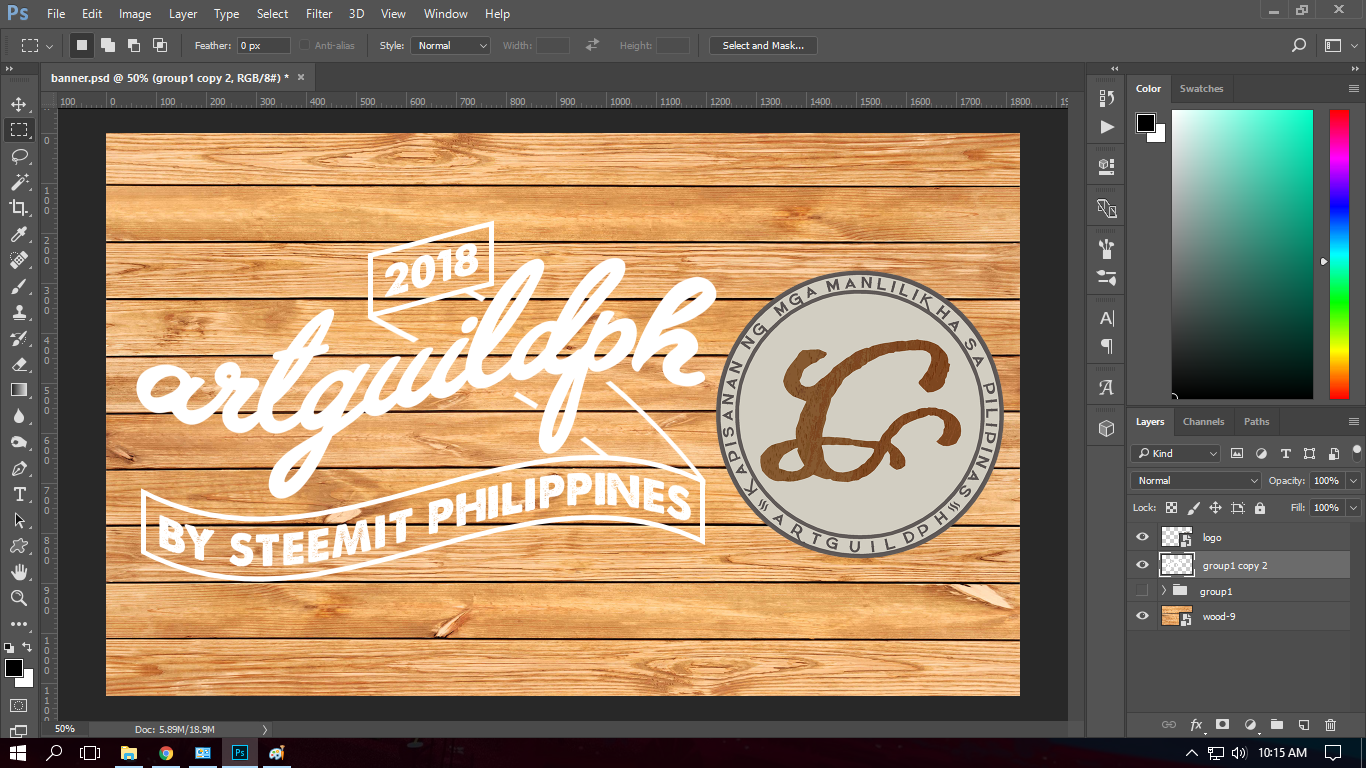
Step 12:
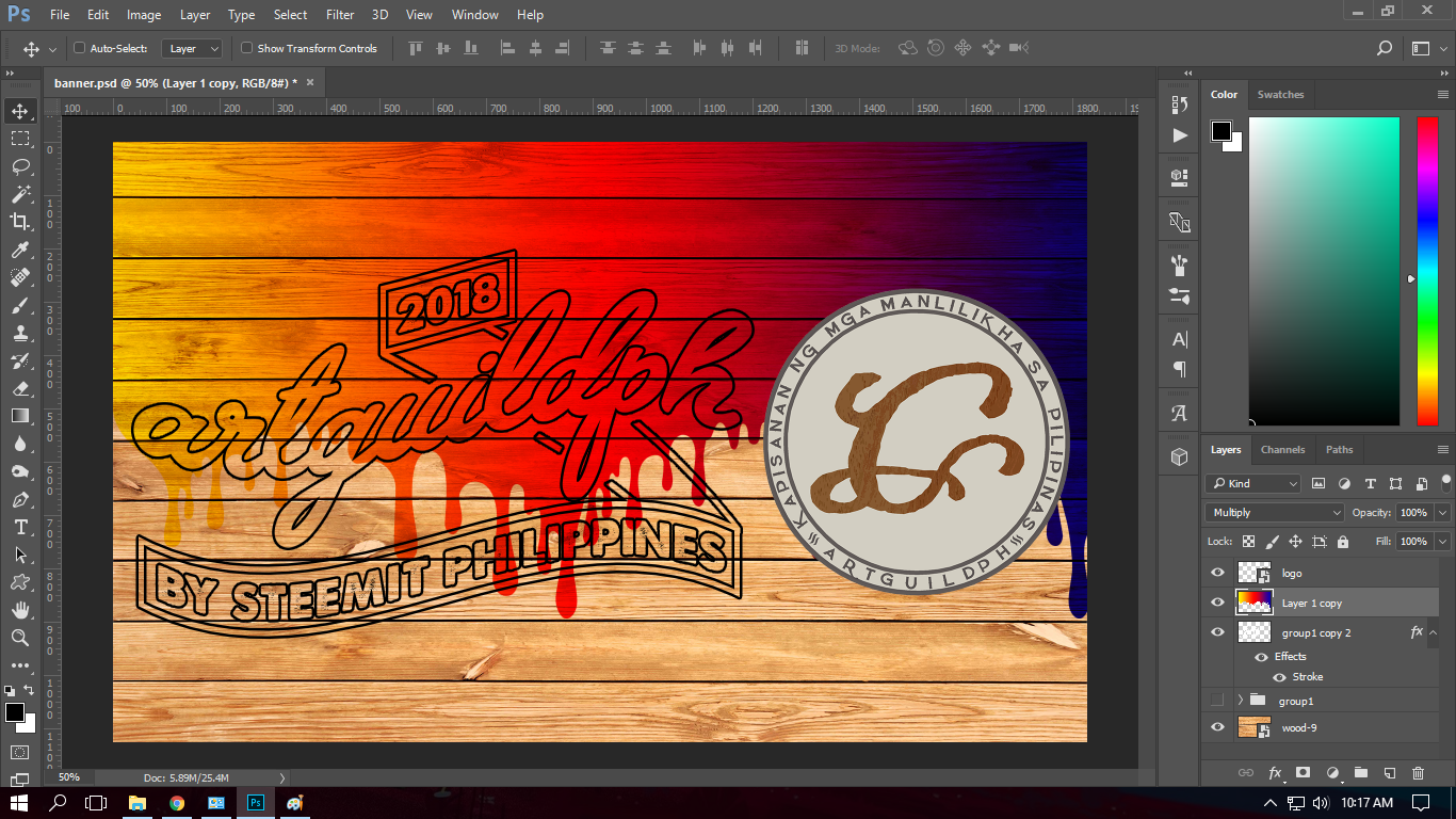
I changed the blending option to Multiply to have a wooden effect on the text, to make it more clearer and emphasized I added a stroke with size of 5px.
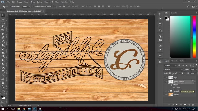
Step 13:
For the backdrop I'll add a dripping paint effect.
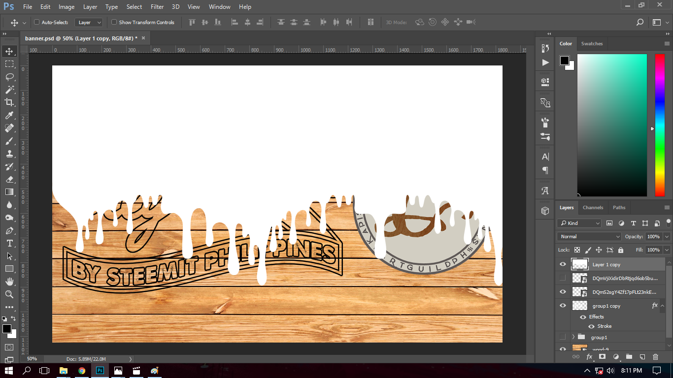
Step 14:
I moved the layer to the background then I added a gradient overlay, with colors yellow, blue and red to symbolize the Philippine Flag and my dedication for my country.
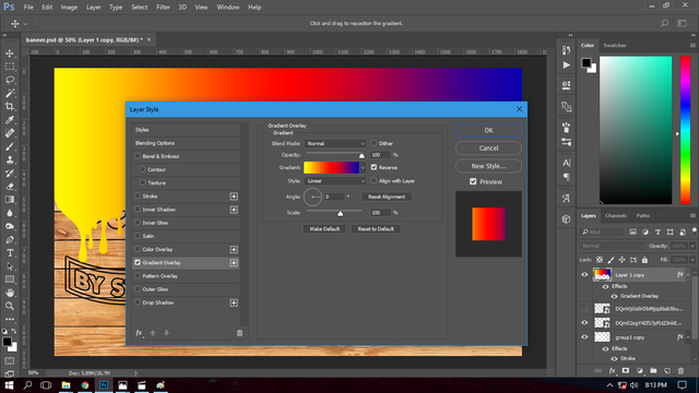
Step 15:
Lastly, I changed the blending option to multiply to retain the wooden effect of the backdrop.
And here's the how it will look when its finished.
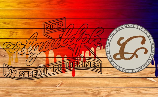
Because of the wooden backdrop, I thought of retaining its texture to have a unique look. Thanks for your time reading about my entry. I put to effort in making this, I hope you like it.
Special thanks to @steemitfamilyph for making me this footer.

Post was updated due to my confusion, instead of writing artguildph I had written artguideph, thanks to @eceninzz for noticing my error.
Best Regards,
@baa.steemit
Congratulations @baa.steemit! You have completed some achievement on Steemit and have been rewarded with new badge(s) :
Click on any badge to view your own Board of Honor on SteemitBoard.
For more information about SteemitBoard, click here
If you no longer want to receive notifications, reply to this comment with the word
STOP