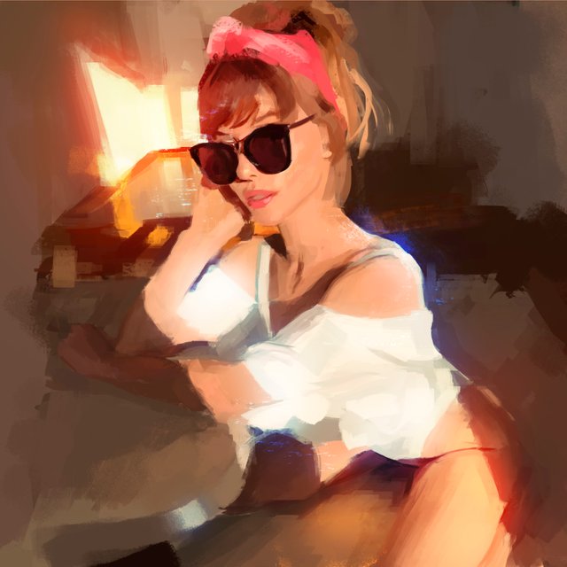
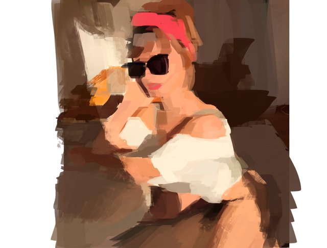
Another lighting exercise and Some details on photoshop.

Hello everyone! I hope each of you had a great weekend
I'm sharing this quick exercise that i've made because I think its kinda cool! I bet if you're working on illustration and digital painting, light it's one of the most complex task, beside of composition and proportions and an endless list of things to tame before having a decent result; lighting it's always there trying to beat you.
That's why I'm always trying to pick references with a very very dramatic light with high contrast and that touch of sunset helps me warm a little bit the painting. Also I exaggerate this features to hide things that I can't control yet or things that I do not have enough knowledge to apply them (Like depth of field on this one; In fact if you have been followed my work you will have noticed that most of my illustrations have no background, the lack of this skill has become part of my style).
How do I get this cinematic result? Blend modes, you can select highlight areas, them create a new layer, fill the selected area with the bucket tool and difuminate it with gaussian blur, change the blend mode of the layer to "Divide" you will have to try several times with different tones before getting one that match with your palette. I made this twice in this illustration: Blue on the clothes and orange on the wall and legs.
Natural lighting

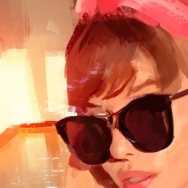
Some details.

Model: Paulina Shafir
Go to try this easy trick and let me know your thoughts on the comments.
If you have some easier way to perform lighting let us know!
Have a good week!
(English it's not my native language so pardon any missing details on writing or any kind of grammatical errors).