Crypto Trading 101 : The Moving Average Convergence Divergence
Simple trading methods like the trend-following approach work best when trading cryptocurrencies or financial markets in general.
While several technical indicators help identify changes in the strength, momentum, and duration of a trend, none are simpler and more widely used than the Moving Average Convergence Divergence (MACD).
By definition, the MACD "turns two trend-following indicators, moving averages, into a momentum oscillator by subtracting the longer moving average from the shorter moving average."
Since the MACD is a "trend following" or "lagging" indicator, it trails pricing events that have already happened in order to gauge the strength of the current trend.
Like with most indicators though, money is made by understanding how to use the indicator rather than how it works, but it's worth explaining the inner workings of the MACD so you get an idea why it is such a beloved indicator.
Constructing the MACD
There are three main components to the MACD indicator: the MACD line (blue oscillator), the signal line (orange oscillator) and the histogram.
MACD line is made up of the 12-period exponential moving average (EMA) minus the 26-period EMA.
The signal line is the 9-period EMA of the MACD line.
The histogram plots the difference between the MACD line and the signal line.
Ways to interpret the MACD
The explanation may be hard to wrap your head around, but the MACD is one of the easiest indicators to use because of how simply it's data is visually represented.
The Cross
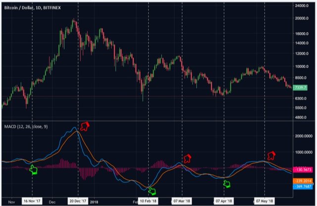
When the MACD crosses above the signal line, it is known as a bullish cross and when it crosses below, its known as a bearish cross. The crosses indicate a shift in trend momentum and represent buy or sell signals depending on the type of cross.
BTC/USD Daily Chart
As can be seen, MACD crosses tend to provide confirmation of a trend change, at least in the short term.
For example, on November 16, 2017, the MACD line made a bullish cross above the signal line, presenting a buy signal. The MACD stayed above the signal line for over a month when the rice went on to rally more than 150 percent before its next bearish cross. The bear cross occurred on Dec. 20, 2017, which signaled a bullish-to-bearish trend change.
It's recommended to use the MACD in conjunction with other indicators like volume, RSI or price action because like any indicator the MACD is not 100 percent accurate and can give off false signals.
For example, the bullish crosses in January and March were relatively flat and failed to stay above the signal line for very long, resulting in short-lived price rallies and poor buy signals.
Overbought and Oversold
The MACD is great for identifying possible changes in a trend. But it can also identify overbought or oversold market conditions, as we'll explore below.
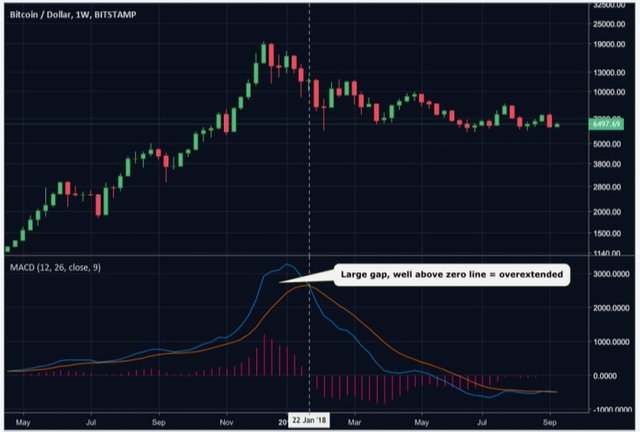
The conditions are presented when the MACD and signal line separate too far away from both one another as well as the zero line.
BTC/USD Weekly Chart
As can be seen, the MACD line began to stray noticeably far away from the signal line in December of 2017. Also at this time, both the MACD and Signal were well above the zero line.
The combination of the two warned investors that the surge in price action was causing over-extended market conditions and a pullback was becoming likely.
Zero line/Histogram
The zero line marks the midpoint of the MACD oscillator. When the 12 EMA crosses above the 26 EMA, the MACD crosses above the zero line, presenting a buy signal. Conversely, when the 12 EMA crosses below the 26 EMA, the MACD crosses below the zero line and presents a sell signal.
The histogram (pink bars) quantifies the distance between the MACD and the signal line. The histogram prints a bar above the zero line when the MACD is above the signal line and prints below when the MACD is below the signal line. The size of the bar depends on the how great the distance is between the two lines.
As you can see in the above chart, the histogram reaches its highest level when the MACD is at its farthest point above the signal line, implying the rally is becoming overstretched.
Once the pullback occurs, the bearish MACD cross and histogram retreating below the zero line cemented the trend in bearish favor.
Conclusion
The MACD is a great tool for the trend following traders, whether you're a beginner or a professional.
It depicts buy and sell signals simply by the crossing of two lines, so even the most novice traders can quickly become comfortable with the tool.


Nice content. Follow me, Check my blog Upvote and Comment. And I'll do the same. Thanks.
Follow me too
Hi! I am a robot. I just upvoted you! I found similar content that readers might be interested in:
https://www.coindesk.com/crypto-trading-101-the-moving-average-convergence-divergence/