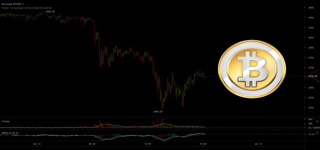
BITCOIN - Today's Chart Figures - Support/ Resistance -Before It Happens
Knowing Bitcoin's price movements before they take shape can provide you remarkable trading opportunities. As I discussed earlier, I will be providing to everyone the chart line figures for Bitcoin for the next trading day, as early as possible, so that you can track it yourself in real time.
In my first Bitcoin article, found HERE, we covered the basic understanding of how this powerful Algorithm provides the Zero Point, Upper and Lower Lines and how they operate. If you haven't read that as an introduction, I suggest you take the time to read that so you will have the necessary understanding on how to apply these figures.
The crypto currencies have been going up lately in a dramatic fashion, and using this technique during times of brand new price action is where you will see the most dramatic realization of its accuracy, as it will be evident that there are no lines being drawn from existing price points. These points are independent from any existing chart patterns, they search for its true fair value and its internal capacity to move in any particular direction targeting its support and resistance levels, before they take shape.
Just like the Dot Com stocks, big moves usually have a maximum range before an inevitable pause or bounce. This pause can provide a sideways move or proceed to the next level. These upper and lower lines can assist you in projecting where those opportunities will be ahead of time.
Every stock or Crypto currency has there own internal critical mass and range that forces it to pause at certain levels each day. Like a stretched out rubber band that can only stretch to a certain point without breaking, depending on its size and thickness, so to does the underlying instrument your trading. If you know ahead of time where those prices will be, then you can anticipate the bounce as you watch the price action at those areas.
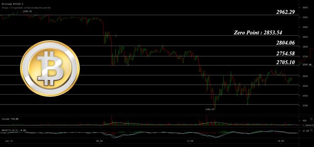
You should pre-draw these lines on your charting software, before you trade. Look at the chart above as a guide. Use them along with you other TA tools, then ask yourself the following:
- Did the price react at a particular line?
- Did it plunge right through it?
- Has it successfully bounced off a particular line and now moving sideways?
Think about when you should begin plotting lines in between the major price lines by dividing by 2 until you trap the price movements, this will allow you to trade in and out as many times as possible before others realize a trend has formed.
Getting in early on a bounce removes some of the risk and allows you to profit sooner by getting out before it hits its next price line. Try it out by first 'paper trading' this technique until you are comfortable and confident in using it. I will continue to post these figures as often as possible. If there is a big high flying stock you want to test it on as well, just shoot me back the symbol and I will get you the numbers on that as well.
Here are the figures for June 13:
Zero Point: 2853.54
Upper Lines: 108.75
Lower Lines: 49.48
(Remember just keep subtracting the same Lower line number from the last number like this: 2853.54 - 49.48 = 2804.06 then again 2804.06 - 49.48 = 2754.58, as many times as needed. Also divide the Upper and Lower by 2 if needed so that 49.48/2 = 24.74 and 24.74/2 = 12.37 and so on.)
Let me know if you have any questions.
Enjoy!