Ripple Looks Ripe for a Reload of the Shorts
After making the bold (and nearly 100% accurate) claim that Ripple would backslide by nearly 20% in value, this article shall serve as a follow-up of sorts to that claim in order to attest to its veracity (or lack thereof).
The claim in specific has been successfully archived on TradingView here:
https://www.tradingview.com/chart/XRPUSD/6IztJNTJ-Ripple-Looks-Primed-For-a-20-Decline/
Thus far, Ripple is down 14% from the price that it was when this original price analysis (advocating for an aggressive short position) was originally crafted.
There is a R/R on the trade that describes the exact targets and S/L for the trade here as well.
The purpose of this analysis will also be to see whether there needs to be any adjustment in the trading strategy that was prescribed in this article in order to preserve maximum security for consumer funds.
Ripple Price Analysis
https://www.tradingview.com/x/vUzhSbxW/
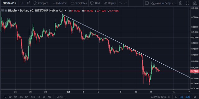
From the very first picture, the strong and demonstrable downtrend on the H1 chart (1-hour time frame) should be fairly obvious. ‘

https://www.tradingview.com/x/PDD8rY5Z/
Each translucent blue box in the picture above represents another instance where the price failed to break above the overhead diagonal downtrend resistance.
As credible trading theory dictates, the repeated testing and failure to break above the diagonal downtrend resistance should be seen as a reinforcement of the overhead downtrend resistance as an increasingly strong entity.
Again, it is worth noting that this formation has taken place on the H1 chart.
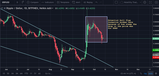
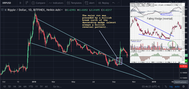
Brief Look at Chart Formations
https://www.tradingview.com/x/SmXswU5s/
https://www.tradingview.com/x/fCczaAiu/
Let’s Scroll Out to Larger Chart Resolutions
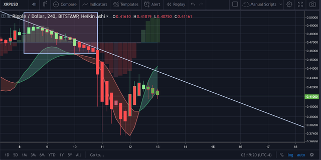
Below is the Zero_n0ncense Reversion Ribbon V2 on the H4 :
https://www.tradingview.com/x/skBsqacw/
In the picture above, there are a few things of note:
- The ZN Reversion Ribbon V2 has been applied to the chart. This is a custom indicator (i.e., you cannot add this to your TV chart without my express permission at this point in time; give it another day or so).
- This indicator essentially acts as an indicator and an EMA reversion in one.
- The fact that the last three candles have a heavy green fill in with a red outside (showing that the red candles have been candled), means that there is strongly waning buy pressure (if any at this point).
- In addition, there seems to be a slight convergence of the Histogram, which would corroborate the assumption that the gains that are being experienced in the markets at this current point in time are larger temporary in nature and not an indicative of a general ‘bottom’ in the market (although there are numerous accurate contemporary examples that can be made).
To wrap it up, the indicator is still flashing off bearish signals.
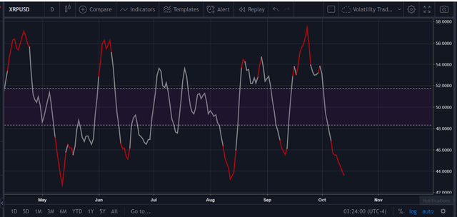
However, here’s a potentially bullish indicator that can be spotted on the daily charts for $XRP.
Zero_n0ncense Balance of Power RSI (14)
https://www.tradingview.com/x/DRrUbnia/
On its face, you read this indicator the exact same way that you read the regular RSI, but with a twist.
With this indicator:
- The purpose of this line is to track the underlying momentum of the Balance of Power indicator.
- The Balance of Power indicator is designed to track buy and sell pressure, not necessarily price action (the normal RSI can track price action).
- Thus, the Balance of Power RSI provides a means of tracking the momentum of a cryptocurrency’s underlying buy and sell pressure by smoothing the data from the basis Balance of Power indicator, then subsequently and accurately plotting its momentum by using past price data.
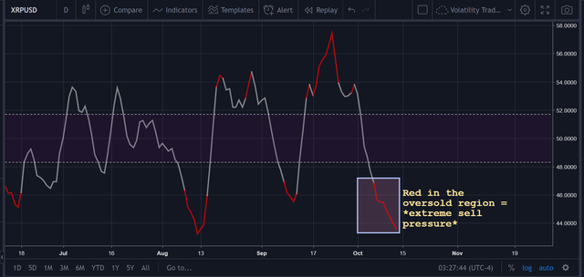
https://www.tradingview.com/x/GK4CdLVa/
What is noteworthy about this indicator is that what the line is literally telling us is that there is still no relief in the underlying buy pressure for $XRP.
Now, let’s check out the line on a smaller time frame than the daily to see if we can detect any individuals beginning to accumulate $XRP at some of the levels that it has been over the last couple of days or so while the price action has stabilized.
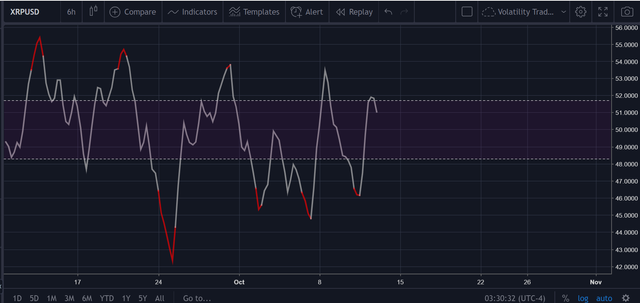
https://www.tradingview.com/x/N3WGoCyz/
The picture above shows the Balance of Power RSI on the H6 chart.
From the data above, it is hard to conclude that there is any underlying trend in the price that can be biased toward buying or selling.
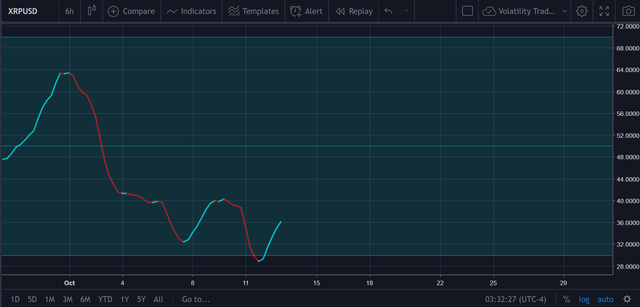
Volatility RSI
https://www.tradingview.com/x/AaNUM9co/
The volatility RSI is yet another custom indicator was designed with volatility as its basis, rather than the price.
Thus, as the line nears the bottom, so does volatility.
The theory behind this is that volatility generally increases substantially as the price increases (in this bear market), and, as such, when the line is headed upward, so is the general price of the underlying asset that this indicator is tracking volatility for.
Thus, from what we can see in the picture above for the H6, the volatility may be very close to ‘bottoming out’ in a short-term sense.
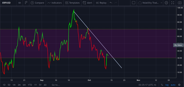
https://www.tradingview.com/x/xzNTaYes/
As can be seen in the picture above, the RSI(14) gives us no information that is useful for us to work with on the H6, so let’s pan down to a lower time frame.

https://www.tradingview.com/x/KtgYCBKp/
The same can be said of the H3 as well.
Overall, however, the RSI(14) is reflecting a bearish trend that is yet to be broken on the H3 and above, which is still very bearish overall.
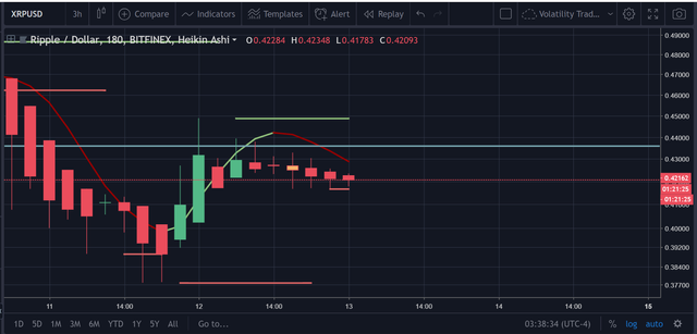
Aggressive Moving Average Indicator (Custom)
https://www.tradingview.com/x/9Tqo9NHY/
In situations like these where there appear to be no indicators on the chart that are capable of assisting with the rendering of a predictive analysis, I tend to rely on the ‘fastest ‘ indicators that I have.
In this instance, that would be the aggressive MA, which is a custom indicator that is infused with a plethora of mathematical calculations and price signals with the purpose of curating the fastest signal.
As one can see from the chart above, this ‘super fast’ indicator has provided a sell signal.
Support/Resistance Points
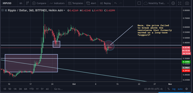
The most obvious sighting can be spotted directly on the chart itself:
https://www.tradingview.com/x/t2YhgV3M/
Above, the overhead resistance that is shown was actually formerly a major point of support.

https://www.tradingview.com/x/ZAkazICA/
Therefore, the theory that I have is this:
It seems as though the price of Ripple is merely re-testing the overhead resistance point before it continues downward.
I say this because;
- There is nothing in the underlying indicators to suggest that this is a true reversal.
- The failure of the price to actually break above this overhead resistance which, once again, was a major point of support in numerous instances prior is another major red flag.
See below to see what I mean:
Using a set of pictures from the site, https://dailypriceaction.com/friday-qna/should-you-wait-for-a-retest-following-a-forex-breakout , I will illustrate my point:
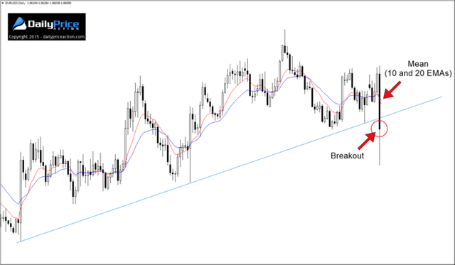
The scenario that you see above is one of a typical ‘breakout’ where the price has just plummeted through a solid and well-tested uptrend support.
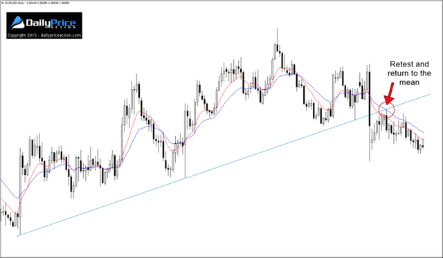
Once this happens, there is usually a period of time where the price will ‘re-test’ that same support as a resistance point before continuing its descent.
Conclusion
Now, the inherent danger here is obvious:
What if this is not a re-test and the price continues to rise?
This is a valid fear that most traders have when it comes to making such an assumption because a failure to recognize the difference between a re-test and an ascension toward a higher price point may = dramatic losses in question.
However, in this instance, there does not appear to be anything that signifies the price will go up.
However, in order to hedge onself, the following R/R is advocated for this trade (if one has consolidated the profits from their short already and is looking to re-enter in with another short position):
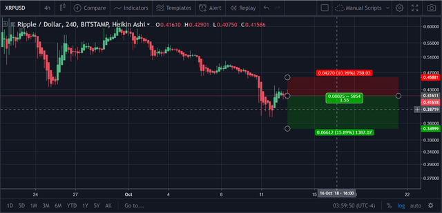
https://www.tradingview.com/x/xesdcuo7/
The ‘stop’ for this trade is placed slightly below the next overhead resistance point in order to provide greater assurance for traders that the S/L will be successfully triggered (the close one is to a resistance/support point, the more likely it is that the S/L will not trigger in the event that there is a massive switch in sentiment/price action spontaneously)
The ‘reward’ / take profit portion of the trade is placed at the same spot that we placed our last reward spot in the preceding price analysis because it is the next reliable support point that can be identified on the chart.
Congratulations @proofofresearch! You received a personal award!
You can view your badges on your Steem Board and compare to others on the Steem Ranking
Vote for @Steemitboard as a witness to get one more award and increased upvotes!