Basic rules of visual design Casino games
Hello World!
It's my first article on steemit! At the start, I want to add something new to the steemit community and perfect my English skills.
This article is part of my UX research in casino games and I would like to give an answer to a question. How to design games for online casinos?
There is a lot of types of casino games on the market - roulette, jackpot, poker and more. I have expierience in creating online games where you can pay bitcoins Let's dive into one of them - "slot machine".
Before we begin, I have to say something about the technological aspect. A lot of games ware created in Flash. The technology which should already be dead. This situation creates an opportunity for new business.
The enormous of flash games forces loading screens or even whole animations with loaders before the game. Durning loading is placed on the screen some information like ownership, product name, and license agreement.
UI ELEMENTS
After loading all assets, typical game own features:
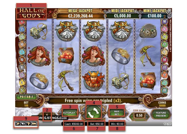
- Game name
- Bet amount
- Level/Lines count
- Autoplay
- Spin/play
- Max Bet ( not obligatory)
- credits
- Total bet )
- Last win (result of last game)
And some additional options like instruction how to play, sounds and music, advanced autoplay settings, and how many spins lefts.
For point 3, I prefer terminology lines rather than level. It is telling more how it works.
VISUAL DESIGN
How does game look and how is designed for better immersion? We can group some elements to better analyzing.
1. Background
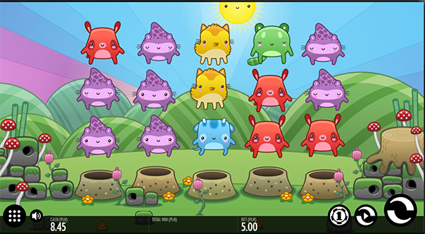
[+] Good example, Toki-time is one of the best-designed game, especially for beginners. Inspiring for developing own solutions is how the contract works between background and foreground. Despite the fact that Background is quite detailed and colorful, it doesn't dominate. Furthermore, we can spot some animated elements - dancing mushroom, spinning sky and changing the time of the day. I get the feeling that game is happy and optimistic.

[+] another good example is "Wolf club". This game has a little bit darker background. That increase contrast between foreground and background. Creators added small animation too. A wolf which reacts on gameplay. He can wave or howl from happiness.
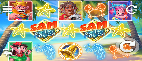
[-] "Mirror magic" and "Sam on the beach" are bad examples. Backgrounds and Icons fuse each other (grey on grey or blue one blue), Number of details on different elements is almost the same to find some depth.
2. Space between reels
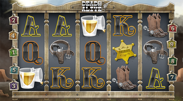
This space can be useful. We can create a stylish front machine. We can use this space for creating a new section for information. "Dead Alive" game has some wooden parts from the saloon. These elements, for example, plates, they are showing bet lines on hover state.
3. Symbols.
This is a wide topic. There are traditional cards, liberty bell, bars, or free spin. All symbols are highly hierarchized.
- Low-level symbols are average rewarded with 40-120% bet amount.
- Blank is replacing other symbols.
- Bonus. After lining up this type of symbols, you can get free spins or even change rules of the game.
General rules for good creating symbols is "use different shape and colors for different types of rewards". If a game is fast, then is even more important.
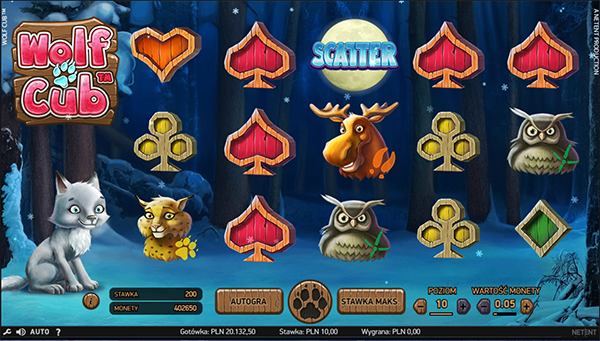
[+] "Wolf club" is a good example. Symbols are rounded or have hard edges. High rewarder symbols represent animals.
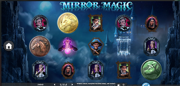
[-] Bad example "Mirror Magic". All kind of elements is similar to each other. We can only recognize shape of portraits and rounded medals.
SOUNDS
Sounds have to used in reasonably way. I prefer to use only for big wins and bonuses.
ANIMATIONS
Except for backgrounds animation, we have to keep attention on reels animation. How fast it spins? Is it blurred? Have reels some additional animation? Are reels spined in the queue or simultaneously?
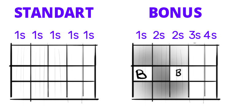
Changing the tempo of reels animation is the most addictive thing for players. It should be even accented if the chance for reward is high. It is good practice to add fading screen when winning rewards are showing.
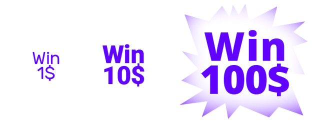
Size of information should be dependent on reward value.
THE END
Could you leave a comment or upvote?
I will always be grateful for that
Do you want work with me, visit my website - www.slabiak.com
widzę, że @curiosit dopiął swego ;)
namawiał namawiał abym coś zapostował, to musiałem to zrobić :)
A tak z ciekawości, kiedy Ci zaakceptowali konto?
bardzo fajna platforma, motywuje do pisania :)
ვიზუალური დიზაინის ძირითადი წესები კაზინოს თამაშებში გადამწყვეტია მომხმარებლის სრულყოფილი გამოცდილების შესაქმნელად. გასაოცარია, რამხელა ფიქრი მიდის ვიზუალურ ელემენტებზე, რათა მოთამაშეები გაერთონ. როგორც დიზაინით და თამაშებით დაინტერესებულ ადამიანს, მიყვარს ონლაინ თამაში და ვეძებ ონლაინ კაზინო პლატფორმებს ამის გასარკვევად მეტი აზარტული თამაშების შესახებ და იხილეთ ეს პრინციპები მოქმედებაში. თუ გსურთ გაიმარჯვოთ, კარგად უნდა იყოთ მომზადებული.