Engulfs - how to pick support and resistance
I see a lot of people looking at support and resistance and think that because we can see a spike on the chart, that is automatically the resistance to be looking at.
Everything on the chart has a level of importance, and the best way to find out what is a more significant level is by looking at engulfs.
Put simply, an engulf occurs when a candle reaches higher than a previous high, or vice versa with a low. This can happen because somebody, or an institution, has a large order to fill and therefore needs to take out some stops - also known as a "stop run".
Otherwise, it'll happen organically because price is on an uptrend or downtrend.
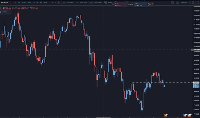
Here's a quick example of some engulfs:
See if you can find any more on your own charts, or in this example.
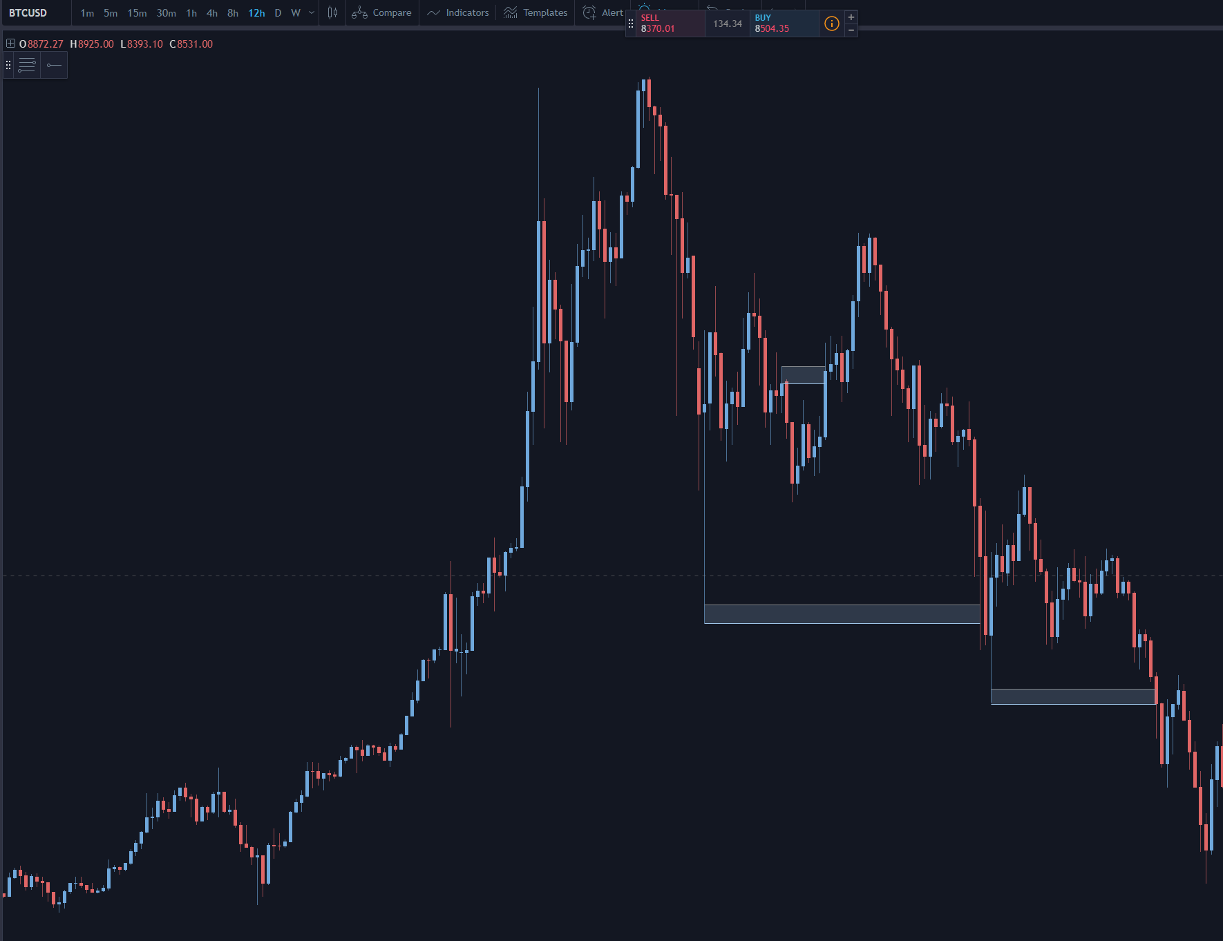
Now, if we put it in practice, let's look at a chart which I saw somebody mark on Twitter as below:
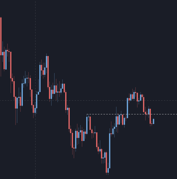
Let's zoom in to make it easier to see:
His argument was that this resistance could potentially turn to support, but as you can see, price engulfed it south, made a small reaction upwards from the consolidated area that the resistance line had previously held down, and now doesn't paint a very clear picture.
Can you see where he went wrong?
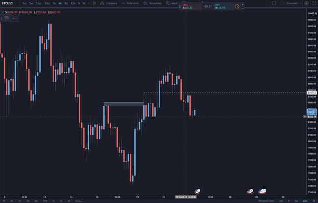
Here, I've marked the engulf of what really was a retrace in price, and shown the more significant resistance line.
As you can see, it turned into a very temporary support and bounced price perfectly for about 3%, before price dropped, and now this line has been respected twice as resistance again. It's also important to note that this resistance is on the daily chart, adding more weight to its importance.
Let's see how it plays out. I saw it as a great example of how engulfs work and thought I'd share it.
Follow me on Twitter: https://twitter.com/technical_anal
That's a pretty good example. I think most people don't underrstand S&R at all.
The other day I saw a post from someone who claimed a 'major support line' off the bottom of one single candle. This candle was from about 6 months and price had been nowhere near it. In fact, I think in the entire history of the stock it had only touched that level with that one single candles wick.
Oh no, it couldn't have been a short lived pullback because of some news item, it was a bone fide 'major support level'. Dumbasses...
Yeah, a really nice example. When I've written in the past that TA really is quite simple, it's using simple techniques like S/R and S/D, but these sorts of little nuances are what make them effective. As in your example, it's all about where you're looking.
I've seen a lot of people even failing to go back months or weeks in time and are only looking at recent PA for what's going to happen.
The problem is it's all very subjective. Just looking at that chart I would say a big line is the one in blue. Lots of touches (red), turns from resistance to support and even a fakeout in the middle. So to me the current price is bouncing off support and on the way up...
It depends how you trade though, for me I'd put a sell stop below the blue line and catch all the trapped traders... but it's subjective...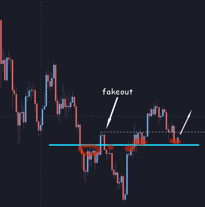
It is indeed subjective.
That area that you've marked the blue line from was actually from a bounce on a demand level, so I wouldn't necessarily call it a fakeout. (I appreciate that you're not looking at the entire chart here for overall context!)
As such, we've dropped below that blue line you've drawn too, but I'm interested to see how it plays out. I can certainly see why you've picked that line.
"we've dropped below that blue line" so I'd be making money right now ? sweet ! lol
No, the opposite. You said it would bounce off support and head up ;-)
ah, but I didn't say I would buy, I said I would put a sell stop below the blue line, so I'd be short right now... he he
So you did, my mistake!