Bitshares.org Is getting a New Look!
Hello BitShares Community,
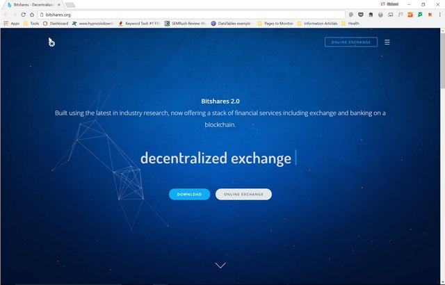
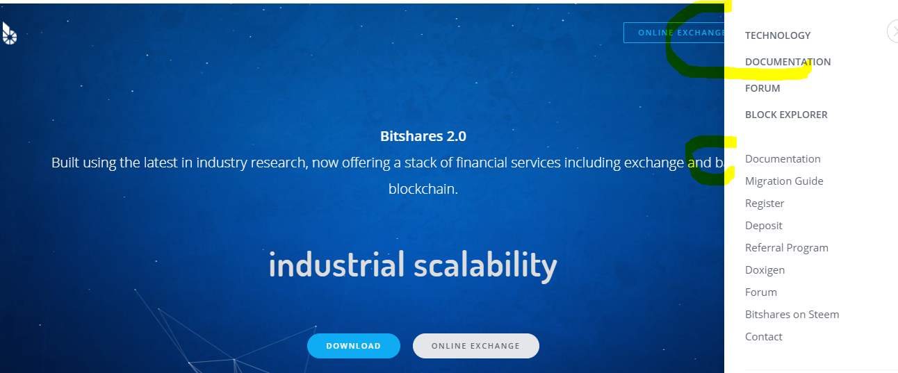
I am submitting to you a concept my team, and I are working on for the www.bitshares.org website. Above is a screen capture of what the home page looks like so far. You can click on the image to take you to the temporary URL. Please comment bellow and give us an upvote if you like what you see so far. Obviously, this is a work in progress, if you happen to see any errors please let me know by commenting below.
Cheers!
Read my other posts for more engaging content.

It would be greatly appreciated. :-)
This should be good! Thank you.
If you keep posting updates as you progress, I will keep upvoting, promoting and re-steeming them.
Me too :D
Thanks!
Thx, giving this again some notice on steemit..
but the exchange is the same :| well the page looks good :D I'd like to know how the exchange is built, can some javascript wizardry make it more snappy and clean?
You are doing great! Keep pming me on Telegram for feedback and we will get this thing pretty!
Will do. thanks!
Wow! looks awesome!
That looks great :)
BTS! Wake up this sleeping beauty.
Looks fantastic! Can't wait the final production.
This will be open source MIT right?
please disable the mouse animations in the blue top field.
but why? it's ok, well, may be make it just more tiny?
because it looks like a $5 template with it
Do you mean the blinking cursor?
the moving stars in the background
http://fastbitcoinunited.com/ is using them too...
I like it!
Thank for sharing this with us. This looks very nice. I had a look and maybe you could rescale the main page when you click on the menu button. I think that looks more professional and slick. Hope to see more soon.
Thanks. I will keep it in mind. Good idea.