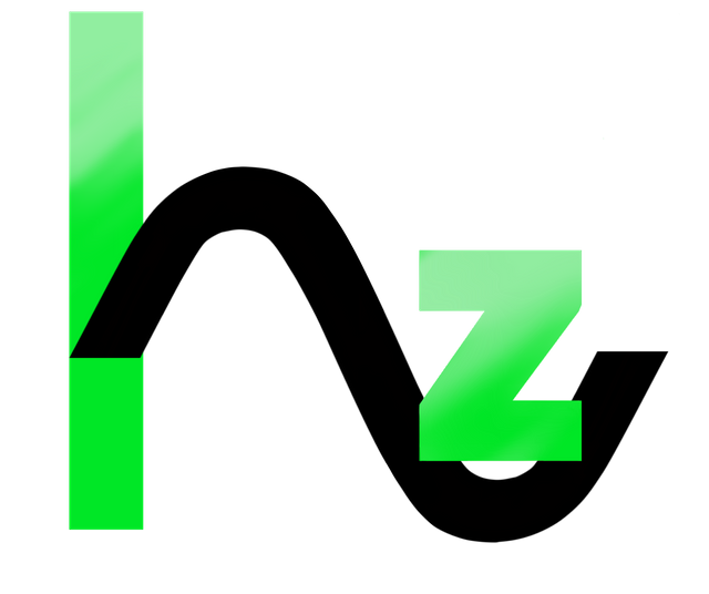
Logo for Hertz Coin
I was recently contacted by @cm-steem for a logo design for a cryptocurrency they are developing. They explained it briefly to me as a coin where the value changes in the pattern of a sine wave. That's me simplifying it entirely and many of you will understand it a lot better, I'm just an artist! Here's the link so you can see how terrible my explanation is: https://sites.google.com/view/hertz-aba/
They wanted the sine wave incorporated into the logo and after a lot of back and forth, this is the design I came up with:

Secondly they requested a 140x140 pixel version of the logo. It needed a little extra shadowing to accentuate it here.

If you're also interested in logo work or any commission for that matter, feel free to message me through steemit chat. Thanks again to @cm-steem for choosing me for this :)
My version logo for Hertz Coin :-)
https://steemit.com/cryptocurrency/@serkorkin/my-logo-for-hertz-coin
Personally I think the gradient needs to go, the sine wave is too big/long, the z is too far away from the vertical line, and the green in general doesn't match the vibe they're trying to give. The z is kind of just sitting uncomfortably on top and the overlap won't look too great when it needs to be smaller. The z needs better alignment and something needs to be done about the overlap. Also the sine itself isn't aligned to the line properly, and at the least the leftmost edge of the wave should be thickened and meet the vertical line by dropping down at a steeper angle so the leftmost edge of the wave becomes flush with the left edge of the green bar, not come to a point as it does now.
This is extremely rude and shitty of me to do this in your thread but this is just my take on it, don't have access to photoshop now and gimp is ass.
Nice logo, I like it
Its great, the logo is awesome.
I also sometime work on as a graphic designer on illustrator software, Is amazing experience for me and design different logos project.
Wow!!!.. amazing your blog i like this. and also like your art.
all the best my dear friend
Looks good. Looks like a chemistry formula or something. I don't know I am not a science person.
Congratulations @trixiedraws, this post is the eighth most rewarded post (based on pending payouts) in the last 12 hours written by a User account holder (accounts that hold between 0.1 and 1.0 Mega Vests). The total number of posts by User account holders during this period was 2532 and the total pending payments to posts in this category was $8456.17. To see the full list of highest paid posts across all accounts categories, click here.
If you do not wish to receive these messages in future, please reply stop to this comment.
Good
Wow that's great
All work is good work, but to be fair, i would had taken less risks and just go for a coin , with an H and a sinusoidal wave.
Everyone does a coin, it's over done.
A billet then!
Now speaking seriously, its true, but its because it works, thats what i meant for taking less risks . The logo isnt bad at all, it just has a huge early 2000 vibe to it .
Looks like the coin sine wave logo was done years ago: https://cryptocurrencytalk.com/topic/14192-hertzcoin-hz-information/
I've been in graphic design for over 17 years and I agree with you. KISS...keep it super simple.