You are viewing a single comment's thread from:
RE: Burned tokens, rewards, and inflation summary September 17, 2022 - Total burn estimates: 96,709K STEEM/SP and 60 SBD
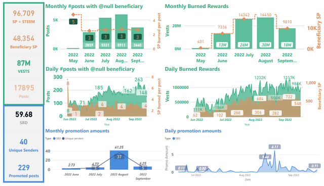
Thanks! It's done with Power BI.
It's a shame that the visualizations lose a lot of resolution when I upload them as images to Steemit's web site. It looks a lot better in the original format. I'm thinking I might also start posting weekly PDFs in github, ipfs, or btfs since the PDF format is so much more readable. Unfortunately, I don't have time to do that for this week, though.
Good idea! I have to keep bending my eyes to read the small numbers.... ;-)

An intermediate solution might be if you insert the graphics with a link to the graphic, then you can display the graphic itself larger...
like this:
Plain text:
Good idea, though I've always done it like this:
i.e.
I hadn't done that because I normally just right-click and then open the image in a new tab, but from your example, I see that the readability is much better this way, so I just updated all three images in this week's post.
That is also a possibility. I haven't been able to do that with Markdown yet. Thanks for the tip!
Sometimes I also open the image with a right-click. But often the image is still quite small and I have to resize it manually in the address. That's why I prefer one click. :-))
Agreed, and it gets blurred when you expand the size. The images definitely look much sharper this way. I hadn't been aware of that difference before.