Bitcoin: Update and Projection

With the market still running around like a headless chicken, it's time for a proper update.
Update
Here's the update: "Important – Bitcoin Price Movement Analysis".
That's a link to my previous Bitcoin post of 23 April.
How has my analysis of the situation changed since then?
Not at all.
That post is still 100% valid and needs little added to it, other than further confirmation that we are indeed experiencing a Bitcoin "Scenario 1". The post explains Scenario 1, a scenario which I originally proposed on 5 January (linked to in the post above) and which has been receiving ever-clearer confirmations since. In simple terms: a "Scenario 1" is a repetition of the 2013 Bitcoin price movement.
Projection
For today's projection, I'm going to project a "Scenario 1" onto our current chart, along with the next most likely historical scenario (a "Scenario 2" - also originally proposed in the post of 5 January).
On the chart below we see "Scenario 1" overlaid on the current chart. Remember: price movements rhyme, they don't repeat!
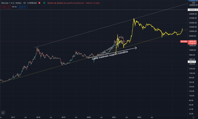
Don't read too much into the highs and lows "predicted" by this overlay, it's only a "best fit" attempt. The overlay is raw, I didn't manipulate it by stretching or squashing it, but it is possible that my interpretation of how it should line up with the current market is incorrect. And again I say: it's only rhyming!
In "Scenario 2" we assume that the current market is mimicking the 2017 bull run. Once again I've gone for a "best fit" attempt. That overlay is seen below.
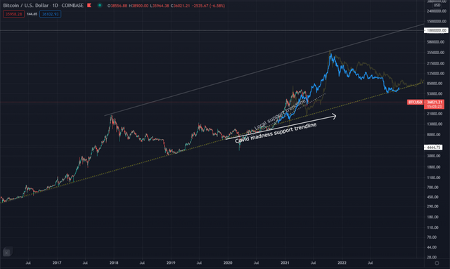
It is worth noting that it's easier to line up the 2013 market than the 2017 one. One should consider that the 2013 market was far more volatile due to MUCH lower liquidity being present in the market. This means that the 2013 market was more susceptible to radical spikes and dips. If one allows for those, 2013 is a pretty good fit for what we are seeing in the market now.
One way to mitigate that volatility would be to compare the Moving Averages of the two markets. Since this is not an in-depth analysis, I'm not going to dive into detailed MA comparisons. Here is a quick MA chart I created, highlighting the relevant periods using a 2-week MA period.
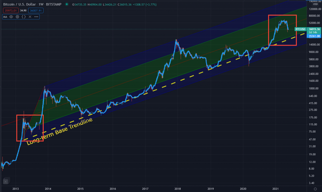
Note how the 2013 and 2021 MA bear a strong resemblance to one another - at least so far - but that the 2017 MA does not resemble the 2021 MA.
Nonetheless, we should not rule any options out prematurely, so here is the overlay of both the 2013 market (yellow) and the 2017 market (blue) raw data on then 2021 market.
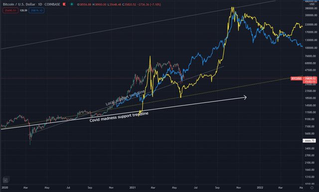
It is important to note that while they are different in many ways, the general trends of the two are very similar, both in extent (i.e. price movement) and duration (i.e. their timelines).
Because of this, we can semi-confidently average them out and approximate the future price movement of the 2021 market - or at least attempt to predict it. The dashed lines below are a rough indication of the sort of price movement we may expect to see over the next year or so.
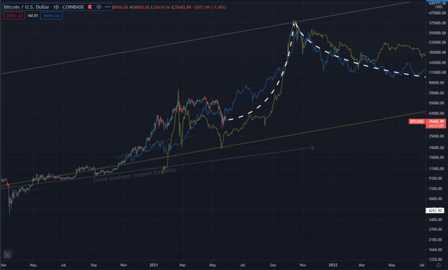
Note the following on the chart above:
- Using major dips to align the overlays with the current market, we see that they both predict a market peak at almost exactly the same time. For the record, that time is mid-October 2021. I'm very happy with that prediction because it ties in perfectly with far older long-term predictions of mine. (Sadly I never published them. Most talk about market peaks is hyped-based and mainly speculative. I try to avoid going down that particular rabbit hole unnecessarily.)
- The "Scenario 1" situation creates a pause in the bull run, allowing it to consolidate and to then surge to higher highs than what it would otherwise have been able to achieve. Previously I would have predicted a BTC peak of approximately $250 000, perhaps wicking up to $300 000 for a very short period. This "extension" allows us to add around $100 000 to those figures! In other words, this bull run should (in the very loosest meaning of the word "should") take the price of Bitcoin to around $350 000, perhaps wicking up to $400 000 momentarily.
- There is still room on the chart for the market to dip lower. Do not worry if you see prices of around $25000. I'm not saying that it will happen, I'm saying that it can. The 2013 dip went lower than this, but - as previously discussed - it was a more volatile market.
- We can expect the market to travel sideways for a while. If you follow me on Twitter, then you should already know this:
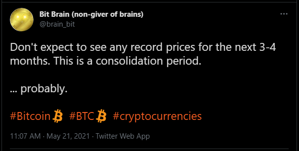
I don't always explain my Tweets, but that doesn't mean that I'm just sucking the info out of my thumb. Now you get a little insight into where it comes from...
Conclusion
That's all for today. It's good to be writing again. As my wife slowly recovers from her surgery, so I hope to be able to write more regularly again. Nevertheless, as you can see, little has changed recently and I do endeavour to publish the most critical updates, no matter how busy I may otherwise be. In addition to that, I am ALWAYS happy to chat to readers who have questions or comments. My blogs are published in several places other than TIMM, but and I don't normally check the comments on forums like STEEM and HIVE regularly. However, I am on Twitter daily, so feel free to comment or DM me there if you wish. I don't bite - unless you happen to be a fan of XRP, DOGE, SAFEMOON or other shitcoins! 😁
Times are tough and they're only getting tougher. Crypto has gone from an interesting hobby to an absolute necessity - for all of us! Make good decisions. Make careful decisions. Be bold without being careless. Think long-term, not short-term. And take care of one another.
Yours in crypto
Bit Brain
All charts made by Bit Brain with TradingView

"The secret to success: find out where people are going and get there first"
~ Mark Twain
"Crypto does not require institutional investment to succeed; institutions require crypto investments to remain successful"
~ Bit Brain

Bit Brain recommends:
Crypto Exchanges:


