RE: BTC update 23.01.18 - pointing out the worst case
Too bad Steemit doesn't allow for expanding/enlarging images. The charts I see across the platform are rather small and it's quite difficult to see any meaningful detail.
It would seem then, from what you describe, that the recent all-time-high in the 20k zone and the subsequent sharp downturn underway are rather significant 1st and 2nd waves at higher degrees of trend i.e perhaps Primary, Cycle, Super-Cycle, or even possibly Grand-Super-Cycle degree.
I would very much entertain tinkering with technical analysis of cryptos, however, my charting platform, (TradeStation) lacks any meaningful price data on such issues - not to mention lacking a significant level of historical data from which to begin any serious technical assessment.
Lastly, after 20-years, quite honestly, my interests have shifted significantly - but I do maintain an ancillary interest i.e my comments here.
Thank you for the detailed response and suggestion.

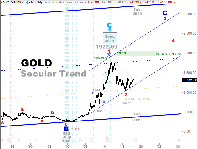
Interestingly enough, my "preferred" wave count for Gold is quite similar albeit the primary degree wave-2 down (in red) has taken several years vs. several weeks to unfold. The price data included herein goes back to 1984 (in case it's too hard to see), and each price-bar consumes one-month of price data vs weekly, daily, or intraday bars.
As a true Elliott Wave Technician, I'm certain that you maintain "alternate" counts at hand in the event that your "preferred" count blows up. I know I have always used alternates - it keeps one's mind open to the possibilities without getting to deeply or emotionally attached to any specific "preferred" count. Thanks again.
I hope they will offer enlarging images with their next hardfork. I am totally annoyed by it too, but STEEMIT is still in beta phase...
Yes, of course I keep some alternates in mind and check back up on them whenever I have to doubt my primary.
I would love to see more of your analysis and counts! (especially longterm analysis like this one in gold)
Please consider tradingview.com as a very good and free charting solution with longterm data.
https://www.tradingview.com/chart/?symbol=BITSTAMP:BTCUSD
This red wave 1 and 2 in gold is my primary count too. The problem is what should be wave 1 of red wave 3 looks threewave-ish like a wave B. I am super curious how gold is gonna perform in the coming months.
I have a CFD broker which offers over the counter "paper gold" where I can open and close positions on leverage in gold within a second, and this wave 3 would make me very happy if it plays out ;-) However, buying more physical gold for 700$/ounce would also be cool.
Hopefully you can use this charting platform and share some of your knowledge. Thanks again and greetings from germany.
edit: to enlarge an image you could use the zoom in your browser (I use firefox browser but I think others have it too)
Or you could just download the image, then open it on your PC.
Thank you for the "tradingview" link! I will certainly make it a point to check it out to see what type of charting tools are available there. PS. The edit to enlarge solution you offer in the interim is a good one, thanks! Cheers, my friend - perhaps we'll speak again sometime in the near future. :-)
www.investing.com web site also have very good charting support and I use it a lot! All my charts in my analyses blogs are from there and they have over 30 different TA tools for using them on charts.
This gold chart is interesting for me in one other perspective. It shows how all world main currencies pegged on US dollar are in inflationary cycle and are not good store of value. Governments steel silently from our pockets inflating currencies and contract their debts on our backs.
I start to use a nice unit for expressing value in gold it is mtoG or milli troy ounce of gold this is 0.31103 gram of gold and is worth about $1.34 or €1.08 at the time of writing.