"SLC21/WK6: Summary on Lessons so far [Hands-on Practical]
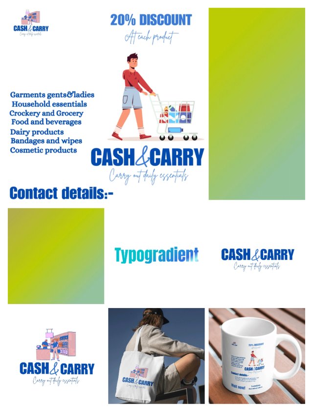
In season 21,week 1 I learned about gradients which is basically we will effect in which we see transition in between colours in a smoothway and transitions occurs in those colours that looks similar to each other or that mix up with each other smoothly otherwise it doesn't give good look to mix totally opposite colour like black with white.
Gradients are used for adding depth and interest in any element or in background of an design so let's have a comprehensive look at practical of gradient made with one colour and two colours.
Gradient made with one colour
 |  |  |
|---|
I open canva app and then I selected Instagram size post for making gradient design.
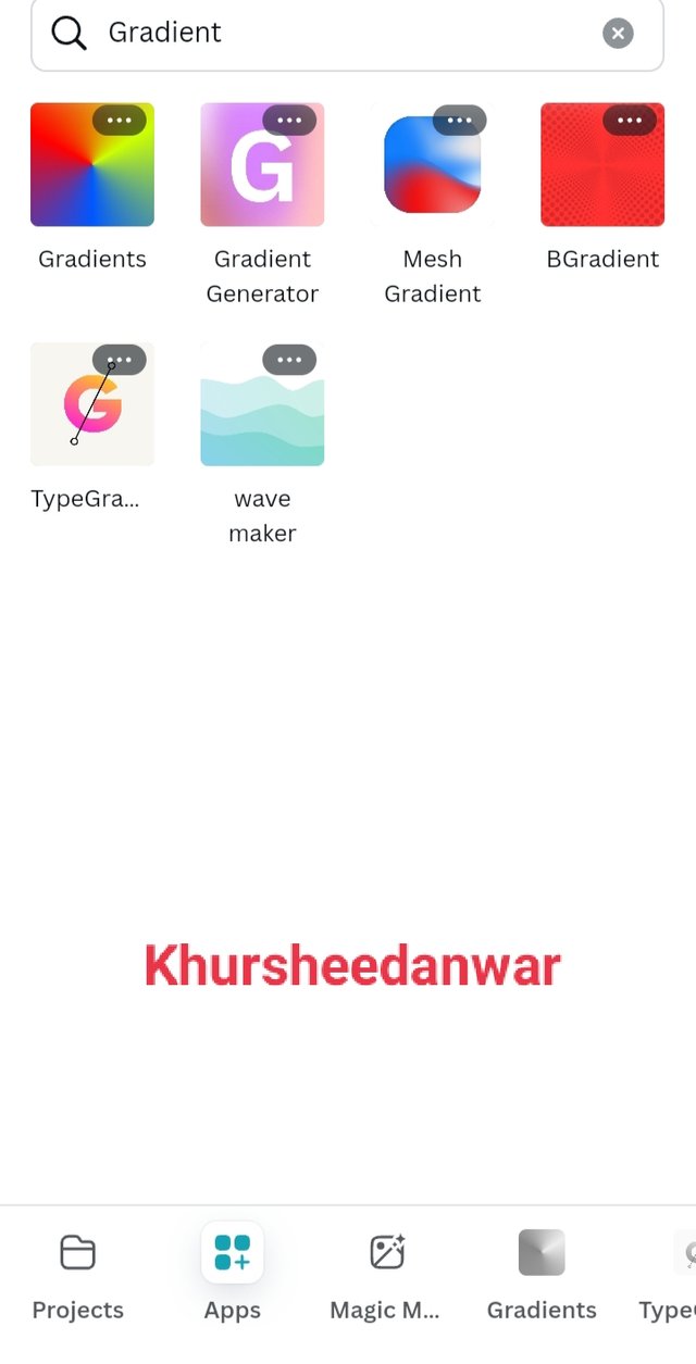
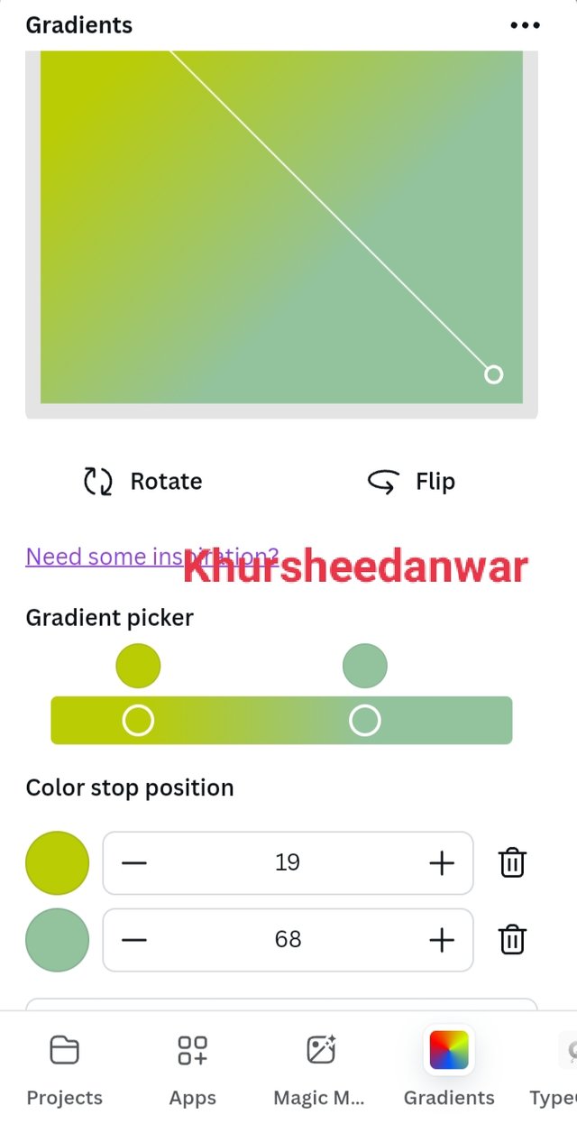
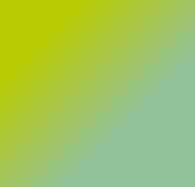
I locate option of apps that was just in bottom of page you can also see from where I search for gradient. I select on creating gradient and I choose two light shades of green and mix up two shades of one colour for giving a smooth gradient.
 |
|---|
This is what I have created and you can see that how much smoothly they are mix up with each other
Gradient with two different colours
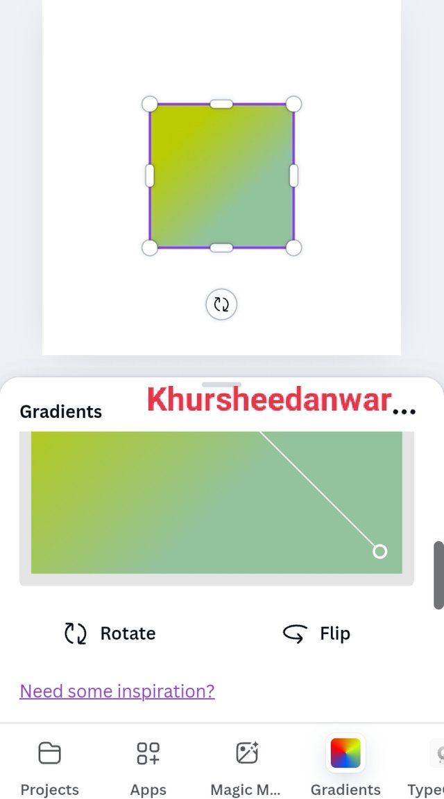
Again I selected Instagram size post and I started to create gredient by locating apps and by searching gradient from there.
 |  |  |
|---|
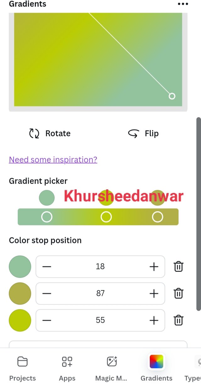
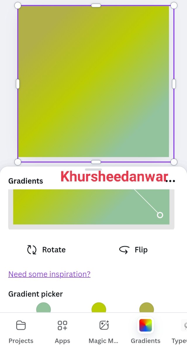
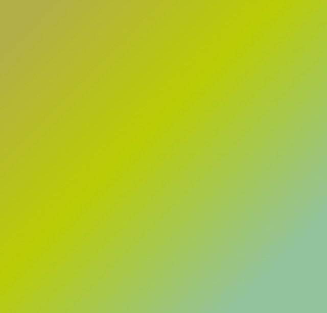
For this time with two shades of green colour I add very light shade of brown that can mix up with both of these shades properly so I give almost 87% weightage to new colour that I added and adjusted both shades of green accordingly for giving it a smooth look to my gradient.
 |
|---|
This is final look of gredient with two different colours including three shades.
Typography gradient
Typography is all about text so now this is a time to create gradient in text.
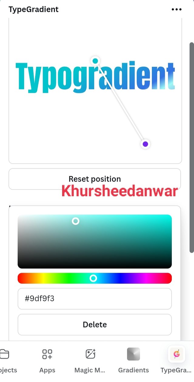
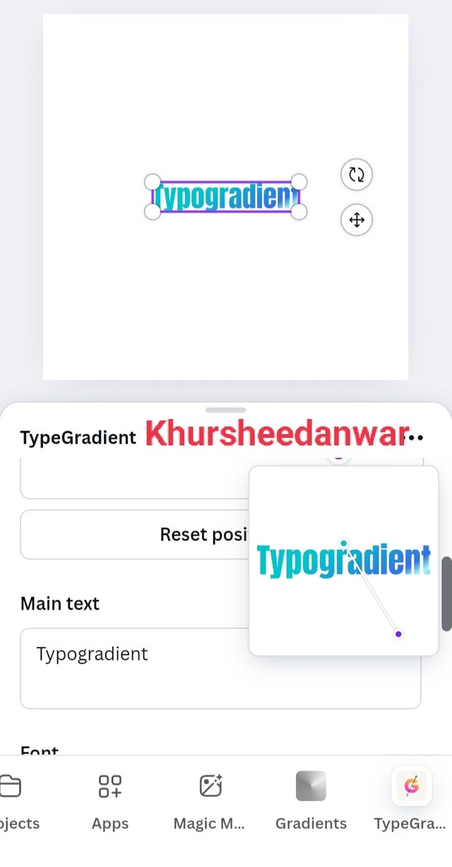
Again I locate canva from where I selected Instagram size post and I locate apps from where I searched for typogradient.
 |  |
|---|
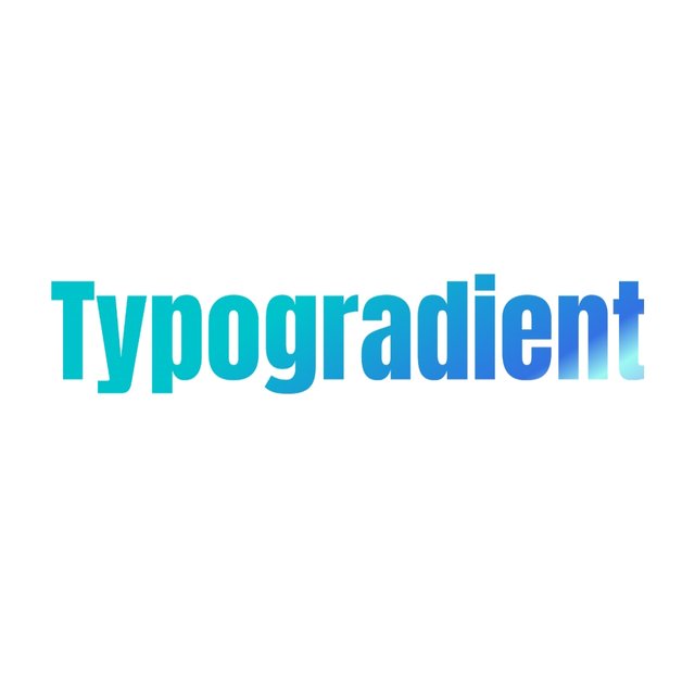
I selected dark blue and light blue shades for my text and I add TYPOGRADIENT word as my text. You can also see hex code of colours I am using for creating it.
 |
|---|
This is my TYPOGRADIENT with final look!
In week 2,I learned about logo design and some. of its principles.
If I talk about logo design in my words whatever I have learnt from lesson then this is basically a symbol or mark or unique text which is our representation of particular project company brand or organisation as well as it should look good as well as should not be more complex and should be easy to remember for everyone.
if I talk about some of the principles of logo design I have learnt then these are following;
• Logo design should be easily recognisable and it should be simple.
• Logo design should not be overloading with too much elements that make it more complex.
• Logo designs should have scalability like in different resolutions it should looks perfect.
• Logo designs always contains some of the features or elements that make it different from other brand logos or other brand identification marks.
• Logo design should be relevant to company or a particular project with which it relates.
Hands on practical of logo design
I opened canva app and selected Instagram size post for making my design.
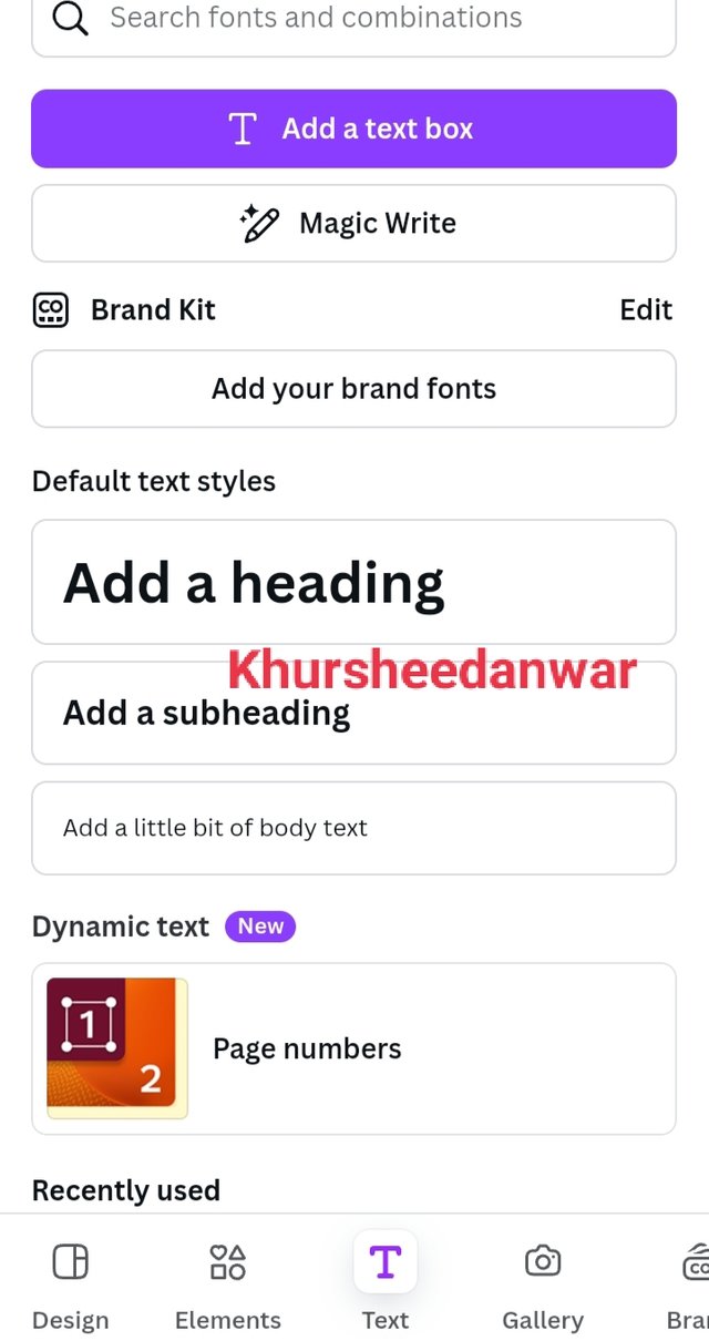
After that I locate text option from where I selected Add a heading.
 |  |  |
|---|
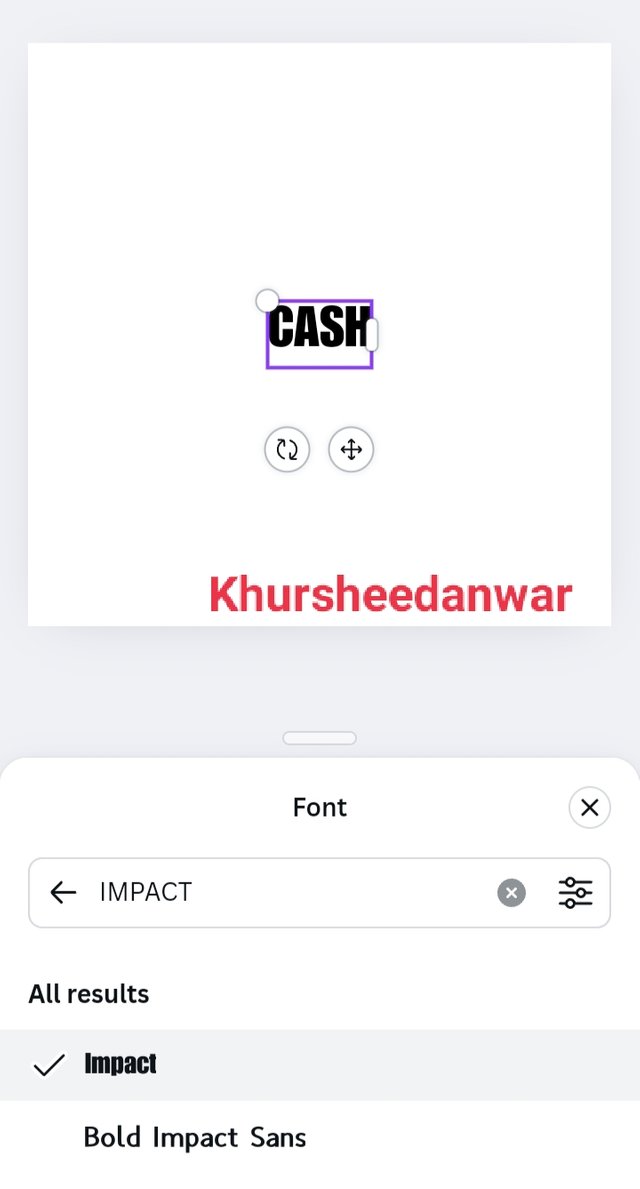
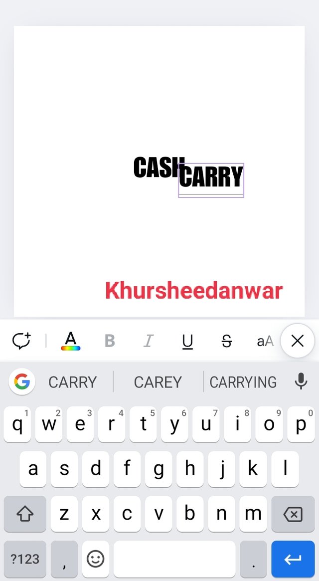
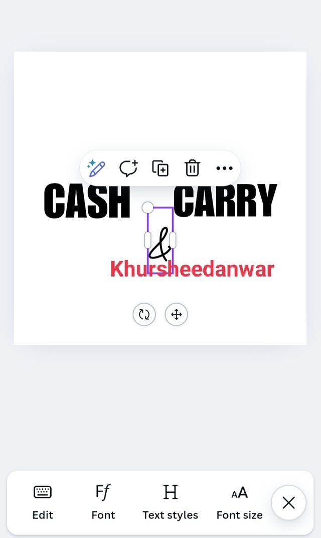
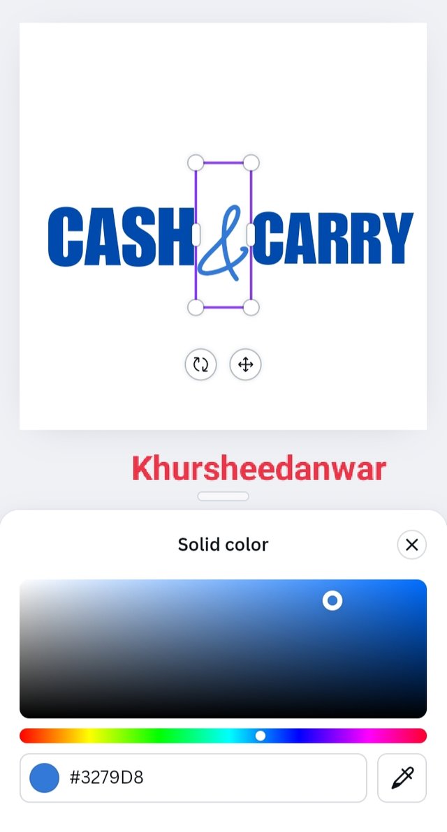
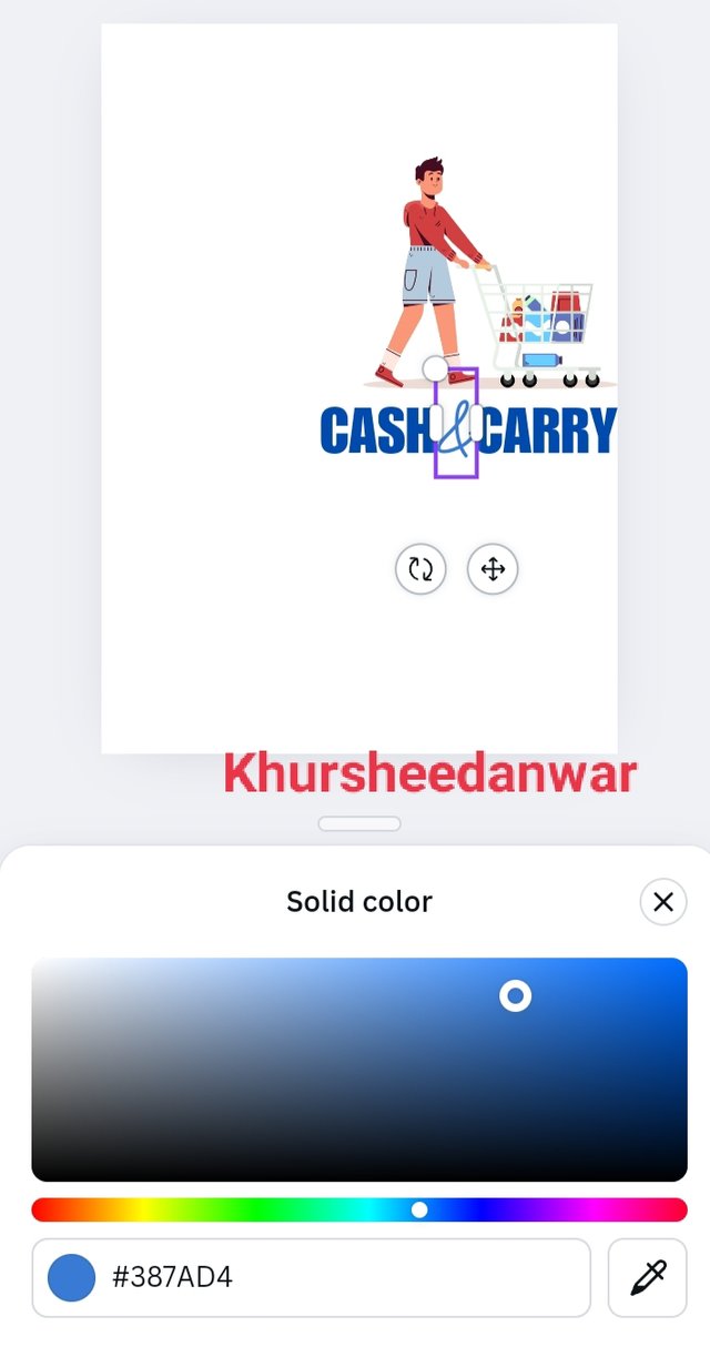
I simply write CASH and duplicate it by clicking on plus sign and then at the place of other cash I wrote CARRY and in between I wrote a symbol of & because for this time I am going to create a logo design of a general store.
I keep in mind the principles of logo design so I make it simple and write brand name in bold IMPACT font.
 |  |  |
|---|
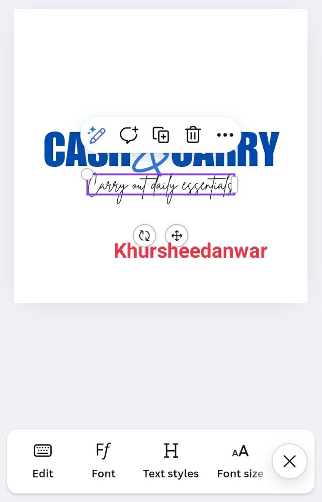
I wrote brand description carry out daily essentials at below of brand name and font style and size was small and less prominent then brand name which is another principal of logo design so it was quite simple,easy to read and unique also.
 |
|---|
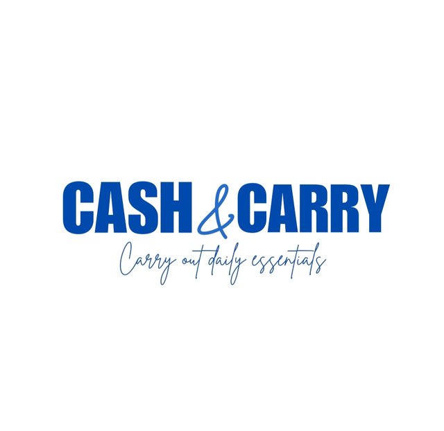
This is final look of my logo design that is following all the principles.
In week 3, I learnt about types of logo design from which some of the types I would like to discuss again;
• If I talk about text based logos than these are wordmark logo as it is indicated by its name like Google.
• If I talk about logo which contain single letter or initials of brand then these are called letter form logos like we see McDonald's.
• If I talk about logos that only contain symbols then these are iconic logos like we see symbol of Apple in iPhone.
• If I talk about logos in which you see a particular symbol mark icon or text also than these are called combination mark logo as it is combination of both symbol or text.
• If we see logos in which text and symbols seems to be integrated then these are emblem logos.
Hands on practical of word Mark logo
I opened canva app and selected Instagram size post for making my design.
After that I locate text option from where I selected Add a heading.
 |  |  |
|---|
I simply write CASH and duplicate it by clicking on plus sign and then at the place of other cash I wrote CARRY and in between I wrote a symbol of & because for this time I am going to create a logo design of a general store.
I keep in mind the principles of logo design so I make it simple and write brand name in bold IMPACT font.
 |  |  |
|---|
I wrote brand description carry out daily essentials at below of brand name and font style and size was small and less prominent then brand name which is another principal of logo design so it was quite simple,easy to read and unique also.
 |
|---|
This is Wordmark logo design
Hands on practical of combination mark logo
I opened canva app and selected Instagram size post for making my design.
After that I locate text option from where I selected Add a heading.
 |  |  |
|---|
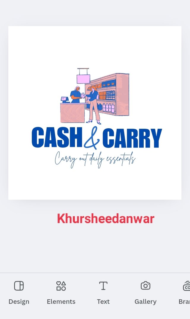
I simply write CASH and duplicate it by clicking on plus sign and then at the place of other cash I wrote CARRY and in between I wrote a symbol of & because for this time I am going to create a logo design of a general store.
I keep in mind the principles of logo design so I make it simple and write brand name in bold IMPACT font.
 |  |
|---|
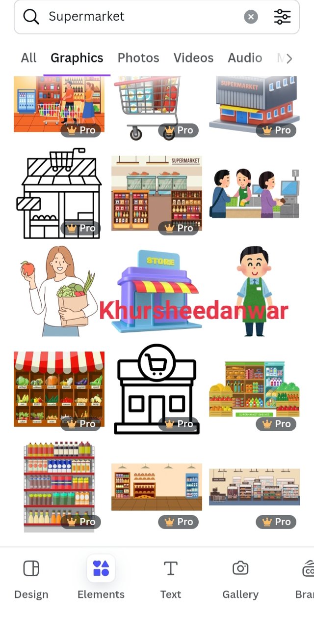
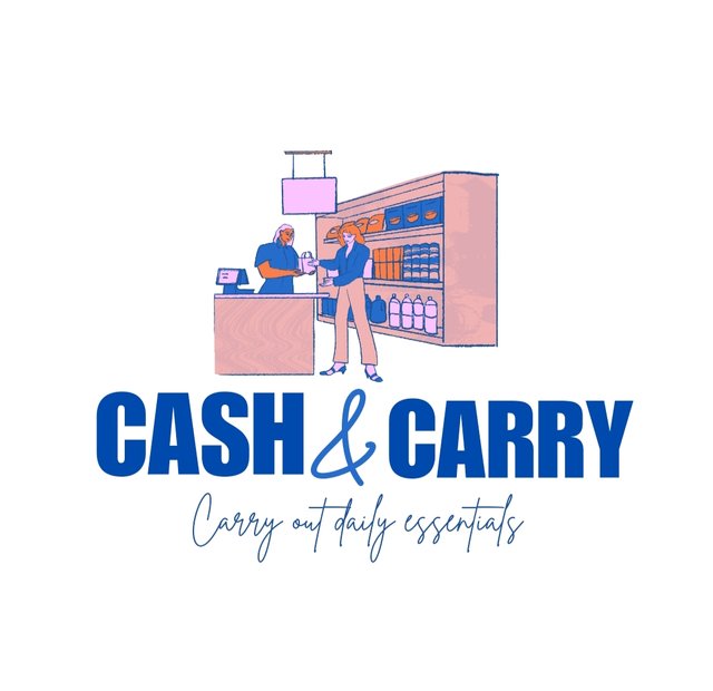
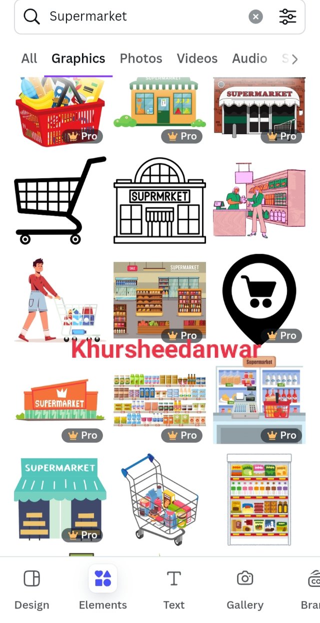
Now I have selected elements option from where I searched for supermarket and I choosed one most attractive element from there and added it as a symbol in my design. Now this is my logo design prepared with symbol and text both so this is combination mark logo.
 |
|---|
This is Combination mark logo !
In week 4,I learned about mockups so for me this is representation of design concept which represents that how a particular design look like in real world applications like if they are seen in 3D form like at mugs, at billboards etc.
Hands on practical of mockup design
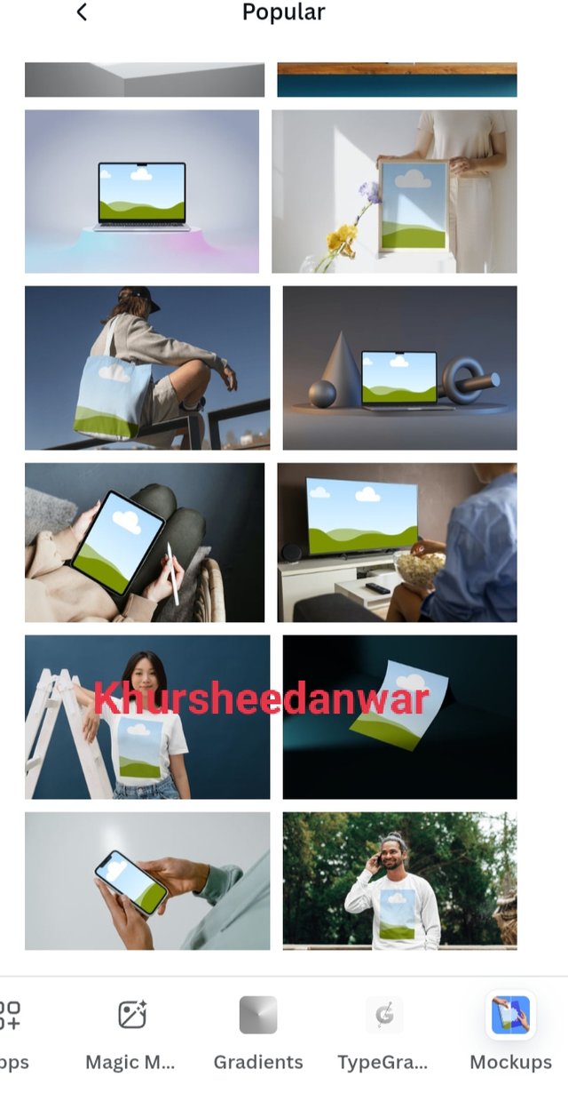
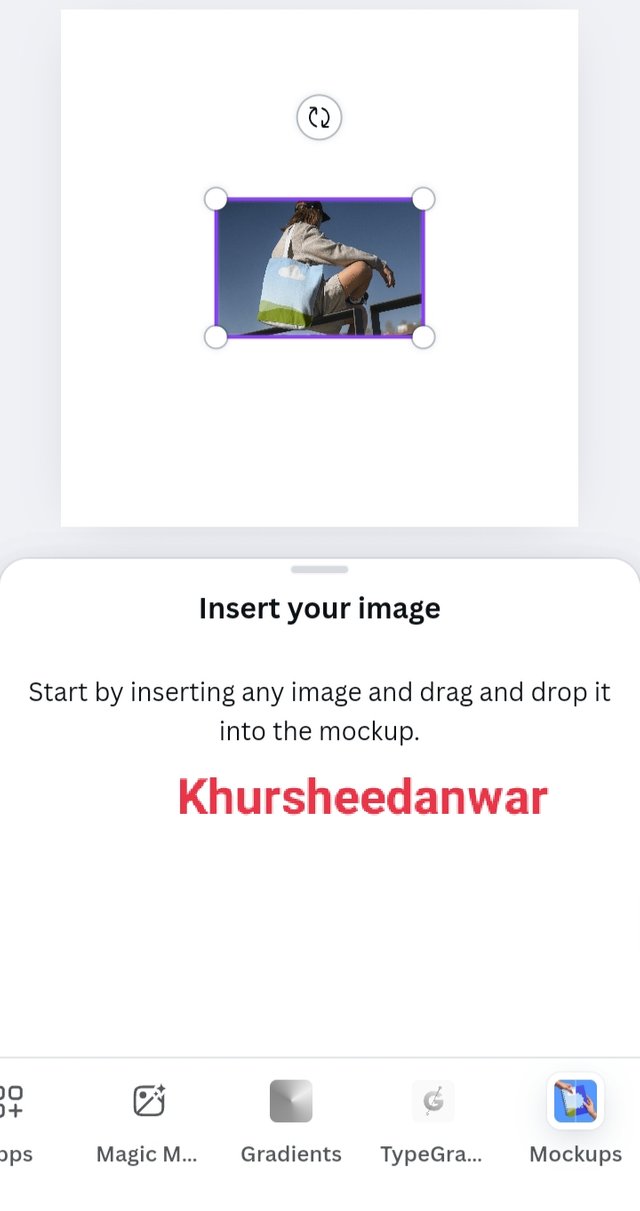
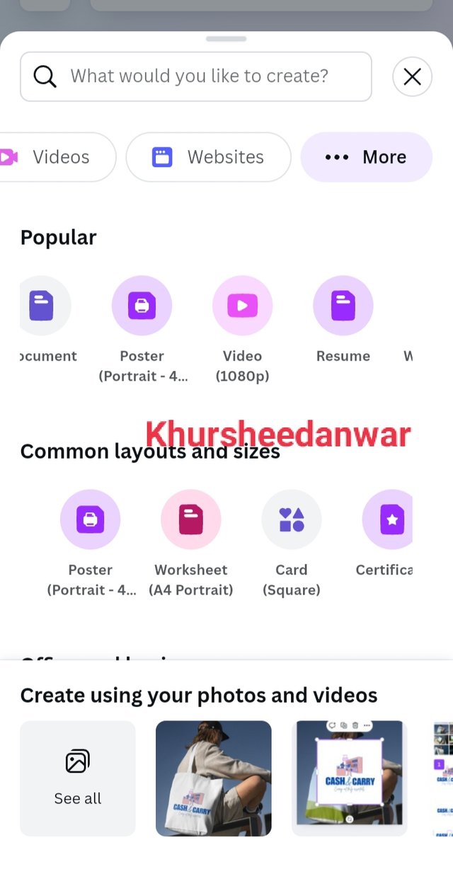
I locate canva app from where I selected Instagram size post and then I locate apps option from where I searched for mockup.
 |  |  |
|---|
The whole process of choosing mockup design can be seen in screenshots I have provided.
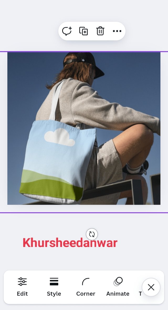
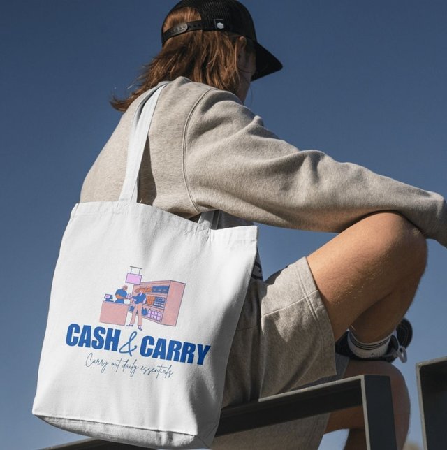
I selected mockup in which a girl is wearing bag.
 |  |  |
|---|
I add mockup at my Instagram post and then I started make adjustments in it.
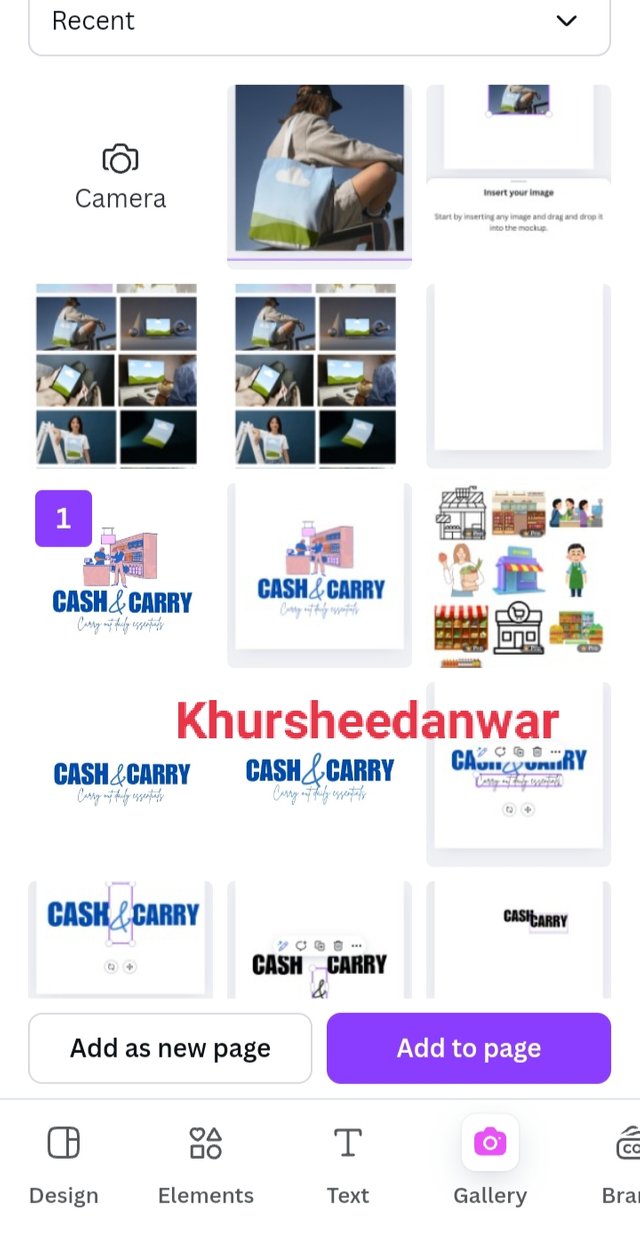
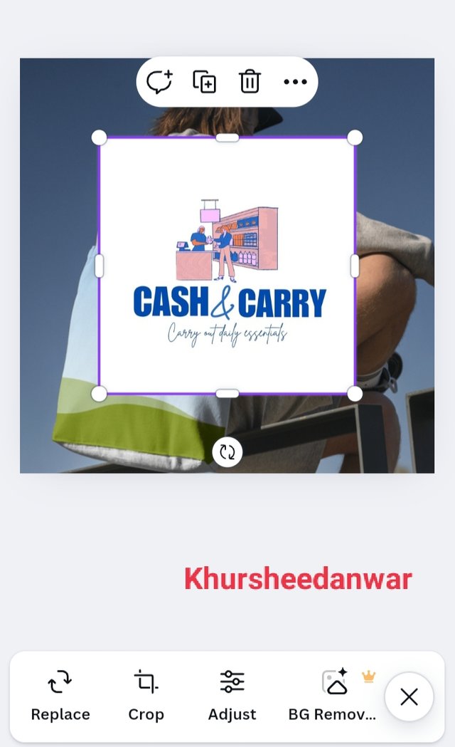
After that I located my personal gallery from where I choose combination mark logo to fit into it.
 |
|---|
This is my bag mockup design!
In week 5, I learned about flyer design that what is this how we can create it and how can we fit it into our mockup of own choice.
If I talk about flyer design then this is a process to create most attractive informative and printed materials that are useful for advertisement of a particular brand company or project by representing logo services or products they provide or contact information written on it.
If I talk about characteristics of a perfect flyer design then it should be the following;
• A perfect flyer design should be eye catching and most attractive element containing.
• A perfect flyer design should contain clear message and information for viewers or customers.
• A perfect flyer design contain easy typography.
• A perfect flyer design contains all elements distributed equally.
Hands on practical of flyer design creation
 |  |  |
|---|
I opened canva app and selected poster for creation of my flyer or poster for a general store brand which is CASH&CARRY
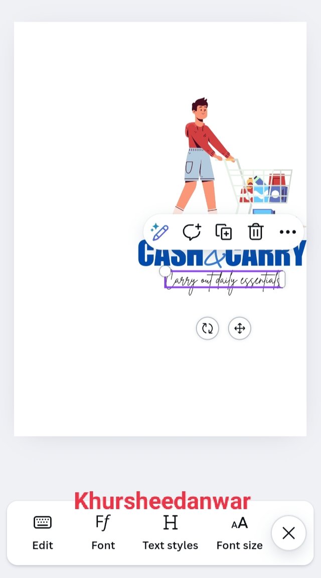
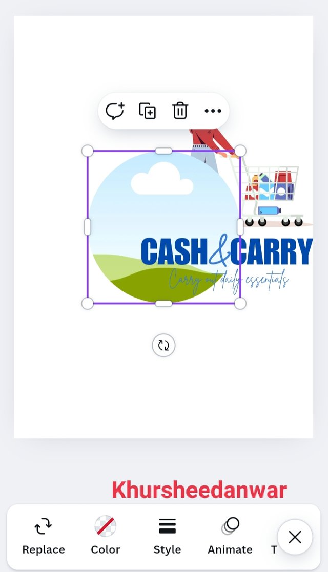
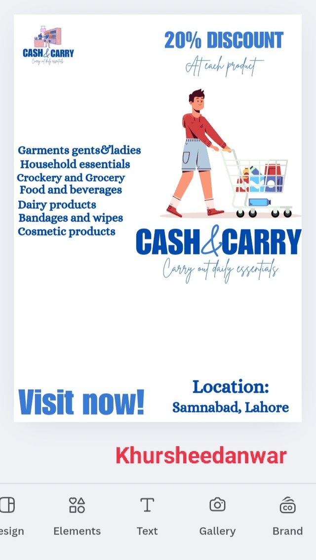
I locate elements from where I searched for supermarket and I selected one most attractive element and add it to poster.
 |  |  |
|---|
I aligned that poster and below it I wrote my brand name along with brand description.Brand name was written in bold than description.
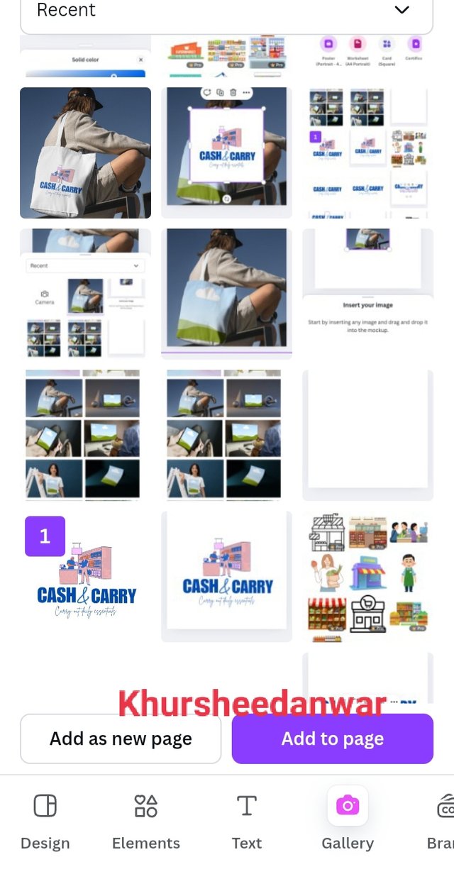
Again by locating elements are selected around frame and it to page at top left corner so that I may add my logo design in it so I added combination mark logo in it that I already created.
 |  |  |
|---|
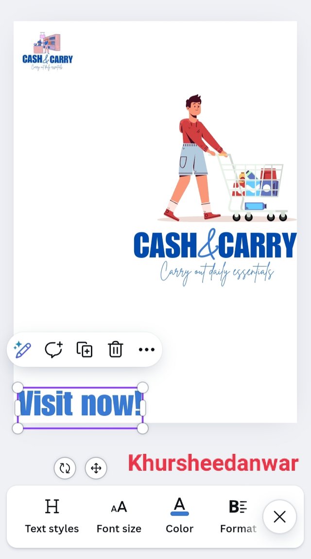
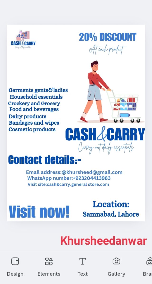
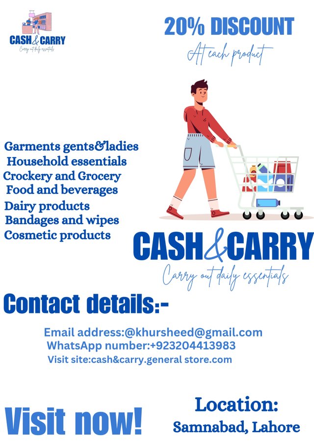
After that I wrote in bottom a slogan VISIT NOW along location of general store. I wrote it at bottom because from last week I learnt that location and contact details should be kept at last and offers or services that are provided by brand should be kept at top while making flyer design so this is something I improved.
After that in centre of poster at left side I wrote items or products that are available at this general store generally and below eye added contact details including email address, WhatsApp number and main link if online page of store.
I finished this design by adding discount offer in which 20% of was available at each product a customer will buy and I keep it at top for attracting more customers as it was really eye catching!
 |
|---|
This is flyer design I created!
Fitting my flyer design in to mockup
I located canva from where I again selected Instagram size post because now I want to see this flyer design in real application in Mockup form.
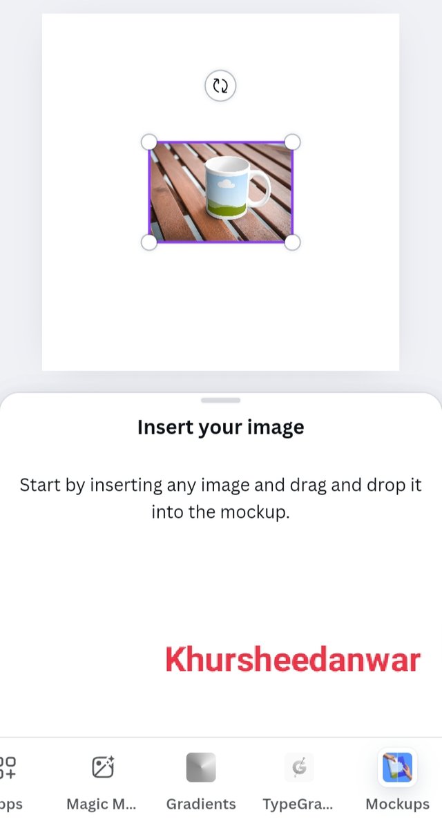
I locate apps from where I selected mockups by searching it.
 |  |  |
|---|
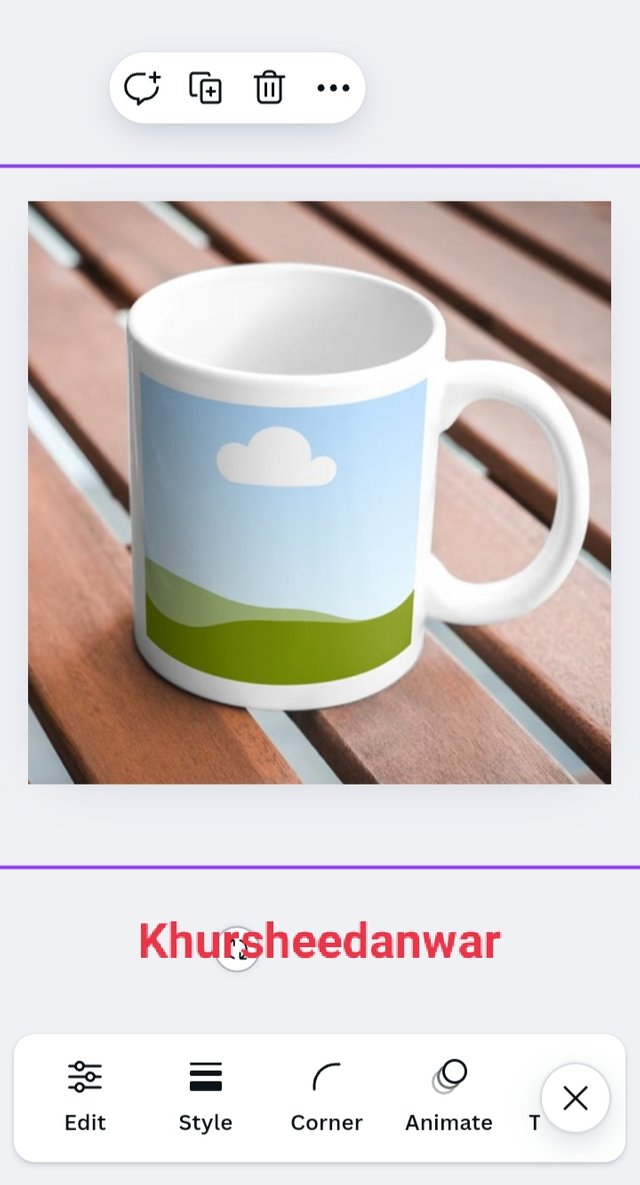
As I searched for mockup then I had mug makeup in front of me so I choose it and added to page.
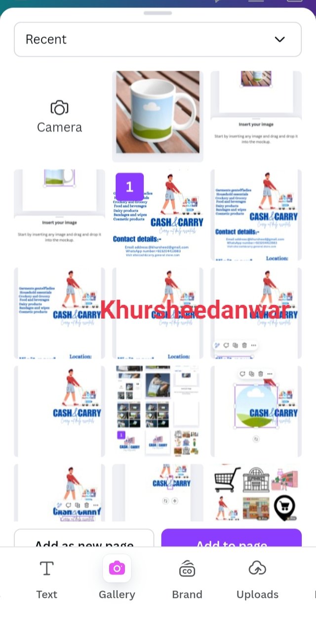
I locate gallery from where I selected my flyer design and add it to my Instagram post from where I adjusted it into mug.
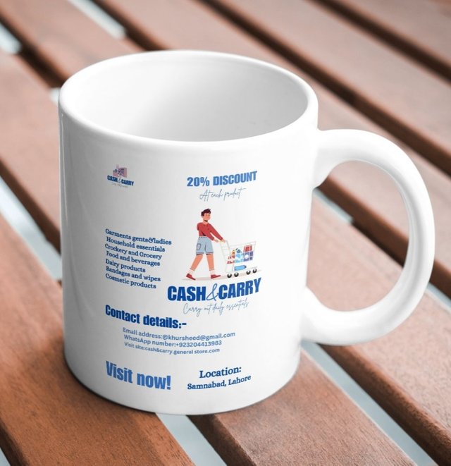
This is I fitted my flyer design into mug mockup!
I want to invite @ahsansharif,@kouba01,@wilmer1988,@adeljose
Hello @khursheedanwar thank you for participating in this week's lesson. We have assessed your entry and we present the result of our assessment below.
Feedback:
Welcome back to class dear student.
Let me start by commending you for a job weldone, the effort put in this work is quite commendable.
You have done a nice summary of the lesson and this you did practically which is quite commendable.I want to also salute your courage for staying through the lesson and for taking every form of correction in love and patience. I hope you would maximize all of these lesson and you them to your profiting. Thanks for staying through.
Regards
@lhorgic❤️
Thank you soo much
It takes around 4 hours to write and revise all lessons but finally 9.8 rating is fruit of my efforts
I was expecting more than 9.7....
And I got it by grace of Almighty
You're welcome dear student...
Your logo design guidelines and explanation of its importance is very instructive. Newbies can learn a lot from this. Good luck for the contest.
Thank you soo much .
It's all about my consistency I have shown in graphic design part 2 module