Maps and their cartographic projections.
Hello, readers friends.
What would happen to your head if I told you that the plane of the world that you have known all your life is not correct?
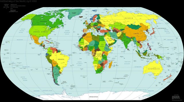
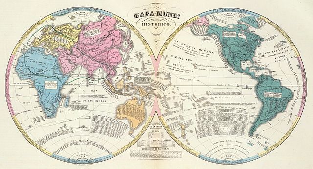
To begin with, some of the aspects of the world map that we take for granted are completely arbitrary. We are used to seeing America on the left and Asia on the right. But the world is a sphere and its surface has no edges; So for the Americans, Asia is left to the West and Europe to the East. What happens is that we have adopted a convention in which Europe is at the center of the map. And of course, as they designed the maps ... each civilization has had the habit of believing itself to be the center of the world.
The first "world map" was made by the Babylonians around 500 BC and of course Babylon is at the center of the map.
The Chinese call their country Zhong Guó. What do you think it means ?, "The middle country". In the Middle Ages, when Christianity stood out, the three known continents were painted around Jerusalem.
From the fifteenth century the whole world is explored and the maps become more accurate. Nowadays, thanks to satellite images and other technological advances, the map of the surface of the earth is practically exact, except when we have to represent it in a plane.
If you draw a small square on an orange you will notice that it has a curvature, but so small that it does not matter much. We could draw a flat map of that "part of the world" without problems. But if that square is bigger you will realize that it is impossible to draw a really straight line on a spherical surface.
How to turn the sphere into a flat map, a planisphere?
If you peel the orange to turn the shell into a plane you will notice that the figures are torn or deformed. The solution that cartographers have reached is to do what is called "projections". They can be done in many ways.
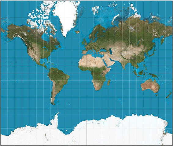
In the 16th century, geographer Gerardus Mercator invented the best-known projection we have used up to now. He mathematically projected the figures of the sphere into a cylinder. This method preserves the shapes of the continents but not the areas. The countries near Ecuador shrink compared to those that are far from the equator. It seems that Greenland, for example, is as big as the entire African continent, when in reality it represents a very small fraction of its area. The Gall-Peters projection respects the relative sizes. (In the image: Mercator projection, Source)
If you have time, visit "thetruesize.com" Which is an interactive map where you can compare the real size of your country with that of others. Source
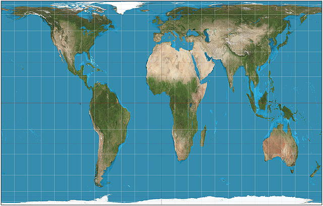
Like the projection of Mercator and Gall-Peters, there are many types of projections: all privilege some aspect, but sacrifice another, none is free of error.
- Mollweide projection: It is pseudo-cylinder and of equal areas. The long axis, the equator, is twice as long as the short axis, the central meridian. The central meridian is straight. The meridians at 90 ° are circular arcs. The parallels are straight but unequally spaced. The scale is true only along the standard parallels of 40: 44N and 40: 44S, so it has a greater representation for the equatorial zone.
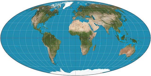
The Mollweide projection is used for maps of the world, especially to represent areas of low latitudes.
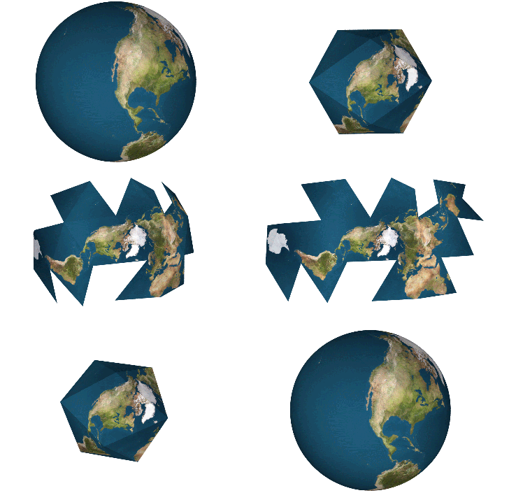
- Fuller's projection or Dymaxión map: Unlike the cylindrical or pseudo-cylindrical projections (the most popular ones) the Fuller Projection does is convert the terrestrial sphere into a slightly modified icosahedron. The main problem that resolves this projection, is the disproportion in areas that have not been able to avoid other similar projects.
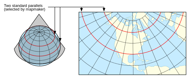
- Lambert conformal conic projection: It is the representation of the sphere on an auxiliary surface, which is a cone circumscribed along a parallel. Later this parallel is developed on a plane. This projection is one of the most indicated for the middle latitudes. The system of state plane coordinates uses this projection for all the zones whose greater east-west layout.
The way in which our maps were built, like so many other conventions, is due to the conjunction of technology, politics and chance. For example, why is the north up?
If the earth is in space, where there is no up or down, the maps could be in any direction. The first Egyptian maps had the south up, probably because it seemed logical to them that the Nile, running from South to North, flowed from top to bottom.
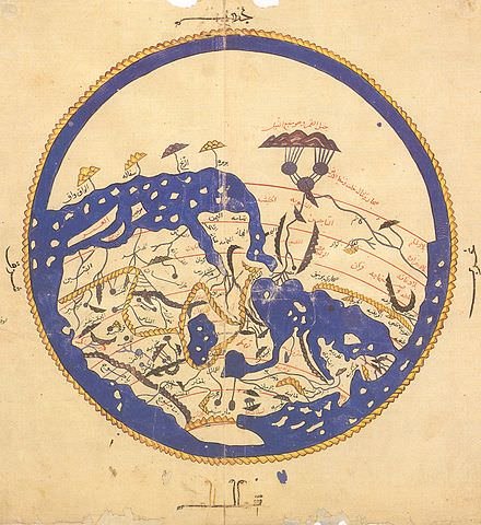
Like old Muslim maps: the majority lived to the north of the MECA, so the MECA (the South) should be up. In some medieval maps, what is above is the east, where it was thought that paradise was. If the north ended up it was because Ptolemy, a Greco - Egyptian geographer of the first century, possibly used the Polar star to make the projection (Conic) of his map. Ptolemy was the first to trace the longitude and latitude lines.
(In the image: World map belonging to the Rogerian Tabula. Note that the South appears at the top of the map Source)
This system was abandoned for a long time, but when the age of exploration arrived, navigators and cartographers such as Enrique Martelo or Mercator himself found the Ptolemy System useful. And as the printing press had just been invented, the idea of "up North" spread rapidly. And if that would leave the powerful nations in a "Superior" position, they would not complain.
One of the most recent and most interesting projections is the AuthaGraph, designed by the Japanese architect Hajime Narukawa: it is faithful to both the sizes of the areas and their shapes, besides that it can be assembled in mosaic to reflect the continuity of the globe, it has the window that does not give "Superiority" to any country.
This artist and Japanese architect to create it was inspired by origami, the ancient Japanese paper folding technique. Source
To finish I must say that there are numerous projections and that I have only mentioned some in this article, later I will write about those that are missing.
If you have been useful this post you can share it so that someone else knows a little about this topic.
- The images used in this article are Public Domain and can be reused according to your copyright.
References.
- http://www.bbc.com/future/story/20160614-maps-have-north-at-the-top-but-it-couldve-been-different
- http://www.authagraph.com/top/?lang=en
- http://dwl.gov-online.go.jp/video/cao/dl/public_html/gov/pdf/hlj/20120401/26-27.pdf
- https://www.britannica.com/biography/Gerardus-Mercator
- http://desktop.arcgis.com/en/arcmap/10.3/guide-books/map-projections/projection-types.htm
You received a 60.0% upvote since you are a member of geopolis and wrote in the category of "geopolis".
To read more about us and what we do, click here.
https://steemit.com/geopolis/@geopolis/geopolis-the-community-for-global-sciences-update-4
This is really interesting, never knew about it, coincidentally, I had a student ask why the map is rectangular when the earth is round
Yes, it is very interesting. Thanks to the cartography and its projections we can transform the model in 3D (sphere) to 2D (plane) of our planet.
Congratulations! This post has been upvoted from the communal account, @minnowsupport, by Jlmol7 from the Minnow Support Project. It's a witness project run by aggroed, ausbitbank, teamsteem, theprophet0, someguy123, neoxian, followbtcnews, and netuoso. The goal is to help Steemit grow by supporting Minnows. Please find us at the Peace, Abundance, and Liberty Network (PALnet) Discord Channel. It's a completely public and open space to all members of the Steemit community who voluntarily choose to be there.
If you would like to delegate to the Minnow Support Project you can do so by clicking on the following links: 50SP, 100SP, 250SP, 500SP, 1000SP, 5000SP.
Be sure to leave at least 50SP undelegated on your account.