Styling SVG with CSS and Stylesheets

This is the second part of a series on SVGs for the web. If you want to read the first part of this series then you can do so here.
Today we will be looking at how we can use stylesheets to style inline SVG graphics on our website. Let's start by using our sample SVG code from the previous article
<svg width="100%" height="100%" viewBox="0 0 360 120" xmlns="http://www.w3.org/2000/svg">
    <rect width="360" height="120" fill="white"/>
    <circle cx="62.5" cy="60.5" r="17.5" fill="#FF0000"/>
    <circle cx="163" cy="60" r="25" fill="#05FF00"/>
    <circle cx="281" cy="60" r="35" fill="#000AFF"/>
</svg>

By inspecting our code it's easy to see that the colours for our circles are being applied using an inline attribute in this case the fill attribute fill=“#ff0000”. This works fine but that’s not the only way to style these vector shapes appear.
Instead, let's use CSS as we are most likely going to already have a stylesheet for our website so we can now use that to control our graphic further. But before we do, we are going to need to remove the inline attributes as these take priority over our stylesheet.
<svg width=“100%" height=“100%" viewBox="0 0 360 120" xmlns="http://www.w3.org/2000/svg">
    <rect width="360" height="120"/>
    <circle cx="62.5" cy="60.5" r="17.5"/>
    <circle cx="163" cy="60" r="25"/>
    <circle cx="281" cy="60" r="35"/>
</svg>
Which unfortunately looks like this in the browser
As you can see the entire graphic is now black, this is because both the rectangle and the three circles are all black as without specifying a colour it assigns it a fill of black and not transparent as you may expect. As this is no use like this we need to put the colours back but this time we are going to use CSS, and in order to that first we need to add some code so the CSS knows what it is we are trying to style.
To do this all I need to use are classes and ID’s as I would with any other element on a webpage and I am going to do that to each of the components of our SVG.
<svg id="mysvg-1" class="mysvg-1" width="100%" height="100%" viewBox="0 0 360 120" xmlns="http://www.w3.org/2000/svg">
    <rect class="background" width="360" height="120"/>
    <circle class="circle-small" cx="62.5" cy="60.5" r="17.5"/>
    <circle class="circle-medium" cx="163" cy="60" r="25"/>
    <circle class="circle-large" cx="281" cy="60" r="35"/>
</svg>
No we have our classes ready next I need to also added those classes to our stylesheet so that we can put the colours back to how they looked originally. So in our stylesheet I will add the following:
.mysvg-1 .background    { fill : white; }
.mysvg-1 .circle-small  { fill : #ff0000; }
.mysvg-1 .circle-medium { fill : #05ff00; }
.mysvg-1 .circle-large  { fill : #000aff; }
Hold on that's not a CSS attribute!
True so the question is why do we use 'fill' not 'background-color' in our css classes?
This is an excellent question and the answer is that even though we have embedded our SVG code into HTML it's still an SVG and has to conform to the specification as defined by those W3C web standards people so that they behave consitently on all platforms. So even though we can use classes to target the SVG elements we are apply SVG attributes not standard CSS atributes. If you're interested MDN Docs have created an easy to read list of SVG attributes available in a handy alphabetical list.
So what are the advantages using style sheets?
The first advanage is how easy it is to make quick changes. If our client asks to change the colour of one of our dots then we dont need to create a new file and replace every instance where we used the old one. Simply change the stylesheet once and update all instance of that SVG throughout our entire site, remeber this is inline code its not a case of updating the source file and everything that links to it updates too.
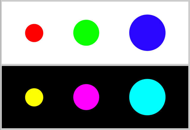
Now we can also go one step further, what if we want to use the same graphic but use different colours perhaps we want to use the graphic in the header on white background but again in the footer on dark background. Well thats not a problem lets us put the power of CSS to work and use the cascading part of Cascading Style Sheets to do just that.
<header class="site-header">
<svg id="mysvg-1" class="mysvg-1" width="100%" height="100%" viewBox="0 0 360 120" xmlns="http://www.w3.org/2000/svg">
    <rect class="background" width="360" height="120"/>
    <circle class="circle-small" cx="62.5" cy="60.5" r="17.5"/>
    <circle class="circle-medium" cx="163" cy="60" r="25"/>
    <circle class="circle-large" cx="281" cy="60" r="35"/>
</svg>
</header>

<footer class="site-footer">
<svg id="mysvg-1" class="mysvg-1" width="100%" height="100%" viewBox="0 0 360 120" xmlns="http://www.w3.org/2000/svg">
    <rect class="background" width="360" height="120"/>
    <circle class="circle-small" cx="62.5" cy="60.5" r="17.5"/>
    <circle class="circle-medium" cx="163" cy="60" r="25"/>
    <circle class="circle-large" cx="281" cy="60" r="35"/>
</svg>
</footer>
Now we can use the classes on the header and footer to tell the SVG to apply different fill colours depending on which container it is inside.
.site-header .mysvg-1 .background { fill : white; }
.site-header .mysvg-1 .circle-small { fill : #ff0000; }
.site-header .mysvg-1 .circle-medium { fill : #05ff00; }
.site-header .mysvg-1 .circle-large { fill : #000aff; }

.site-footer .mysvg-1 .background { fill : black; }
.site-footer .mysvg-1 .circle-small { fill : yellow; }
.site-footer .mysvg-1 .circle-medium { fill : magenta; }
.site-footer .mysvg-1 .circle-large { fill : cyan; }
And this is what that looks like same code different look.

So now we have combined the power of CSS and SVG to get even more from our graphic. So lets not stop there lets go one further and take advantage of some of the other features CSS has to offer. This time lets use a CSS psuedo class to tell it to apply a different set of attributes when the cursor is over the graphic but only in the footer. To do this we are going to target the .mysvg class and apply the :hover state to it and then change the .background class to a different color;
.site-footer .mysvg-1:hover .background { fill : purple; }

Summary
So I have focused on a simple fill effect for the purposes of simplicity but there are many other attributes we can control such as borders or opacity and add user interactivity via transtions and element states like :hover, :focus and :active which gives plenty of scope for us the developer to create high quality impactful content for our sites. Think of its use on maps for instance where you can change the colour of a country and its borders when the mouse hovers over it for example.
So as you are hopefully begining to see in this series having access to the SVG code by embeding it into our HTML the SVG format is a very powerful tool in our toolbox with many potential advantages over the more traditinal image formats and without the heavy overhead of animated gifs or video content. But thats not all if we can do that with CSS we can also do much more with Javascript. But that is an article in its own right and will be the third post in this series.

Thank you for contributing to #LearnWithSteem theme. This post has been upvoted by @Reminiscence01 using @steemcurator09 account. We encourage you to keep publishing quality and original content in the Steemit ecosystem to earn support for your content.
Regards,
Team #Sevengers
This is a one-time notice from SCHOOL OF MINNOWS, a free value added service on steem.
Getting started on steem can be super hard on these social platforms 😪 but luckily there is some communities that help support the little guy 😊, you might like school of minnows, we join forces with lots of other small accounts to help each other grow!
Finally a good curation trail that helps its users achieve rapid growth, its fun on a bun! check it out. https://plu.sh/somland/