POLIS: The Trial of Socrates - Kickstarter is FUNDED!

Well, it was rather close, but the campaign for POLIS: The Trial of Socrates was a success on Kickstarter! A number of people on Steemit helped me get there, so thanks so much for the support.
The art progresses - Daniel has now delivered the first full twenty pages of the book. I'll get some updates going on those soon (been crazy, and it's been hard to update steemit lately).
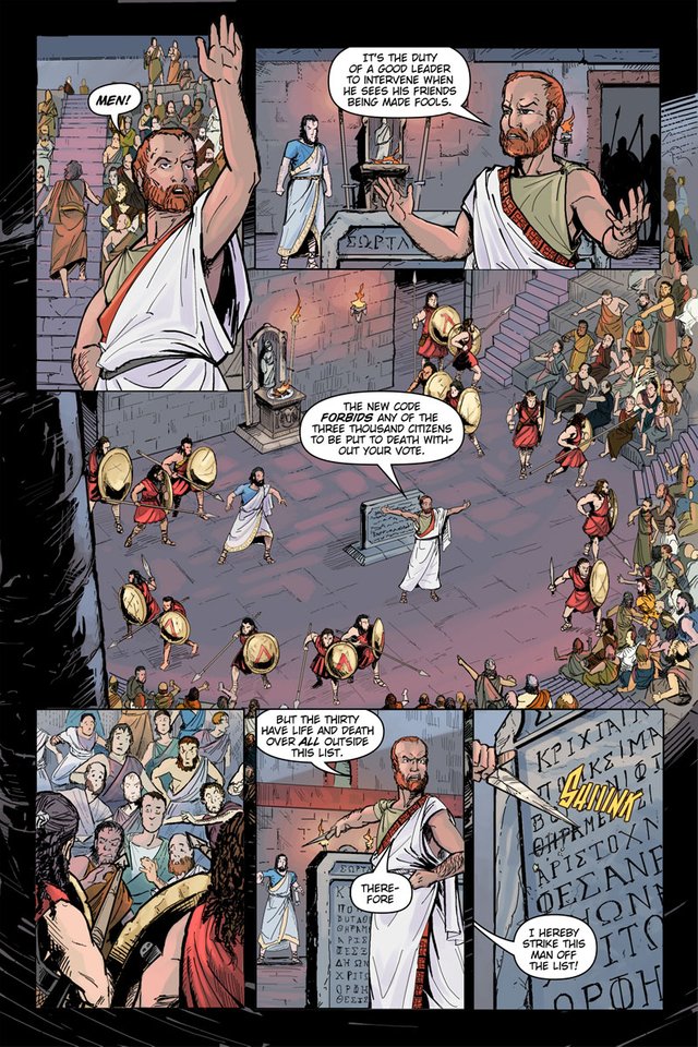
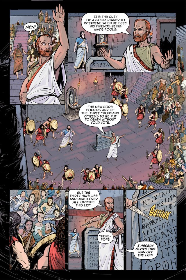
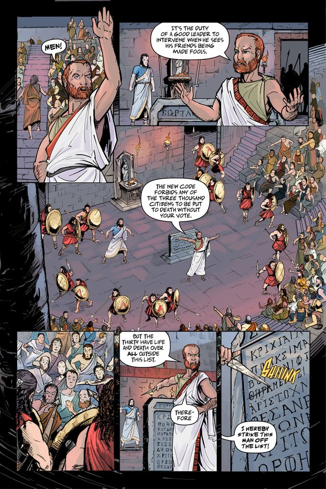
In the meantime, I'm wondering if I can get your opinion? I've been looking at the lettering that I've done, and I figure it can use some improvement. I've tested out a couple fonts, and also massaged some of the balloon and word stacking. Take a look below - does one version stand out as better than the other two?
Original

Test #1

Test #2

Test #3

Art by Daniel Becker.
Previous colored pages: Page 14-15 | Page 16 | Page 17 | Page 18 | Page 19
Thanks for your support and any feedback! Your upvote is definitely appreciated. I hope you'll stick around and watch it all come together.

I’d say #1. 3 has less readability, while 2 might be just a little too open & readable! #1 seems to strike the right balance of ease of reading and being a bit more dense, allowing you to economically fit more text & obscure less artwork! Are these fonts Blambot offerings? They look familiar, but I’m not a skilled enough typographer to recognize on sight!
Hmm, well, I think at least the balloons are significantly better in the later two options, no? The original uses WildWords, which I used for Lesbian Zombies, so I kind of wanted to change things up. Option #2, I thought, maybe gave it a bit of a "aged" look. However, clarity is the most important thing. (#1 is Anime 2 by Blambot, #2 is Adam Warren pro, free font on another site.)
How about this one (also added some SFX):
Actually, I'll post this above, so it's not so small.
This uses BackIssue by Blambot.