From the table and tablet...
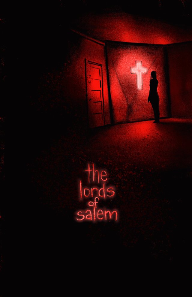
So with some excellent advice from @veryspider, I’m making an effort to not only post more often, but also post more in-process and unfinished pieces. So today, we have a bunch of different stuff. First up are the two posters I’ve managed to finish this week for my alternative movie poster #inktober2018, “Lords of Salem” and “Nosferatu”
Most of the Lords of Salem posters focus on the amazing character imagery of the flick, specifically Sheri Moon Zombie in her face paint. However, the atmosphere and set work in the film is one of my favorite parts, so I wanted to showcase more of the feeling of the flick.
Nosferatu is a classic by any definition, but due to the nature of the film itself, a lot of the alt posers feature one or two of the full on images of Count Orlock. I wanted to convey the menace of the vampire, as well as including a nod to the simplicity of the films composition and framing.
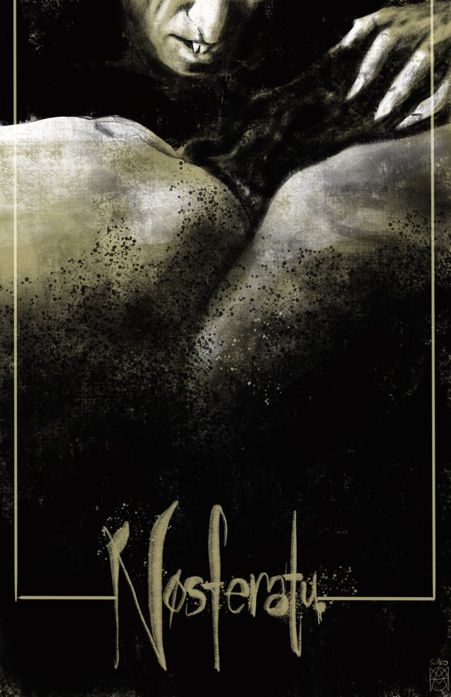
Both were done on the iPad in Procreate, around 2 hours each.
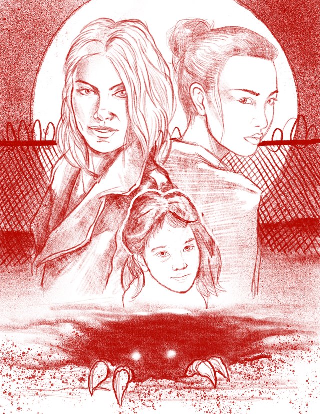
Next up is a character sketch that got away from me a bit for a one shot comic I am doing with an author that is giving me pretty much total freedom. He sent me a five page story, with some specific plot points and dialogue, and asked me to make it into a 20 page comic. Love it. So while sketching the two main characters, this piece sort of turned into a mock up rough cover design. I dunno if I will develop this one to its finished stage, though at this point I’d really like to.
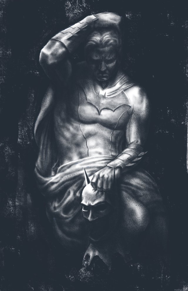
I am also currently working on a series of posters for a Batman fan-film being shot here in Minneapolis this coming spring/summer called The Kid From Crime Alley. Below is the first concept poster, based on a famous statue of Lucifer. There may be some tweaks so that Batman’s costume fully reflects the one being made for the film, but for now this one is being used as a teaser image.
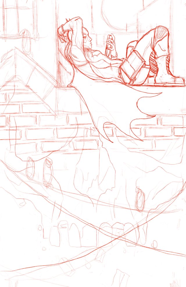
And finally, last nights sketch! Most nights, somewhere around midnight or 1am, I put away all of my commission work and either work on personal projects, just just sketch for fun. Last night I was into the idea of drawing Batgirl. I’ve been reading Batgirl and the Birds of Prey via the DCU app, which is awesome and totally worth the money. I wanted to try and capture the modern youthful nature of the character, as well as some added menace. The idea is that the bricks of the building will transition in to a skull. Jock has done some stunning cover work for the Batman world, a few issues of which I managed to scoop up at a garage sale yesterday, so I wanted to have a solid and interesting design element to it as well. Again, not super sure when or if I’ll bring this one to a finished state, but it seems likely.
Anyway, that’s ll for today. Hoping the next post will be the color process on the Hellboy Commission. Take care y’all!
Your poster designs are always very attractive.
My favourite one is the Batman here. The black and white and how you rendered it are just beautiful <3.
Thank you! That one was rendered almost entirely using the spray paint brushes in Procreate, specifically the splatter tip.
Yay ! I am glad if we can see more posts from you, Adam <3 Love these posters very much, your design and composition eye are A M A Z I N G !!!
And the sketch for batgirl at the end is really cool ! I hope to see more Batgirl from you in the future :D
Thanks for the support and encouragement! It’s actually helping me on a personal level as well. I tend to do a lot of drawing during the week, and I can loose track of stuff sometimes. These posts really help me step back and look at all the stuff I’ve done during week. Hoping I eventually finish that batgirl, or atleast merge it with a stronger overall composition,
This post was shared in the Curation Collective Discord community for curators, and upvoted and resteemed by the @c-squared community account after manual review.