Tauchain - The Decentralized P2P Network - The logo creative process
Prima di iniziare con i dettagli tecnici, è bene spendere qualche parola sul progetto. Tauchain è un sistema di scambio dati P2P, realizzato per distribuire materiale di qualsiasi tipo, in qualsiasi ambito, diventato per sua natura anche un robusto sistema di scambio valutario, attraverso un algoritmo di tipo blockchain.
L'ideatore di questo progetto è il matematico programmatore israeliano Ohad Asor.
Veniamo quindi alla composizione del logo, partendo da Tauchain. La dicitura Tauchain, fa esplicito riferimento alla lettera "Tau" dell'alfabeto greco, molto utilizzata in ambito matematico e scientifico, ma rappresenta sopratutto un simbolo antico e potentissimo, del quale si può trovare un interminabile letteratura, ho ritenuto quindi importante mantenere il simbolo come parte identificativa del logo.
La moderna "t", è una chiara evoluzione dell'antico tau. Il rapporto tra larghezza e altezza è stato leggermente aumentato con il carattere occidentale moderno, questo con ogni probabilità, è dato dalle proprietà ottiche e della sua struttura.
Before starting with the technical details, it is good to spend a few words on the project. Tauchain is a P2P data exchange system, designed to distribute material of any kind, in any area, which by its nature has also become a robust exchange system, through a blockchain algorithm.
The creator of this project is the Israeli mathematician programmer Ohad Asor.
We come then to the composition of the logo, starting from Tauchain. The word Tauchain, makes explicit reference to the letter "Tau" of the Greek alphabet, widely used in mathematics and science, but mainly represents an ancient and powerful symbol, of which you can find an endless literature, I thought it important to keep the symbol as an identifying part of the logo.
The modern "t" is a clear evolution of the ancient tau. The relationship between width and height has been slightly increased with the modern western character, this in all probability, is given by the optical properties and its structure.

Il tau, nella sua struttura, è chiaramente un simbolo tendente al basso, di una certa pesantezza ottica. Tale peso, in alcune versioni antiche è controbilanciato dalla grazia sottostante, che tende a smorzare la caduta, e la leggera inclinazione del ductus superiore.
The tau, in its structure, is clearly a symbol tending to the bottom, of a certain optical heaviness. This weight, in some ancient versions, is counterbalanced by the underlying grace, which tends to dampen the fall, and the slight inclination of the upper ductus.
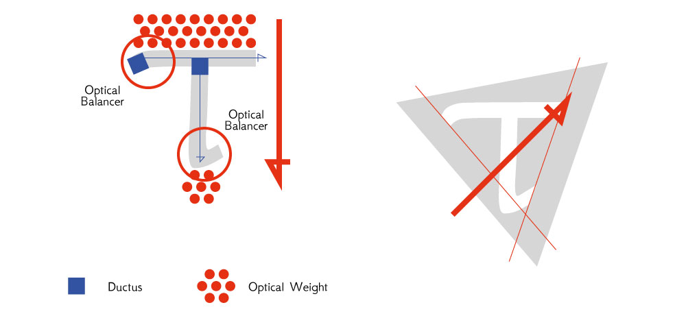
Analizzando il ductus di questo font, e i vari pesi, si può percepire chiaramente come i pesi vengano distribuiti.
è mia abitudine, quando posso, cercare di distribuire i pesi ottici in maniera di controbilanciare l'effetto di caduta. Ho pensato quindi di trovare un modo per aggiungere significato e struttura alla lettera T. Dal punto di vista cabalistico e religioso, questa lettera è fortemente legata al numero "3", data la sua struttura.
In maniera più ampia, rappresenta triplici simbolismi, come "Saggezza, Forza, Armonia." oppure "Creatività, Espansione, Intuizione.".
Ho quindi pensato quindi che applicare una base a fondo triangolare fosse quindi appropriato, qualunque sia il suo ambito applicativo. Nel nostro caso, la Tauchain, le triangolazioni dello scambio dati, sono alla base del P2P, e della rete in generale, motivo ulteriore che mi ha spinto a mantenere questa struttura.
Il triangolo quindi è approvato.
Piuttosto di una disposizione centrale, ho preferito puntare il triangolo in alto a destra, per enfatizzare il ductus che contraddistingue il tau, e sfruttare la sua inclinazione per tracciare un margine costante.
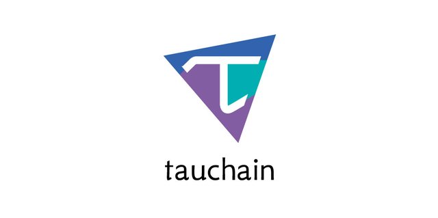
Questo il risultato finale.
By analyzing the ductus of this font, and the various weights, we can clearly perceive how the weights are distributed.
it is my habit, when I can, to try to distribute the optical weights in order to counterbalance the fall effect. I thought then to find a way to add meaning and structure to the letter T. From the cabalistic and religious point of view, this letter is strongly linked to the number "3", given its structure.
More broadly, it represents triple symbolisms, such as "Wisdom, Strength, Harmony." or "Creativity, Expansion, Intuition."
So I thought then that applying a triangular base was therefore appropriate, whatever its scope of application. In our case, the Tauchain, the triangulations of data exchange, are the basis of P2P, and the network in general, a further reason that led me to maintain this structure.
The triangle is therefore approved.
Rather than a central arrangement, I preferred to point the triangle at the top right, to emphasize the ductus that distinguishes the tau, and exploit its inclination to draw a constant margin.
This is the final result.
Enjoy!
Thanks for putting that much thought into your process! Great logo(s) It's fresh.
Thanks You appreciated, and Thanks for the upvote!
It's my method 😜
When, like in this case (..raaare cases), You move on freewheel, have such super-powerful symbol with to play, the design become funny and exciting. A continuous discover.
May the power of tau be with You.
✌