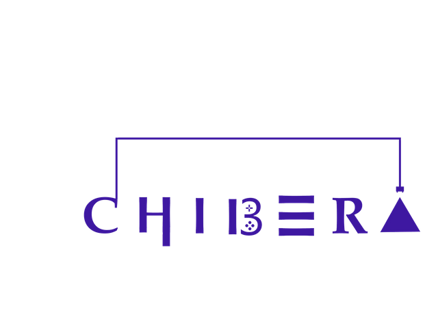
My submission for the chibera logo design contest

Logo for @chibera logo contest
Firstly, I reasoned that a simple design that immediately passed the Chibera concept when seen will be the best choice.
Also, Chibera is a platform that has somuch to do with games. So I reasoned that a logo design with a game touch will do.
To play a game, you need a screen, a game system, and a controller (example a pad or joystick).
In this light, I put the 'CHIBERA' word within a rectangle, with the rectangle signifying the screen. Also the rectangle was in the form of a wire, signifying the connection of the game to electricity.
Also, I designed the 'B' letter in the form of a game pad. To add a further game touch, I designed the letter 'A' and 'E' in the form of shapes, triangle and rectangle respectively, since most basic games have to do with arranging shapes or forming shapes.
Thanks for reading. To participate in the contest, visit here
Great Post 😆
Thanks
Congratulations @stellastella! You have received a personal award!
Click on the badge to view your Board of Honor.
Do not miss the last post from @steemitboard:
Congratulations @stellastella! You received a personal award!
You can view your badges on your Steem Board and compare to others on the Steem Ranking
Do not miss the last post from @steemitboard:
Vote for @Steemitboard as a witness to get one more award and increased upvotes!