CoinCheckup Redesign Live! How we build a new CoinCheckup
We’re proud to launch the first part of CoinCheckup’s redesign, after months of hard work: Analyzing our users, 100’s of design iterations and some tricky coding, we made it.
We’re finally ready to give you the user experience that lets you consume all the data on CoinCheckup easily. We believe that no design is ever finished but this is a nice start 😉
It’s our mission to make crypto more transparent. To achieve this we need to help you research crypto easier, faster and give you the best information available.
The problems we have noticed with our old design
The first thing that shocked Raul (CoinCheckup’s UI/UX designer), was the sea of green and red. There was just too much information and it was very hard to consume all of this data.
One of the main issues we faced is the fact that the CoinCheckup platform grew very fast in the period “September / February”. We kept adding features, data and new insights. This was great but did not necessarily benefit the end user experience.
All in all, we had to redo the whole interface. With the following process.
- Analyze our users
- Iterate on design changes – like 100+ times
- Implement a solid initial version of the design
- Iterate on this version and make it better based on your feedback.
The first stage improvements for CoinCheckup
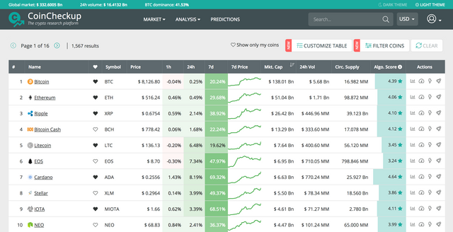
A clean overview page to easily consume information and data. A great top bar with important data, and better color contrast. The customize table and filter coins options are more prominent now + cleaner and easier to use. In our next version, we’ll make this even better.

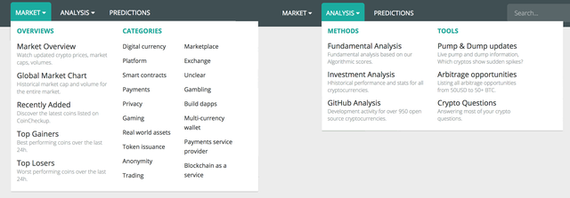
The new mega menu gives you access to a lot more tools and is less invasive and easier to consume.

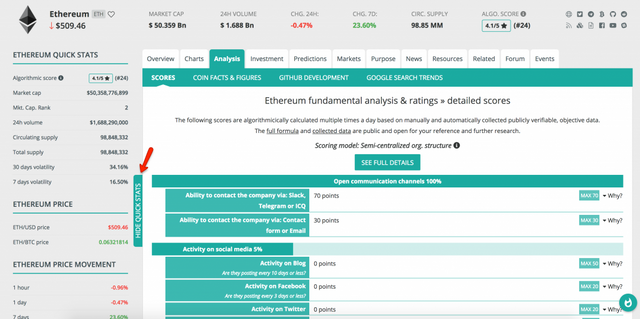
The most important improvement is definitely the redesign of the details pages. We added new tab designs, and the sidebar is now hidden by default.
If you need some quick stats, while you’re researching all the other information we have available on each coin, you can easily make it pop-up from the side.

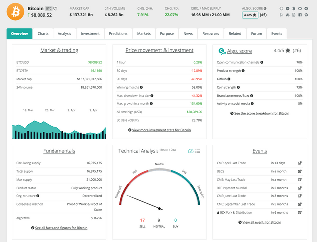
Another major improvement is the Overview page. Up to this point, when entering a coin’s page, you were shown the Basic graphs with information about price, volume, circulating supply etc.
We’ve decided to make the most important information we have on a coin, the first thing you see. The Overview page includes, at a glance, information such as Market & trading, Price movement, Algorithm score, Fundamentals, Technical Analysis, and Events.

You now have the most important information available instantly, and you’re one click away from going in-depth with the rest of the information we have.
Some other details we’ve improved:
- Added the new, 24h Technical Analysis information.
- Made our alpha version of the Arbitrage available for the public. On this site you’ll find all Crypto Arbitrage opportunities * from $50USD up to 50+ BTC.
- And we made our beta Pump & Dump site also available Here you’ll find. Live updates for Crypto’s that pump 5+% in < 5 minutes.
- New header design, with a more visible search input and prominent login/register buttons
- An updated dark theme, now even easier on the eyes (toggle it at the very top-right on the desktop and at the bottom of the page on mobile)
- Updated coin header layout, with the most important data auto-updating every 5-10 minutes (yup, you don’t even need to refresh the page) and always there for you
- More balanced table design and more prominent buttons for table settings/options
- Renamed the “Coin Screener” to “Filter Coins” and the “Settings” button to “Customize Table”, so that new users understand what they’re doing easier.
This is just the first part of the entire redesign process. More improvements are coming, so stick around and be the first to see them updated 😉
If you have any questions or would otherwise like to send us feedback, we’re there to listen. Get in touch with us.
The CoinCheckup Team
Keep up the good work!
Good job guys!