Finding significance in charts - FLAGS (PART TWO)
If you haven't read my previous posts about flags and supply and demand, I suggest you get your starting point sorted first and go and double check them.
Flags: https://steemit.com/cryptocurrency/@technicalanal/improve-your-technical-analysis-flags-part-one
Supply and demand: https://steemit.com/cryptocurrency/@technicalanal/the-most-important-technical-analysis-supply-and-demand
A variant on the saying "the trend is your friend" is "the higher timeframe is always in control".
Any trader worth his or her salt will always start from a monthly or weekly chart, and then cycle down the timeframes from daily, to 4H, to 1H, and so on.
In crypto, most instruments are pretty young and therefore the monthly charts tell us not much, and sometimes this is true with the weekly.
I usually start from the weekly and will cycle down to 12H, 8H and 4H. Generally, if I can't see a valid demand zone on the 4H, I'm a bit hesitant to trade it, though oftentimes in crypto it's necessary to go down to the 1H to find a level to trade and hit it for a smaller percentage gain.
We must ALWAYS look at the higher timeframe trend. There will be opportunities for supply and demand trading on every timeframe, but in respect of the higher timeframe. There's no use looking for a trend reversal on a 1H chart, although you can look for a short term bounce. If you're using that to look for a trend reversal, you're going to get REKT.
When it comes to entering the trade, I will generally use the 5 or 15 minute chart. But all my zones are defined by a higher timeframe.
With the basics of supply and demand, it's only logical that a weekly level that has moved price for something like 200% will produce a nice big bounce on the return to that level.
SIGNIFICANCE
Now, onto the meat of this post.
One thing I want you to always remember when charting is that you must always be looking to the left.
You can't obtain any context to read price from solely looking at the section of the chart on your screen, particularly so if it's a lower timeframe.
Onto some ultra high professional imagery again.
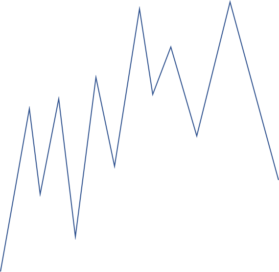
What places are important on this chart? Without context of price history, we don't know.
Let's have a look at it in context now.
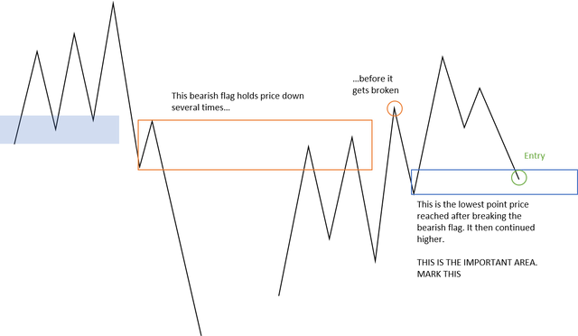
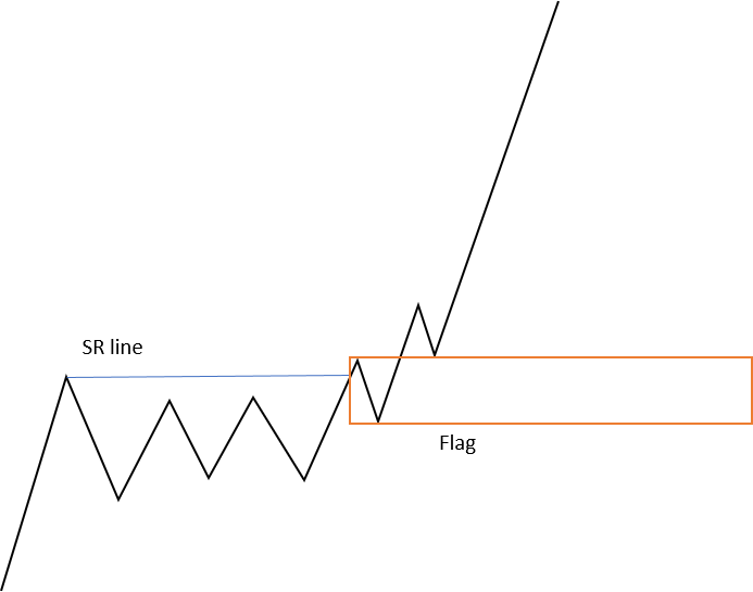
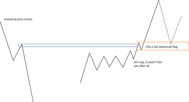
In essence, a flag that forms after price has broken another flag becomes a significant area to mark.
When price revisits this important area, we look to take a trade here. We are at a low of the swing and stand the best chance of making bigger gains. We also reduce our risk of getting caught offside and having to wait for price to climb back up to put us back in profit.
Everything MUST be put in context of price history - look to the left.
We must also remember to do this from higher timeframes.
Here is an example of why using history is so important:
A seemingly nice set up which you can see on your screen, but...
Now it may not look like a huge difference, but this could be the difference in missing out on some gains by not getting in the trade at all, or it could cost you money in a different set up by thinking that it could produce a nice bounce, when in fact, it could get eaten up by price entirely due to the lack of importance.
In my next post, I want to talk about engulfs and how that helps shape price action.
Show me any examples you can find!