My Entry for the Curie Logo Design Contest
Hello Steemians! I've recently found out that @curie is having a logo design contest. Since I am not really a professional graphic designer, I've searched for some tips on how to create a good logo design.
![]()
Some of the important tips in this article that I TRIED to follow are:
1. A good logo design should be strong and balanced.
This could be why it was specified in the post that
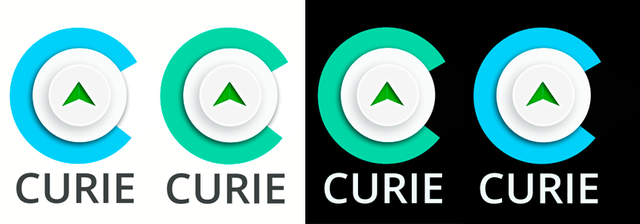
logo has to be in DIGITAL ART format, CIRCULAR and FULL forms – ideal for use as display picture and on posts...So, a circular logo it is!
2. A good logo design should derive meaning from the brand.
I totally agree with this. Branding is very important for any business or organization, as this sets them apart from other existing ones. So our ideas of a logo should be based on what the organization is all about and why it exist.
Curie is a community witness and a meritocratic community curation project..that aims
To discover and reward undiscovered but exceptional content by persistent creators with limited success. To empower quality curators. To develop a curation community on Steem. To build communities. To serve as a community witness.
Based on this, I think some words that I can use to identify @curie are curation community, quality control, and growth. Thus, the idea of adding a settings control icon or a button. I decided to use the latter.
I also decided to use a big letter C at the base. The letter C holds the upvote button, signifying the support of curation trail over good quality posts.

3. A good logo design should use appropriate colors.
Initial colors that I had in mind were blue and green, but I opt to just use green for the upvote to signify life or growth of quality posts in the community. I am still undecided on the color of the big letter C, whether I'd use the signature Steemit color, seafoam-green, or a blue color, to represent trust of the Steemit community to the Curie curation trail. I also did not want to use more than three colors, as I am not good at color combination. I might end up making the logo look complex and distracting.

4. A good logo design should be simple.
Simple is not the same as plain. So while striving for simplicity, we should also try to make a logo that can catch attention. And following this tip...
A logo should be simple...easily recognized and clear, whether printed in color or black and white.
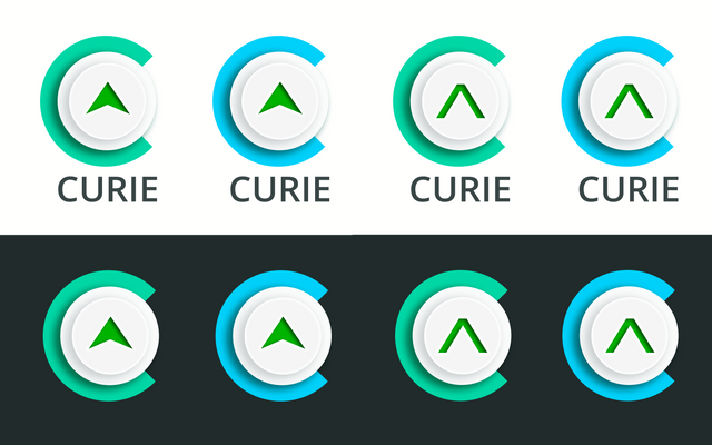
I decided to not add more to the C and upvote button design, and then tested it on black and white background.
5. A good logo design should use strong typography.
I have learned this before in web design, that using clean and easy-to-read font is very important and I think this also applies to logo design. Sans-serif fonts are most recommended in web design since they are easy to read even in smaller screens. So here, I used Open Sans.
Another important factor in making a good logo design is uniqueness. Although, I'm not so sure if my logo design is unique enough to stand the chance of being considered by the Curie curation trail. :D
Here are the final logo variations..
If you like my design, please feel free to upvote my comment with my entry here and if you want to support other logo designers, you may also upvote their comments with the logo entries in this post. I am also betting on two other logo design entries on this contest - the ones created by @bryanlornemez and @fivefiveeleven, their logos look clean and professional.
Thank you for taking the time to read this post..
Happy Steeming!
@sassylori
.png)