Data visualisation: what’s next?
The trends of data visualisation are forever shifting and changing as the data climate evolves at an ever faster pace. I’ve put together some thoughts on trends that I have identified in the last five or more years, where we are now and where, I believe, some of the focus is going.
Meaning of data
Let’s start with how we think about data and how it is processed, which is demonstrated very well by this data evolution flow:

Simply speaking, you start with raw data — data that has been recorded by sensors, people or any other means and stored in its rawest form as numbers, symbols or words. The second step is to organise it into tables, columns and spreadsheets so we can start making sense of it. Once that has happened, we can transform processed data into bits of information by providing contextual details, explaining what certain data points mean and how they relate to each other. After this the data has been given shape. Once I am able to perceive that information, understand it, and connect it to my previous memories and experiences, I have gained knowledge. That ultimately gives me the wisdom to make future decisions based on the knowledge that originally came from that raw data point.
I also think that there is a loose correlation between the data evolution flow and how things are developing in today’s data visualisation world.
But first I would like to share something that, for me, formed the basis for understanding the importance of using visualisation to gain understanding, and to be wiser the next time round.
1986 Challenger disaster

I remember very clearly the first time I came across this article, published in Edward Tufte’s book ‘Visual Explanation’, and I never forgot it. I use this example a fair amount as it demonstrates the importance of understanding the data and choosing the right data points so well.
As part of the investigation after the incident, those responsible for allowing the shuttle to launch gave the following data as evidence that they could not have predicted the dangers. It’s amazing that considering these are supposed to be the brightest people on the planet, these rocket engineers thought it was good enough to present their case in this format.

As part of their statistical evidence the engineers only looked at nine out of the 25 available rocket launches, and only at a small range of technical factors. But the most important points is that nobody seemed to make a correlation between any rocket failures and the air temperature on the launch day.
Tufte redesigned the chart focusing on exactly that correlation.
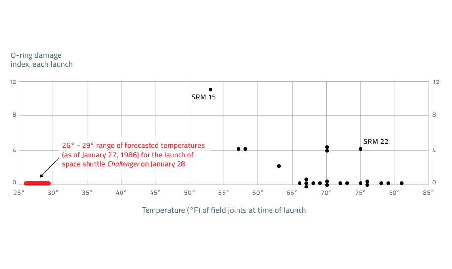
As you can see, the challenger’s launch air temperature was around 27 degrees Fahrenheit less than the coldest launch, which happened to have the highest damage index.
What is also clear from that chart is that the warmer the air temperature the less damage counts there appeared to be. Now, you could say that this chart does not seem like ‘rocket science’ at all — it just proves that finding the most correlative data isn’t always straightforward. There has been a lot of talk that Tufte’s case ignores much of the complexity of the data and physics involved, but in my eyes it remains a vital lesson.
There’s a great example of an early big data project carried out by Matthew Maury, an American oceanographer and cartographer. He gathered data from thousands of ships’ logs to compile the first atlas of the sea.
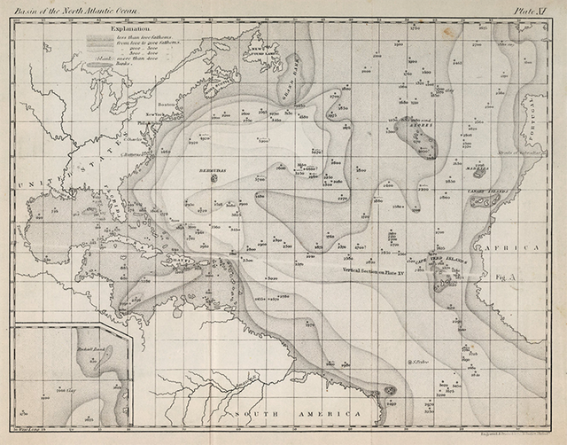
What was so important about this is that it helped ships get where they were going faster and safer. And if you can get there faster, you have an advantage — whether it’s in war or in business.
Celebrating complexity
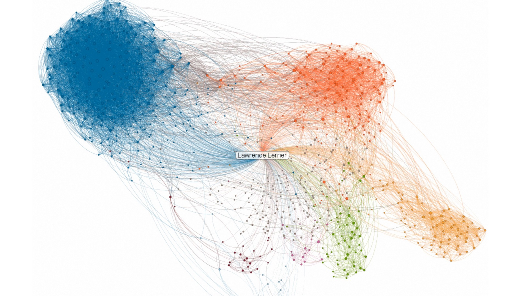
In the past five years or so we have seen many visualisations that have tapped into this very idea. Like this LinkedIn network visualisation, describing the amazingly complex web of people’s contacts. It only visualises the organised data (data evolution chart) though, arguably failing to transform it into meaningful information.

If you consider data visualisation as a new paradigm inside the design world, the idea of showing off the power of data makes complete sense. It’s all about demonstrating that you own the data, that you have access to it, that you can understand it or that you have the ability to manipulate it.
Another example is Brendan Dawes’ work for EE that shows what people are talking about during a day in the life of a city. What’s interesting about these visualisations is that they celebrate complexity. They almost wear it like a badge of honour.
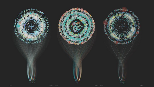
Some say they are more art than anything else. They are beautiful, and don’t get me wrong, I think they were absolutely vital in engaging the viewer with the intangible world of data, and thus earn their rightful place in the evolution of data literacy. However, we can certainly argue that it would be very hard to extract any actual knowledge or insight from them.
Early interactive examples of data visualisation mirror the same argument. The rationale for data visualisation 10 years ago was to show the entire data set in one screen, and to interrogate the data by applying dynamic filters, like this example by Ben Fry, exploring the DNA pattern of two people. As a novice it is very hard to extract any knowledge from these visualisations. Sure, the primary audience for this type of tool are content experts, and again these pieces contributed immensely to the evolution of data visualisation.
Intersection of Data visualisation and UI / UX design
I think that at the moment we are seeing a really exciting shift, which is to use interdisciplinary skills to create more immersive, more intuitive and richer data-driven user experiences. And this is very much how we approach things at Signal Noise. This is by no means a new concept but as always it takes time for great ideas to get widespread recognition. We are becoming more accustomed to data and data displays, at least in part because of the work of Ben Shneiderman, who has pioneered a lot of this thinking since the early 90s.
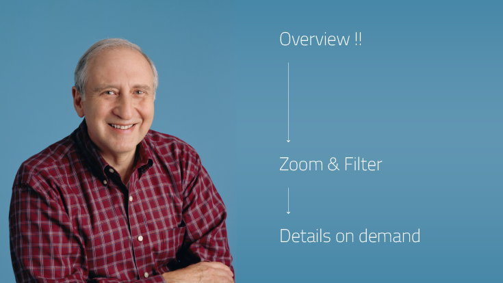
In order to understand any larger data set we need to consider how we as humans perceive information, and what will make us more likely to process it. Shneiderman’s work on very sophisticated data analysis software Spotfire is probably his most successful. He developed a set of principles which begin with creating an overview, then zooming and filtering, and lastly providing details on demand. Display the whole spectrum of data points first, so you are able to quickly identify any extremes, outliers and where the average sits. As you gain an oversight, the second step is to then further investigate a specific data point that caught your attention. As you are discovering more about the chosen data point or subject, you are able to then interrogate the data even further at an even greater granularity on demand.
The next couple of examples demonstrate this really well. And I think that at the moment the cutting edge in data visualisation comes from data journalism, in particular from the New York Times.
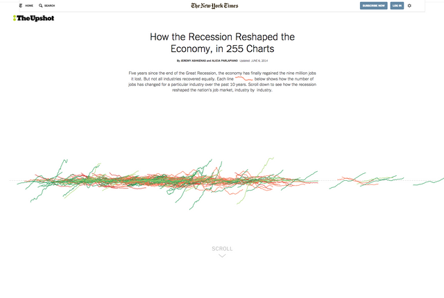
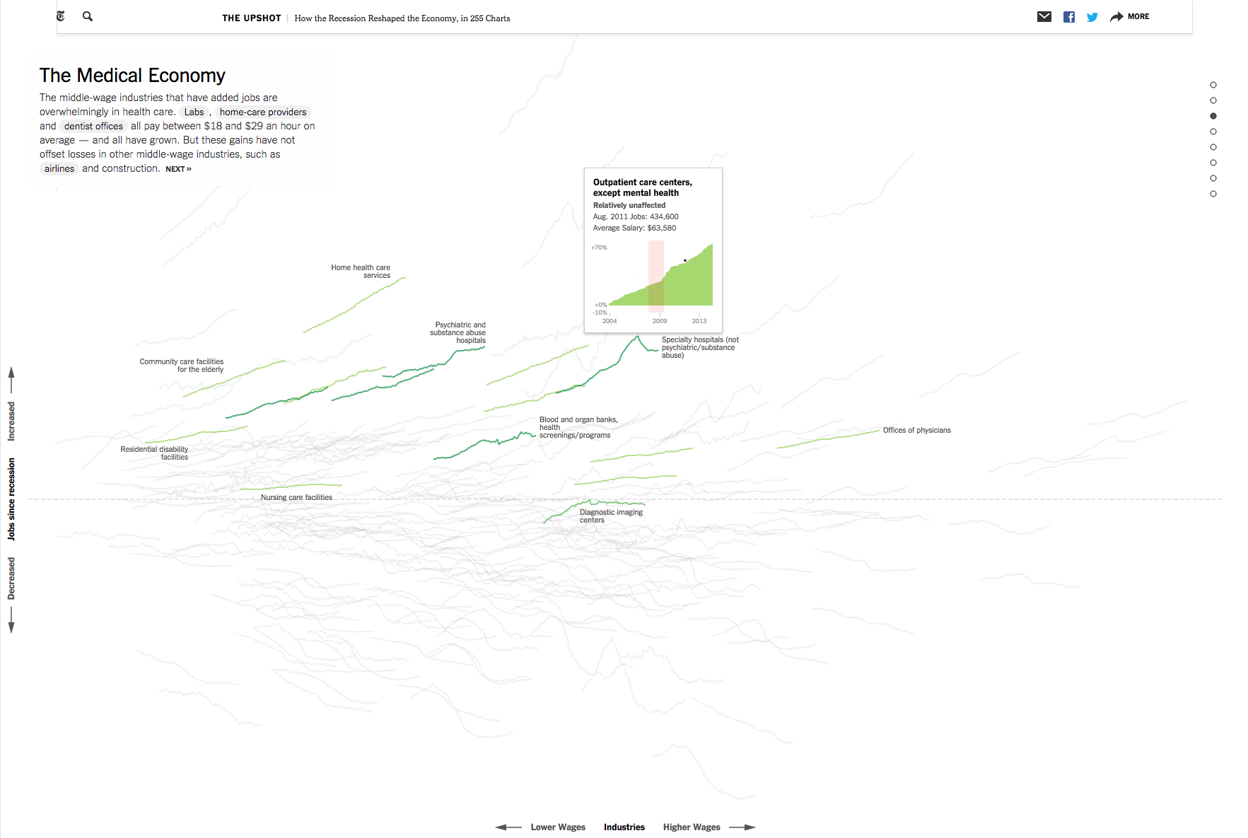
This example applies Shneiderman’s mantra very well. The article is about how the recession reshaped the economy in 255 charts. Sounds scary and certainly looks like a lot of data points. What you see at first is an overview of all the charts overlapping on the same scale allowing you to see any outliers, or extremes. Each chart shows the number of jobs for a different industry. Green indicates an increase and red a decrease.
As you scroll down, the visualisation explodes, expanding the charts so you can now see each one individually. Again like in the Bloomberg example, they are providing additional contextual information in the form of editorial content, and pulling out specific charts to guide the viewer through the data. So from overview to zoom and filter, and lastly to more information on demand as you roll over a chart. Just as Shneiderman preaches.
Moving to the financial sector, one example that works extremely well and certainly provides me personally with a lot of inspiration is this financial trading platform by CMC markets. This extremely rich and holistic platform probably took years to develop, but I think they got almost everything right in terms of visualising and communicating financial stock data.
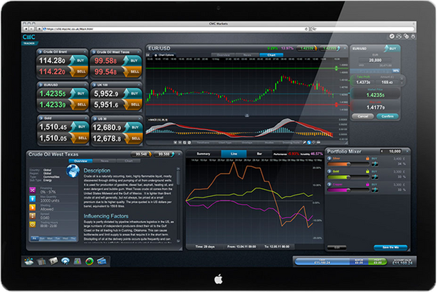
Think about the user types. Anybody from amateurs to experts need to be able to use this platform to make informed decisions on which stock to pick and what trading action to take. Key to this is the ability to heavily customise the interface. You can choose to look at a single index chart, which is a representation of multiple, sometimes thousands of individual stocks in order understand or predict a movement of an individual stock that is nested within that index. Equally you could be looking at 12 charts at once, mixed with some sentiment information. It is up to the users how much or little information they want to consume at any given point.
Interactive and intuitive interface elements, such as sliders, allow the user to adjust certain parameters and understand how their investment portfolio might be affected. Contextual information in the form of news or alerts helps users better understand what’s going on in the market. Combine everything together and you get an incredibly rich data experience. I think it is that exact approach of amalgamating data visualisation with UI/UX expertise that we are seeing much more of. Something that we call ‘Data Design’.
Taking customisation further, I think we will soon be seeing a lot more personalised information.
Interconnected lives
As our lives get more and more interconnected we will be seeing a lot more egocentric data visualisation. Thinking about smart devices and how quickly they improve, the point at which they will know you and able to reflect your life will be interesting in terms of the data display.
Where in the previous examples, you needed extra contextual information to extract meaning, that’s no longer as much of a necessity for personal data. When you see a graph of your step-count on your phone, you instinctively understand how it relates to your actions. In the same way, you don’t need as much contextual information about a smart thermostat like Nest, because you use it in a specific environment where the data it displays is obvious. In turn we are able to strip away all other unnecessary information that would have been needed to cater for multiple user types and user needs. The challenge here is to design the data in a way the user can recognises as his own. We call it ‘show me that you know me’.
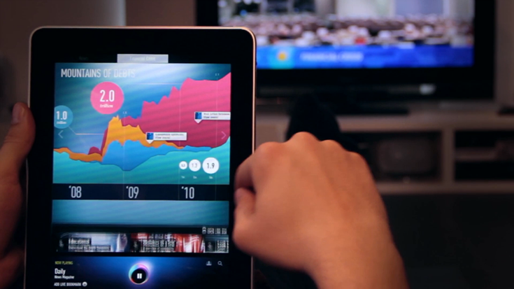
This leads to my last example which is actually more metaphorical. As in most creative industries, everything goes around in circles and most often we swing between maximalism and minimalism. And I think we are currently halfway between these two states, starting with those complex visualisations and shifting into a world which is much more simple and minimal.

This is the Hammerhead navigational device for cyclists. Obviously if you’re cycling, you don’t want to be messing about with your phone. This device tracks the route you’ve added and uses a few LEDs to tell you when there’s a turn coming up. It has a single button that you can press when you see a pot hole. And then every other user will get an alert just in time, when they’re in the same place.
Lots of data, lots of insight, but super minimal feedback. It’s all about the right bit of information at the right time and the right location.
It is that very approach that we, as data designers, will explore more. As the world gets seemingly more and more complex, we will crave an ever simpler way to look and understand the data that surrounds us.
Congratulations @chrille1! You have completed some achievement on Steemit and have been rewarded with new badge(s) :
Click on any badge to view your own Board of Honor on SteemitBoard.
For more information about SteemitBoard, click here
If you no longer want to receive notifications, reply to this comment with the word
STOPCongratulations @chrille1! You received a personal award!
You can view your badges on your Steem Board and compare to others on the Steem Ranking
Vote for @Steemitboard as a witness to get one more award and increased upvotes!