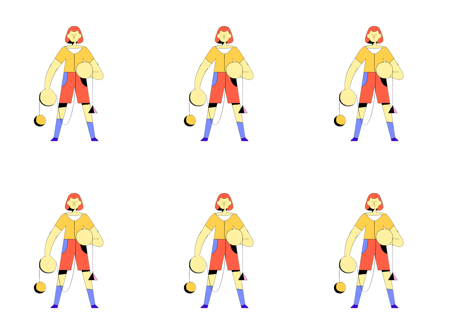
HOW-TO: Character design 01 - Timelapse
Hiya, how's it going -

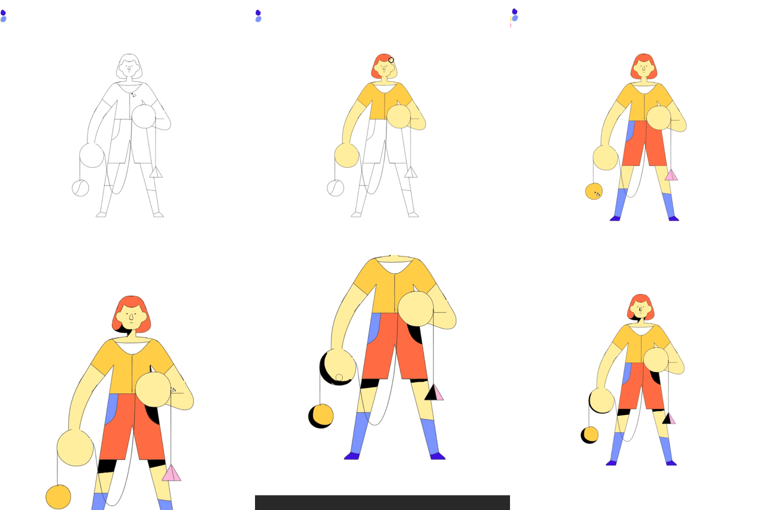
Today I did some character #design tests and decided to record it as a timelapse. It is interesting to see how simple geometric shapes (try to) form a cohesive figure. I especially like this minimalistic creative approach since it lets you play around with options, ideas quickly, which is invaluable in a production environment.
The importance of this exercise is to get yourself familiarized with spitting out roughs and sketches super-fast, yikes!

It is a good idea to use your lineart as a base and fill in the shapes - fancy term for colouring in, lol - to see if the silhouette is working or not - our eyes read shapes and forms a bit easier. It's not a rule of thumb, though, just good to know how to approach things now and then.

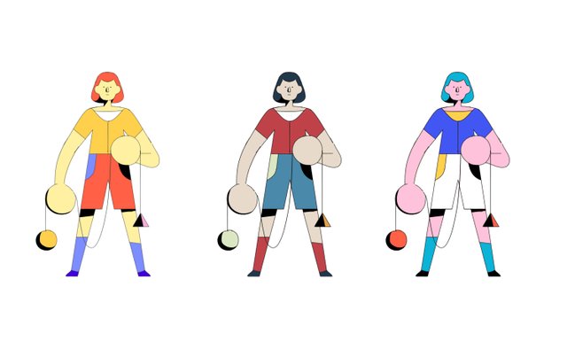
If you have the time, try out a couple more colour palettes. Rarely is the first option the right one, so just go ahead and play around with different shading.

A last step would be to take the design even further and draft up a few more style options of the same characters. For ex. textured, with patterns, without lineart, using traditional media, etc.
Please let me know if this is a format you would like to read/look at/being spammed with more & comment below -
Thanks for reading,
András
........
If you haven't already, check out my Intro post and my other animation break-down over here
........
© 2018 Ferenczy András / All Rights Reserved