Visual Identity For Pastry Shop called "Yum"
Here is my latest project I did couple day ago. As I said in introduction post, my profession is graphic designer, to be more precisely Visual communications design and IT support in publishing.
This project is for my very good friend who is opening pastry shop in my hometown with his girlfriend. He asked me to do something that will look retro, happy and playful but in the other hand something that will not look so childish.
I did some black and white sketches and some progress as you can see:
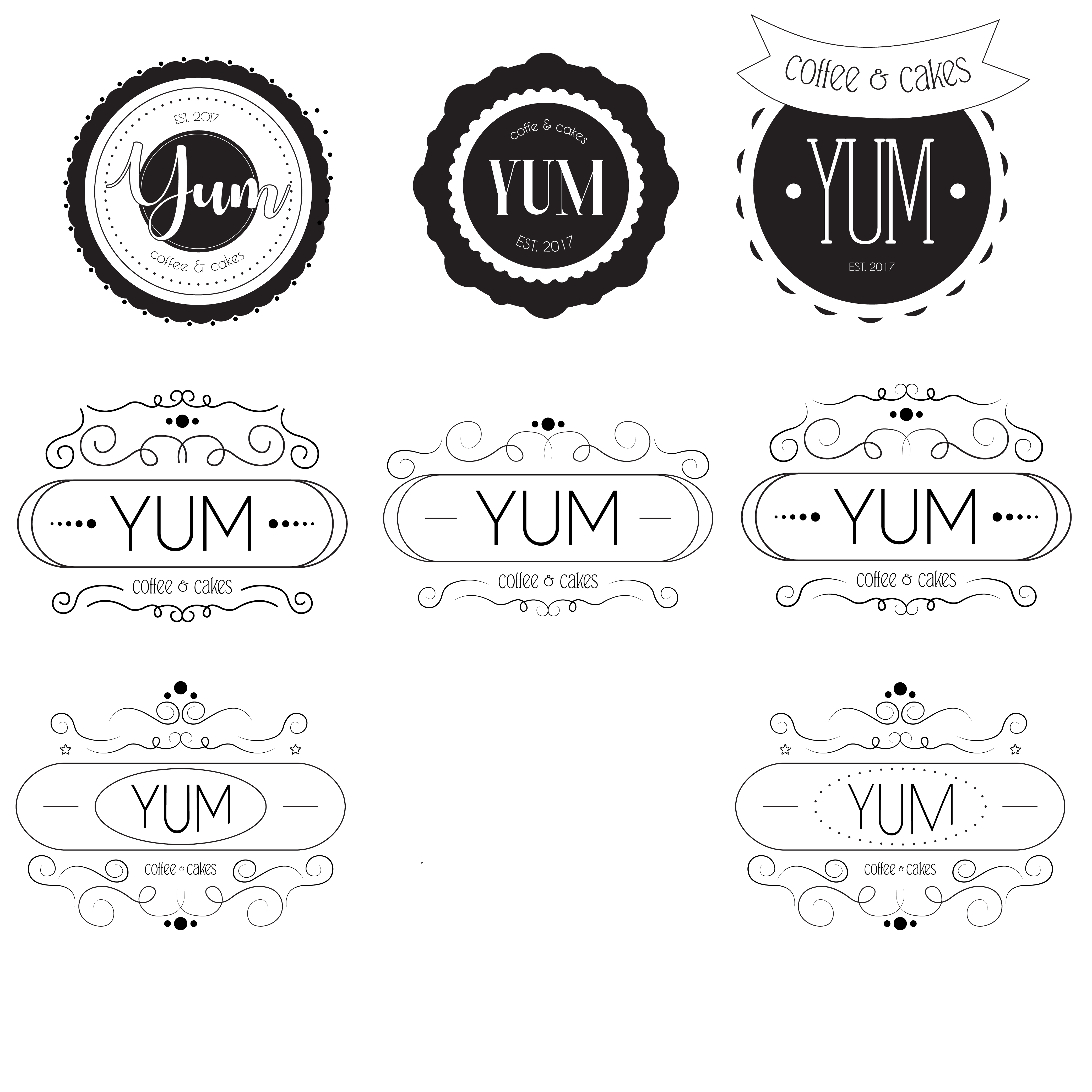
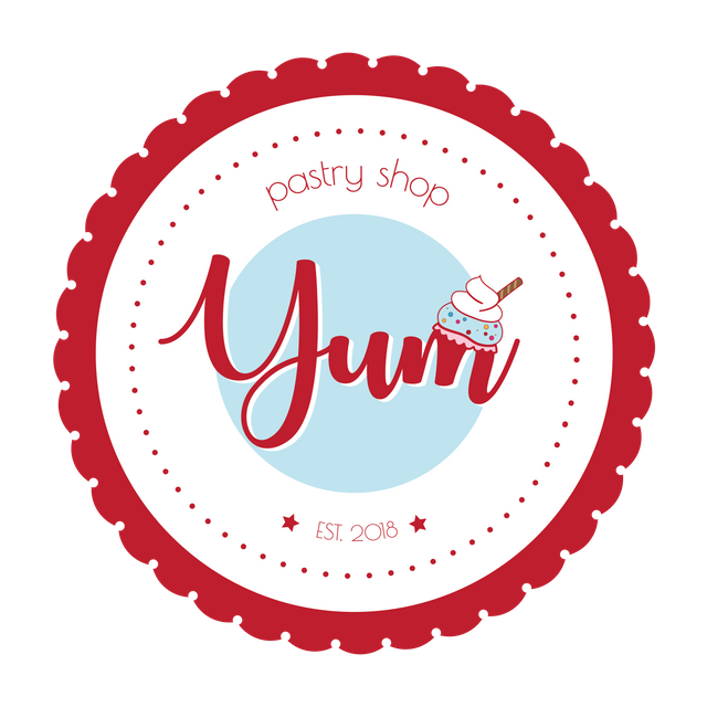
I've chosen this as my favorite one and I did some stylishing and colouring and it ended up like this:
And at the end I did some mockup to see how it will look like after application:
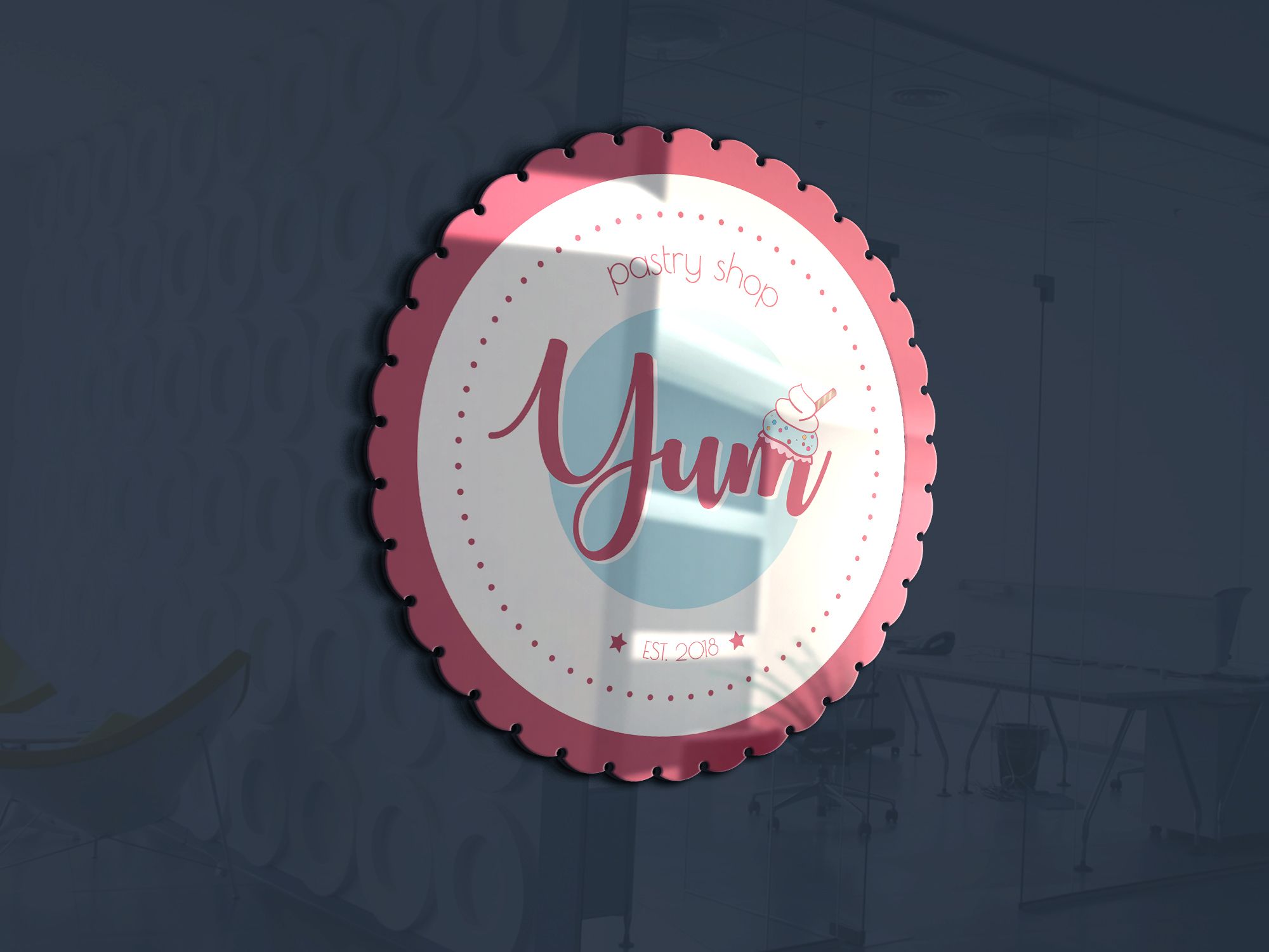
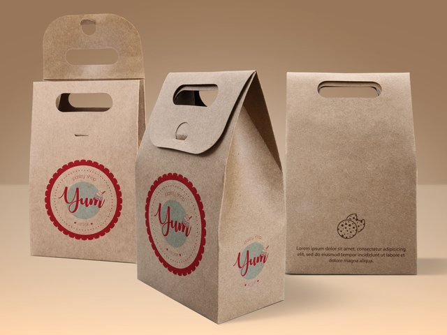
(Third party logo used in logo mockups are for preview only, all rights belong to their respective owners)
What do you think? You like it, or you have something to add? Please, feel free to write me your impression, it will help me a lot. Thanks in advance!
Kind regards,
GG
Where is it?
You will find out soon. It's in progress :)
I was thinking about microlocation and how would it fit. What will they sell ?
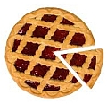
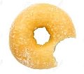
Cut or bite ?
It will be like coffee and cakes. Cuts I think. You will be able to sit and enjoy or just to have some to go.
Hello @gingergeorge. Very cute, for the bakery. You say in your post that you designed it with the help of psdsuckers. That is, is it like a template provided by the website and you give it life with your design?
Thank you @rosibelsac. :) Actually it is a web page with all the templates in which you put your design to see how it would look like when your design is applicated.
It's okay. Very good tool, your design is very beautiful. Successes @gingergeorge
Thanks a lot @rosibelsac, It really means to me :)
It looks good.Reminds of the american 50's style. Retro and playful truly is
Thank you my friend :)