Designing A Logo For @life-relearnt

the finished product
I'm definitely not the best when it comes to designing and drawing, but I like to think that I do an okay job with what I have. Just recently I've tried drawing something up for @life-relearnt (a.k.a. minismallholding or my mum).
I'm doing 2 main logos, one for her #liferelearntproject and one for her account @minismallholding. I've already done the minismallholding logo in the past, so I'm redoing it with my new practised drawing skills. The life relearnt one I've had to do from scratch.
Life Relearnt
I start by sketching ideas. I knew that I wanted something to do with learning and education, as that's what a lot of the account is based on, and also nature. I wanted a green aspect to it to kinda show recycling and growth.
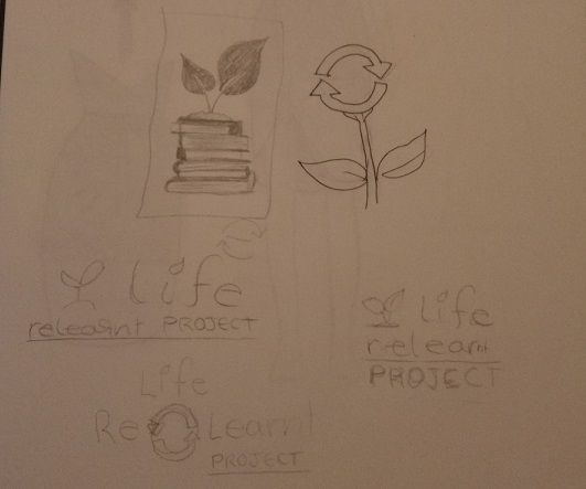
I drew a lot of awful designs, but ended up on a stack of books with a seedling thing on top. Once I'd decided that was the design I wanted, I drew it up by using stock images for ideas and reference.
The next step for me was to do a rough drawing over it in pen to make it stand out better from the paper when I scanned it. I scanned it on an app called tinyscanner (I have it on android, not sure if it's on the appstore). I have the free version of the app so can only scan a few images at a time, but this generally isn't a problem as I move them to my laptop straight away.
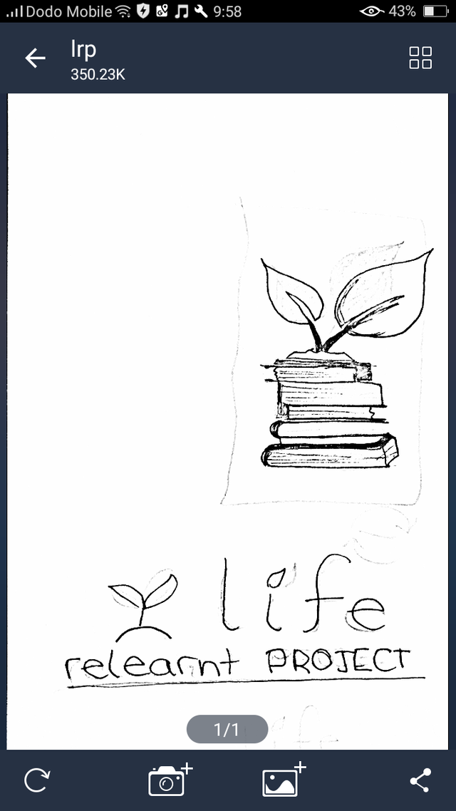
what the scanned image looks like
I edit the images on Paint.net. It's open source and definitely the best drawing and editing software I've found so far (for free). I upload the image, lower the contrast, add a new layer and draw on top of it.

I use the line tool and do a rough outline, then use the paintbrush to fill in any gaps. Once finished I clean up the edges and delete the original layer (paper drawing scan)
I then removed the background (so the logo can be placed on any colour) and saved several copies of it. (black with no background, green with no background, green with white background)

Miniature Smallholding
For the minismallholding logo I traced a figure of a chicken to get better dimensions, as the first logo I did didn't seem to have the right proportions.
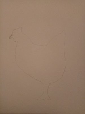
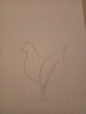
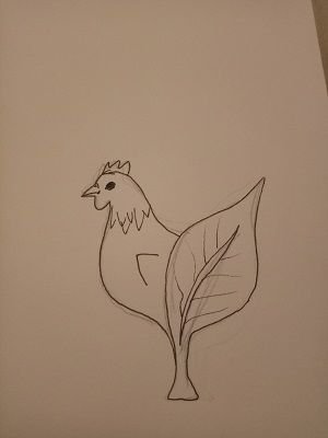
All I have left to do with this is drawing over on paint. I'm also hoping to do text logos for them all.
Thank you :)
Do you not like Krita or Inkscape? XD Okay in fairness I don't really like Inkscape either but clean scalable lines are nice things for logos to have.
Don't worry, everybody starts out with awful designs. What you ended up with is pretty cute, nice work :)
I tried inkscape but I didn't particularly like it. Not heard of Krita though... Still have a long long way to go but thank you!