Principle Of Illumination In Design
I wanted to try this design since quite a while now. I am amazed on how designers create depths in their objects and just by subtle moments add realistic as well as psychologically apt accents in their designs.
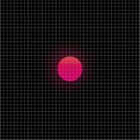
I used to use Outer Glow in Photoshop to enable an exhaustible light coming from the object. But in this particular design form, I have tried to use the blur effect on the smart object of the same circle, behind the duplicate object of the same dimensions, just with the opacity to maximum.
This was the guiding principle:

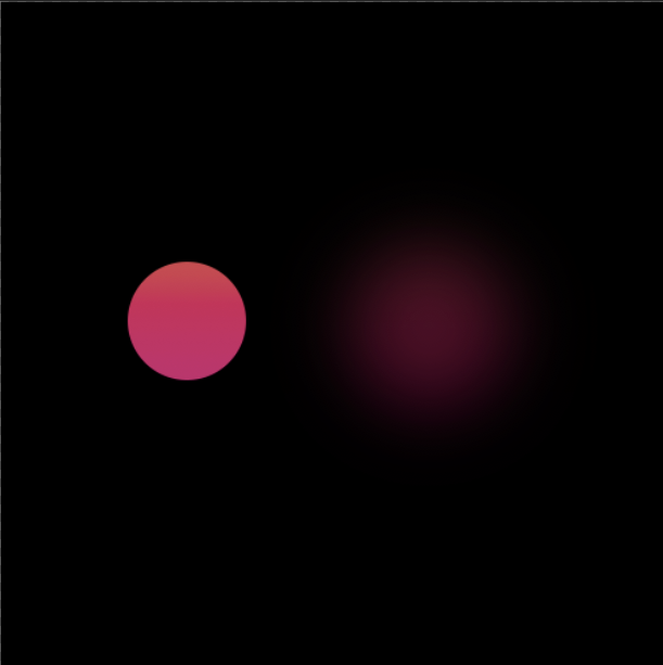
The importance of having color-ful shadows in the front dimension is very important in the illumination model of the object. Here is the close-look for the same.
As you can see here, both the objects are same, just the one of the left is with the blur effect along with reduced opacity.

It is important to understand the difference between Outer Glow & Drop Shadow when you are trying to create a perfect visionary out of your elements.
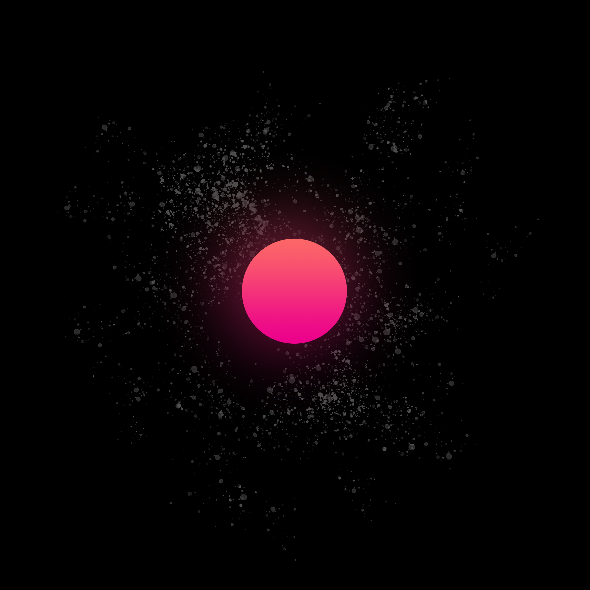
So how does the light setting pan out?
Perfect indeed!

As you can see, I have added the white droplets using the tethered brush to add the layers of stars. It still needs some work, but we will be seeing more into this space exploration!