How I made the KRYPTONIA.IO LOGO (my first post)
Greetings ! before I start let me introduce myself. My name is Kraster and I am a graphic designer from davao city. Today I will show you the process on how I made the kryptonia logo (which, at this time, has been gaining lots of traction) so let's begin, shall we?
First, I research different types of logos and collect any logos that I think matches what I'm aiming to do, or any that fancies me. I then make different thumbnails based on the images that I collected. i compile them all into one file and submit it for checking. :)
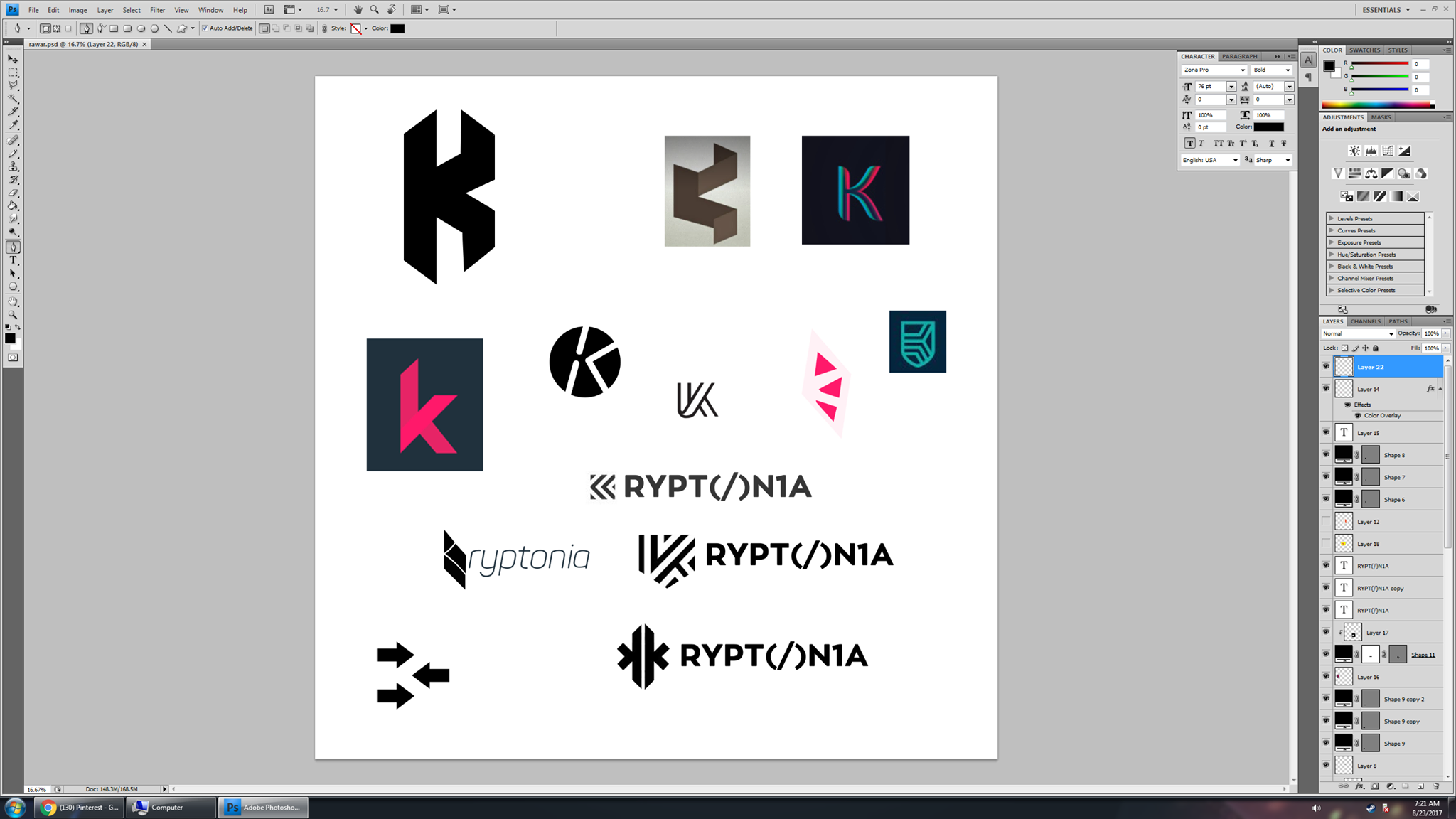
Regarding this particular work, I wasnt happy with the first batch of items. I was thinking I wanted to make a logo that would look like some kind of crystal. So i scrap the first batch and made another, now closely resembling a crystal. I submit it for checking and got good feedback, so I decide to refine it.
I tried looking at the silhouette of the newest logo I made, but it doesn't look good (silhouette is what your logo would look like at it's barest form e.g. black and white). I wanted the silhouette to be clear and recognizable even in its barest form, so I decide to once again scrap the logo and make another one (yes, I tend to scrap multiple designs at once)
I decided that making a silhouette first and improving from there is the way to go, so I go back and make another design.
This is what I came up with:
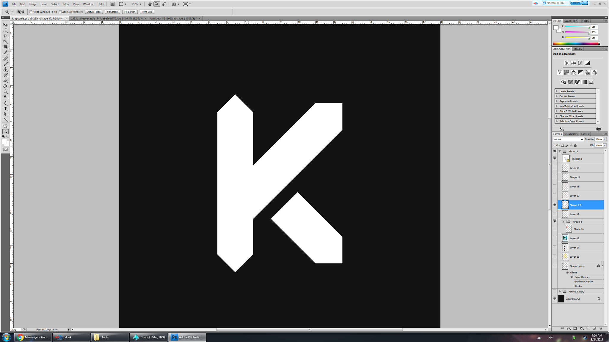
as you can see, the logo is recognizable even when it's in it's barest form. But it doesn't resemble a crystal, so I refine the silhouette and add some details:
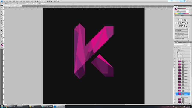
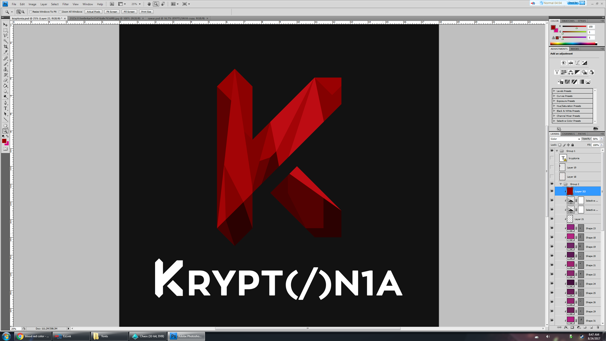
I submit it for checking, and the feedback was: "make it red!" I went with several different shades of red before I arrived at the final color pass (image below)
I then add type and that's it!
I hope you like the final output and had fun reading about the process. Leave a comment, upvote, resteem if you'd like to see more of this.
I bid you farewell this time,
valkangel
Great post hope to see more like this!
Nice! Tha is a talent right there!
Hey besh! Glad to see you here. Hahahah
You're earning now besh. Resteemed and upvoted besh 😁😁😁😁
thanks besh! :D
Effortless besh! Ginalingan hahaha
You really tried here, nice work, my kryptonia id is @grace234
Vote exchange site https://mysteemup.club
Hello, nice post, do you know there is a steemschool on a discord channel waiting to help users become successful on steemit and in real life, its been working for me so far, and with the knowledge i see you have through this post im sure they will love to help you get better. Hope to see you there
https://discord.gg/KY6k7VG
You can also enter a contest to win 3sbd with your selfie contest here
https://steemit.com/steemitschool/@mistakili/4-more-winners-to-go-a-total-of-8-sbds-waiting-to-be-won-or-did-you-win-yesterday-you-can-win-today
Exciting to see your work in action @valangel as you know I have enjoyed your designs for some time and wondered where you found your inspiration.
At last it is explained in using crystals as the backdrop image, natural element giving it a full textured feeling.
Nice post welcome back@christiano199
My Kryptonia account is @ianstevenson
Your view point is correct and this art seems to be very fascinating...