Contest Entry: Spike Spiegel Redesign (Process)
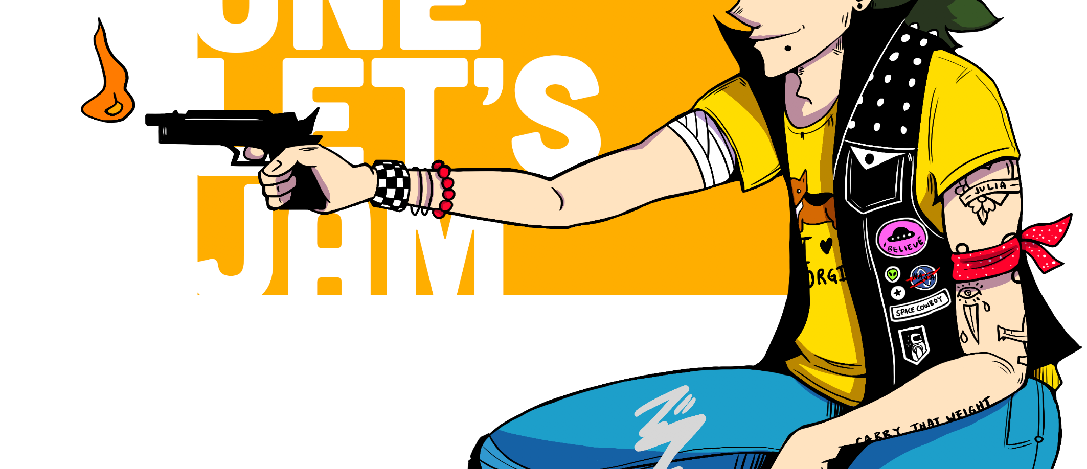
First of all, big shout-out to my pal @cobmaximus for giving me a heads-up about @w0olf's weekly DESIGN A CHARACTER CONTEST. I was super excited because if you know me, then you know I love character design.
I got even more hype when I found out that for Week 8, the prompt was to re-design a character, and then I got EVEN MORE HYPE to discover that one of the characters up for re-design was no other than ...
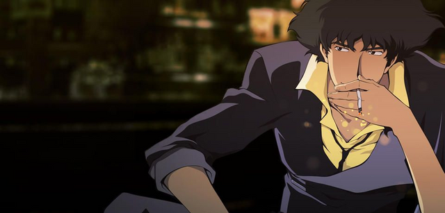
Spike Spiegel from Cowboy Bebop.
GUYS. DO YOU ALL UNDERSTAND. HOW MUCH. I FUCKING LOVE. COWBOY BEBOP. It's one of my favorite animes of all time, and a hugely formative piece of media, not only on my love of space, westerns, and space westerns (you get it) but also on how to tell a story and develop characters. Anyway. The point is, I love Cowboy Bebop a lot, so of course I wanted to re-design Spike Spiegel. So without further ado, I give you ...
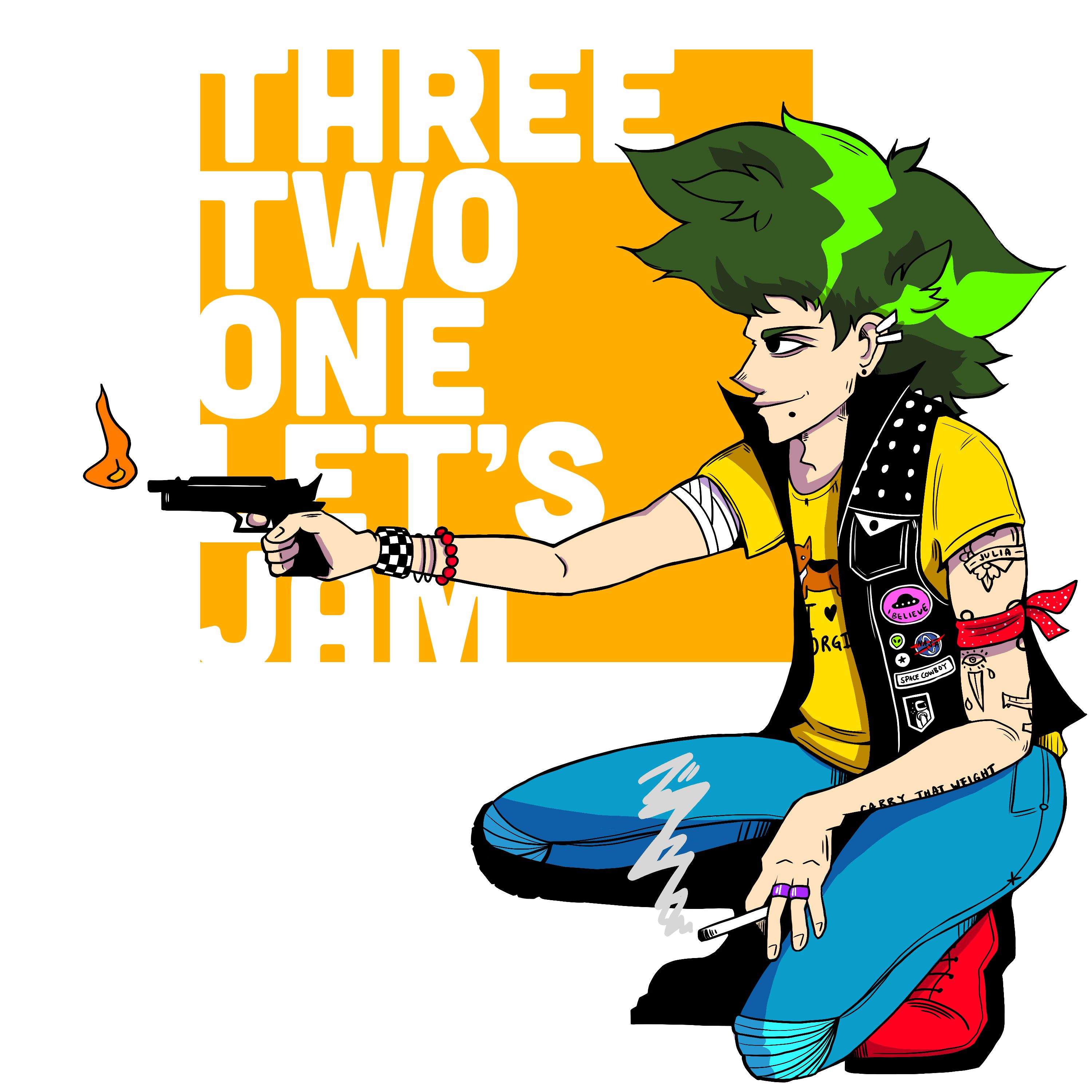
COWBOY PUNK ROCK.
Music is really integral to the world of Cowboy Bebop, and the entire world is kind of built off this low-key jazzy noir aesthetic, so I thought I'd keep the music-inspired look but just shift it to a different genre. So we've got young Spike Spiegel as a space-lovin' punk rock street rat.
Here's a little look into how I redesigned him.
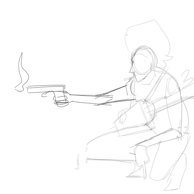
Figuring out the actual pose I wanted was a Mother Son of an Upbitch™. You can see from this first sketch that I actually wanted him to be holding a guitar/keytar, but then I thought about how good I was at drawing in perspective (meh), drawing instruments (bad), and drawing instruments in perspective (death), and decided to quit while I was ahead.
Besides, Spike's gun is such a defining object to his character that I figured I'd keep that, so you can see where I hastily scribbled in his arm as an afterthought.
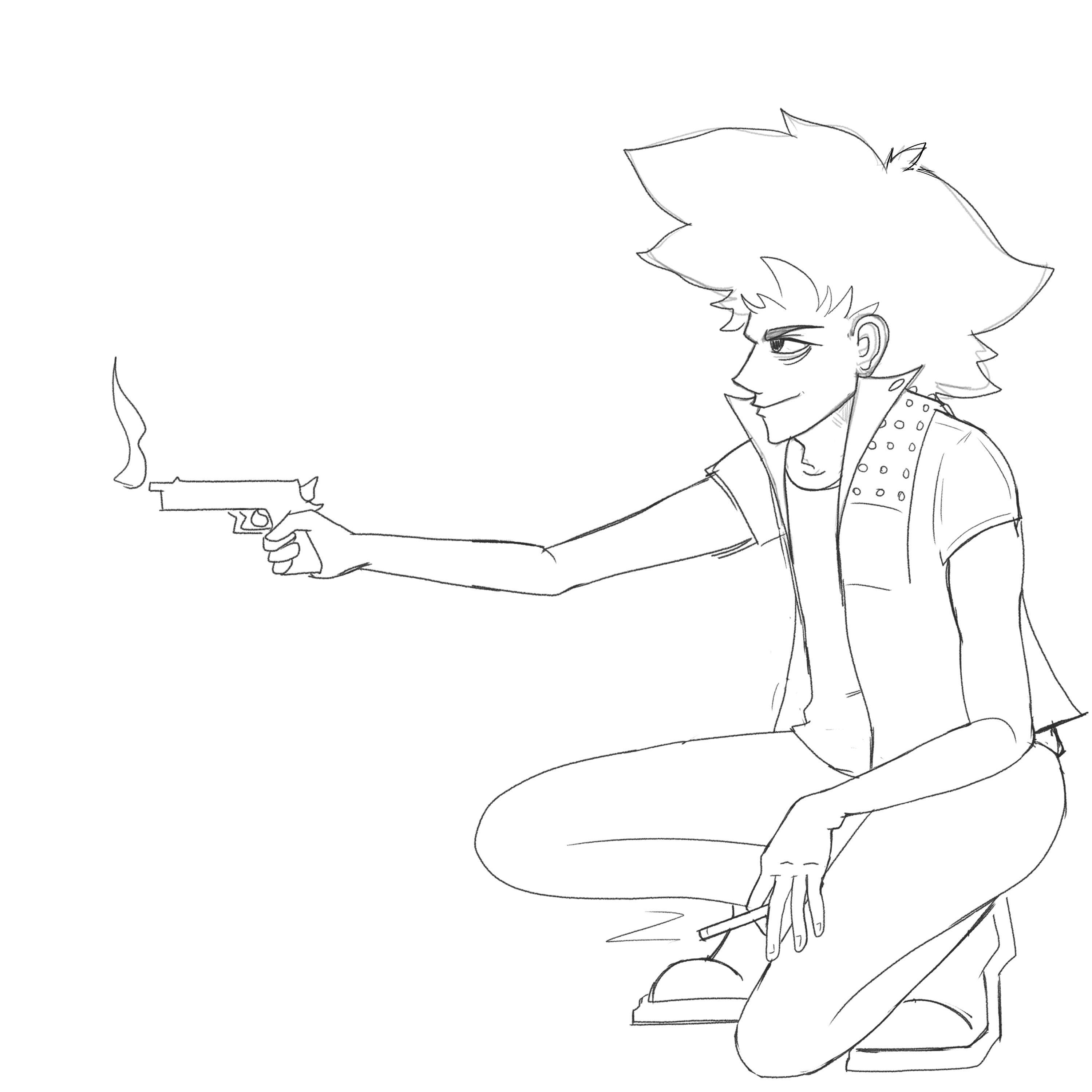
I cleaned things up a little bit while yelling about anatomy the entire time (listen, I had a lot of fun doing this piece but I also really, really didn't). You can see that all his accessories, clothes, patches, etc. weren't drawn into this sketch. Those little details are usually something I leave for the inking stage, where I make them up on the fly.
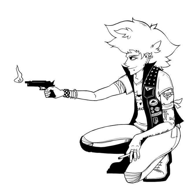
Here are the inks. One thing I wanted to steer away from was straight-up copying the style of the anime, but I think my style is more western comic book-inspired anyway. I'm a big sucker for using large patches of black to add contrast and visual interest to a piece, but this time I had to stop myself from going too far because I wanted a lot of color in this piece.
I'm going to include some detail shots, but as a far warning, I'm about to get Into It™.
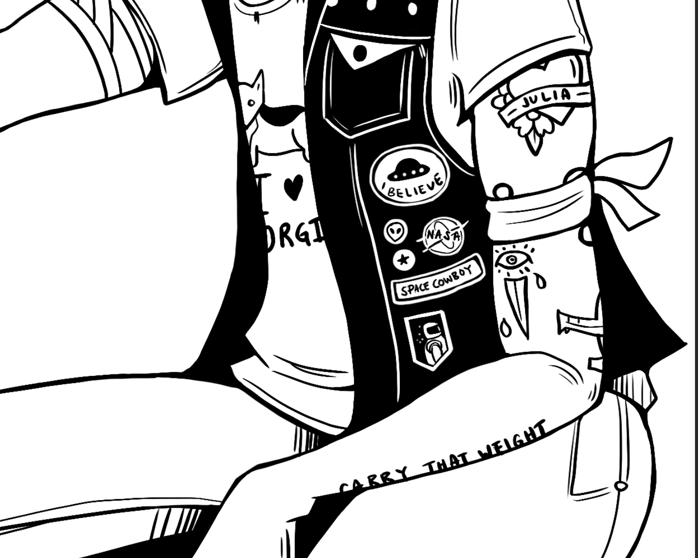
I decided to incorporate some of the details of the anime into his accessories. Tattoos define a person's tastes, beliefs, and personality (I mean, you gotta REALLY think something's important to have it permanently put on you, right?), and since I have a Strong Personal Preference for them, it's almost become a lazy shortcut for me in designing a character. Each of these is a call-back to the anime:
- The heart with Julia is for his One True (tragic) Love
- The eye/sword is a gang tattoo, because in the anime he's part of a crime syndicate, and the antagonist of the series wields a sword (in a world where everyone else uses guns and flies spaceships ... legends only)
- The plane wrapping around the back of his arm is the Swordfish
- (A lot of people in real life have this tattoo, which I found out while researching)
- (Yes, I researched for this, don't underestimate how much I love doing redesigns).
- "Carry That Weight" is a key (: phrase (: to the narrative (: rt if you cry every time bc i do
I also gave him a bunch of space-themed patches because SPACE, and yes, he's wearing a corgi shirt because of Einstein, his pet corgi in the anime. It's very punk, guys.

That done, I threw down some colors. I actually kept all the colors of his original design (he has green hair and a yellow shirt and a blue suit), but I just ... upped them a little. The anime has this cool muted noir look and all the colors are kind of desaturated, but punk is very loud and vibrant, so ... gotta go with that aesthetic.
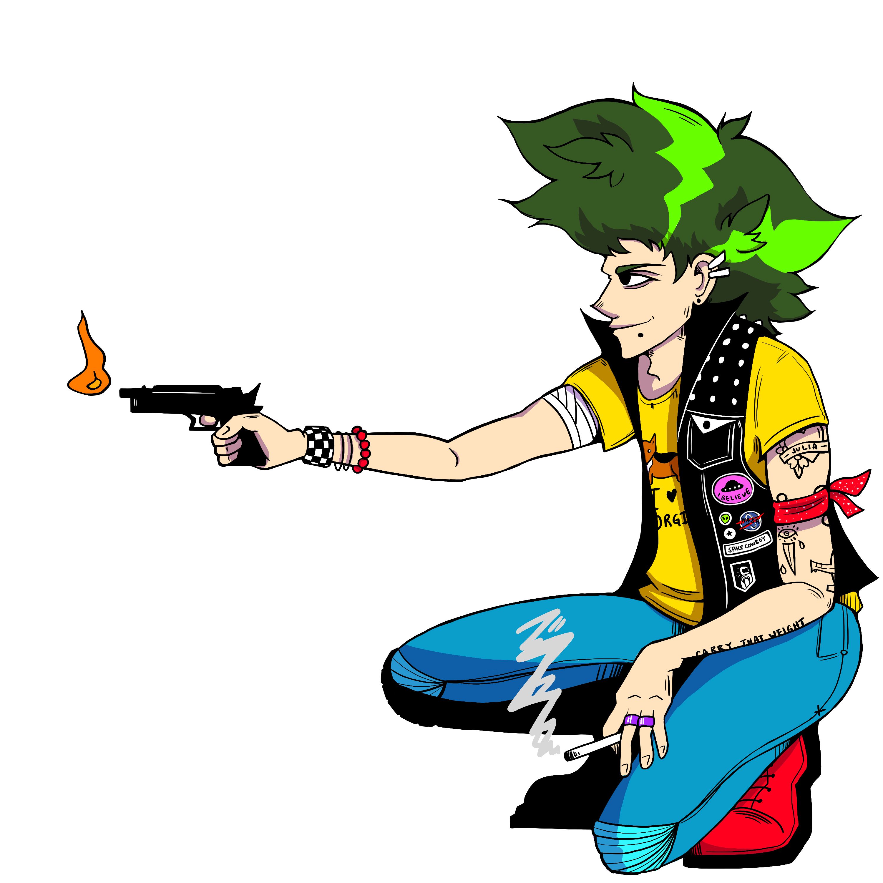
Shadows ... we're nearly there, guys ...
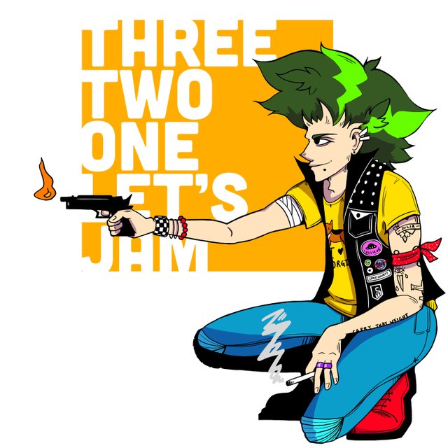
Et voilà, the pretentious graphic designer in me demanded we do some kind of typographic treatment, so I borrowed the lyrics from the opening song and slapped 'em on there. And there we have it! One character redesign of possibly one of my favorite characters from possibly one of my favorite shows of all time ... done!
Here's the process gif:

And uhhh ... go check out @w0olf's weekly character design contest and vote for me?? I guess? Earn me a little $$$?? Thanks??
See ya, space cowboys!
Well done!!!
Dab Dab Dab Dab Dab
ahaha, thank you!!
You managed to make it :D that's amazing :)! Really cool entry, I love all the detail you added, and the fire gun it's a cool toy he has
hehe thanks — i stayed up soooo late to finish this on time and kept getting caught up in all the small details but i'm glad it turned out okay! -_____-
(this week, an entry for your contest!)
Yey :D!!
Woow very cool. Goodluck bro. Hope you will win :)
thank you! fingers crossed :)
Youre welcome bro :)
Really nice :D !
I don't know this anime, but what you did here is soooo nice ! I like the details (space patches, the corgi...) you put in it.
I'm waiting to see the other participations, but for now you got my vote :D
An obviously... my upvote!
See you!
thank you so much! if you're into anime, i highly recommend you watch this series (: it's a classic, and plus, you'll definitely fall in love with the characters.
I put it into my "to watch" list ^^ thank you !
Kudos!
thaaaaaaank you!!
wow very kewl bro love the detail u put at the jacket :D
thank you thank you!! i think the key to a good illustration is in the small details :)