Design a Character S9 Entry #2 : Deathbringer Angel´s twin sister - Klimt style
Hello! Here´s my second entry for the DESIGN A CHARACTER contest - Season 9 by @w0olf. You can find the rules here: https://steemit.com/designacharacter/@w0olf/design-a-character-season-9-style-challenge-win-sbd
For this entry I wanted to make the same character as the previos one but from a total different aproach as the style requires. I think I ended being not quite the same character but who knows, these supernatural beings can probably change their appearences to fool you quite easily.
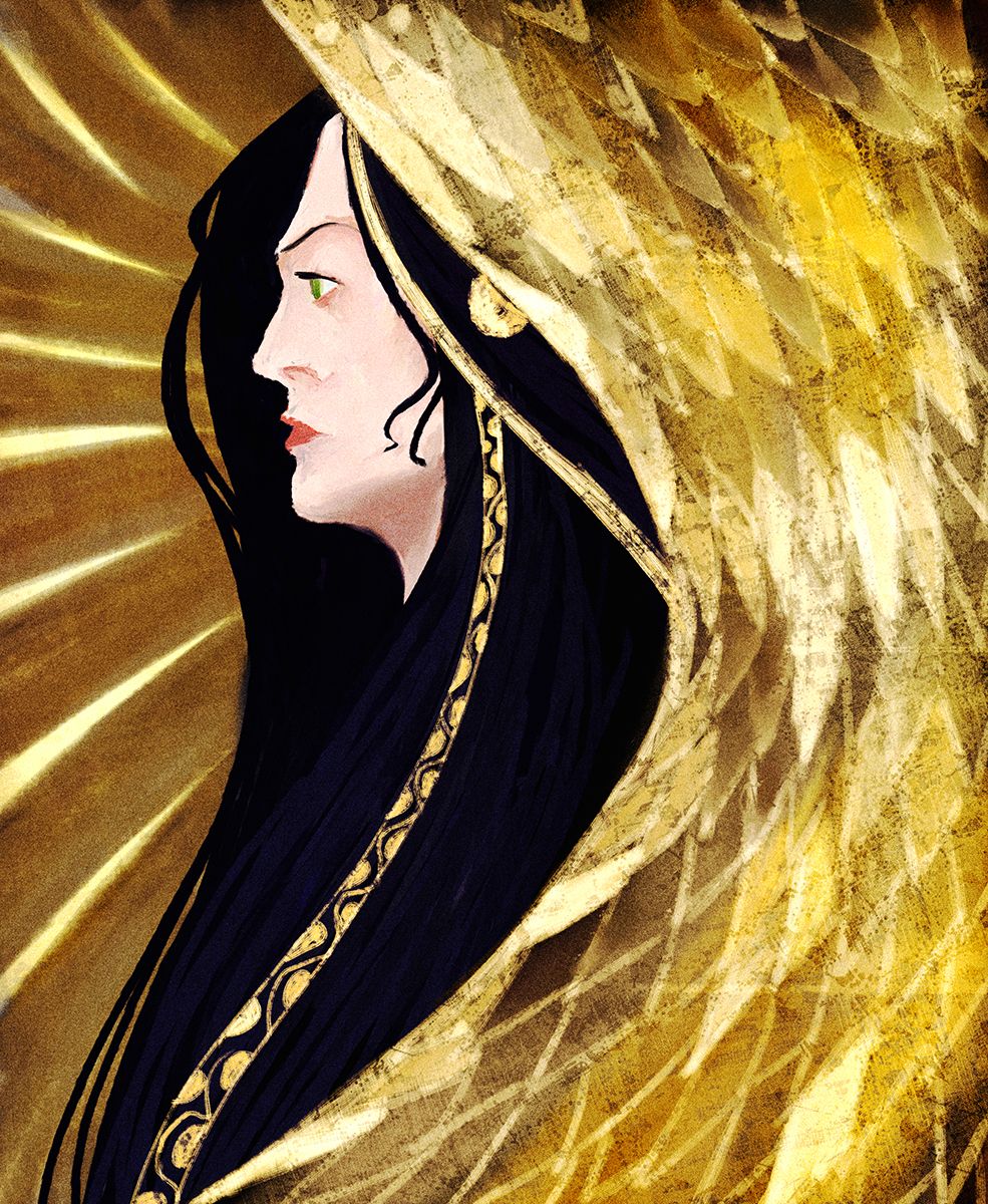
In the process you´ll see how it evolved to this final piece that I don´t hate too much, but I´m not fond of it either.
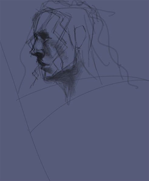
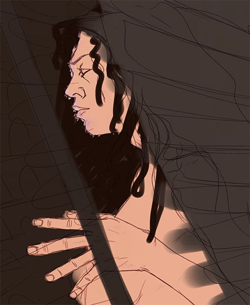
I had one clear idea, I wanted to make a profile portrait.
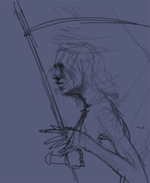
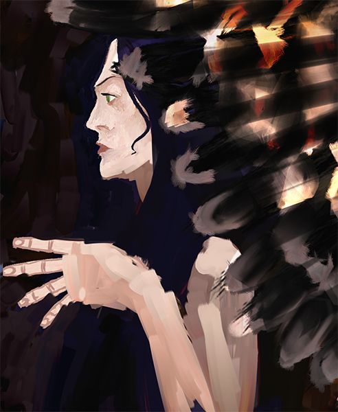
I thought that just a face wasn´t a character design and somewhere in my head, the idea of adding a hand was the best idea to solve this problem. Clever, huh?!
Few seconds after I had completely forgotten about the character and I was already worrying about composition and shapes.
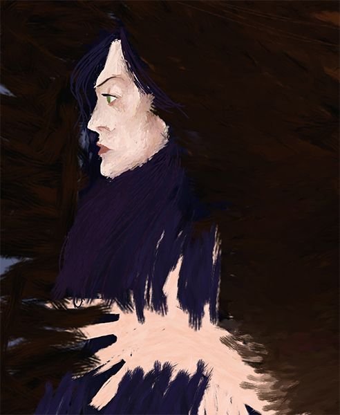
Let´s add some color, that way I´ll see the shapes more clearly! said my yet cheerful brain...
Nothing was working, nothing was looking Klimt-ish enough, so I started changing everything.
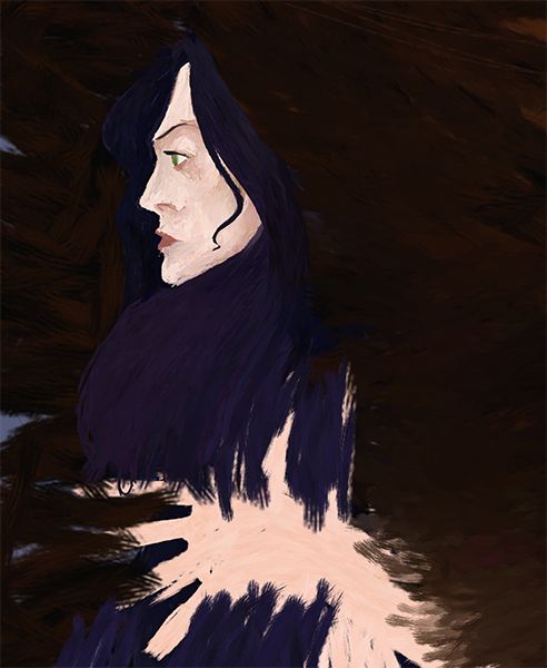
The shape of the face was more simple and I liked it more, but it was not enough.... but wait! I have the solution! let´s add a hair strand in the face!!! That´ll solve all my problems!!
But the solution was far from there.... the hand, that sometime ago looked like a good idea was not helping now, the wings were hardly reading as wings....
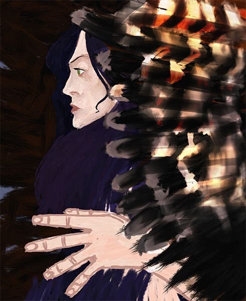
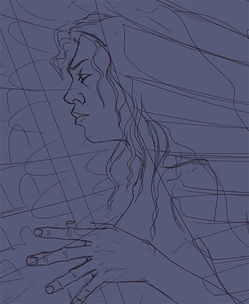
So I tried to fix the image one more time. At this time I was thinking to add an skull cup to the image, you know, she´s thinking... "mmm... nothing like the warm blood of my enemies in the morning..."
I tried some more things and at the end I opted for the "golden graphic" approach.
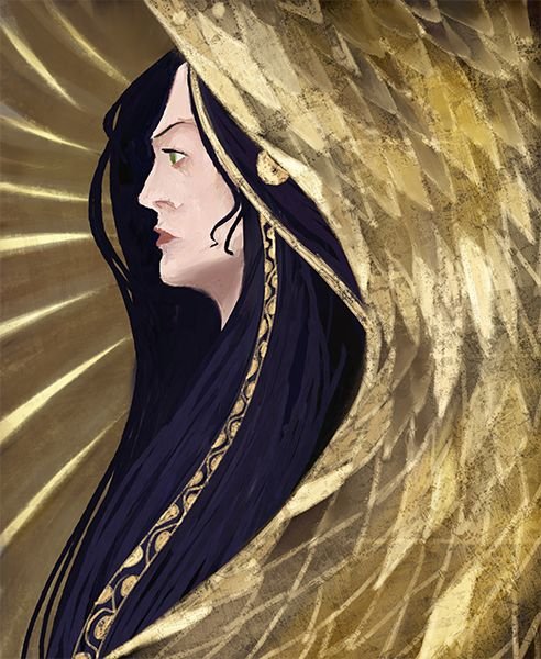
and pushed the contrast a bit, because I´m not happy if I don´t hypersaturate all the images I do....

And that´s pretty much it. I don´t know if a portrait qualifies at a character design for the contest, I´ll let @w0olf and the judges to decide it, but I won´t have time for any other entry, so here it is.
I hope you like it a little bit more than I do. At least anyone doing art should learn the valuable lesson of not getting to fond of your initial ideas. If something is not working, just drop it. Start again. It´ll save you time and headaches. :)
The conclusion is that Klimt, as Mignola and many other great artist don´t, or didn´t let anything out of control. The shapemaking is always deliberate and serves a purpouse in the overall design, and the mastery of those elements (shape and design) is something that takes a lot of practice.
Thanks for watching!

If you want :)
This is lovely
Thank you! :)
Congratulations @javicuesta! You have completed some achievement on Steemit and have been rewarded with new badge(s) :
Click on any badge to view your own Board of Honor on SteemitBoard.
To support your work, I also upvoted your post!
For more information about SteemitBoard, click here
If you no longer want to receive notifications, reply to this comment with the word
STOPDo not miss the last announcement from @steemitboard!
Congratulations!
@ocd now has a witness. You can vote for @ocd-witness with SteemConnect or on Steemit Witnesses to help support other undervalued authors!
Thank you @ocd!
I like how from kinda of a dark figure it turned into a light one :D
Talk about a drastic change! I really like the final result though!
Thank you! Glad you like it. Drastic changes are something I´ve mixed feelings for. I like to be surprised during the process, but on the other hand, it´s easy to get lost and end dropping the work for the lack of a plan... It´s good to hear that someone liked the end result!
I like it very much the drawing. the side face is really cool, i guess I would keep the hand in some other position to visualize an entire body besides just one head, but the final result is incredible! congrats!
Thank you @ceheiberg! The hand had a reason to be. I love Egon Schiele´s work that was a disciple of Klimt and hands are some kind of signature of his work. I could not make it work and that´s probably because, as you said, the rest of the body is missing and it just looked like and sticker. At the end, the practical side of my brain decided to get rid of it and play with the gold effect instead. Again, the lack of a plan led me to and unexpected end result that´s not that bad, so I´m happy. And I´m happy you liked it! :)
see ya bro!...
Done! I did some 3D back in the day and it´s more than a root of art, it´s just another discipline, a bit more technical maybe, but art also! :)
oh really? and why didn't you keep it working on 3d??... haha yes you are right, is a technical root of art, and I think it's good to talk like that ''a Technical Art'' for this time! haha...
The simple answer is that I personally find 2D more rewarding, more "crafty". But It´s a good question, I might make a post about that past life :)
Wow, you are really really great. Your blog is absolutely beautiful. I’m currently running a logo contest that pays 5sbd for an art curation initiative I’m running, would love it if you’d consider submitting. :) https://steemit.com/contest/@lilyraabe/logo-contest-or-design-the-artsearch-logo-for-thenewalchemists
Thank you @lilyraabe. I´ll give it a look later this afternoon. Thank you for the heads up! :)